Yoga Studio Color Psychology: Designing Spaces for Mindfulness and Movement
· Coloracci Team
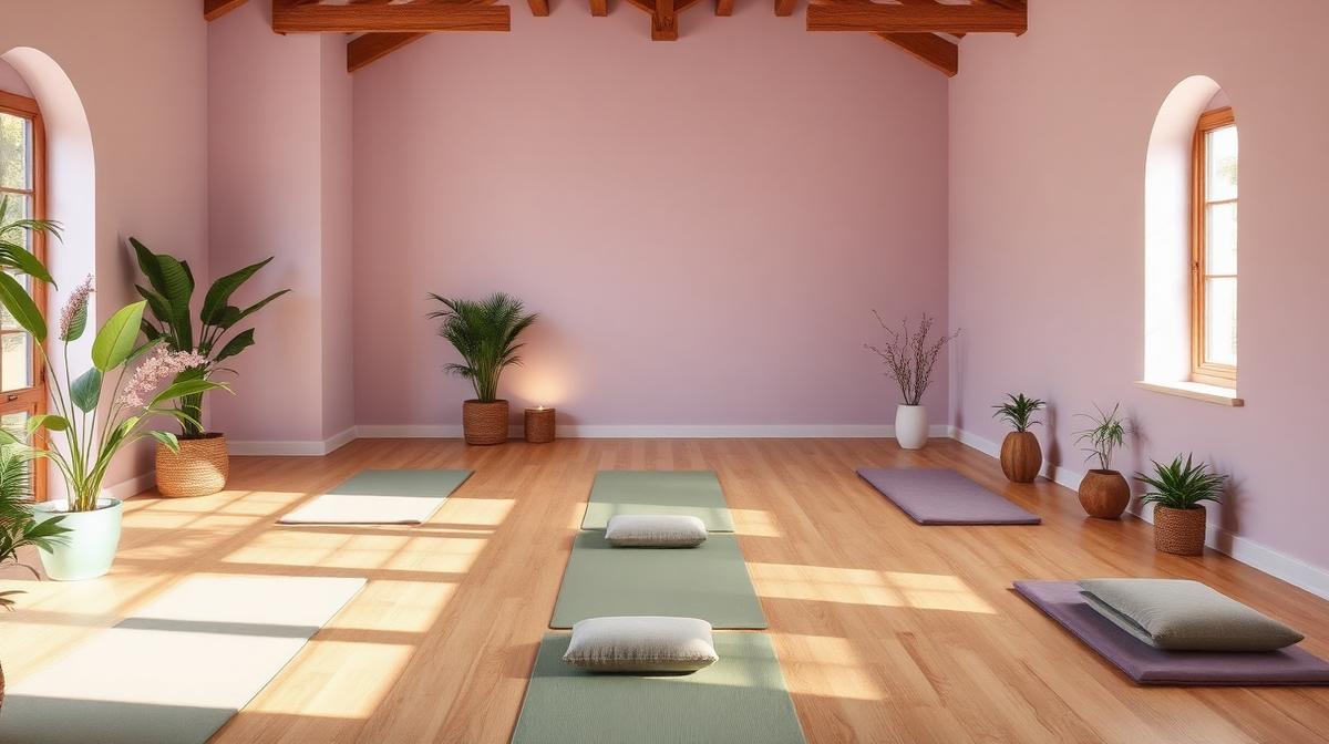
Yoga studios occupy a unique position in interior design — they must simultaneously support intense physical effort and deep mental stillness. The color environment directly influences practitioners' ability to focus inward, regulate breathing, and achieve the mind-body integration that defines meaningful practice. Getting color wrong in a yoga space doesn't just affect aesthetics; it undermines the fundamental purpose of the practice.
The Calm Spectrum: Colors That Support Stillness
Sage Green: The Breath Color
Sage green (#B2AC88, #9CAF88) has become yoga's signature color for specific reasons:
- Parasympathetic activation: Green tones measurably reduce heart rate and cortisol levels
- Nature connection: Green connects indoor practice to the natural world
- Eye comfort: Green sits at the center of the visible spectrum, requiring minimal eye strain
- Non-competitive: Unlike red or orange, green doesn't stimulate competitive or aggressive states
- Breath support: Green's association with plants and forests supports conscious breathing
Lavender: The Meditation Color
Lavender (#E6E6FA, #B57EDC) supports the contemplative aspects:
- Calm without sedation: Lavender calms without inducing sleepiness — critical for active practice
- Spiritual association: Purple/lavender connects to crown chakra traditions in yoga philosophy
- Gentle warmth: Unlike cool blues, lavender has slight warmth that prevents sterility
- Feminine appeal: Yoga's predominantly female clientele responds positively to lavender environments
Warm White: The Canvas Color
The right white (#FAF9F6, #F5F5F0) is crucial:
- Visual expansion: White makes typically small studio spaces feel larger
- Light reflection: Maximizes available light without harsh glare
- Neutrality: Allows practitioners to project their own mental states
- Cleanliness signaling: White communicates the hygiene essential to shared mat spaces
The Chakra Color System in Studio Design
Many yoga studios reference the seven-chakra color system in their interior design.
Chakra-Informed Color Zones
| Chakra | Color | Hex | Studio Application |
|---|---|---|---|
| Root (Muladhara) | Red | #C0392B | Grounding, entrance areas |
| Sacral (Svadhisthana) | Orange | #E67E22 | Creative movement spaces |
| Solar Plexus (Manipura) | Yellow | #F1C40F | Power yoga, heated rooms |
| Heart (Anahata) | Green | #27AE60 | Main practice rooms |
| Throat (Vishuddha) | Blue | #3498DB | Sound healing, chanting |
| Third Eye (Ajna) | Indigo | #2C3E50 | Meditation rooms |
| Crown (Sahasrara) | Violet/White | #8E44AD | Savasana, final relaxation |
The Gradient Approach
Some studios create subtle color gradients through their spaces:
- Entrance: Warmer, grounding tones (earth, terracotta) for arrival and transition
- Changing area: Neutral, practical colors for the practical task of preparation
- Practice room: Cool, calm tones for the main practice
- Savasana zone: Deepest calm — dim lighting, indigo or soft violet
- Exit corridor: Gradual return to warmer, energizing tones for re-entry to the world
Practice-Specific Color Strategies
Different yoga styles benefit from different color approaches.
Vinyasa and Power Yoga
Dynamic, physically demanding practices benefit from:
- Warm neutrals (#D2B48C): Energy without overstimulation
- Muted orange accents (#CC5500): Subtle warmth supporting sustained effort
- Natural wood tones: Warmth and grounding for balance poses
- Minimal visual complexity: Clean walls supporting flow-state focus
Yin and Restorative Yoga
Slow, deep-stretch practices require:
- Cool blues (#B0C4DE): Calm, patience, surrender
- Soft grays (#D3D3D3): Neutral, undemanding environments
- Muted sage: Nature-connected calm
- Minimal contrast: No sharp color transitions that might jar the nervous system
Hot Yoga (Bikram)
Heated rooms have specific needs:
- Perceived coolness: Blues and greens that counteract heat perception
- Minimal visual weight: Light colors feel less oppressive at high temperatures
- High-contrast wayfinding: Clear color differentiation for safety in sweaty conditions
- Moisture-appropriate: Colors that don't reveal water damage or humidity effects
Meditation and Breathwork
Pure contemplative practices demand:
- Deep indigo (#1A1A3E): Depth without blackness, supporting inward focus
- Candlelight warmth: Amber points of light in otherwise muted spaces
- Sound-color synergy: Colors that don't compete with guided audio
- Reduced stimulation: Near-monochromatic environments removing visual distraction
Natural Material Color Palette
Yoga studios increasingly use material color — the inherent colors of natural materials — rather than painted color.
The Natural Palette
| Material | Natural Color | Hex Range | Psychological Contribution |
|---|---|---|---|
| Bamboo flooring | Warm blonde | #D4BC8B | Warmth, sustainability |
| Cork wall panels | Honey gold | #B8860B | Acoustic warmth, organic |
| Linen curtains | Oatmeal | #C3B091 | Softness, natural light filter |
| Stone accent | Gray-blue | #778899 | Grounding, permanence |
| Live plants | Varied green | #228B22 | Oxygen, life, growth |
| Exposed wood | Warm brown | #8B6914 | Stability, craftsmanship |
Lighting Color in Yoga Spaces
Lighting color temperature profoundly affects the yoga experience.
Class-Phase Lighting Strategy
- Arrival (10 min before): 3000K warm, welcoming, social
- Warm-up: 3500K, gradually dimming, transition to practice
- Active practice: 2700-3000K, moderate intensity, sufficient for form visibility
- Cool-down: 2200K, dimming, parasympathetic activation
- Savasana: Minimal light, 1800-2200K if any, candle simulation
- Post-class: Gradual return to 3000K, gentle reawakening
Color Washing
LED color-wash systems allow studios to shift room color:
- Pre-class warmth: Amber wash creating welcoming glow
- Flow sequences: Subtle green wash supporting sustained effort
- Meditation: Deep indigo wash deepening contemplative states
- Savasana: Complete darkness or softest lavender
Brand Identity Color for Yoga Studios
Studio Positioning Through Color
| Studio Type | Brand Palette | Target Audience |
|---|---|---|
| Athletic/Power | Charcoal + orange accent | Fitness-oriented practitioners |
| Traditional/Spiritual | Earth tones + gold | Experienced yogis |
| Modern/Minimal | White + sage + natural | Design-conscious urban professionals |
| Community/Accessible | Warm neutrals + teal | Beginners, diverse populations |
| Luxury/Boutique | Navy + gold + cream | Premium wellness consumers |
Digital Presence Color
Yoga studio websites and social media should extend the physical space palette:
- Website background: Same warm white or natural tones as studio walls
- Typography: Serif or humanist fonts in warm grays, avoiding harsh black
- Photography: Warm, naturally lit images reflecting studio atmosphere
- Call-to-action: Muted accent color (sage, dusty rose) rather than aggressive bright buttons
- Schedule display: Clean, minimal, using color to differentiate class types
Common Color Mistakes in Yoga Studios
Over-Spiritualizing
- Using every chakra color simultaneously creates visual chaos, not spiritual depth
- Excessive purple/violet feels New Age rather than professional
- Too many Om symbols and mandala patterns in conflicting colors overwhelm
Under-Designing
- All-white studios feel clinical rather than calm
- Ignoring lighting color temperature undermines even perfect wall colors
- Neglecting the changing room and entrance creates jarring transitions
Wrong Energy
- Red or bright orange in main practice rooms increases heart rate and anxiety
- Cool fluorescent lighting contradicts warm, mindful atmosphere
- High-contrast patterns on walls distract during balance poses and focus work
Measuring Color Success in Yoga Spaces
Effective yoga studio color can be measured through:
- Class completion rates: Do practitioners stay for full savasana?
- Return frequency: Does the environment support habit formation?
- Practice quality reports: Do students report deeper focus and relaxation?
- Social media mentions: Is the space photographed and shared?
- Teacher feedback: Do instructors find the space supports their teaching?
- Membership retention: Long-term, does the environment keep people practicing?
The most effective yoga studio colors are the ones you stop noticing. When a practitioner is so absorbed in their practice that the room dissolves around them — that's color psychology working perfectly. The color should be felt, not seen.