The Matrix Color Palette: Why the Simulation Is Green and the Woman in Red Still Works
· Coloracci Team
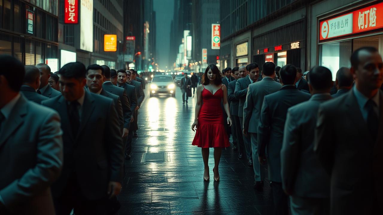
She was never a character. She was a trap.
In The Matrix (1999), everything inside the simulation is tinted green — sickly, digital green, like staring into an old CRT phosphor. That was deliberate. The real world got blue. The machine world got green. Your eyes learn the code without ever being told.
And then: one woman in red. In a street full of identical gray suits, the Wachowskis detonate a red dress. Red is the fastest color your brain can find. It hijacks attention in milliseconds, before thought begins. Neo stares. Distraction, aimed like a weapon.
Here is the genius twist. Red was already the color of truth in this movie — the red pill wakes you up. So the same hue means freedom in one scene and a deadly trap in the next. They trained your instinct, then used it against you. One color, two meanings, total control of your eyes.
Green Inside, Blue Outside: The Two Worlds
Bill Pope (cinematography) and the Wachowskis built a binary the audience feels before it can name it:
| World | Hex Anchor | Feel | Narrative Job |
|---|---|---|---|
| Simulation (Matrix) | #3D5C3A → #6B8F3C green cast |
CRT, code, sickly digital | "You are inside the machine" |
| Real world / Zion side | #3A5F7A steel blue |
Cold, harsh, unglamorous truth | "This is not the dream" |
| Code rain | #00FF41 (display green) |
Terminal phosphor punch | Iconography / title language |
| Construct / dojo | Slightly cleaner green-grey | Training limbo | Neither fully real nor street |
The greens are not "nature green." They are monitor green — yellow-leaning, desaturated in the shadows, a little nauseous in the midtones. That is why the Matrix looks like software instead of a forest. If you build a "Matrix UI" with #008000, you are quoting a traffic light, not the film.
Blue outside is not heroic blue either. It is institutional, cold, underexposed — the opposite of Oz's wonder or a Jedi's trust signal. Truth, in this film, is uncomfortable.
The Woman in Red: Isolated Color as Weapon
| Color Name | Hex Code | Role |
|---|---|---|
| Code Green | #4A6B3D |
Simulation base grade |
| Phosphor Accent | #39FF14 (sparingly) |
Literal code / UI glow |
| Signal Red | #C8102E |
Dress, pills, alarm |
| Steel Blue | #3A5F7A |
Real-world grade |
| Suit Grey / Black | #2A2A2A / #0A0A0A |
Crowd camouflage, void |
The red dress works for the same reason the red coat works in Schindler's List: strip the field to near-neutral, then spend one hot accent. The crowd of gray suits is the "Kansas" — muted on purpose — so the dress becomes an event. In attention science terms, red wins the pop-out race; in narrative terms, the Agents built a lure optimized for Neo's (and your) visual system.
This is the classic "lady in red" cinema trope applied with cyberpunk precision. Same mechanism as a single red CTA on a muted dashboard — and the same danger: if you train users that red means "important truth," then a red distractor becomes irresistible. See also the psychology of red in marketing.
One Color, Two Meanings: The Pill Problem
Most films assign one job per hue. The Matrix double-books red:
- Red pill = wake up, choose truth, leave the simulation
- Red dress = stay asleep, chase the bait, lose the mission
Blue, meanwhile, is both the "blue pill" (stay comfortable in the lie) and the grade of the harsh real world. The film refuses a kindergarten legend like Star Wars lightsaber colors, where red simply equals evil. Here, color is a language the system can lie in.
Design takeaway: semantic color only works if you do not overload it. If red means "delete" and also "featured" and also "sale," you have rebuilt the pill problem in your product.
A Practical Matrix Palette for UI / Brand
| Role | Hex | Use |
|---|---|---|
| App chrome / void | #0B0F0C |
Dark shells where code can glow |
| Simulation surface | #1A2418 |
Cards inside "system" modes |
| Phosphor primary | #3DDC84 |
Primary actions in tech / terminal themes (not neon scream) |
| Truth / cold | #4A7A96 |
Secondary "real" mode, settings, exit states |
| Alert / lure | #C8102E |
One critical accent — never decorate with it |
Contrast: phosphor green text on black can pass AA for large type; for body copy use #D7E0D4 on #0B0F0C. Never put signal red paragraphs on green grounds — chroma clash and accessibility both fail.
Generate and stress-test ramps in the AI color palette generator or Fibonacci color generator. Need print-safe equivalents of these cinema hexes? Match them in the Pantone finder. For a softer cinematic "before/after" world split (sepia vs full spectrum rather than green vs blue), see The Wizard of Oz Technicolor transition.
What Designers Should Steal from The Matrix
- Grade the world, not just the logo. A global cast (green vs blue) teaches context faster than any label.
- Mute the crowd so one accent can kill. Gray suits exist so the dress can win.
- Do not double-book your danger color unless the double meaning is the story.
- Pick monitor greens, not grass greens, when you want "digital" rather than "eco."
One color, two meanings, total control of your eyes.
So tell me the truth. Red pill or blue pill — which one would you take?