The Wizard of Oz Technicolor: How One Door Opening Changed Movies Forever
· Coloracci Team
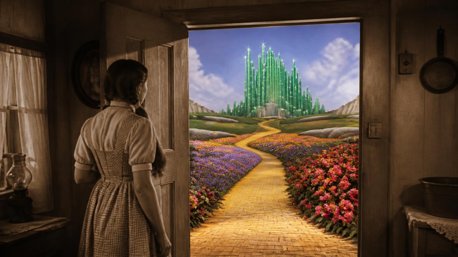
Hollywood's biggest lie was color. And it changed movies forever.
When The Wizard of Oz opens, Kansas is sepia. Flat. Exhausted. The world looks like grief. Then Dorothy opens a door — and Technicolor detonates. Flowers explode in reds and purples. Skies turn impossible blue. Your brain does not ease into it. It gets punched.
That door is still the most famous color transition in cinema. Not because the effects are flashy by modern standards, but because the film teaches a rule designers still use every day: establish a muted world, then break it once, on purpose.
How the Wizard of Oz Sepia-to-Color Transition Was Actually Shot
Audiences in 1939 thought Dorothy stepped from black-and-white into color. She did not — not exactly. Kansas was filmed and printed in sepia (warm brown monochrome), and Oz was shot in three-strip Technicolor. The door-opening sequence was a practical trick on a set: the interior of the farmhouse was painted and lit to match the sepia look while a body double wore a sepia-toned gingham dress; when the door opens, Judy Garland in her true blue gingham steps forward into a fully colored Oz. Later restorations sometimes present Kansas as pure greyscale, but the original theatrical experience was sepia-into-spectrum.
The punch lands because of contrast, not saturation alone. If the whole film were Technicolor from frame one, Oz would look pretty. Because Kansas is drained first, Oz feels like a revelation. Same principle as the isolated red coat in Schindler's List — lower the noise floor, then raise one signal. Here the "signal" is an entire world.
Why three-strip Technicolor mattered
Three-strip Technicolor split incoming light into three negatives — red, green and blue records — and recombined them as dye-transfer prints. It needed blinding levels of light on set, which is why Oz looks lacquered and hyper-real rather than natural. That "wrongness" is the point: Oz was never supposed to look like the world. It was supposed to look like a wish.
The Oz Color Palette: Hex Codes Behind the Wonder
| Color Name | Hex Code | Role in the Film | Why It Works |
|---|---|---|---|
| Ruby Slipper Red | #C41E3A |
Dorothy's shoes — the technology flex | Highest-attention hue; silver from the book would vanish on Technicolor |
| Yellow Brick Gold | #E8B923 |
The road — guided path for the eye | Warm, luminous path color against greens and blues |
| Emerald City Green | #0B7A4B |
Destination / promise of paradise | "Emerald" as brand of wonder (even when faked on set) |
| Gingham Blue | #4A7AB5 |
Dorothy's dress | Complementary to the yellow road — she pops off the path |
| Kansas Sepia | #8B7355 |
Home / grief / the before | Warm monochrome that makes Oz feel colder and louder |
Want the print-ready equivalents of these five? Drop each hex into the Pantone finder to see the closest matched ink before you spec anything physical.
The ruby slippers were silver in the book — until money said otherwise
In L. Frank Baum's novel, Dorothy's shoes are silver. MGM was spending a fortune on the most expensive color process ever built. Silver would disappear on screen. So they turned the slippers ruby red — the most aggressive, seductive red in the palette — and suddenly every frame screamed look at this technology. That is product design logic: if your hero object cannot read against the medium, change the object.
The yellow brick road is a guided missile
The road is not whimsy. It is a golden path through a world designed to sell wonder — a continuous warm accent that pulls the eye through composition after composition. Designers who build onboarding flows and museum wayfinding are still copying it: one continuous hue = one continuous journey.
Dorothy is a living color wheel
Blue gingham against yellow brick is complementary contrast. She does not blend into Oz; she is the moving focal point on top of it. Pair that with ruby shoes and you get a three-point hierarchy: path (yellow), person (blue), prize/power (red).
Even the Emerald City is a lie
On set, parts of the Emerald City were painted in sickly yellows and pinks because early color stock could not read true green the way the eye expects. They faked paradise with the wrong colors — and the audience still believed. Lesson for brand systems: named color and perceived color are not the same. Test on the actual medium (screen, print, LED wall), not on the naming meeting.
A Designer's Oz Palette (Practical)
| Role in Design | Hex Code | Purpose |
|---|---|---|
| Before / Quiet World | #8B7355 |
Muted hero sections, "before" states, documentary frames |
| Path / Journey | #E8B923 |
Progress bars, routes, primary warm accent |
| Hero Figure | #4A7AB5 |
Trust / protagonist UI, links that must pop on warm grounds |
| Power Object | #C41E3A |
The one thing you want saved, clicked, or remembered |
| Destination | #0B7A4B |
Success, arrival, "Emerald" moments |
Contrast: body text on sepia backgrounds needs cream or near-white (#F7F1E8), not pure white (too clinical). Red CTAs on yellow paths vibrate — put a dark outline or place red only on sepia/green fields.
Build and test combinations in the AI color palette generator, or explore harmonic ramps with the Fibonacci color generator. For how moral sides get coded as blade colors rather than worlds, see Star Wars lightsaber colors and hex codes. Theater environments that stage anticipation before the reel even starts are covered in cinema color psychology.
What One Door Taught the Industry
- Transition is a design element. The cut from muted to saturated is the story beat — not just a technical reel change.
- Hero objects need chroma that survives the medium. Silver shoes die on Technicolor; ruby shoes sell the process.
- Complements create characters. Blue-on-yellow keeps Dorothy readable in every wide shot.
- Named paradise can be a paint lie. If the medium cannot hold the color, fake the feeling and keep the name.
Frequently Asked Questions
Was The Wizard of Oz filmed in black and white or sepia?
The Kansas scenes were shot on black-and-white stock and then printed in sepia tone, giving them a warm brown cast rather than neutral grey. Oz was shot in three-strip Technicolor. Some modern restorations render Kansas closer to greyscale.
How did they do the door transition to color?
Practically, in camera. The farmhouse interior and a stand-in's costume were painted in sepia tones so the "monochrome" world continued into the color negative. When the door opened onto the full-color Oz set, Judy Garland stepped through in her real blue gingham dress.
What color are the ruby slippers exactly?
Screen captures cluster around a deep crimson near #C41E3A. They were silver in the original book and changed to red specifically so they would register vividly in Technicolor.
What is the yellow brick road's hex code?
Roughly #E8B923 — a warm, saturated gold. Under different lighting setups in the film it drifts between a paler straw and a deeper amber.
Why does the Emerald City look off-green?
Sets were painted in yellows and pinks in places because the film stock and lighting rendered true greens unpredictably. The perceived color on screen mattered more than the paint in the can.
One movie taught the world that color is not decoration. It is the story.
So tell me: which moment made you gasp the first time you saw it?