Schindler's List and the Red Coat: The Most Powerful Use of Color in Film History
· Coloracci Team
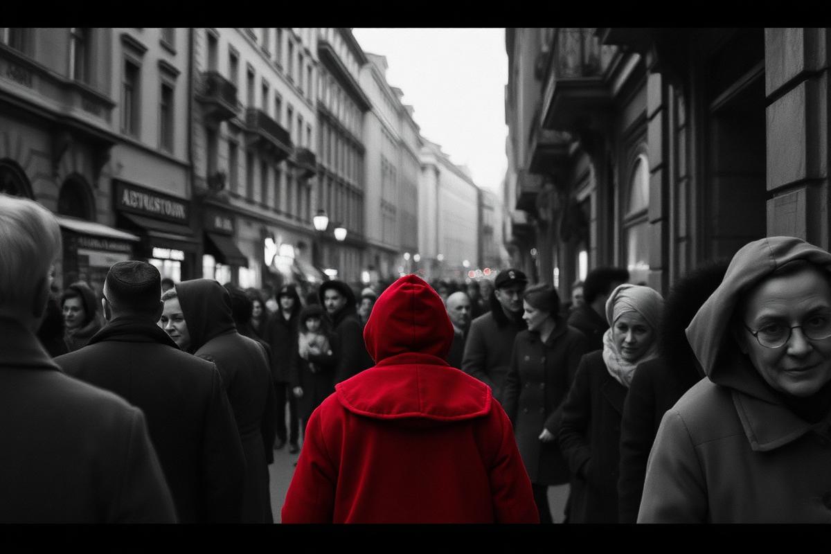
This is the most powerful use of color in the history of film. And it is almost the only color in the entire movie.
Steven Spielberg's 1993 masterpiece, Schindler's List, is a film defined by stark, brutal honesty. Shot almost entirely in black and white, it presents the horrors of the Holocaust with a documentary-like clarity that refuses to soften the edges. The greyscale is a world of shadow and grief. Until one moment. A little girl walks through the chaos of the Kraków ghetto liquidation, and she is wearing a red coat.
One small splash of red in a world drained of everything.
No dialogue. No dramatic score. Just one color doing what a thousand words could not — forcing you to see one life inside a faceless crowd. That is the psychology of isolated color. When you strip everything down to grey, the single thing that remains becomes unbearable to ignore.
The Psychology of Isolated Color: Why You Cannot Look Away
Our brains are wired to chase the exception. In a field of green, a single red flower commands attention. In a wall of text, one highlighted word becomes the focus. This is a survival trait: the thing that is different might be a threat, a resource, or an opportunity. Filmmakers and designers exploit this instinct constantly.
By presenting over three hours of meticulously crafted black-and-white footage, Spielberg and cinematographer Janusz Kamiński lull the visual system into monochrome acceptance. When the red coat appears, it is not just a color. It is an event. It violates the established rules of its own universe.
The effect works on three levels at once:
- It makes the craft visible. The audience is suddenly aware of a deliberate artistic choice, pulled out of passive viewing and forced to ask why.
- It directs the eye. In a chaotic scene of violence and despair, the red coat becomes an anchor point. Your gaze locks onto one child, and she becomes specific rather than statistical.
- It amplifies emotion. Red — the color of life, blood and passion — creates an agonizing contrast with the lifeless grey around it. Innocence, walking through hell.
Red on grey is not decoration. It is a spotlight for the heart.
The Palette of a Masterpiece
The palette of Schindler's List is one of extreme restraint, and that restraint is exactly what gives the single splash of red its power. It is a masterclass in using the absence of color as a statement.
| Color Name | Hex Code | Role in the Film |
|---|---|---|
| Signal Red | #C81414 |
The girl's coat. Life, innocence, and the blood of a people. |
| True Black | #000000 |
SS uniforms, the shadows of the ghetto, the finality of death. |
| Paper White | #F0EFE6 |
The stark unforgiving light, and the paper of the list itself. |
| Ash Grey | #A9A9A9 |
The dominant tone: the fog of war, despair, moral ambiguity. |
| Warm Sepia Grey | #706153 |
Moments of reflection, the story as a fading painful memory. |
This is not a palette designed for comfort. It is a palette of historical record — ash, bone, and one burning memory.
How the red was actually made
Kamiński and Spielberg did not simply paint a coat red on a black-and-white print. The production shot the girl sequences with selective color processing — a technique that isolates one hue while desaturating everything else. The coat itself was a carefully chosen brick-crimson, not a candy red, so it would survive the grain of 35mm and still read as blood-adjacent when reduced to a single channel. That technical choice matters for designers: a "spot color" only works if the accent has enough chroma and enough tonal separation from the neutrals around it. Soft pink on soft grey disappears. #C81414 on #A9A9A9 does not.
The same principle appears in print (spot-color PMS hits on uncoated stock), in UI (one brand CTA on a muted dashboard), and in fashion photography (one garment saturated against a desaturated street). Schindler's List is the extreme case — three hours of grey so one minute of red can land forever.
Spielberg's Intent: A Symbol for a World That Looked Away
Spielberg has explained that the red coat also stood for the indifference of the Allied powers. The Holocaust was not a secret; it was documented while it happened. In his words, it was as obvious as a little girl in a red coat walking down the street, and still the rail lines were never bombed.
The girl wanders through the liquidation apparently unseen, a ghost of color in a grey world. That is the point. She becomes a person rather than a number, and her fate is bound to a world that chose not to look. Later, when Oskar Schindler sees that same red coat again among the exhumed dead, the symbol of innocence becomes the confirmation of its destruction. The abstract horror turns into a personal loss.
One color did what an hour of dialogue could not. Red carries this weight in commercial work too — see how the same hue is deployed deliberately in the psychology of red in marketing and branding, and how filmmakers use color right down to the title card in movies with colors in their titles.
Spot Color vs. Full Palette: When Restraint Wins
Most brand systems default to five or six saturated colors. That is often the wrong starting point. A restrained field with one decisive accent creates hierarchy that a rainbow cannot. Use a full palette when the job is celebration, exploration, or category browsing. Use the red-coat model when the job is focus:
- One primary action on a landing page
- One product callout in a catalogue spread
- One emotional beat in a long-form film or case study
- One wayfinding signal in a dense environment
If everything is special, nothing is. Spielberg's greyscale is extreme, but the math is ordinary: lower the noise floor, then raise one signal. Designers who skip the noise reduction and only "add a red button" are solving half the problem.
Applying the Red Coat Principle to Your Own Designs
A single powerful accent in an otherwise neutral field is one of the most effective tools a designer has. It is the core principle behind every call-to-action button that actually gets clicked. Create a rule, then break it once, on purpose.
| Role in Design | Hex Code | Purpose |
|---|---|---|
| Dominant Neutral | #F4F4F4 |
The main background. Clean, quiet, unobtrusive. |
| Secondary Neutral | #505050 |
Body text and secondary UI. Clears AAA 7:1 on the background. |
| Accent (the Red Coat) | #FF6B47 |
The one thing you want seen and clicked. Use it sparingly. |
| Subtle Highlight | #EAEAEA |
Borders, dividers, hover states. Structure without attention. |
| Deep Contrast | #222222 |
Headlines and critical information. |
The discipline is the whole trick: the accent has power only because everything around it agreed to stay quiet. Spend the accent once per screen. Two red coats in one frame and you are back to grey.
You can build and test combinations like this with the AI color palette generator, or explore mathematically harmonious ratios with the Fibonacci color generator. For the same psychology applied to physical space rather than a screen, see our guide to cinema and movie theater color design.
So tell me: what is the one detail your eye refuses to let go of?