The Accidental Icon: The Story of Hermès Orange — Hermès Orange Color History
· Coloracci Team
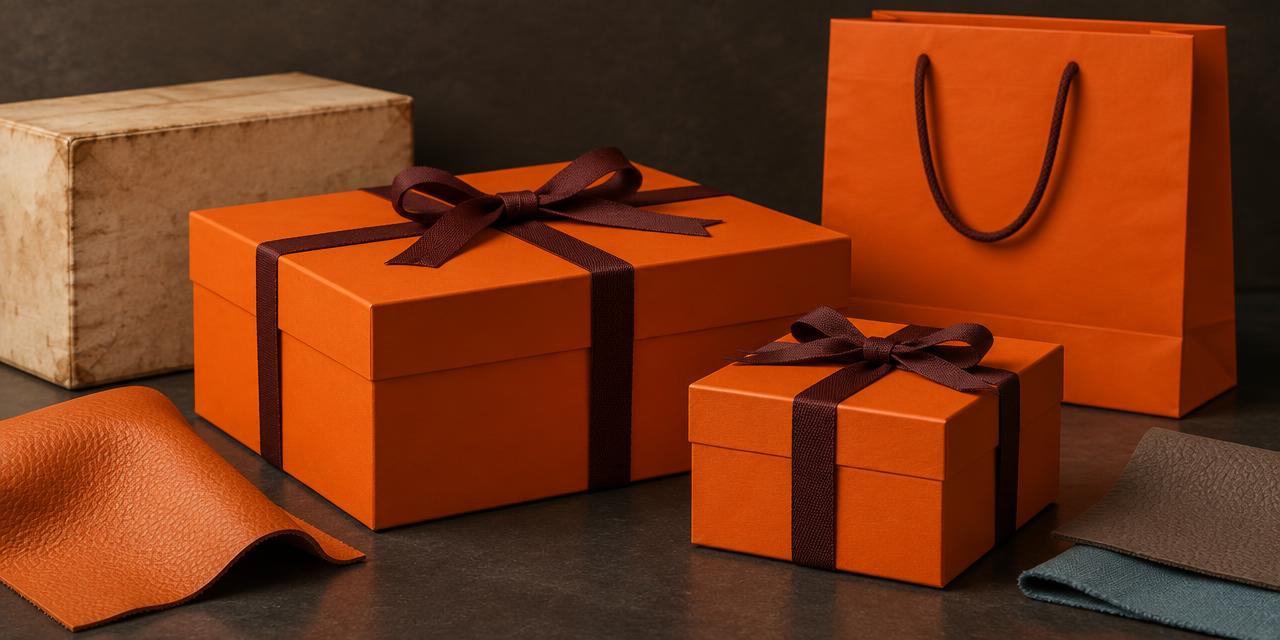
In 1942, a packaging shortage helped give Hermès something a branding agency could not simply manufacture: an unmistakable orange box. Hermès Orange Color History begins with wartime constraint, not a luxury mood board. The house needed packaging; the familiar papers were unavailable; orange was what remained. Today, that once-unwanted color can announce a gift before the recipient reads a name or lifts a lid.
For designers, the revealing part is not the accident. It is what happened afterward. Hermès retained the color, refined its presentation, and repeated it until a practical substitution became a cultural signal. A box acquired the emotional weight of the object inside it.
This guide separates that documented packaging story from the digital shorthand surrounding “Orange H.” It also explains why orange paper, orange leather, and an orange screen swatch should never be treated as interchangeable production specifications.
Hermès Orange Color History: From Cream Boxes to Wartime Necessity
Hermès began in 1837 as a harness maker. Its earliest packing cases belonged to the practical world of saddlery, not the theatrical world of luxury unboxing. The company's own illustrated history, “The orange box” in La Lanterne, traces the transition from wooden cases to carefully finished presentation boxes.
Around 1925, a cream-white box with gold edging accompanied the Bouclier clutch. That detail matters: packaging was already part of the product experience before orange arrived. Light paper, restrained decoration, and a protective enclosure communicated care through construction rather than chromatic spectacle.
Later accounts describe a mustard or marigold stage with darker edging in the 1930s. Consequently, “beige before the war, orange after it” is a useful summary, but an incomplete visual timeline. The identity evolved through several material and color decisions rather than one perfectly preserved beige box.
During World War II, normal supplies became unavailable. Hermès' own history describes orange paper as what remained. The Fashion Law's account of the packaging shortage dates the switch to 1942, during the occupation of Paris. The safest distinction is between the well-supported wartime origin and the more specific date supplied by secondary reporting.
This was not a cheerful design experiment detached from circumstances. Scarcity forced a workable substitution. The optimistic orange we associate with gifting today acquired that meaning through later use; projecting today's luxury associations backward would confuse the outcome with the original reason.
Hermès' account places a further reinterpretation in the 1960s, when the orange box became a more deliberate emblem of the house. The mature system combined a large orange field with dark edging and ribbon. Necessity supplied the raw material. Subsequent stewardship supplied the identity.
The distinction is essential for anyone studying logo color palette design. A surprising origin can start a story, but only repeated, recognizable execution turns a story into brand equity.
Hermès Orange Color History in HEX: One Identity, Several Approximations
What is the HEX code for Hermès orange? There is no responsible single answer for every Hermès surface. #F37021 is the working reference used here. #FF7900, #DE6A1D, and #E86221 are additional supplied approximations that help demonstrate the range commonly associated with the orange family.
These are editorial sRGB references, not authenticated Hermès paint, leather, packaging, or print formulas. The supplementary named colors below are also supplied digital approximations. They should not be used to identify a genuine product, date a collection, or approve a manufacturing run.
| Item | Color | Hex | Name | Meaning |
|---|---|---|---|---|
| Packaging-inspired anchor | Warm orange | #F37021 | Hermès orange working approximation | Recognition, gifting, confident warmth |
| High-energy digital variation | Yellow-leaning orange | #FF7900 | Vivid orange approximation | Strong screen presence and immediacy |
| Material-study variation | Muted orange | #DE6A1D | Earthier orange approximation | Tactility, depth, and restrained warmth |
| Redder digital variation | Red-orange | #E86221 | Vermilion-orange approximation | A denser, more emphatic accent |
| Neutral supporting reference | Grey-brown | #8F867B | Etoupe approximation | Quiet structure and visual relief |
| Cool supporting reference | Muted blue | #5D9CB5 | Blue Jean approximation | Counterpoint to orange's warmth |
| Soft supporting reference | Coral pink | #F6929A | Rose Azalee approximation | Gentler expression and softness |
| Fresh supporting reference | Light green | #B8D47A | Vert Criquet approximation | Liveliness and springlike contrast |
| Deep supporting reference | Wine burgundy | #4E2124 | Rouge H approximation | Depth, heritage associations, and emphasis |
The four oranges are not synonyms. In sRGB, #FF7900 reaches the maximum red channel and contains no blue, giving it a forceful, relatively yellow-orange appearance. #F37021 introduces more blue and slightly reduces red. #DE6A1D reduces overall channel intensity, while #E86221 shifts the balance toward a redder expression.
Place these swatches beside one another before choosing. Against pale paper, the vivid option may feel assertive; across a large screen area, it may feel too promotional. The earthier option can suggest material warmth, but that impression is contextual, not proof that it matches a leather sample.

For an actual print project, begin with the HEX-to-Pantone converter, then compare physical chips on the intended substrate. A nearest digital result is a shortlist, not an official Hermès equivalent. Our Pantone versus HEX guide explains why those systems describe different production realities.
Why Orange Reads as Luxury Here, Not as a Discount Signal
Orange does not inherently mean exclusivity. It can mark a clearance sticker, sports equipment, safety clothing, or a children's toy. Hermès demonstrates how category, material, proportion, and repetition condition interpretation.
First, the orange occupies a deliberately constructed object. Stiff board, precise edges, a fitted lid, and controlled ribbon placement establish care. Color amplifies that evidence; it does not replace it. Apply an approximately similar orange to weak packaging and the association can change immediately.
Second, darker detailing anchors the chromatic energy. The eye encounters a vivid field, then a stable boundary. This is a compositional relationship rather than a mystical rule about orange and brown. A bright surface becomes easier to organize when its perimeter and identifying marks have a quieter tonal role.
Third, the box participates in a ritual. Seeing the orange, carrying the shopping bag, releasing the ribbon, and opening the lid form a sequence of recognition and anticipation. The brand color is encountered before the product, so it becomes associated with the emotional moment of receiving it.
Finally, consistency lets the signal accumulate meaning. The house can offer products in many colors while preserving a recognizable packaging family. This separates brand recognition from product variety, a distinction explored more broadly in our fashion brand color psychology analysis.
Compare the orange field with Chanel's black, white, and gold strategy. Chanel's restraint and Hermès' warmth are different visual routes to a premium impression. Neither proves that a particular hue automatically increases perceived value. Both work through a coherent relationship among product, presentation, and history.
Orange H Beyond the Box: Bags, Shopping Bags, and Clic H Bracelets
“Orange H” commonly names a classic orange in the Hermès product-color vocabulary, especially in discussions of leather. It is related to the signature packaging story, but it should not be treated as a guarantee that every orange object shares one measurable color.
A Birkin in Orange H makes orange the principal product surface. Grain, gloss, curvature, stitching, and hardware all change the way that surface is perceived. A flat digital rectangle cannot reproduce the shadows between grains or the highlight along a rounded handle.
The classic orange shopping bag does something different. Its broad paper faces carry the color through a street or a shop entrance. Folded edges and handles introduce structure, while the orange remains the dominant recognition cue. Here, portability extends the packaging identity into public space.
An orange Clic H bracelet offers another scale of experience: a narrow enamel surface beside reflective metal and skin. Specific colors and finishes vary by collection, so an orange example is not evidence that every bracelet is officially named Orange H. Its useful design lesson is how a strong color can remain legible in a small, repeated accent.
These objects support three distinct roles: immersive surface, recognition field, and concentrated detail. Designers often flatten those roles into “use the brand color everywhere.” A better system defines where the color should dominate, where it should identify, and where it should punctuate.
For a digital storefront, that might mean reserving a signature orange for selected identity moments rather than saturating navigation, prices, error messages, and purchase controls alike. Recognition should not make different interface functions look identical.
Hermès Orange Color History and the Limits of Trademark Protection
The statement “Hermès owns orange” is too broad. Color-related trademark protection depends on territory, the registered representation, specified goods or services, and whether consumers recognize the presentation as identifying a source.
A single color, a color combination, and the overall appearance of packaging are not interchangeable legal claims. Recognition in popular culture also does not establish the precise scope of a registration. Designers need to distinguish a famous association from a universal prohibition.
A useful counterexample comes from Japan. Reporting on the 2023 rejection of Hermès' orange-and-brown packaging application explains that the appeals board did not accept the claimed combination as sufficiently distinctive on the evidence presented. That decision illustrates territorial and evidentiary limits; it does not mean the brand lacks protection elsewhere.
Conversely, a reported registration in one market would not make every orange website or garment an infringement. Commercial context and the likelihood of mistaken source association matter. This article does not provide a current worldwide trademark-register audit or legal clearance.
Our Tiffany Blue analysis provides a useful comparison: a powerful association between color, packaging, and gifting. The design takeaway is to study how recognition is built without copying the complete recognizable presentation of another house.
If developing competing luxury packaging, obtain jurisdiction-specific legal advice. Changing an orange HEX value slightly is not a reliable clearance strategy when the rest of the presentation still imitates a distinctive box, border, ribbon, and naming system.
A Practical Workflow: Borrow the Principle, Not the Packaging
1. Define a recognizable job for your color
Choose whether the hue identifies the company, separates a product line, or highlights a specific action. Write that role before selecting the swatch. A signature needs a repeatable function, not simply a large area of saturation.
For a boutique brand, an orange could identify shipping sleeves while product labels remain neutral. That arrangement creates a memorable arrival moment without requiring every object to be orange. Review the wider positioning through our luxury brand palette guide.
2. Build a restrained supporting palette
Use #F37021 as an illustrative anchor, #8F867B as a quiet support, and #4E2124 for a deep accent. Alternatively, let #5D9CB5 introduce a cooler counterpoint. Select a small subset with clear roles; do not use all nine colors merely because they appear in the reference table.
Treat pink and light green as optional expressions, not mandatory companions. #F6929A may suit a softer seasonal composition, while #B8D47A produces a fresher contrast. Neither should displace the anchor accidentally. Explore related identity systems in the brand colors hub.
3. Separate screen values from material approvals
Record an sRGB HEX for screens, a physical reference for print, and an approved sample for each material. Specify coated or uncoated paper before evaluating Pantone candidates. Leather, enamel, and textile require their own sampling processes; a coated-paper chip cannot approve all three.
Ask the supplier to produce a proof on the final stock. Compare it under controlled lighting and the expected viewing conditions. Discuss tolerances and measurement methods with the supplier instead of inventing a universal color-difference threshold.
4. Test hierarchy and accessibility
Do not assume white lettering is readable over a vivid orange. Test the exact pair with the Color Contrast Checker, especially for small labels and purchase controls. Separate decorative color use from text contrast requirements, and never make color the sole indicator of an error or status.
5. Document substitutions before shortages arrive
The historical lesson is not “accept any available material.” Define acceptable alternatives, who approves them, and which recognizable properties must survive. Keep approved samples so future decisions have a physical reference.
A useful handoff records color role, screen value, stock, finish, supplier, proof date, and approved substitute. Constraints can produce innovation, but undocumented substitutions usually produce inconsistency. Hermès' accident became meaningful because the house subsequently chose continuity.
Conclusion: The Accident Was the Beginning, Not the Strategy
Hermès orange became iconic through an unusual sequence: a material shortage introduced the color, deliberate repetition established recognition, and carefully made objects supplied the associations of quality and exclusivity.
For designers, the transferable lesson is stewardship. Preserve the relationship between color, material, proportion, and experience. Do not mistake a supplied HEX approximation for a manufacturing formula, a famous hue for universal legal ownership, or an evocative origin story for a complete brand strategy.
Turn the story into a production-ready experiment: enter #F37021 in Coloracci's HEX-to-Pantone converter, compare the nearest candidates, and request a proof on your actual paper. Then build a supporting palette with a recognizable purpose of its own. Study the orange box; do not reproduce it.
The images in this article are original conceptual artwork, not official Hermès photography or certified color samples. HEX values are editorial approximations supplied for design exploration.