Chanel Brand Colors: Black, White & Gold — Complete Color Palette, Hex Codes & Luxury Design Psychology
· Coloracci Team
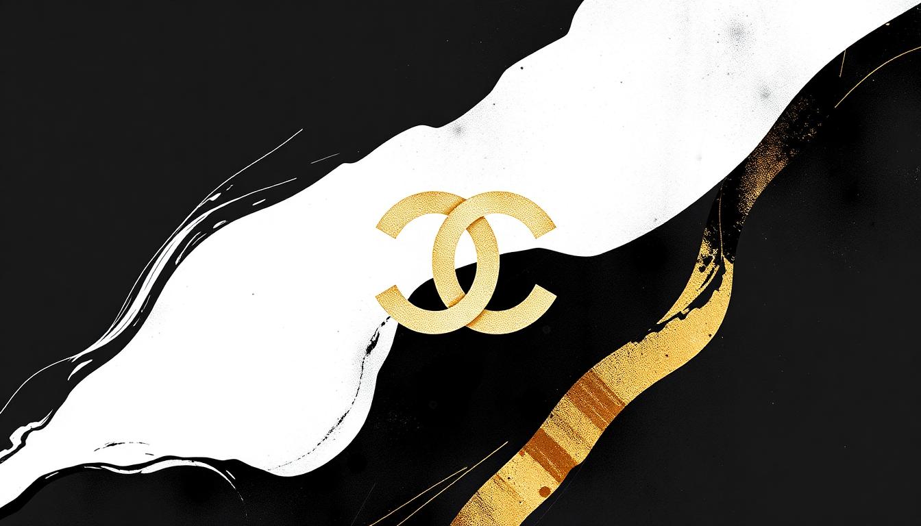
Chanel Brand Colors: Black, White & Gold — Complete Color Palette, Hex Codes & Luxury Design Psychology
Chanel's color strategy is the most radical in luxury fashion: refuse to follow color trends entirely. While competitors chase seasonal palettes, Chanel's identity rests on three colors — black, white, and gold — that haven't changed in over a century. This unwavering commitment to a minimal palette is itself the ultimate luxury statement: "We don't follow trends. We ARE the trend."
Chanel's Primary Brand Color Palette
| Color Name | Hex Code | RGB | Usage |
|---|---|---|---|
| Chanel Black | #000000 | 0, 0, 0 | Primary brand, packaging |
| Chanel White | #FFFFFF | 255, 255, 255 | Backgrounds, contrast |
| Chanel Gold | #C9B037 | 201, 176, 55 | Logo accents, hardware |
| Cream | #F5F5DC | 245, 245, 220 | Boutique interiors |
| Soft Pink | #F4C2C2 | 244, 194, 194 | Beauty line accent |
| Rouge Noir | #8B0000 | 139, 0, 0 | Iconic lipstick shade |
Why Coco Chanel Chose Black
Before Coco Chanel, black was for mourning. She transformed it into the color of liberation and modern elegance:
- 1926: Chanel introduced the "Little Black Dress" — Vogue called it "Chanel's Ford" (as universal as the Model T)
- Rebellion: Black rejected the pastels and ornate colors of 1920s fashion — it was anti-establishment
- Equality: Black is democratic — it flatters every body type and skin tone
- Power: Black communicates authority without trying — see our black color psychology guide
- Timelessness: Black never goes out of style — Chanel's 100-year-old choice still dominates luxury
The Black-White-Gold Triad
Chanel's three-color system creates the most efficient luxury code in existence:
Black (#000000) — Authority & Mystery
- 60% of Chanel's visual identity
- Packaging, shopping bags, store facades
- Communicates: "This is serious. This is important. This is forever."
White (#FFFFFF) — Purity & Space
- 30% of visual identity
- Boutique interiors, camellia flower motif
- Creates breathing room — luxury needs space
- Signals purity of design and materials
Gold (#C9B037) — Wealth & Heritage
- 10% of visual identity
- Logo accents, handbag hardware, perfume caps
- The specific matte gold (not shiny) says "old money," not "new money"
- Connects to French palace aesthetics — Versailles influence
This 60-30-10 distribution perfectly follows the color proportion rule — proving that even the most intuitive luxury design follows color science.
Chanel vs. Other Luxury Houses: Color Strategy
| Brand | Primary Palette | Strategy | Brand Read |
|---|---|---|---|
| Chanel | Black + White + Gold | Total restraint | Timeless authority |
| Hermès | Orange | Bold differentiation | Confident luxury |
| Tiffany | Robin Egg Blue | Color trademark | Romantic aspiration |
| Louis Vuitton | Brown + Gold | Heritage materials | Traditional craftmanship |
| Dior | Navy + Gray | Elegant understatement | Quiet sophistication |
| Gucci | Green + Red | Italian heritage | Bold eclecticism |
| Prada | Black | Intellectual minimalism | Anti-fashion fashion |
Chanel's approach is most similar to Prada's — both use black as their core — but Chanel adds gold warmth that Prada deliberately avoids. Read about luxury color psychology.
Chanel No. 5: Color as Product Design
The Chanel No. 5 bottle is a masterclass in color-as-design:
- Clear glass: No color — lets the golden perfume speak
- White label: Minimal, clean, anti-decorative
- Black text: Maximum contrast, maximum readability
- Gold liquid: The perfume itself IS the color — golden amber
- Black cap: Clean finish — no unnecessary ornament
This bottle hasn't fundamentally changed since 1921 — proving that great color design is permanent.
Chanel Beauty: Where Color Meets Brand
Chanel's beauty line is where the brand finally embraces color — but strategically:
- Rouge Allure: Bold reds and pinks — Chanel "permits" color on the body, not the brand
- Les Beiges: Natural, skin-like tones — staying close to the neutral palette
- Packaging: Always black and white — the product adds color, not the container
- Seasonal collections: Named poetically (Desert Dream, Libre) — color as emotion, not trend
Design Lessons from Chanel
- Restraint is the ultimate luxury: Three colors is enough when each one is perfect
- Black is never boring: Chanel proves black is the most versatile, powerful color in any palette
- Reject trends to become one: By refusing seasonal color changes, Chanel became permanently relevant
- Gold > Silver for warmth: Chanel's gold adds humanity to an otherwise severe palette
- Let products be colorful: When your brand is neutral, your products become the color expression
Create a Luxury-Grade Palette
- Build a refined black-white-gold palette with the AI Color Palette Generator
- Master the 60-30-10 color proportion rule for luxury balance
- Explore luxury color psychology: Purple in Luxury Branding
- Test your minimal palette's contrast with the Color Contrast Checker
Chanel's century of color restraint teaches the most important lesson in brand design: the colors you refuse to use define you as much as the colors you embrace.
More luxury brand analyses: Tiffany Blue, Louis Vuitton, Ferrari.