The Art of Affluence: A Guide to Luxury Brand Color Palettes for High-End Products
· Coloracci Team
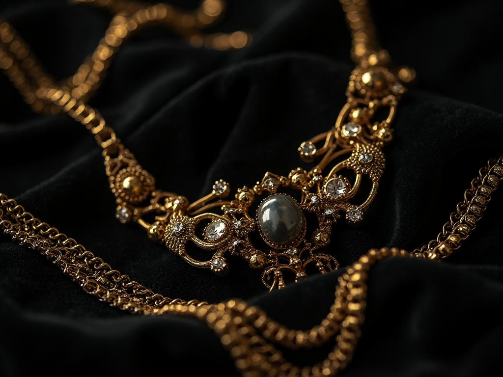
If you want to understand luxury brand color palettes for high-end products, start with a counterintuitive truth: the colors themselves are almost never rare. Onyx black, midnight navy, gold, ivory — anyone can buy them at a paint store. What makes a palette read as luxurious is the restraint around them. A Chanel window, a Rolls-Royce dashboard, and a Bottega Veneta leather goods wall all share the same underlying grammar: three or four colors, precisely balanced, held together by a single deep anchor and a whisper of metal.
This guide lays out that grammar. You'll get the exact HEX codes the great houses actually use, the combinations that have carried old-money brands for a century, the psychology that makes each color perform, and the pitfalls that quietly downgrade a "premium" project into a mass-market one.
Why Luxury Brand Color Palettes for High-End Products Look So Similar
Walk through the ground floor of Harrods, Bergdorf Goodman, or the Ginza flagship district and you'll notice something disorienting: hundreds of competing brands, and yet the color vocabulary feels almost monastic. That's not coincidence — it's a shared operating system built on four principles.
1. Radical restraint. A luxury palette rarely exceeds three to four colors. Every additional hue introduces visual noise, and noise is the enemy of perceived value. Fast-fashion and mass-market brands need five, seven, ten colors to shout on a crowded shelf. Luxury whispers, and it can only whisper if the palette is quiet enough to be heard.
2. The anchor–metal–neutral structure. Almost every high-end palette can be decoded into the same three roles: one deep anchor (black, navy, burgundy, forest green), one metallic accent (gold, platinum, champagne), and one or two quiet neutrals (ivory, taupe, warm cream). Rearrange the ratios and you get Chanel, Rolls-Royce, Rolex, or Brunello Cucinelli — but the skeleton is identical.
3. Meaning through material, not spectacle. Dark tones signal stability and authority. Metallics signal craftsmanship. Neutrals signal confidence — the kind that doesn't need to prove itself. None of these colors are competing for attention; they are competing for permanence.
4. Color as scarcity signal. Neon shouts "sale ends Sunday." A muted ivory paired with brushed gold says the opposite: this object exists outside the discount cycle. Luxury palettes are engineered to feel timeless, because timelessness is the ultimate justification for a premium price.
The Eight Foundational Colors of Luxury (With Exact HEX Codes)
The palettes below aren't design speculation — they're the tones you can pull off a Chanel bag, a Rolex bezel, or a Ralph Lauren showroom wall. Each one is a workhorse for a specific emotional job.
1. Onyx Black — #0A0A0A
Used by Chanel, Prada, YSL. Not a pure #000000, which reads as flat and digital. Onyx black has just enough warmth to look like material — lacquer, leather, obsidian. It represents timeless authority and absolute confidence. Pair it with ivory and gold and you have the most reproduced formal luxury palette in the world.
2. Deep Midnight Navy — #0F172A
Used by Ralph Lauren, Brioni. Navy is what black wears when it doesn't want to feel severe. It signals old-money confidence and inherited heritage — the color of a private-banking lobby, a bespoke suit, and the endpapers of a leather-bound book. It is the safest luxury anchor when black feels too fashion-forward.
3. 24-Karat Gold — #C69B3C
Used by Versace, Rolex. True luxury gold is a slightly desaturated, warm ochre — never the cartoon-yellow "gold" of party decorations. It conveys prestige and exclusivity, and it is the single color most likely to be misused. The rule: gold is punctuation, not paragraph. A gold logo on a dark background is powerful; a gold background is a casino.
4. Polished Platinum — #BFC1C2
Used by Rolls-Royce, Tiffany & Co. Where gold is warm and traditional, platinum is cool and modern. It suggests precision engineering, aerospace-grade craftsmanship, and the kind of quiet luxury that appeals to tech founders. It's the metallic of choice for automotive, jewelry, and premium electronics.
5. Harrods Emerald — #0D4C3C
Used by Harrods, Rolex (crown logo). Deep forest greens carry a coded message: established wealth. Emerald reads as heritage the moment you see it — the color of old libraries, tailored billiard tables, and Ivy League crests. It is one of the most distinctive luxury anchors precisely because so few brands are brave enough to use it.
6. Cellar Burgundy — #6E1423
Used by Mulberry, Bottega Veneta. Burgundy is the color of aged things — fine wine, patinated leather, aged brick. It signals craftsmanship and time-under-tension. Unlike a bright red, which reads as urgent and mass-market, burgundy has been rested. It's the anchor of choice for brands that want to communicate "made slowly, on purpose."
7. Ivory Cream — #F4EADE
Used by Hermès, Gucci. Ivory is the most underrated luxury color. Pure white feels clinical, corporate, digital — a Google Doc. Ivory has warmth and considered restraint, like unbleached linen or the paper of a hand-printed invitation. It is the neutral that quietly announces: this was chosen, not defaulted to.
8. Warm Taupe — #8A7968
Used by Max Mara, Brunello Cucinelli. Taupe is the color of natural high-end materials — undyed cashmere, raw silk, aged suede, unstained oak. It is the anchor of the entire "quiet luxury" movement, and it works because it looks like a material rather than a decision. Pair it with ivory and a whisper of black and you have the current wardrobe of every finance heir on the planet.
Three Proven Luxury Color Combinations
Individual colors matter less than how they're combined. These three palettes have earned billions in revenue between them.
Palette 1 — The Classic Formal: Onyx + 24-Karat Gold + Ivory
The most reproduced luxury combination in fashion history. Onyx (#0A0A0A) provides absolute authority; gold (#C69B3C) injects prestige; ivory (#F4EADE) softens the composition and prevents it from feeling like a funeral. This is the Chanel palette, the Versace palette, the vast majority of luxury cosmetics packaging. It works in print, in packaging, in interiors, and in digital. If you are launching a high-end product and don't know where to start, start here.
Palette 2 — The Old-Money Institutional: Midnight Navy + Platinum + Cream
The palette of authority without aggression. Midnight navy (#0F172A) anchors the composition with heritage; platinum (#BFC1C2) delivers modernity and precision; cream (#F4EADE) provides warmth so the whole thing doesn't feel corporate. This is the palette of private banks, Ralph Lauren's Purple Label, luxury menswear, and heritage watch brands. It is the palette to reach for when your customer is buying reassurance as much as they're buying a product.
Palette 3 — The Heritage Prestige: Harrods Emerald + Champagne Gold + Black
The most distinctive of the three, and the hardest to execute. Emerald (#0D4C3C) signals inherited wealth; champagne gold (#C69B3C) adds ceremonial prestige; black (#0A0A0A) grounds the composition and stops the green from feeling festive. This is Harrods, this is Rolex, this is old English tailoring. Use it when you want your brand to feel like it was already famous a hundred years ago.
The Psychology: Why These Palettes Actually Sell
Luxury pricing isn't justified by materials alone — it's justified by perceived permanence. Every color choice in the palettes above pulls in that direction.
- Dark anchors buy trust. The human eye reads dark, saturated tones as "grounded" and "stable." A brand wearing onyx or navy is telegraphing: we are not going anywhere.
- Metallics buy craft. Gold and platinum are the only colors on the palette that reflect light back at the viewer. Reflection reads as material, and material reads as made by hand. This is why matte metallics (brushed brass, satin platinum) outperform shiny ones in luxury contexts — they suggest tools and skill, not glitter.
- Neutrals buy taste. Ivory and taupe communicate the single most valuable trait in luxury: the confidence to under-say it. A brand willing to sit in a quiet palette is signaling that it doesn't need to shout, which is the surest signal that it can afford not to.
For a broader read on how color psychology maps to marketing outcomes across categories, our color psychology in marketing guide walks through the frameworks luxury brands share with the rest of the branding world.
Practical Takeaways: Designers, Homeowners, and Brand Owners
If you're designing a luxury product or brand:
- Cap your palette at three or four colors. Add a fifth only if you can defend it out loud.
- Choose one deep anchor, one metallic, one or two neutrals. That's the whole system.
- Use metallics as accents (2–5% of the composition), never as backgrounds.
- Photograph your product on ivory or warm taupe, never on pure white. Pure white is Amazon.
- Reject gradients in your primary logo — they date instantly and can't be foil-stamped, embossed, or embroidered.
If you're designing a high-end interior:
- Anchor the room in one dark tone (charcoal wall, ebony floor, deep navy joinery).
- Introduce metallic finishes in hardware, lighting, and small accessories.
- Let neutrals — travertine, linen, unbleached wool — do 60% of the visual work.
- Avoid neon accents entirely; even a single fluorescent object will collapse the composition.
If you're a homeowner picking a "luxury" paint palette:
- Warm off-whites (ivory, bone, alabaster) will always feel more expensive than pure white.
- Deep greens and navies on trim, doors, or a single accent wall are the fastest path to a heritage feel.
- Brass and brushed nickel age well; polished chrome dates the room to the year you installed it.
For the closely related question of when to reach for purple as a luxury signal — royal, ecclesiastical, or modern — our deep dive on purple in luxury branding covers the tradeoffs. And when a brand deliberately breaks the "quiet luxury" rules — the way Ferrari, Louboutin, and Coca-Cola do — the psychology of red in logos and food brands explains why loud can still be premium in specific categories.
Colors to Avoid in Luxury Brand Color Palettes for High-End Products
The palette you leave out is as important as the one you keep in. These are the colors that quietly downgrade any high-end project:
- Neon anything. Electric pink, safety yellow, fluorescent green. They read as discount signage — the opposite of scarcity.
- Bright primary red and yellow. Fantastic for fast food, terrible for luxury. They signal accessibility, appetite, and impulse — three things luxury brands actively avoid.
- Gradients in the logo mark. They look dated within five years and cannot be reproduced in the premium finishes (foil, embossing, deboss, embroidery, laser etch) that luxury manufacturing depends on.
- Pure white (#FFFFFF). Reads as digital, corporate, or clinical. Always warm it slightly toward ivory or bone.
- Cool grays with a blue cast. They feel like an office building HVAC unit. Reach for warm taupe or greige instead.
The Luxury Palette Reference Table
Save this table. It is the single most reused reference in luxury brand work.
| Item | Color | Hex | Color Name | Psychological Meaning |
|---|---|---|---|---|
| Deep Anchor | ⬛ | #0A0A0A | Onyx Black | Timeless authority, absolute confidence |
| Deep Anchor | 🟦 | #0F172A | Deep Midnight Navy | Old-money heritage, inherited trust |
| Deep Anchor | 🟩 | #0D4C3C | Harrods Emerald | Established wealth, ivy-and-oak prestige |
| Deep Anchor | 🟥 | #6E1423 | Cellar Burgundy | Craftsmanship, aged quality, time-under-tension |
| Metallic Accent | 🟨 | #C69B3C | 24-Karat Gold | Prestige, ceremony, ornament |
| Metallic Accent | ⬜ | #BFC1C2 | Polished Platinum | Precision, modernity, engineered luxury |
| Quiet Neutral | 🟫 | #F4EADE | Ivory Cream | Considered restraint, warm confidence |
| Quiet Neutral | 🟫 | #8A7968 | Warm Taupe | Natural materials, quiet luxury, cashmere |
Conclusion: Build the Palette, Then Protect It
The great houses aren't luxurious because they discovered secret colors. They're luxurious because they picked three or four ordinary colors and refused to add a fifth for a hundred years. That discipline is the real product. The onyx, the gold, the ivory, the taupe — those are just the tools that make the discipline visible.
If you're building a high-end product, brand, or interior, your job isn't to be creative with color. Your job is to pick a palette worth being disciplined about, and then protect it from every well-meaning suggestion to "add a pop of color." That "pop" is the sound of your positioning collapsing.
Ready to build your own luxury palette with exact HEX codes, harmony rules, and export-ready swatches? The Coloracci palette generator is built for exactly this workflow — pick an anchor, refine with metallics and neutrals, and export a palette that will still look premium a decade from now.