Tiffany Blue: The Most Protected Color in Fashion
· Coloracci Team
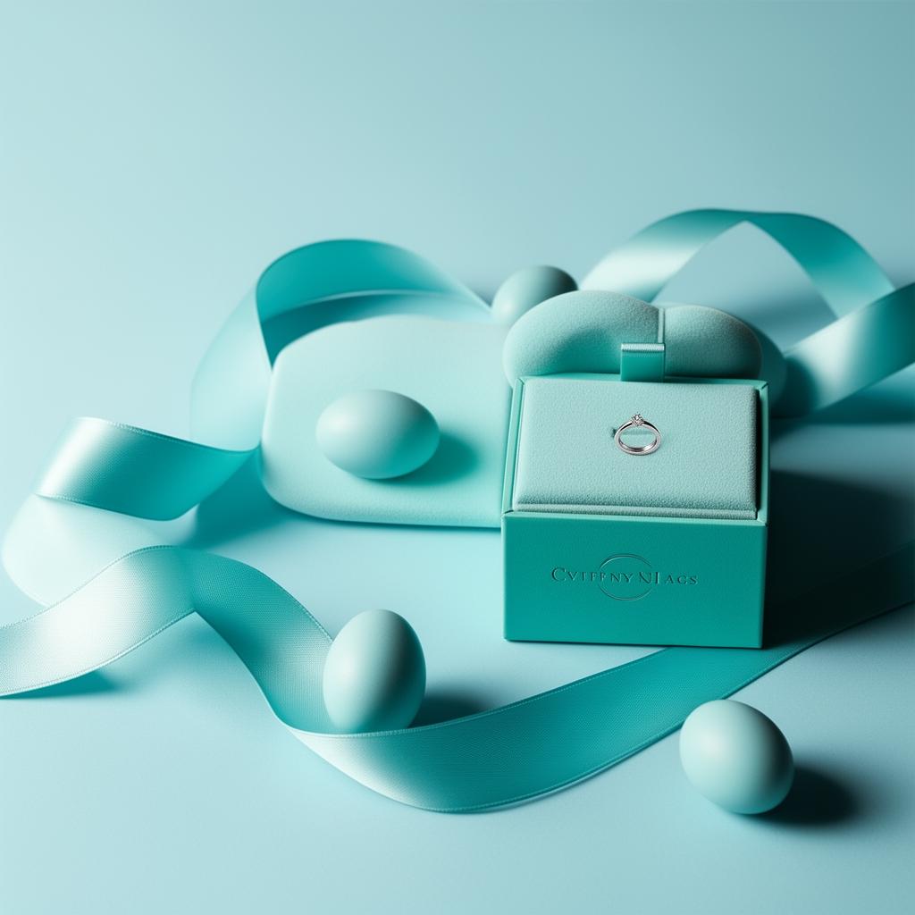
There are brand colors, and then there is Tiffany Blue. No other color in the fashion and luxury world enjoys such absolute legal protection, such instant consumer recognition, or such a meticulously guarded history. You cannot buy Tiffany Blue paint at a hardware store. You cannot order it from a standard Pantone swatch book. The color exists, for all practical purposes, as the exclusive property of Tiffany & Co. — a shade so valuable that the company has spent more than 180 years building walls around it.
In this article, we explore the complete history of Tiffany Blue, examine the extraordinary legal measures that protect it, analyze why it works so powerfully from a psychological perspective, and survey the broader landscape of trademarked brand colors.
The History of Tiffany Blue
Charles Lewis Tiffany selected the distinctive robin-egg blue for the cover of his first Blue Book catalog in 1837 — the same year he founded the company. The choice was deliberate and culturally informed. In Victorian-era America and Europe, turquoise was the fashionable gemstone given as a gift at weddings, symbolizing purity, fidelity, and new beginnings. Robin-egg blue was associated with spring, renewal, and the natural world. By choosing this color for his brand, Tiffany aligned his jewelry house with the era's most aspirational associations.
The exact shade Tiffany selected sits in a narrow space between turquoise and aqua — neither purely blue nor purely green, but a luminous midpoint that feels simultaneously cool and warm. The closest approximation in hex is #0ABAB5, though the true Tiffany Blue is a custom formulation that does not correspond exactly to any standard digital color value. In some references, it appears closer to #81D8D0, a slightly lighter and more pastel interpretation, while others cite #0ABAB5 for its richer depth.
What made Tiffany Blue extraordinary was not the initial color choice but the unwavering consistency that followed. From 1837 to the present day — through two world wars, the Great Depression, the digital revolution, and countless shifts in fashion — Tiffany & Co. has never changed its blue. This 180-plus-year commitment to a single color is virtually unmatched in brand history.
The company formalized the color's status in 1998 by commissioning a custom Pantone color: Pantone 1837, with the number deliberately referencing the year of the company's founding. This custom Pantone shade is not available in standard Pantone color guides. It is produced exclusively for Tiffany & Co., making it one of the very few colors in the Pantone system that belongs to a single entity.
How Tiffany Protects Its Blue
Tiffany & Co.'s approach to color protection represents the gold standard — or rather, the blue standard — for brand color management. The company employs multiple overlapping strategies to ensure that its blue remains exclusively its own.
Trademark registration is the foundation. Tiffany Blue is a registered trademark of Tiffany & Co. in the United States and numerous international jurisdictions. The trademark covers the color as applied to retail packaging, shopping bags, advertising, and promotional materials in connection with jewelry, timepieces, and luxury goods. This means that any competitor using a substantially similar shade of blue in similar commercial contexts can face legal action.
Custom manufacturing prevents unauthorized reproduction. The Tiffany Blue Box — perhaps the most famous piece of packaging in the world — is produced by a single supplier under strict quality controls. The paper stock, the ink formulation, the finish, and even the white satin ribbon are specified to tolerances that would satisfy an aerospace engineer. No Tiffany Blue box leaves the factory without meeting these standards, and no one outside the authorized supply chain can obtain the materials.
Distribution control reinforces exclusivity. You cannot buy an empty Tiffany Blue box. The company has actively pursued sellers of empty boxes on secondary markets like eBay, arguing that the boxes themselves carry brand value and that their unauthorized sale constitutes trademark infringement. A Tiffany Blue box is not packaging — it is a promise, and the company treats any unauthorized use of that promise as a threat.
Employee training extends protection to the retail level. Tiffany employees are trained to handle the blue boxes and bags with specific protocols. The presentation of the box — the unveiling of the white ribbon, the opening of the hinged lid — is choreographed as a ritual that reinforces the color's precious status. The blue is not just seen; it is experienced.
Why Tiffany Blue Works Psychologically
Tiffany Blue's psychological power operates on multiple levels simultaneously, which is what makes it so remarkably effective as a brand color.
Color temperature and emotion. Tiffany Blue sits in the cool-to-neutral range of the color spectrum, but it contains enough green warmth to avoid feeling clinical or cold. Cool blues communicate trust, calm, and reliability — qualities essential for a brand asking consumers to spend thousands of dollars on a purchase. The subtle green undertone adds freshness and vitality, preventing the color from feeling austere. The result is a shade that feels both trustworthy and alive.
Rarity and specialness. Robin-egg blue is relatively rare in the natural world and even rarer in commercial environments. Unlike red, blue, black, or white — which dominate retail spaces — Tiffany's specific turquoise stands out as genuinely unusual. This visual rarity reinforces the brand's positioning: Tiffany is not like other jewelers, and its color proves it at a glance.
Conditioned association. After nearly two centuries of consistent use, Tiffany Blue has become a Pavlovian trigger. The sight of the color — on a box, a bag, or even in an unrelated context — automatically evokes the emotional associations of receiving a Tiffany gift: anticipation, excitement, romance, luxury, and being valued. This conditioned response is so strong that researchers have documented elevated heart rates in subjects shown Tiffany Blue boxes, even when the boxes are empty.
Gender-neutral luxury. Unlike pink (which skews feminine) or dark blue (which skews masculine), Tiffany Blue occupies a gender-neutral space that allows it to appeal broadly. The gift-giver and the gift-recipient both respond positively to the color, making it effective across the entire purchase journey.
The key hex values for designers studying this color space:
- Tiffany Blue (rich)
#0ABAB5— The deeper, more saturated interpretation - Tiffany Blue (pastel)
#81D8D0— The lighter, more delicate interpretation - Robin Egg Blue
#00CCCC— A close digital approximation for web use - Light Tiffany
#B2DFDB— A soft background variant for supporting design elements - Deep Teal
#00897B— A darker companion shade for text and contrast
Other Protected Brand Colors
Tiffany Blue is the most famous example, but it is far from the only trademarked color in the commercial world. Understanding the broader landscape of color trademarks helps designers appreciate both the power and the limitations of color as intellectual property.
Cadbury Purple (#4A148C) — Cadbury attempted to trademark its signature purple for chocolate packaging in the UK. After years of legal battle with Nestlé, Cadbury secured limited protection for the color as applied to chocolate bar wrappers, though the scope of the trademark remains narrower than Tiffany's.
UPS Brown (#644117) — United Parcel Service trademarked its distinctive brown, officially known as Pullman Brown, for delivery services. The "What can Brown do for you?" campaign explicitly leveraged the color trademark as a brand asset. UPS Brown is one of the most successful examples of trademarking an unconventional color choice.
T-Mobile Magenta (#E20074) — T-Mobile has aggressively defended its magenta trademark, pursuing legal action against companies using similar pinks in telecommunications. The company has sued AT&T, Lemonade Insurance, and several smaller companies over magenta usage, establishing one of the most actively enforced color trademarks in technology.
Christian Louboutin Red (#EA0A2A) — Louboutin's red sole is trademarked specifically as a red lacquered outsole contrasting with a different-colored upper shoe. The landmark case against Yves Saint Laurent established that single-color trademarks can apply to specific positions on a product, not just overall packaging.
Owens Corning Pink (#FFB6C1) — The fiberglass insulation company was the first to trademark a color for a product in the United States in 1985, using the Pink Panther as its mascot to reinforce the association.
Practical Lessons for Brand Designers
Color distinctiveness requires commitment. Tiffany's blue works because of 180 years of unwavering use. If you choose a distinctive color, commit to it completely — across every touchpoint, every sub-brand, every campaign.
Specificity creates ownership. Tiffany does not own "blue." It owns a very specific blue. When building a brand color, move beyond generic swatches and find the precise shade — down to the exact hex value — that captures your brand's essence.
Context determines protectability. Color trademarks protect colors in specific commercial contexts, not universally. Tiffany Blue is protected for luxury goods packaging; the same shade used for a plumbing company would not infringe. Understand your competitive landscape when evaluating color protection.
Packaging is a color delivery system. Tiffany's box is not just a container — it is the primary vehicle through which the brand color reaches consumers. Consider how your packaging, digital interfaces, and physical spaces serve as delivery systems for your brand color.
Build rituals around your color. The Tiffany unboxing experience transforms a color into an emotion. Think beyond visual identity: how can your brand color be touched, experienced, and remembered through multi-sensory brand moments?
Tiffany Blue proves that a color can become as valuable as any product a company sells. For designers and brand strategists, it is the ultimate case study in what happens when color strategy is executed with absolute precision and defended with absolute resolve over the course of nearly two centuries.