What Color is Red Clay? Why This 10,000-Year-Old Shade is Taking Over Design in 2026
· Coloracci Team
I should have known better than to wear white sneakers to a Georgia wedding. The ceremony was beautiful, the reception was fun, and my shoes? Permanently dyed a warm reddish-brown that no amount of bleach could touch. Welcome to the world of red clay—where "just a little dirt" means you're basically married to that color now.
Three months and four failed cleaning attempts later, I started researching what made this stuff so stubborn. Turns out, I'd accidentally discovered why interior designers are charging premium rates for "terracotta accent walls" and why every design board on Pinterest looks like someone raided an Italian pottery shop.
What Exactly is Red Clay Color?
Here's where it gets confusing—"red clay" isn't just one color. It's more like a family reunion where everyone's related but nobody looks exactly alike.
Red Clay (Pantone): #C2452D - This is the rich, deep version. RGB(194, 69, 45) if you're being technical about it. It's what you see when red clay is wet and vibrant, right after rain.
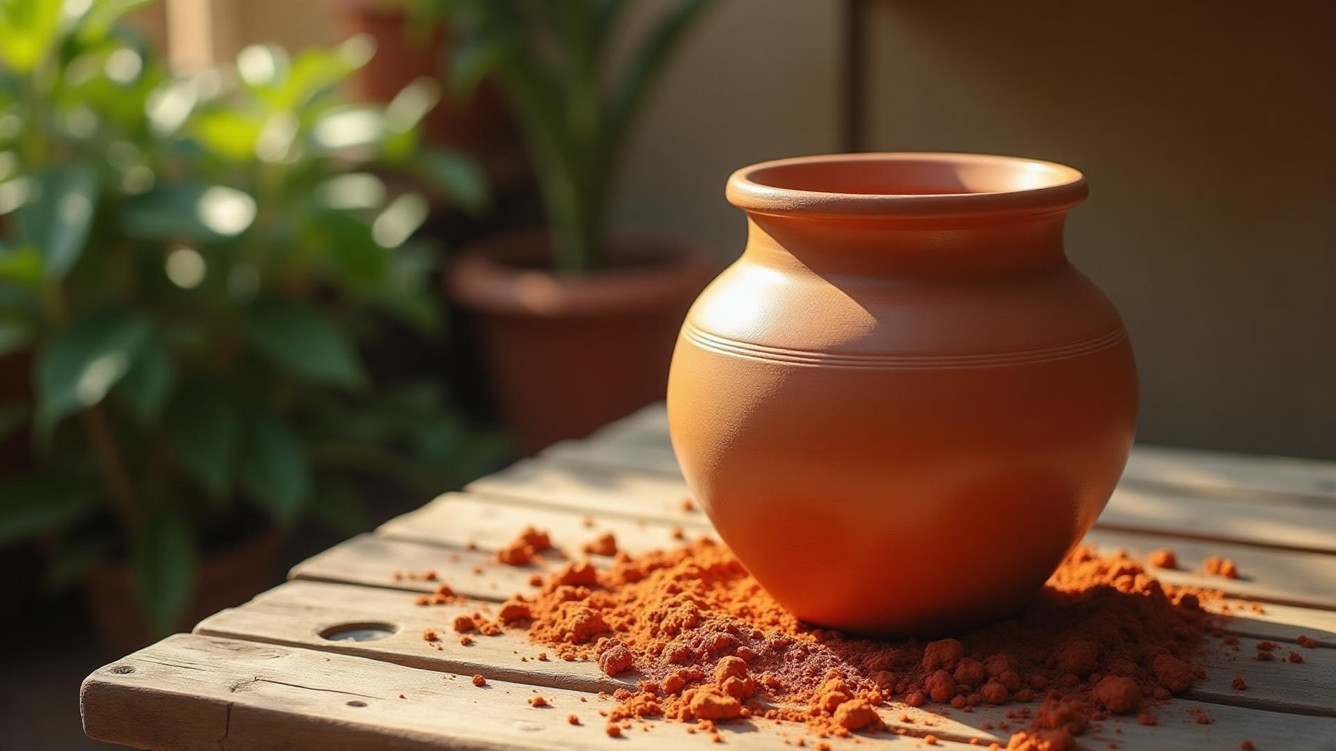
Clay (General): #B66A50 - The softer, earthier cousin. RGB(182, 106, 80). This is dried clay, the color of those classic terracotta pots sitting on everyone's grandmother's porch.
Terra Cotta: #E2725B - The orange-leaning friend of the family. RGB(226, 114, 91). Literally means "baked earth" in Italian, which is exactly what it looks like.
The reason there are so many variations? Iron content. More iron oxide = deeper red. Less iron = more orange-brown. It's basically the same chemistry that makes rust, which explains why both red clay and rusty metal share that distinctive warm tone.

The Science: Why Red Clay Stains Everything It Touches
Remember my sneakers? Here's why they never recovered: red clay gets its color from iron oxide—the same compound that makes rust. When clay particles get wet, they're small enough to work their way into fabric fibers, paper, wood, pretty much anything porous. Then they dry and bond. It's not staining in the traditional sense; it's more like micro-particles of iron setting up permanent residence.
The mineral responsible is called hematite, and it's ridiculously stable. While other pigments fade over time, hematite-based colors can last thousands of years. Which brings us to...
10,000 Years of Red Clay History
The word "terracotta" comes from Italian—terra (earth) + cotta (baked). But humans have been working with red clay since way before Italy existed as a concept.
The Yangshao culture in China was making red pottery around 5000 BCE—that's over 7,000 years ago. By the time the first dynasty rolled around, Chinese artisans had gotten so good at it that they created the Terracotta Army: 8,000 life-sized soldiers made from local red clay, each one individually sculpted. They've been buried since 210 BCE, and the clay? Still that distinctive red-brown.

Mediterranean cultures built entire architectural traditions around red clay. Those iconic Italian villas with terracotta roof tiles? The color isn't paint—it's the actual clay. Same with the classic flowerpots that somehow make every plant look instantly more sophisticated. There's something about that warm earth tone that says "this has been here forever and will be here forever more."
Red Clay vs. The Competition
Let's line up the usual suspects and see how they stack up:
- Red Clay #C2452D RGB(194, 69, 45) - The original, deep and rich
- Clay #B66A50 RGB(182, 106, 80) - Softer, more approachable
- Terra Cotta #E2725B RGB(226, 114, 91) - Bright and energetic
- Burnt Sienna #E97451 RGB(233, 116, 81) - Artists' favorite, more orange
- Rust #B7410E RGB(183, 65, 14) - Darker, more brown undertones
- Brick Red #CB4154 RGB(203, 65, 84) - Cooler, with pink notes
- Cinnamon #D2691E RGB(210, 105, 30) - Warmer, heading toward orange
The key difference? Red clay has that perfect balance—not too orange (like burnt sienna), not too brown (like rust), not too pink (like brick red). It's warm without being aggressive, earthy without being dull.
Why 2026 Design is All About Red Clay
Here's what nobody tells you about design trends: they don't just randomly appear. There's always a reason, and right now, the reason is simple—people are exhausted.
We spent the 2010s drowning in gray. Gray walls, gray couches, gray everything. It was supposed to be "sophisticated" and "minimalist," but mostly it just felt cold. Then 2020 happened, and suddenly everyone was stuck at home staring at their gray walls wondering why they felt so depressing.
Red clay (and its terracotta cousins) became the antidote. It's warm without being loud. It's natural without being rustic. It works in a modern apartment but doesn't look out of place in a 200-year-old farmhouse. Interior designers started specifying it for accent walls, and suddenly everyone wanted in.
The "quiet luxury" trend accelerated this. Earthy tones signal quality and permanence—these are colors that have been around for thousands of years and will be around for thousands more. They're the opposite of fast fashion and disposable decor. A red clay accent wall isn't trendy; it's timeless.
Plus, let's be honest: it photographs incredibly well. That warm glow in natural light? Design Instagram gold.

Want to see these colors in action? Try our AI Website Designer to experiment with red clay palettes in real designs.
Color Palettes Featuring Red Clay
Red clay pairs beautifully with cooler tones—blues like Blue Zircon create stunning contrast, while whites provide clean breathing room.
The magic of red clay is how well it plays with others. Here are three palettes that actually work:
Mediterranean Summer:
- Red Clay #C2452D
- Whitewashed White #F8F6F4
- Aegean Blue #4A90A4
- Olive Green #808000
- Golden Sand #D4A76A
This is the classic combo—think Greek islands, Italian coastlines, anywhere that bakes in the sun. The red clay grounds everything while the blues and whites keep it fresh. The blue tones in this palette are essential for balancing the warmth—if you love cool blue shades, explore what makes Blue Zircon so striking.
Desert Modern:
- Clay #B66A50
- Warm White #FAF9F6
- Sage #9CAF88
- Charcoal #36454F
- Brass #B5A642
This is 2026 in a palette. Earthy but refined, warm but not overwhelming. The sage brings in nature, the brass adds a touch of luxury, and the charcoal keeps it modern.
Earthy Boho:
- Terra Cotta #E2725B
- Cream #FFFDD0
- Forest Green #228B22
- Burnt Orange #CC5500
- Deep Brown #654321
This is the "I have plants everywhere and my apartment smells like essential oils" palette. In the best possible way. It's warm, layered, and completely unpretentious.
Need help building a perfect palette? Our Fibonacci Color Generator can create mathematically balanced color schemes featuring red clay.
Using Red Clay in Digital Design
Here's where it gets interesting for web designers and brand creators. Red clay works surprisingly well in digital spaces—if you use it right.
Brand Applications: Red clay is perfect for businesses that want to signal warmth, authenticity, and craftsmanship:
- Coffee shops and bakeries
- Artisan food brands
- Handmade goods and pottery studios
- Wellness and natural products
- Restaurants (especially Mediterranean/Italian)
UI/UX Considerations: The trick is using red clay as an accent, not a primary color. It's too warm and saturated to cover an entire interface. Instead:
- Buttons and CTAs (especially against cream or white backgrounds)
- Section dividers and borders
- Hover states for navigation
- Icon fills for selected states
- Alert banners for positive or warm messages
Contrast and Accessibility: Red clay #C2452D on white #FFFFFF gives you a contrast ratio of about 4.8:1—which passes WCAG AA for large text but not for regular text. If you need to meet AAA standards or use smaller text, you'll want to darken it slightly or use it on a light background.
For best results, always check your contrast ratios. Use our Color Contrast Checker to make sure your red clay combinations are accessible.
Digital vs. Print: Here's something that surprised me: red clay looks different on screen versus print. On screen (RGB), it tends to look slightly more orange. In print (CMYK), it often comes out slightly more brown. If you're doing brand work, always test physical samples before committing to a Pantone match.
Speaking of which, find the exact Pantone match for your perfect red clay shade.
The Psychology of Red Clay
Red carries psychological weight—it's the color of passion, energy, urgency. Think about how many "BUY NOW" buttons are bright red. It grabs attention and demands action.
Red clay softens all that intensity while keeping the warmth. Instead of "URGENT," it says "welcome." Instead of "exciting," it says "comfortable." It's red that's been mellowed by time and earth.
The brown undertones add reliability and stability. Brown is the color of wood, stone, earth—things that last. Combined with red's energy, you get a color that feels both warm and dependable.
This is why red clay works so well for brands that want to signal authenticity. It's not trying to be flashy or modern; it's been here since humans first started shaping clay 10,000 years ago, and it'll be here long after current design trends fade.
For more on how colors affect perception, check out our guide on color psychology in marketing.
Practical Tips for Working with Red Clay
Finding Your Perfect Shade: Not all red clay is created equal. If you're matching paint to a specific vision:
- Look at physical samples in your actual lighting (natural light vs. artificial makes a huge difference)
- Test on your actual surface (red clay on white drywall looks different than on wood or concrete)
- Live with it for a few days before committing
Digital Color Matching: Have a terracotta pot or clay tile you love? Extract colors from the image to get the exact hex code.
CMYK Conversion: For print work, Red Clay #C2452D converts to approximately C: 0%, M: 64%, Y: 77%, K: 24%. But always get a physical proof—red-brown colors are notoriously tricky in CMYK.
Pantone Matching: The closest Pantone to classic Red Clay is 173 C, but there's also 1675 C (more orange) and 175 C (more brown). The exact match depends on your specific shade preference.
Final Thoughts: Why Red Clay Endures
My stained sneakers are still sitting in my closet. I keep meaning to throw them out, but I haven't. There's something about that warm red-brown that's grown on me. It's a reminder of a good day, a connection to the literal earth I walked on.
Maybe that's why red clay never really goes out of style. It's not a trendy color invented by a design committee. It's dirt. It's the same shade humans have been working with since they first figured out they could shape wet earth and bake it hard. Those Chinese artisans making pottery 7,000 years ago were using the exact same color we're specifying for accent walls today.
In a world of fleeting trends and digital everything, there's something deeply satisfying about a color that's literally as old as civilization. Red clay isn't trying to be cool or modern or on-trend. It just is.
And honestly? That might be the most sophisticated choice you can make.
Ready to Create Your Perfect Red Clay Palette?
Explore red clay combinations with our AI-powered design tools:
- Generate harmonious color schemes with the Fibonacci Color Generator
- Test accessibility with the Color Contrast Checker
- Find exact Pantone matches with Pantone Finder
- Extract colors from inspiration images with Image Color Extractor
- Design complete websites with AI Website Designer
Start creating with colors that have stood the test of time—literally 10,000 years of it.