Disney Brand Colors: Complete Color Palette, Hex Codes & the Magic Behind Disney's Visual Identity
· Coloracci Team
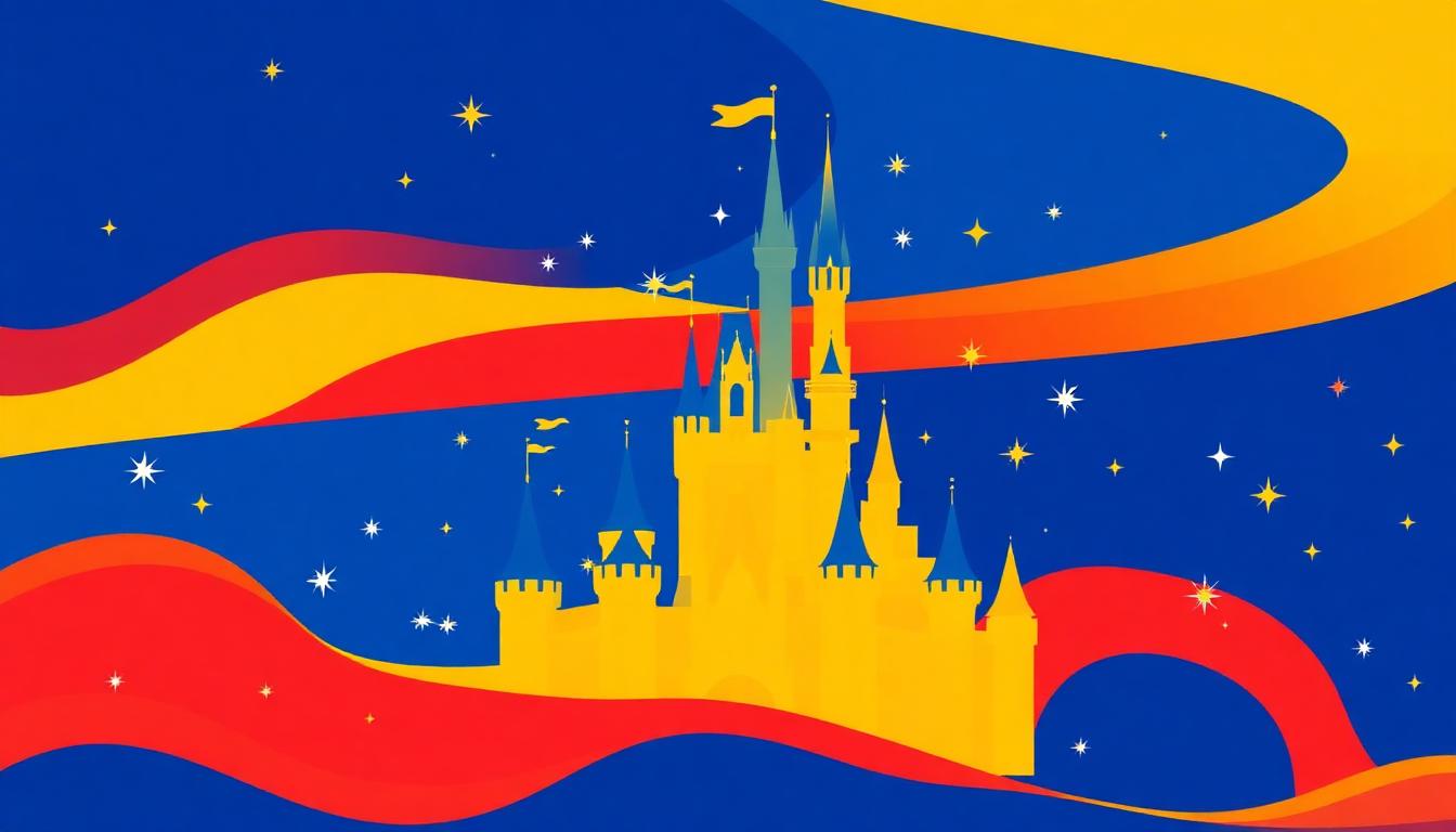
Disney Brand Colors: Complete Color Palette, Hex Codes & the Magic Behind Disney's Visual Identity
For over a century, Disney has been synonymous with magic — and its color palette is the visual spell that makes that magic tangible. From the deep blue of the castle logo to the golden sparkle of fairy dust, every color in Disney's arsenal is carefully orchestrated to trigger nostalgia, wonder, and emotional connection across generations.
Disney's Primary Brand Color Palette
| Color Name | Hex Code | RGB | Usage |
|---|---|---|---|
| Disney Blue | #006E99 | 0, 110, 153 | Primary brand, castle logo |
| Magic Blue | #0057B8 | 0, 87, 184 | Disney+ streaming |
| Fairy Tale Gold | #FFC72C | 255, 199, 44 | Accents, sparkle effects |
| Classic Red | #CC0000 | 204, 0, 0 | Mickey Mouse, heritage |
| Castle White | #FFFFFF | 255, 255, 255 | Clean backgrounds |
| Midnight Black | #1A1A2E | 26, 26, 46 | Premium content, dark mode |
The Psychology of Disney Blue
Disney Blue (#006E99) is not a corporate blue — it's a dreaming blue. Positioned between sky and sea, this shade evokes:
- Imagination and possibility: The color of an endless sky where anything can happen
- Trust and safety: Parents trust Disney because blue signals reliability (see our blue in corporate design guide)
- Night sky magic: Disney's castle sequence happens at dusk — when the sky turns this exact blue
- Calm wonder: Unlike electric blues, this muted shade creates peaceful excitement
Sub-Brand Color Strategy
Disney masterfully uses color to differentiate its massive portfolio:
| Sub-Brand | Primary Color | Hex | Personality |
|---|---|---|---|
| Walt Disney Animation | Castle Blue | #006E99 | Classic magic |
| Pixar | Green + Purple | #7AB648 | Playful innovation |
| Marvel | Red | #ED1D24 | Action, heroism |
| Star Wars | Black + Gold | #000000 + #FFD700 | Epic mythology |
| Disney+ | Magic Blue | #0057B8 | Modern streaming |
| ESPN | Red + Black | #CC0000 | Sports energy |
| National Geographic | Yellow | #FFCC00 | Exploration |
This color-based sub-branding allows Disney to serve completely different audiences while maintaining a unified corporate identity. Each sub-brand's color tells you exactly what emotional experience to expect.
Color in Disney Theme Parks
Disney theme parks are the world's largest color psychology experiments. Every paint choice, lighting decision, and costume color is meticulously planned:
Color Wayfinding
- Main Street USA: Warm pastels (cream, soft pink, mint) — nostalgia and comfort
- Tomorrowland: Cool blues, silver, white — futuristic and sleek
- Adventureland: Earth tones, deep greens, warm browns — exotic exploration
- Fantasyland: Royal purple, gold, pink — fairy tale enchantment
The "Forced Perspective" Color Trick
Disney uses color to enhance architectural illusions — buildings painted in lighter, cooler tones at the top appear taller than they are, while warmer, darker bases create grounding. This technique uses principles from our warm and cool colors theory guide.
Disney's Color Evolution
| Era | Dominant Palette | Cultural Context |
|---|---|---|
| 1920s-1950s | Red, Black, Yellow | Mickey era — bold, simple, printable |
| 1960s-1980s | Blue, Gold, White | Theme park expansion — magical branding |
| 1990s-2000s | Deep Blue + Renaissance colors | Film renaissance — sophisticated storytelling |
| 2010s-Present | Streaming Blue + Diverse sub-palettes | Digital platform era |
Design Lessons from Disney's Color Strategy
- Color creates worlds: Different color palettes can transport people to entirely different emotional states
- Sub-brands need color autonomy: Use color harmony principles to create related but distinct palettes
- Nostalgia is a color: Disney's warm golds and soft blues specifically trigger childhood memories
- Consistency across scale: The same blue works on a castle, a streaming app, and a plush toy
- Color enhances storytelling: Every Disney film has a deliberate color script that guides emotional arc
Recreating Disney's Magical Aesthetic
- Generate fairy-tale-inspired palettes with the AI Color Palette Generator
- Explore complementary color harmonies like Disney's blue-gold pairing in our complementary colors guide
- Use the Pantone Color Finder to match Disney's exact brand colors for merchandise or events
- Check how your magical palette works for all users with the Colorblind Simulator
Disney's century of color mastery proves that the right palette doesn't just represent a brand — it creates an emotional universe that generations choose to inhabit.
Explore more brand color analyses: Apple, Netflix, Google, and McDonald's.