Google Brand Colors: The Four-Color Strategy Behind the World's Biggest Search Engine
· Coloracci Team
The Brand That Broke Every Color Rule — and Won
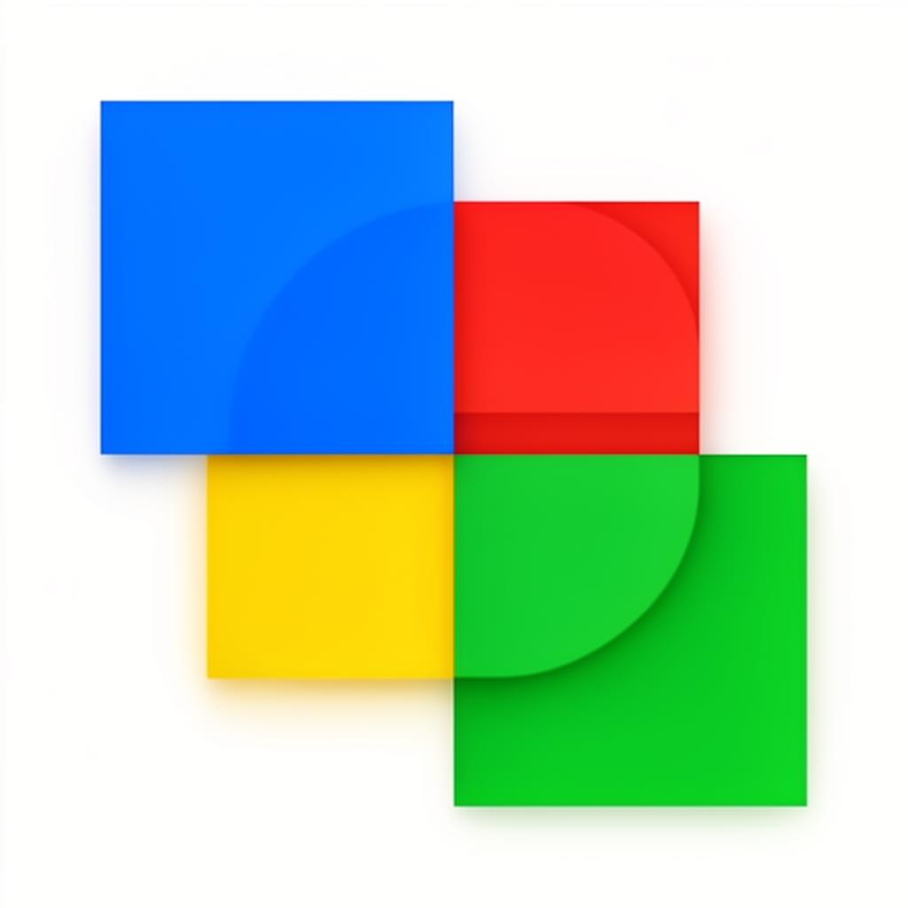
Conventional branding wisdom says: pick one or two colors and own them. Coca-Cola owns red. Tiffany owns robin's-egg blue. Facebook owns dark blue. But Google looked at the rulebook and decided to use four primary colors — Blue (#4285F4), Red (#DB4437), Yellow (#F4B400), and Green (#0F9D58) — and somehow built the most recognized digital brand in history.
To reproduce Google's four brand colors off-screen, our Pantone color finder converts each hex value into its nearest Pantone ink.
How did Google break every color rule and still win? The answer lies in understanding that Google isn't a single product — it's an ecosystem. And their four-color system is the connective tissue that makes dozens of distinct products feel like one family.
The Exact Google Brand Color Palette
| Color Name | Hex Code | RGB | Primary Usage |
|---|---|---|---|
| Google Blue | #4285F4 | 66, 133, 244 | Search, Chrome, primary actions |
| Google Red | #DB4437 | 219, 68, 55 | YouTube, Gmail, alerts |
| Google Yellow | #F4B400 | 244, 180, 0 | Keep, warnings, accents |
| Google Green | #0F9D58 | 15, 157, 88 | Sheets, Meet, success states |
| Gray 700 | #5F6368 | 95, 99, 104 | Body text, icons |
| Gray 100 | #F1F3F4 | 241, 243, 244 | Backgrounds, surfaces |
Why Four Colors Work for Google
Most brands would create visual chaos with four primary colors. Google makes it work because:
- Each color occupies a distinct position on the color wheel — they're not analogous or competing
- The colors follow a loose primary sequence (blue, red, yellow, green) that feels playful and universal
- Blue dominates — appearing in the logo's first letter and most products, creating a hierarchy within the four-color system
- The broken pattern (two primary colors, then green instead of a third primary) signals that Google doesn't follow conventions
The Psychology of Google's Color Choices
Blue (#4285F4): Trust and Intelligence
Blue is the most trusted color in digital design, and Google places it first in the logo for good reason. As the dominant brand color, Google Blue communicates:
- Reliability — You can trust search results
- Intelligence — Complex technology made accessible
- Calm authority — Confident without being aggressive
Red (#DB4437): Energy and Communication
Google's red appears in communication-focused products (Gmail, YouTube) because red signals:
- Urgency — "You have new messages"
- Passion — Emotional content creation and consumption
- Attention — Standing out in crowded digital spaces
Yellow (#F4B400): Optimism and Creativity
Yellow surfaces in creative and organizational tools (Keep, Jamboard) because:
- Optimism — Encouraging creative thinking
- Warmth — Making productivity feel less sterile
- Attention — Highlighting important information
Green (#0F9D58): Growth and Success
Green appears in productivity and success contexts (Sheets, Meet, success confirmations):
- Growth — Progress and productivity
- Confirmation — "Action completed successfully"
- Balance — Calming presence in complex interfaces
Material Design: Google's Color System
Google's Material Design framework represents one of the most comprehensive color systems ever created for digital products:
The Color System Architecture
Material Design uses a layered approach:
- Primary color — The main brand color for each product (Gmail uses red, Docs uses blue, Sheets uses green)
- Primary variants — Lighter and darker shades for surface elevation and states
- Secondary color — An accent color for interactive elements
- Surface colors — Neutral whites and grays for content backgrounds
- Error color — Standardized red for error states across all products
Product Color Identity
Each Google product has a unique primary color, but all draw from the same master palette:
| Product | Primary Color | Hex | Why This Color? |
|---|---|---|---|
| Search | Blue | #4285F4 | Trust, intelligence |
| Gmail | Red | #DB4437 | Urgency, communication |
| Maps | Green | #34A853 | Navigation, environment |
| Drive | Yellow/Green/Blue | Multi | Collaboration, diversity |
| YouTube | Red | #FF0000 | Passion, entertainment |
| Calendar | Blue | #4285F4 | Organization, reliability |
| Photos | Multi-color pinwheel | Multi | Creativity, memories |
This system creates immediate visual differentiation between products while maintaining family resemblance through shared design patterns, typography, and interaction models.
The 2015 Logo Evolution
Google's 2015 logo redesign was a landmark moment in digital typography and color:
Before (1999–2015)
- Serif typeface (Product Sans predecessor)
- Subtle 3D shadows and beveling
- Same four colors but with dimensional treatment
After (2015–Present)
- Custom sans-serif typeface (Product Sans)
- Completely flat, no shadows
- Same four colors in pure, flat fills
- Geometric "G" icon in four colors
The redesign kept the four-color system perfectly intact while modernizing the rendering. This proves that Google's brand power lives in the color sequence, not in typographic details. Change the font — the brand survives. Change the colors — the brand dies.
The Four-Color G
The "G" favicon/icon is one of the most elegant examples of multi-color logo design. Four segments of the letter carry each brand color, creating a miniature brand expression that works at any scale from 16px to billboard size.
Accessibility in Google's Design
Google takes color accessibility seriously, implementing several strategies:
Contrast Standards
All Google products target WCAG AA compliance minimum:
| Combination | Contrast Ratio | WCAG Level |
|---|---|---|
| Gray 700 on White | 7.1:1 | AAA ✅ |
| Blue on White | 3.4:1 | AA Large ✅ |
| Red on White | 4.5:1 | AA ✅ |
| Green on White | 4.2:1 | AA ✅ |
Beyond Color
Google never relies on color alone to communicate meaning. Every colored element includes:
- Text labels
- Icon shapes
- Position changes
- Animation states
This means color-blind users can use Google products without losing any functionality, even though the four-color system is central to the brand.
What Designers Can Learn from Google
Lesson 1: Rules Are Made to Be Broken — Strategically
Google's four-color system breaks the "one or two colors" rule, but it works because each color serves a distinct purpose within an ecosystem. Rules should be broken with intention, not ignorance.
Lesson 2: Create a Color System, Not Just a Palette
Google doesn't have a palette — they have a system with primary colors, variants, surfaces, and state colors. This systematic approach scales across dozens of products. Use complementary color theory as a starting point for building your own system.
Lesson 3: One Color Should Dominate
Even in a four-color system, one color (blue) takes the lead. If you use multiple brand colors, establish a clear hierarchy.
Lesson 4: Color Can Differentiate Products Within a Family
Using different primary colors for different products creates instant recognition while maintaining brand cohesion.
Practical Tips
- If you're building a multi-product ecosystem, consider assigning distinct colors to each product while sharing design patterns
- Use Coloracci's palette generator to find four colors that are equidistant on the color wheel for maximum differentiation
- Test your multi-color palette for color blindness using a colorblind simulator
- Establish a clear dominant color even if you use multiple brand colors
- Build a color system document that defines primary, secondary, surface, and state colors for your design team
Google's four-color strategy proves that there's no single "right" approach to brand color — what matters is having a system that serves your brand's unique needs.