Card Game App Color Palettes: Poker, Blackjack & Baccarat UI Design
· Coloracci Team
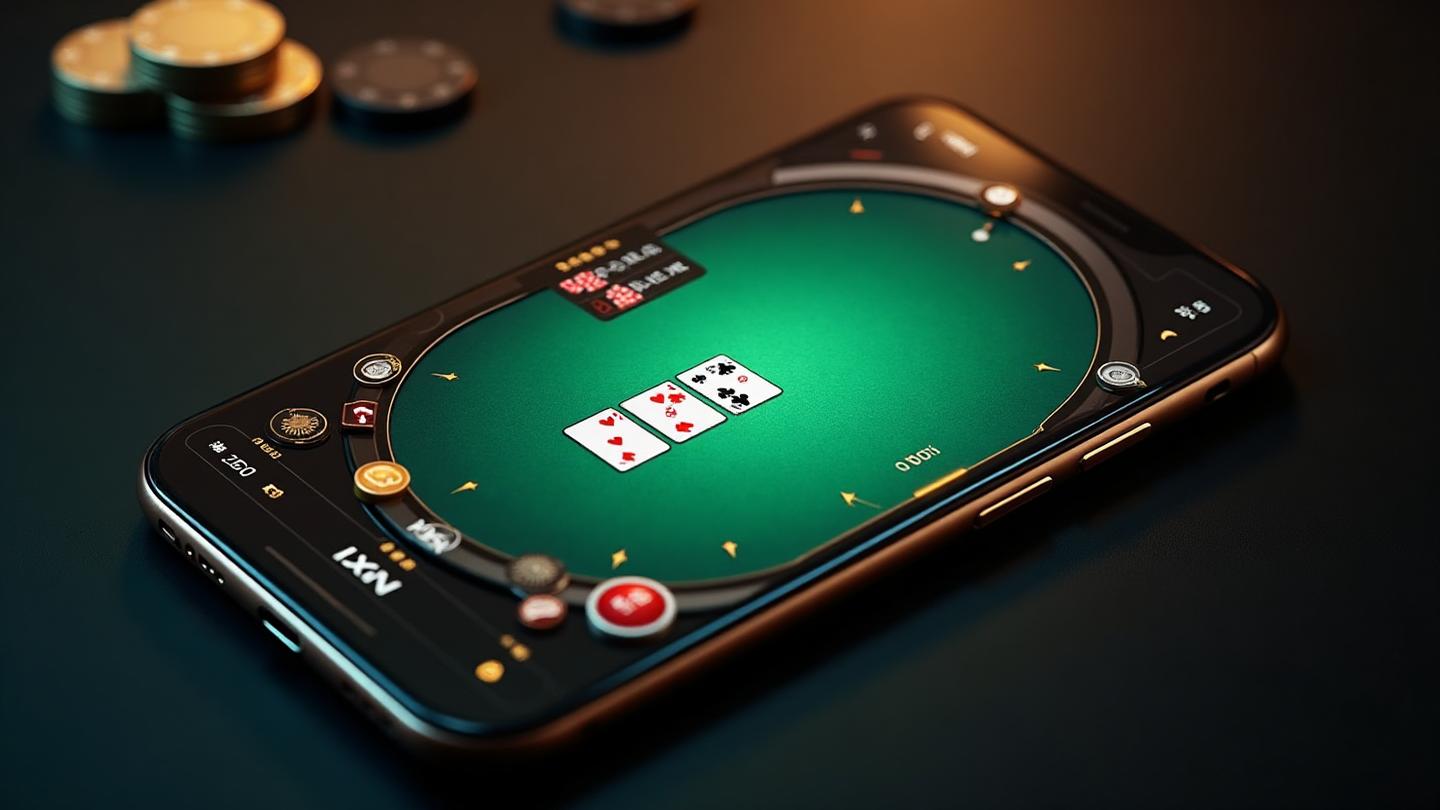

The first time I downloaded a poker app, I noticed something felt different from the flashy slot games I'd tried before. The colors were calmer. The interface was cleaner. I could focus for hours without feeling overwhelmed. That's when I realized: card game apps operate under completely different color psychology rules than the rest of the casino world.
Unlike slot machines that assault your senses with neon explosions, card games require concentration, patience, and strategic thinking. The color palette needs to support hours of focused gameplay without causing eye strain or mental fatigue.
Today, I'm sharing everything I've learned about designing color schemes for poker, blackjack, and baccarat apps that keep players engaged, comfortable, and coming back for more.
Why Card Game Apps Look Different from Slots
If you've ever wondered why your favorite slot machine apps look nothing like poker apps, the answer lies in fundamental gameplay differences:
Skill vs. Luck: Slots are pure chance; card games require skill and decision-making. Players need to think clearly, which means reducing visual noise.
Session Length: A slot spin takes seconds; a poker tournament can last hours. Color choices must prevent eye fatigue over extended periods.
Information Density: Card games display complex information (cards, chips, player stats, betting history). Colors must aid readability, not compete with it.
Emotional State: Slot players chase dopamine hits; card players maintain emotional control. The color palette should promote calm focus, not excitement spikes.
This fundamental difference shapes every color decision in card game app design.

Poker App Color Psychology
The Sacred Green Table
The psychology of green dominates poker app design for good reason. Green reduces eye strain, promotes concentration, and carries centuries of card-playing tradition.
Classic Poker Green Spectrum:
- Tournament Green: #0D5E3A (deep, professional)
- Cash Game Green: #1E5C3D (slightly warmer, relaxed)
- Modern Mint: #2ECC71 (lighter, mobile-friendly)
- Vintage Baize: #2D6B47 (traditional felt texture)
The key is choosing the right green for your audience. Tournament apps lean darker and more serious. Casual games can use brighter, more inviting greens.
Action Button Color Hierarchy
Every poker app needs clear, intuitive action buttons. Color creates instant recognition:
Standard Button Colors:
- Fold: Red or gray (#DC143C or #6B7280) - negative action, easy to spot
- Check/Call: Blue or green (#3B82F6 or #22C55E) - neutral/positive
- Raise/Bet: Gold or orange (#D4AF37 or #F59E0B) - aggressive action
- All-In: Deep red with gold (#8B0000 with #FFD700) - dramatic moment
The goal is muscle memory. Players should never hesitate about which button does what.
Player Avatar and Chip Colors
In multiplayer poker, distinguishing players quickly matters. Strategic color coding helps:
Player Differentiation:
- Use distinct hue families (not just light/dark variants)
- Avoid colors that clash with table green
- Consider colorblind users (test with colorblind simulator)
Chip Color Standards: Following casino floor conventions:
- White: $1
- Red: $5
- Green: $25
- Black: $100
- Purple: $500
- Orange: $1,000
Maintaining these conventions helps players instantly understand bet sizes.

Blackjack App Interface Design
Blackjack apps face unique challenges: displaying cards clearly, communicating game state instantly, and making complex options (split, double, insurance) immediately understandable.
Card Visibility and Contrast
Cards must be instantly readable. This means:
High Contrast Requirements:
- Red suits on white (#E31937 on #FFFFFF)
- Black suits with clean edges (#1A1A1A on #FFFFFF)
- Card shadows that separate overlapping cards
- Background colors that don't compete with card faces
Never use a background color that reduces card readability. The table might be green, but the card area needs maximum contrast.
Betting Area Color Zones
Clear visual zones help players understand where actions happen:
Zone Color Strategy:
- Main Bet Area: Highlighted circle (gold outline #D4AF37)
- Insurance Bet: Separate color zone (often red warning #DC143C)
- Split Areas: Duplicated but distinguished spaces
- Chip Stack: Dark background for contrast (#1A1A1A)
Win/Loss Celebration Balance
Unlike slots, blackjack celebrations should be understated:
Subtle Victory Indicators:
- Soft green glow for wins (#22C55E with 30% opacity)
- Gentle gold shimmer for blackjack (#FFD700)
- Brief animations (1-2 seconds max)
- No flashing lights or screen takeovers
Respect the player's concentration. A poker or blackjack player who just won wants to focus on the next hand, not watch fireworks.

Baccarat: The VIP Digital Experience
Baccarat, especially popular in Asian markets, demands a completely different color approach. This is where lucky colors and gambling culture become essential reading.
Asian Market Color Preferences
Red Dominance: Red (#CC0000) symbolizes luck and prosperity in Chinese culture. Baccarat apps targeting Asian markets lean heavily into red:
- Primary UI elements in red
- Gold accents (#FFD700) for wealth symbolism
- Black (#1A1A1A) for sophistication
- White text for clarity on dark backgrounds
Avoiding Bad Luck Colors:
- Pure white backgrounds (associated with death in Chinese culture)
- Certain number displays (avoiding 4, highlighting 8)
Scoreboard (Roadmap) Design
Baccarat's distinctive scoreboards require careful color coding:
Roadmap Colors:
- Banker Wins: Red circles (#E31937)
- Player Wins: Blue circles (#1E40AF)
- Ties: Green marks (#22C55E)
- Pairs: Small dots in corner
These colors are industry standard. Changing them would confuse experienced players.
VIP Room Aesthetic
High-roller baccarat rooms (physical and digital) use luxury brand color strategies:
VIP Color Palette:
- Deep burgundy backgrounds (#800020)
- Gold trim and accents (#D4AF37)
- Dark wood textures (#3D2314)
- Subtle pattern overlays
The goal is exclusivity. Colors should whisper "private club," not shout "casino floor."

Essential UI Elements Color Guide
Typography and Text Hierarchy
Card games display lots of text. Color hierarchy keeps it scannable:
Text Color System:
- Primary Text: High contrast (#FFFFFF on dark, #1A1A1A on light)
- Secondary Info: Slightly muted (#94A3B8)
- Monetary Values: Gold or green (#D4AF37, #22C55E)
- Warnings/Alerts: Red or orange (#DC143C, #F59E0B)
- Disabled States: Very muted (#6B7280 at 50% opacity)
Notification and Alert Colors
In-game notifications need instant recognition:
Notification Hierarchy:
- Your Turn: Prominent highlight (gold pulse #D4AF37)
- Time Warning: Orange or red (#F59E0B → #DC143C)
- Chat Message: Subtle (blue dot #3B82F6)
- Achievement: Celebration (gold #FFD700)
- Error: Red (#DC143C)
Progress and Timer Elements
Poker turn timers and tournament progress use color to communicate urgency:
Timer Color Progression:
- Full time: Green (#22C55E)
- Half time: Yellow (#FBBF24)
- Low time: Orange (#F59E0B)
- Critical: Red (#DC143C)
This universal pattern requires no explanation. Players instantly understand.

Live Dealer Apps: Blending Real and Digital
Live dealer games present unique color challenges: your UI overlays a video feed of a real dealer.
UI Overlay Considerations
Transparency and Readability:
- Semi-transparent backgrounds (rgba with 80-90% opacity)
- Strong text contrast on video
- Minimal obstruction of dealer view
- Edge-anchored controls (corners and sides)
Color Choices for Video Overlay:
- Dark glass effect backgrounds (#0A0A0A at 85% opacity)
- Bright accent colors for clickable elements
- Avoid colors that clash with common casino decors
Chat and Interaction Colors
Live dealer chat connects players with dealers:
Chat UI Colors:
- Your messages: Highlighted (#3B82F6 background)
- Dealer messages: Gold or special color (#D4AF37)
- Other players: Neutral (#374151)
- System messages: Muted (#6B7280)
Mobile vs. Desktop Color Differences
Screen Size Adaptations
Mobile card games need bolder color choices:
Mobile Adjustments:
- Higher contrast ratios (minimum 4.5:1, prefer 7:1)
- Larger touch targets with clear color boundaries
- Simplified color palettes (fewer colors, stronger distinction)
- Consider outdoor/bright light viewing
Dark Mode Requirements
Most card game apps offer dark mode. It's not just inverting colors:
Dark Mode Strategy:
- Background: Not pure black, use #0A0A0A or #121212
- Text: Not pure white, use #E5E5E5 or #F3F4F6
- Accents: May need increased saturation
- Green felt: Adjust for dark surroundings
Learn more about dark mode design psychology.
Common Mistakes in Card Game App Design
Mistake 1: Copying Slot Aesthetics
Wrong: Neon colors, constant animations, rainbow gradients Right: Subdued palette, purposeful motion, cohesive color scheme
Card players want focus, not stimulation.
Mistake 2: Poor Card Contrast
Wrong: Colored backgrounds that reduce card readability Right: Maximum contrast in card display areas, subdued surroundings
Test with actual gameplay. Can you instantly read every card?
Mistake 3: Ignoring Cultural Preferences
Wrong: One color scheme for global audience Right: Regional themes and color preferences, especially for baccarat
Asian markets have strong color associations. Respect them.
Mistake 4: Inconsistent Action Button Colors
Wrong: Changing button colors between game types or screens Right: Universal color language across entire app
Muscle memory matters. Consistency prevents costly misclicks.
Mistake 5: Overwhelming Information Display
Wrong: Every element competing for attention with bright colors Right: Clear hierarchy with most elements subdued, key actions highlighted
Use the 60-30-10 rule even in game UI.
Designing Your Card Game App
Ready to create your own card game app color palette? Here's a step-by-step approach:
Step 1: Define Your Game Type and Audience
- Tournament poker? Go darker, more serious
- Casual blackjack? Brighter, more inviting
- VIP baccarat? Luxury colors, Asian preferences
- Social games? Vibrant, playful
Step 2: Establish Core Palette
Use the Color Hierarchy tool to create:
- Primary table color (usually green variant)
- Secondary UI background (dark or light theme)
- Accent colors (gold for premium, blue for casual)
- Action button spectrum (fold to raise)
- Text hierarchy (3-4 levels)
Step 3: Test for Accessibility
Run your palette through:
- Color Contrast Checker for WCAG compliance
- Colorblind Simulator for all users
Step 4: Create Consistent Design Tokens
Export your palette with the AI Website Designer to ensure consistency across all screens.
Step 5: Iterate Based on Player Feedback
Launch, gather data, and refine. The best card game apps evolve their color schemes based on actual player behavior and feedback.
Conclusion
Card game app design is a specialized discipline within casino color psychology. Unlike slot machines that maximize stimulation, poker, blackjack, and baccarat apps must support sustained concentration, clear decision-making, and comfortable extended sessions.
The principles are clear:
- Green dominates for tradition and focus
- Action buttons follow hierarchy (fold → call → raise)
- Cultural preferences matter (especially for baccarat)
- Less is more compared to slot design
- Consistency builds trust and muscle memory
Whether you're designing a tournament poker platform or a casual blackjack app, these color principles will help you create interfaces that players love to use—for hours at a time.
Ready to create your card game color palette? Start with our AI Website Designer or explore the Gradient Maker for modern card table aesthetics.