The Best Paint Colors for Interior Exposed Brick Walls
· Coloracci Team
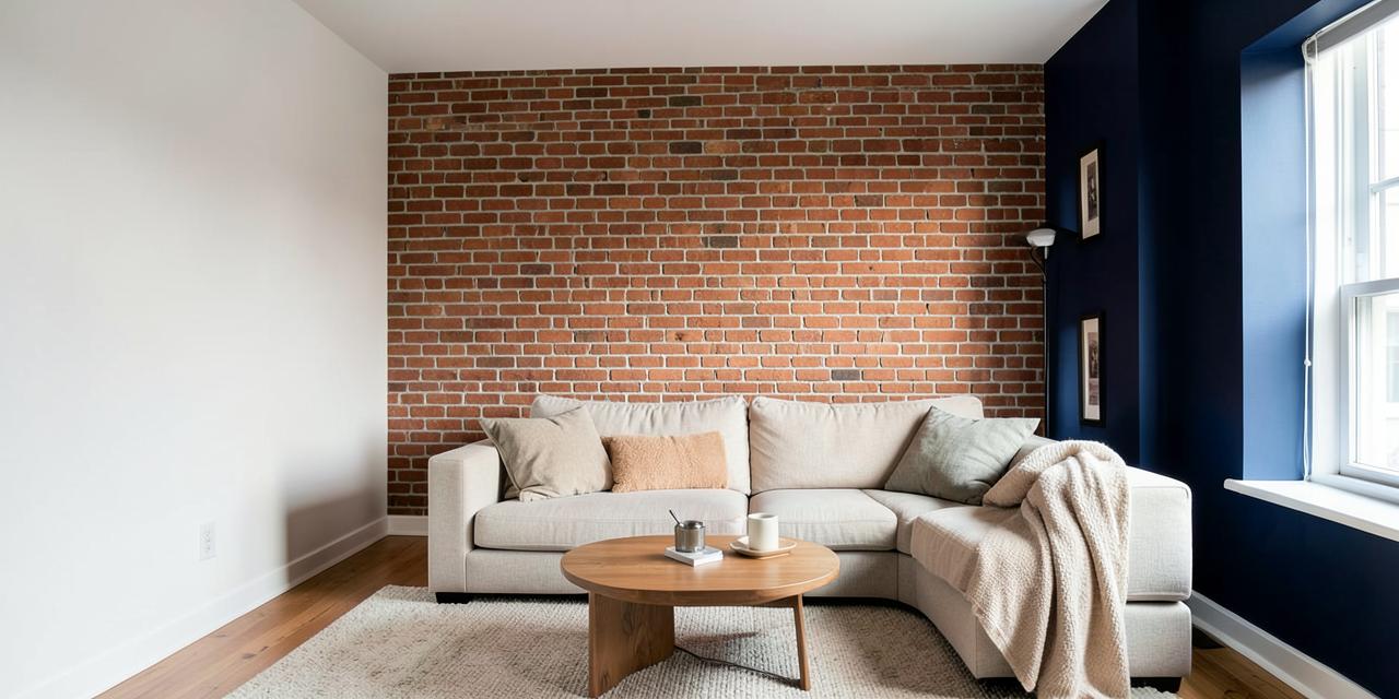
The Best Paint Colors for Interior Exposed Brick Walls
If you are wondering what paint colors go with interior exposed brick walls, the honest answer is that brick is one of the most forgiving architectural features you can design around — but only if you respect its undertone. Exposed brick carries warmth, texture, and history in every irregular surface, and the paint you choose for the surrounding walls either amplifies that character or fights it. The most reliable pairings are crisp whites like Benjamin Moore Chantilly Lace (#F3F4F0) for clean contrast, warm whites like Swiss Coffee (#F1EEE3) for a soft, cohesive glow, versatile neutrals like Sherwin-Williams Agreeable Gray (#D4CDC3) and Benjamin Moore Revere Pewter (#CBCCC6) for balance, calming greens like Sea Salt (#DAE0D9) for an earthy dialogue, and dramatic darks like Hale Navy (#4F5A67) or Tricorn Black (#2F3031) for a modern, moody statement. This guide breaks down exactly why each works, with HEX codes, palettes, and room-by-room direction.
The Color Psychology of Exposed Brick
Exposed brick is never just a wall — it is a psychological anchor. It evokes history, authenticity, and industrial chic in a single glance. Interior brick wall ideas succeed or fail on whether the surrounding palette honors that emotional weight.
Brick reads as inherently warm: even "cool" reclaimed brick carries iron-oxide reds, burnt oranges, and earthy browns. That warmth does two things in a room. First, it makes the space feel grounded and honest — a reaction design researchers tie to our preference for natural, aged materials over synthetic perfection. Second, it dominates the color conversation. Whatever you paint next to brick will be judged against it, because the eye always compares a flat painted plane with the textured, variegated one beside it.
This gives you two strategic directions:
- Complement the rustic charm. Warm, earthy tones — creams, greiges, sage greens — enhance the cozy, traditional, heritage feel. The room reads as layered and settled.
- Create modern contrast. Cool neutrals and bold dark colors — crisp whites, charcoals, navy — push brick into a contemporary, dramatic, gallery-like role. The brick becomes sculpture.
Neither is wrong. The mistake is the undecided middle: a paint color that is neither warm enough to harmonize nor crisp enough to contrast simply makes brick look dirty.
Step One: Read Your Brick's Undertone
Before choosing any paint, spend a day watching your brick. Most interior brick falls into one of three families:
| Brick Family | Typical Tones | Undertone | Paint Direction |
|---|---|---|---|
| Classic red clay | Reds, rusts, warm browns | Warm red-orange | Creams, sage, greige, navy |
| Reclaimed/aged | Mixed reds, charcoals, faded pinks | Neutral-warm | Whites, soft grays, charcoal |
| Whitewashed/German schmear | Off-white over red | Cool-warm | Almost anything; keep contrast deliberate |
Hold a plain white sheet of paper against the brick in daylight. If the brick looks orange-red beside it, you have warm brick — lean into warm whites and earthy greens. If it reads more muted and brownish, you have neutral brick — cool grays and crisp whites will sit cleanly against it.
The Best Paint Colors for Exposed Brick: Full Breakdown
Here is the complete analyst's breakdown of what paint colors go with interior exposed brick walls, with exact HEX codes for every recommendation.
1. Crisp White — The Gallery Contrast
Crisp white is the single most popular partner for exposed brick, and for good reason: it makes the brick pop like artwork on a gallery wall.
- Benjamin Moore Chantilly Lace (OC-65) — #F3F4F0. A bright, nearly neutral white with no creamy cast. Against red brick it creates a sharp, clean, modern contrast that feels architectural rather than cozy.
- Best for: living rooms with exposed brick, loft spaces, kitchens, and any room where you want the brick to be the undisputed focal point.
- Watch out for: in dim, north-facing rooms, stark white can go flat and make brick look harsh. If your light is limited, move one step warmer.
2. Warm White and Cream — The Soft Harmonizer
Warm whites soften the transition between painted wall and brick, enhancing the masonry's inherent warmth instead of competing with it.
- Benjamin Moore Swiss Coffee (OC-45) — #F1EEE3. A creamy off-white that blends gently with brick's reds and browns, producing a warm, cohesive, slightly rustic envelope.
- Best for: bedrooms, breakfast nooks, farmhouse or traditional interiors, and rooms where comfort matters more than drama.
- Design note: warm white is the safest choice when your brick is very red — it neutralizes the intensity without a jarring temperature clash.
3. Soft Gray — The Versatile Neutral
A well-chosen gray is the diplomat of the palette: it can lean warm or cool, and it gives brick a contemporary frame without the severity of pure white.
- Sherwin-Williams Agreeable Gray (SW 7029) — #D4CDC3. A balanced, warm-leaning gray that delivers a contemporary look while still respecting brick's warmth. It is the most requested "safe" answer for a living room with exposed brick.
- Best for: open-plan spaces, transitional interiors, and rooms that mix modern furniture with historic shell.
- Watch out for: avoid cold, blue-heavy grays against very warm brick — the temperature clash reads as accidental.
4. Greige — The Sophisticated Backdrop
Greige — the gray-beige hybrid — is the most sophisticated neutral in this list. It absorbs brick's warmth while staying firmly modern.
- Benjamin Moore Revere Pewter (HC-172) — #CBCCC6. A classic greige that provides an elegant, gallery-neutral backdrop and flatters both red and reclaimed brick.
- Best for: dining rooms, hallways, and whole-home palettes where brick appears in more than one room.
- Design note: greige is the professional's choice when you want the brick to feel integrated into the architecture rather than framed against it. For a deeper dive, see our guide on what colors go with Revere Pewter.
5. Sage Green — The Earthy Complement
Green sits opposite red on the color wheel, which makes muted greens a natural, low-contrast complement to red brick. Sage in particular shares brick's earthy, mineral quality.
- Sherwin-Williams Sea Salt (SW 6204) — #DAE0D9. A calming, chameleon green-gray that complements the natural tones of brick and reads as fresh rather than themed.
- Best for: bedrooms, bathrooms, reading corners, and biophilic interiors with plants and natural fiber.
- Design note: this is the pairing to choose when you want the room to feel calm and organic. Our article on what colors go with sage green walls covers full palette building around this family.
6. Navy Blue — The Dramatic Statement
Navy against brick is the boldest move on this list — and one of the most rewarding. Deep blue creates a cozy, sophisticated, almost clubby atmosphere while letting the brick glow by contrast.
- Benjamin Moore Hale Navy (HC-154) — #4F5A67. A rich, grounded navy that works beautifully as a dramatic accent wall adjacent to brick, especially on the wall opposite the masonry.
- Best for: living room feature walls, home offices, dining rooms, and bedroom accent walls behind a headboard.
- Watch out for: navy absorbs light. Pair it with warm metallics (brass, aged gold) and layered lighting so the room reads intimate rather than dark.
7. Charcoal and Black — The Industrial Edge
For a modern, industrial, or moody aesthetic, deep charcoal is brick's most architectural partner. It doubles down on the loft narrative.
- Sherwin-Williams Tricorn Black (SW 6258) — #2F3031. A true, neutral black that gives brick a sharp contemporary frame — especially effective on trim, shelving, or a single accent wall rather than every wall.
- Best for: modern industrial color schemes, media rooms, kitchens with open shelving, and spaces with generous natural light.
- Design note: charcoal works best when the brick itself has variation — the dark paint lets every red, rust, and umber note in the masonry stand forward.
Reference Data Table: Brick-Compatible Paint Colors
| Item | Color | Hex | Color Name | Psychological Meaning |
|---|---|---|---|---|
| 1 | Crisp White | #F3F4F0 | Benjamin Moore Chantilly Lace (OC-65) | Clean contrast, gallery-like clarity, modern freshness |
| 2 | Warm White | #F1EEE3 | Benjamin Moore Swiss Coffee (OC-45) | Softness, warmth, rustic cohesion |
| 3 | Soft Gray | #D4CDC3 | Sherwin-Williams Agreeable Gray (SW 7029) | Balance, versatility, contemporary calm |
| 4 | Greige | #CBCCC6 | Benjamin Moore Revere Pewter (HC-172) | Sophistication, neutrality, quiet elegance |
| 5 | Sage Green | #DAE0D9 | Sherwin-Williams Sea Salt (SW 6204) | Calm, nature connection, organic ease |
| 6 | Navy Blue | #4F5A67 | Benjamin Moore Hale Navy (HC-154) | Drama, intimacy, tailored sophistication |
| 7 | Charcoal Black | #2F3031 | Sherwin-Williams Tricorn Black (SW 6258) | Edge, modernity, industrial confidence |
Complete Palettes for a Living Room with Exposed Brick
Palette 1: Modern Gallery (crisp contrast)
- Walls: Chantilly Lace — #F3F4F0
- Trim and ceiling: Chantilly Lace at full strength — #F3F4F0
- Accent (shelving or door): Tricorn Black — #2F3031
- Textiles: oatmeal linen, charcoal wool, blackened steel
- Mood: bright, editorial, loft-like
Palette 2: Warm Heritage (cozy harmony)
- Walls: Swiss Coffee — #F1EEE3
- Trim: one shade deeper cream
- Accent wall opposite brick: Revere Pewter — #CBCCC6
- Textiles: cognac leather, aged brass, warm walnut
- Mood: settled, traditional, fireside
Palette 3: Earthy Retreat (organic calm)
- Walls: Sea Salt — #DAE0D9
- Trim: warm white — #F1EEE3
- Accent: deep botanical green in small doses
- Textiles: natural jute, raw oak, unbleached cotton, live plants
- Mood: restorative, biophilic, grounded. This palette pairs naturally with the schemes in our earthy industrial color palette for living room guide.
Palette 4: Dramatic Loft (bold contrast)
- Walls: Agreeable Gray — #D4CDC3 on main walls
- Feature wall opposite the brick: Hale Navy — #4F5A67
- Trim: crisp white — #F3F4F0
- Textiles: brass fixtures, camel leather, dark-stained wood
- Mood: tailored, intimate, sophisticated
Room-by-Room Guidance: What Paint Colors Go with Interior Exposed Brick Walls
Living room with exposed brick. This is where brick performs best as a focal wall. Choose Agreeable Gray or Revere Pewter for an effortless contemporary envelope, or Chantilly Lace if your light is strong. If the room is large, add a Hale Navy accent wall opposite the brick to create visual bookends.
Bedroom accent wall. Brick behind the headboard is a classic. Keep the other walls calm: Swiss Coffee for warmth or Sea Salt for a serene, sleep-friendly envelope. Reserve navy and black for large bedrooms with good natural light.
Kitchen. Brick plus white cabinetry is a proven combination — Chantilly Lace on walls and cabinets lets the brick act as a textured backsplash feature. Warm white works better with butcher block and farmhouse details.
Home office. Agreeable Gray with a brick wall reads professional and focused; Hale Navy behind the desk adds authority on video calls.
Lighting, Finish, and Practical Takeaways
- Test in your light. Brick changes dramatically from morning to evening. Paint two large sample boards and move them around the brick for 48 hours before committing.
- Finish matters. Use matte or eggshell on walls near brick — sheen competes with texture. Reserve satin for trim only.
- Keep ceilings light. With a textured focal wall, a ceiling lighter than the walls preserves height and airiness.
- Mind the mortar. Light mortar lines amplify contrast with dark paints; dark mortar softens crisp whites. Factor the mortar color into your undertone reading.
- Don't paint the brick unless you mean it. Painting brick is effectively permanent. If you want a lighter look, try a limewash or German schmear first — they preserve texture and are more forgiving.
- Coordinate fixed elements. Floors, beams, and fireplaces share the room with your brick. Warm wood floors favor warm whites and greige; concrete or cool-toned floors favor crisp white and charcoal.
And if your brick continues outside, the same logic applies at the facade — see our architect's guide to exterior paint colors for a brick house for curb-appeal pairings.
Conclusion: Let the Brick Lead
The best answer to what paint colors go with interior exposed brick walls is the one that decides, deliberately, between harmony and contrast. Crisp white (#F3F4F0) frames brick like art. Warm white (#F1EEE3) and greige (#CBCCC6) wrap it in comfort. Sage green (#DAE0D9) speaks to its earthy nature. Navy (#4F5A67) and charcoal (#2F3031) turn it into architecture. Read your brick's undertone, test in your light, and commit fully to one direction.
Ready to build your complete palette around these HEX codes? Open the Coloracci AI Palette Generator to generate harmonious combinations, check contrast, and export your scheme in seconds — or try our Room Palette Generator to get a full wall, trim, ceiling, and accent scheme tailored to your room's lighting.
Related Resources
Continue with Earthy Industrial Color Palette for Living Room, Best Exterior Paint Colors for a Brick House, and What Colors Go With Sage Green Walls.