The Architect's Guide: Best Exterior Paint Colors for a Brick House
· Coloracci Team
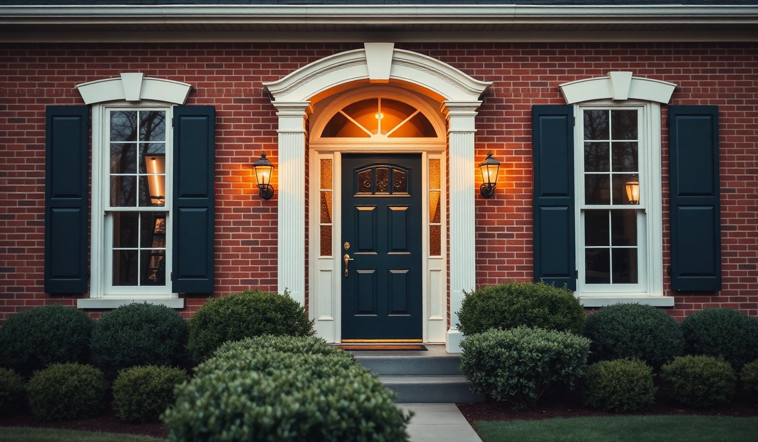
The Direct Answer: Best Exterior Paint Colors for a Brick House
The best exterior paint colors for a brick house are the ones that respect the brick as the loudest voice on the facade — warm off-whites like Sherwin-Williams Alabaster (#F2EDE4), sophisticated greiges like Benjamin Moore Revere Pewter (#D0CABE), grounding charcoals like Iron Ore (#4F4E4C), timeless navies like Hale Navy (#49535C), and earthy sages like Evergreen Fog (#A5A79A). Each of these works because it either echoes brick's warm undertones or provides a controlled, harmonious contrast — never a clash.
Brick is not a background material. It is a textured, multi-tonal, deeply pigmented surface that already carries reds, oranges, browns, and mortar grays within a single wall. The mistake most homeowners make is choosing a trim or accent color in isolation, on a paint chip in a store, without accounting for how much visual work the brick is already doing. This architect's guide walks through the six palettes that consistently win, the psychology behind each, and how to combine them into a body-trim-accent system that will still look right a decade from now.
Why Brick Demands a Disciplined Color Strategy
Before we look at swatches, understand what you are painting against. Red brick typically lives in the warm-red to red-brown range (roughly #8B3A2F to #A8574A), with mortar joints introducing a cooler gray-beige grid. That means a brick facade is already a two-color composition before you paint a single board of trim.
Your paint choices have three jobs:
- Frame the brick — make it feel intentional, not dated.
- Establish hierarchy — direct the eye to the front door, then windows, then rooflines.
- Connect the house to its site — landscape, sky, and neighboring homes.
The colors below succeed at all three. The colors that fail — bright pure whites, cool blue-grays, yellow-tinted beiges — fight the brick's warmth and end up looking either dingy or accidental.
The Six Best Exterior Paint Colors for a Brick House
1. Warm Off-White — Sherwin-Williams Alabaster (SW 7008) · #F2EDE4
Alabaster is arguably the single most-specified trim color for red brick in the last decade, and for good reason. It reads as clean and classic without the icy blue undertone that makes a stark white look surgical next to warm masonry.
Why it works with brick: The subtle cream base picks up brick's warmth, softening the transition between wall and trim. It photographs beautifully in both morning and evening light.
Best used for: Fascia, soffits, window trim, columns, and porch ceilings. On a partial-brick home (brick lower, siding upper), Alabaster is an excellent main body color.
Psychology: Alabaster communicates welcome, cleanliness, and quiet confidence. It is the color of a well-kept, unpretentious home.
2. Classic Greige — Benjamin Moore Revere Pewter (HC-172) · #D0CABE
Revere Pewter has become a modern-classic for a reason: it splits the difference between gray and beige, giving you the earthiness of a warm neutral with the sophistication of a cool one.
Why it works with brick: The beige undertone shakes hands with brick's warmth, while the gray keeps the facade from feeling monochromatic or overly rustic.
Best used for: Siding on mixed-material homes, garage doors, and secondary body color on Colonial or Craftsman styles.
Psychology: Balanced, grounded, timeless. Revere Pewter reads as considered — the kind of choice a designer would make.
3. Soft Warm Gray — Sherwin-Williams Repose Gray (SW 7015) · #D3CEC7
Repose Gray is what you reach for when you want gray without commitment to a gray house. It has just enough warm undertone to sit peacefully next to brick without disappearing into it.
Why it works with brick: Cool grays go dead against warm brick; Repose Gray's slight taupe cast keeps the facade harmonious. It also flatters both cool-toned rooflines (asphalt shingles) and warm ones (cedar shakes).
Best used for: Full-house siding on mixed brick-and-siding homes, dormers, and larger trim surfaces.
Psychology: Tranquil, balanced, quietly modern. It says the homeowners have taste, but no need to show off.
4. Dramatic Charcoal — Sherwin-Williams Iron Ore (SW 7069) · #4F4E4C
If Alabaster is the safest bet, Iron Ore is the most rewarding one. This deep, near-black charcoal has become the go-to accent color for brick homes that want to feel current without abandoning tradition.
Why it works with brick: Iron Ore reads as an architectural outline — it defines shutters, doors, and window sashes with the same weight as brick itself, creating visual balance rather than contrast for its own sake.
Best used for: Shutters, front doors, garage doors, window sashes, light fixtures, and railings. Also stunning as the main body color on a brick-accented modern farmhouse.
Psychology: Grounded, confident, dramatic. Iron Ore is the exterior equivalent of a perfectly cut charcoal suit.
5. Timeless Navy Blue — Benjamin Moore Hale Navy (HC-154) · #49535C
Navy and red brick is one of the most enduring pairings in American residential architecture — think Federal, Colonial, and Cape Cod styles. Hale Navy is the version designers reach for because it is deep enough to read as an accent, but slightly grayed so it never feels toy-like.
Why it works with brick: Blue is the complement of orange on the color wheel, and red brick contains orange. That makes navy the mathematically ideal accent — it makes the brick look more like itself.
Best used for: Front doors, shutters, and porch ceilings. Rarely a full body color unless the home is coastal.
Psychology: Trustworthy, calm, deeply rooted. Navy signals stability and heritage without feeling stuffy.
6. Earthy Sage Green — Sherwin-Williams Evergreen Fog (SW 9130) · #A5A79A
Evergreen Fog was Sherwin-Williams' 2022 Color of the Year, and it has quietly become one of the most flattering accent colors for red brick homes surrounded by mature landscaping.
Why it works with brick: Sage bridges the house to its garden. It picks up the gray-green tones already present in mortar and mature foliage, so the home reads as sited rather than dropped onto the lot.
Best used for: Front doors, shutters on smaller homes, and outbuildings like detached garages or garden sheds. Excellent on Craftsman and Tudor styles.
Psychology: Serene, organic, restorative. Sage green connects to biophilic design principles — colors drawn from nature that measurably reduce stress. For more on how residential colors affect daily well-being, see our guide to residential home color psychology and well-being.
Building a Complete Exterior Palette: Body, Trim, Accent
A brick house is never a one-color decision. Professional exterior palettes follow a three-part structure that maps naturally to the 60-30-10 color proportion rule:
- 60% — Dominant body (the brick itself, or brick plus siding)
- 30% — Trim and secondary body (fascia, soffits, window frames, columns)
- 10% — Accent (front door, shutters, light fixtures, house numbers)
Palette A — Classic Colonial
- Body: Existing red brick
- Trim: Alabaster #F2EDE4
- Accent: Hale Navy #49535C (front door and shutters)
This is the safest, most timeless palette in the guide. It works on 90% of red-brick Colonials and never dates.
Palette B — Modern Farmhouse
- Body: Repose Gray #D3CEC7 (siding above brick wainscot)
- Trim: Alabaster #F2EDE4
- Accent: Iron Ore #4F4E4C (doors, shutters, window sashes, gooseneck lighting)
Contemporary, high-contrast, photographs beautifully. Ideal for two-story homes where brick covers only the lower level.
Palette C — Garden Craftsman
- Body: Existing brick + Revere Pewter #D0CABE on wood elements
- Trim: Alabaster #F2EDE4
- Accent: Evergreen Fog #A5A79A (front door) with Iron Ore #4F4E4C hardware
Softest and most organic. Best for homes with mature trees and layered landscaping. Draws heavily on the earth tone color palette tradition.
Palette D — Refined Traditional
- Body: Existing brick
- Trim: Revere Pewter #D0CABE
- Accent: Hale Navy #49535C with Alabaster #F2EDE4 on porch ceiling
Warmer and richer than the Classic Colonial. The greige trim reduces contrast with the brick, giving the whole facade a more integrated, upscale feel.
Color Psychology on the Facade
Exterior color is the first thing a guest, buyer, or neighbor experiences about your home. Unlike interior color, which is felt over hours, exterior color is judged in seconds. Every choice below sends a clear message:
- Alabaster — approachable, cared-for, welcoming
- Revere Pewter — sophisticated, balanced, tasteful
- Repose Gray — calm, modern, considered
- Iron Ore — confident, architectural, current
- Hale Navy — trustworthy, established, classic
- Evergreen Fog — serene, connected to nature, restorative
Pair one warm neutral with one grounding dark and (optionally) one nature-derived accent, and you will land inside the emotional register almost every buyer responds to: this house is loved.
The Data Table — Best Exterior Paint Colors for a Brick House
| Palette Role | Paint Color Name | HEX Code | Psychological Feel |
|---|---|---|---|
| Body / Trim (light) | Sherwin-Williams Alabaster (SW 7008) | #F2EDE4 | Welcoming, clean, classic |
| Body / Siding (warm neutral) | Benjamin Moore Revere Pewter (HC-172) | #D0CABE | Sophisticated, timeless, balanced |
| Body / Siding (soft gray) | Sherwin-Williams Repose Gray (SW 7015) | #D3CEC7 | Tranquil, modern, understated |
| Accent — shutters, doors, sashes | Sherwin-Williams Iron Ore (SW 7069) | #4F4E4C | Grounded, dramatic, architectural |
| Accent — door, shutters | Benjamin Moore Hale Navy (HC-154) | #49535C | Trustworthy, classic, calm |
| Accent — door, outbuildings | Sherwin-Williams Evergreen Fog (SW 9130) | #A5A79A | Serene, organic, restorative |
| Reference — Red Brick Base | Common Red Brick | #8B3A2F | Warm, historic, textured |
| Reference — Mortar | Standard Gray Mortar | #B8B2A7 | Neutral, structural, cool-warm |
Practical Takeaways for Homeowners
1. Sample on the actual brick, not on a paint chip. Order peel-and-stick samples or paint 12×12-inch boards and hold them directly against your brick in morning, midday, and evening light. Brick shifts significantly across the day; your trim will too.
2. Never go pure white. Bright, cool whites (like Chantilly Lace or High Reflective White) look blue and clinical against warm brick. Always choose a white with a warm undertone — cream, buttery, or greige.
3. Match undertones, not values. Your trim can be lighter or darker than your brick — that is fine — but its undertone should agree. Warm brick wants warm neutrals. This is the single most common failure point.
4. Use the darkest accent sparingly and repeat it. Iron Ore or Hale Navy on the front door only will look like an afterthought. Repeat that same accent on shutters, sconces, house numbers, and the mailbox to create visual rhythm.
5. Consider the roof. Your roof is roughly 30% of the facade and it is a color you cannot change easily. Warm brown or copper roofs pair beautifully with sage and navy; cool asphalt-gray roofs are better served by Repose Gray and Iron Ore.
6. Test the front door in isolation. The door is your 10% accent. It should be the most saturated, most confident choice on the entire facade. If it doesn't make you smile when you pull into the driveway, it is the wrong color.
7. Don't paint the brick unless you're certain. Painted brick is a one-way door — once painted, it requires repainting every 5–8 years and can never truly be reversed. Use trim and accents to update the look first; paint the brick only if the color is genuinely working against you.
Conclusion: Let the Brick Lead
The best exterior paint colors for a brick house are not the trendiest ones — they are the ones that let brick do what brick does best: age gracefully, absorb light, and anchor the home to its site. Warm off-whites, considered greiges, grounding charcoals, timeless navies, and earthy sages have all earned their place in the architect's kit because they respect the material rather than compete with it.
Choose one warm neutral to frame the brick, one dark to give it architectural weight, and — if the site invites it — one nature-derived accent to bridge the home to its garden. Follow that formula and you will have a facade that reads as intentional and beautiful today, and still reads that way in 2036.
Design Your Perfect Brick-House Palette with Coloracci
Ready to test these combinations on your own home before you buy a single gallon? Head over to the coloracci.ai palette generator — upload a photo of your brick, pull the actual pigments from your facade, and generate coordinated body-trim-accent palettes in seconds. It is the fastest way to see Alabaster, Iron Ore, and Hale Navy alongside your own brick before the paint truck arrives.
Your brick has been telling its story for decades. Choose paint that lets it keep talking.