Earthy Industrial Color Palette: The Ultimate Guide for Your Living Room
· Coloracci Team
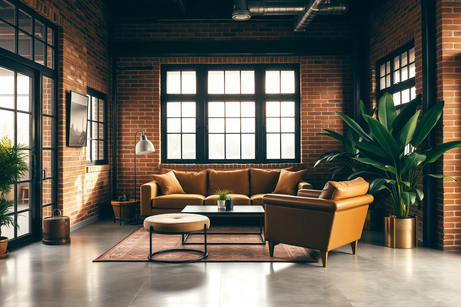
If you have been searching for the right earthy industrial color palette for living room design, the answer is not one color—it is a coordinated conversation between four color families that most people never learn to pair correctly: grounded greens, warm browns, raw neutrals, and muted industrial blues. Get the balance right and the room reads as a Brooklyn loft with a soul; get it wrong and it reads as either a coffee shop cliché or a cold warehouse. This guide gives you the exact hex codes, the designer-approved combinations, and the color psychology behind every pick, so you can build a living room that feels warm, expensive, and unmistakably yours.
The earthy industrial style is having its longest moment in a decade for a reason: it solves the two problems modern living rooms most often suffer from. Pure industrial spaces (concrete, steel, black metal) feel cold and unlivable. Pure earthy spaces (all beige, terracotta, and jute) feel dated and heavy. The earthy industrial color palette for living room interiors blends the two—rough materials warmed by natural pigments, hard surfaces softened by botanical greens—and the result is a room that is both grounded and current.
What Makes a Color Palette "Earthy Industrial"?
Before we get into hex codes, it helps to name the visual formula. An earthy industrial living room palette almost always includes:
- A raw industrial base — concrete grey, black steel, and charcoal, evoking exposed structure.
- A warm earth mid-tone — deep camel, medium brown leather, or terracotta, evoking exposed brick and worn wood.
- A grounding green — olive, camouflage, or sage, standing in for the softening presence of large houseplants.
- A dusty accent neutral — sand, dusty gold, or oatmeal, that keeps the whole scheme from reading too heavy.
- A single muted industrial blue — atomic slate or charcoal-blue, used sparingly for tension.
Skip any one of these categories and the palette collapses. Nail all five and the room reads as intentional, layered, and photographable from any angle. If you want a broader philosophy on grounding a room in nature-derived pigments before applying the industrial layer, our companion guide to the earth tone color palette is the natural starting point for this style.
The Complete Earthy Industrial Color Palette (with Exact Hex Codes)
Below is the full palette—organized by family, with the exact hex, the designer color name, and the role each shade plays in a living room. These are the codes to hand your painter, your upholsterer, or the Coloracci palette generator.
The Greens — Grounded, Restful, Nature-Adjacent
Green is the single most important color in the earthy industrial palette because it is what stops the room from reading as a warehouse. It appears as wall paint, velvet upholstery, ceramics, and—most importantly—as living plants.
1. Camouflage Olive Green — #3D4622 The deepest green in the palette. Almost black-green in low light, this shade works beautifully as an accent wall behind a black metal media console, or as a saturated velvet on a single armchair. Its low LRV makes the surrounding concrete and brick read even more luminous by contrast.
Psychology: stability, wisdom, and permanence. #3D4622 tells the eye "this room has been here a long time."
2. Dingley — #607C44 The workhorse mid-green. Dingley is the shade to reach for on a sofa, on the largest textile in the room, or on a color-drenched built-in bookcase. It agrees with brass, black steel, oak, and camel leather equally well.
Psychology: balance, restoration, connection to the outdoors.
3. Olive — #808000 A warmer, more yellow olive that works especially well in south-facing rooms with strong afternoon light. Use it on curtains, on a large rug border, or on smaller upholstered pieces.
Psychology: organic warmth, quiet confidence, understated luxury.
The Browns — The Warm Backbone
Browns do the emotional heavy lifting in an earthy industrial room. They stand in for leather, worn wood, aged brick, and terracotta pots. The right browns make the room feel comfortable; the wrong ones make it feel dated.
4. Deep Camel — #AB824C The hero brown of the palette. Deep Camel reads simultaneously as leather, honey, and worn saddle. Use it on a large upholstered sofa, on floor cushions, or as the dominant color in a large area rug.
Psychology: warmth, hospitality, quiet expense.
5. Medium Brown Leather — #904F34 The single most important accent brown. #904F34 is the color of a well-loved leather armchair, and it is what gives an industrial room its lived-in emotional temperature. Use it in leather furniture, in ceramics, or as a saturated accent textile.
Psychology: stability, reliability, craftsmanship.
6. Terracotta — #C97456 The bridge color that ties the browns to the industrial reds of exposed brick. Terracotta works as pottery, as a throw blanket, and as smaller decorative accents. It is the color that photographs best on Instagram, which is not a small consideration for a living room.
Psychology: comfort, earthiness, artisanal warmth.
7. Espresso — #3E2C23 The deepest brown—almost black. Espresso appears in dark timber floors, in leather cushion piping, and in dark walnut coffee tables. It is what makes the mid-tone browns above read as intentional rather than muddy.
Psychology: grounding, seriousness, expensive restraint.
The Neutrals — The Quiet Backdrop
Every high-impact color above needs a resting neutral. In the earthy industrial palette, these are warm, dusty, and slightly imperfect—never bright white and never modern cool grey.
8. Sand — #E1CDA5 The warmest neutral in the palette. Sand walls behind a Dingley-green sofa give the room a plaster-and-linen softness that pure white cannot approach.
Psychology: calm, warmth, unforced ease.
9. Dusty Gold — #B6B181 A designer favorite for its ability to sit between neutral and color. Dusty Gold is a warm, greyed-out mustard that works as a wall color, a rug field, or a large upholstery textile. It is the shade that most reads as "expensive but effortless."
Psychology: muted luxury, patience, sophistication.
10. Warm Concrete Grey — #B7B0A4 The industrial neutral. This is the exact undertone of polished, sealed concrete floors, and using it on walls or trim creates the visual echo that ties the ceiling and the floor into one continuous envelope of raw material.
Psychology: neutrality, calm, urban modernity.
The Blues and Charcoals — The Industrial Edge
A single muted blue or charcoal is the finishing move. It creates the tension that stops the palette from tipping fully into "rustic farmhouse."
11. Atomic Blue — #334355 A slate-charcoal blue with just enough colour to feel intentional. #334355 is the color of oxidised steel, faded denim, and stormy sky. Use it on the door of a black metal cabinet, on a single accent wall, or on a large art canvas.
Psychology: calm, focus, quiet authority.
12. Charcoal Black — #2B2A28 The final anchor. Not pure black—slightly warmed with brown pigment. #2B2A28 is the color of black steel window frames, wrought iron pendant lights, and matte black hardware. It is the color that makes every other color in the palette pop.
Psychology: structure, drama, definition.
The Complete Reference Table
| Item | Color | Hex | Color Name | Psychological Meaning |
|---|---|---|---|---|
| Accent wall / velvet chair | Deep forest-olive | #3D4622 | Camouflage Olive Green | Stability, wisdom, permanence |
| Sofa / built-in bookcase | Balanced olive green | #607C44 | Dingley | Balance, restoration, nature |
| Curtains / rug border | Warm yellow-olive | #808000 | Olive | Organic warmth, confidence |
| Hero sofa / large rug | Warm saddle brown | #AB824C | Deep Camel | Warmth, hospitality, expense |
| Leather chair / accent | Rich red-brown | #904F34 | Medium Brown Leather | Stability, craftsmanship |
| Pottery / throw blanket | Warm orange-brown | #C97456 | Terracotta | Comfort, earthiness, warmth |
| Timber floor / dark accent | Near-black brown | #3E2C23 | Espresso | Grounding, seriousness |
| Wall paint | Warm dusty neutral | #E1CDA5 | Sand | Calm, warmth, ease |
| Wall paint / large textile | Greyed warm mustard | #B6B181 | Dusty Gold | Muted luxury, sophistication |
| Wall / trim / concrete echo | Warm industrial grey | #B7B0A4 | Warm Concrete Grey | Neutrality, urban calm |
| Accent wall / metal cabinet | Slate charcoal-blue | #334355 | Atomic Blue | Calm, focus, authority |
| Window frames / hardware | Warm near-black | #2B2A28 | Charcoal Black | Structure, drama, definition |
Three Designer-Approved Palette Combinations
A palette on paper is not a room. Below are three combinations that professional designers actually specify for the earthy industrial color palette for living room briefs—each with the 60-30-10 proportion baked in.
Combination A — "Brooklyn Loft"
- 60% (walls, ceiling, largest textiles): Warm Concrete Grey #B7B0A4
- 30% (sofa, large rug, curtains): Deep Camel #AB824C
- 10% (accents): Camouflage Olive Green #3D4622 velvet armchair, Charcoal Black #2B2A28 steel window frames, brass hardware, one live fiddle-leaf fig
- Effect: The room reads as raw industrial base warmed by leather-and-wood living. Best for rooms with genuine exposed brick, tall ceilings, or original steel windows.
Combination B — "Warm Urban Retreat"
- 60% (walls, ceiling): Sand #E1CDA5
- 30% (sofa, rug): Dingley #607C44
- 10% (accents): Medium Brown Leather #904F34 chair, Espresso #3E2C23 coffee table, Terracotta #C97456 ceramics, black metal pendant light
- Effect: The room leans into the earthy side of the palette—less warehouse, more Mediterranean-modern. Best for suburban living rooms that want the industrial aesthetic without a genuinely industrial architecture.
Combination C — "Modern Foundry"
- 60% (walls, ceiling): Dusty Gold #B6B181
- 30% (sofa, large art): Atomic Blue #334355
- 10% (accents): Deep Camel #AB824C leather bench, Espresso #3E2C23 shelving, Charcoal Black #2B2A28 hardware, sculptural olive-green plants
- Effect: A more moody, editorial version of the palette—the blue and gold read as high-fashion industrial. Best for north-facing rooms and evening-dominant spaces like dens and TV rooms.
For the framework that makes these proportions repeatable across your whole house, our guide to how to add color to a home walks through the same logic room by room; and for readers pulling this palette into a smaller footprint, our minimalist color palette article shows how to strip these twelve colors down to the essential three or four without losing the mood.
Color Psychology of the Earthy Industrial Palette
Color psychology matters more in living rooms than in almost any other space in the home—this is the room where you unwind, host, and set the emotional tone of your day. The earthy industrial palette does something specific: it satisfies two competing psychological needs at once.
Grounding without heaviness. The browns (Deep Camel, Medium Brown Leather, Espresso) trigger the same associations as wood, leather, and soil—stability, permanence, safety. Research on interior color perception consistently shows brown-dominant rooms lower cortisol and encourage longer stays.
Restoration without softness. The greens (Camouflage Olive, Dingley, Olive) are the wavelengths the human eye processes with the least effort, which is why sage- and olive-painted rooms feel restful within seconds. In an industrial context, these greens play the role of a living forest inside a stone box—they signal life without pastel prettiness.
Focus without coldness. The industrial elements (Atomic Blue, Charcoal Black, Warm Concrete Grey) tap into the same psychology as gallery and studio spaces—structure, discipline, quiet authority. On their own they would feel cold; anchored by the browns and greens, they instead feel purposeful.
Warmth without cliché. The neutrals (Sand, Dusty Gold) and the terracotta accents contribute the emotional temperature that pure industrial rooms lack. They are the color equivalent of a lit candle in a concrete space. If you want a longer treatment of how colors work on the nervous system in a residential setting, our deep dive on residential home color psychology and wellbeing unpacks the neuroscience behind every choice above.
Real-World Materials That Bring the Palette to Life
Colors are half the equation. In earthy industrial rooms, the material delivering each color is what makes the palette read as authentic rather than themed. Match colors to materials as follows:
- Exposed brick delivers Terracotta #C97456 and Medium Brown Leather #904F34 for free—do not paint over it.
- Polished concrete floors or micro-cement walls deliver Warm Concrete Grey #B7B0A4 as a permanent finish.
- Leather furniture (worn, un-treated, semi-aniline) delivers Deep Camel #AB824C and Medium Brown Leather #904F34 better than any textile.
- Steel window frames, black metal shelving, wrought iron pendants deliver Charcoal Black #2B2A28.
- Copper pipes left exposed, brass hardware, unlacquered bronze lighting deliver a metallic warm-orange that reads as part of the terracotta family.
- Large sculptural houseplants (fiddle-leaf fig, monstera, olive tree, snake plant, rubber plant) deliver Dingley #607C44 and Olive #808000 in a way no paint can match. Buy the biggest plants your ceiling will allow.
- Vintage or reclaimed wood tables (walnut, oak, elm) deliver Espresso #3E2C23 and Deep Camel #AB824C in a single object.
Practical Takeaways for Designers and Homeowners
- Start from the largest permanent surface. If your floor is polished concrete, build outward from Warm Concrete Grey #B7B0A4. If it is dark hardwood, build outward from Espresso #3E2C23. The floor decides everything.
- Never use pure white. Bright white walls kill the earthy industrial palette instantly. Reach for Sand #E1CDA5 or Warm Concrete Grey #B7B0A4 instead.
- Buy the plants first. Green delivered by living foliage always reads better than green delivered by paint. Budget for two or three large statement plants before you order any furniture.
- Limit yourself to two browns per room. Deep Camel + Medium Brown Leather works. Deep Camel + Espresso works. Trying to layer all four browns creates visual mud.
- Anchor with black metal hardware. Charcoal Black #2B2A28 window frames, pendants, and picture rails give the palette its "industrial" reading. Without them, the room reads as farmhouse.
- Use brass sparingly. One brass or unlacquered bronze fixture per zone (lighting, hardware, small table lamp) is enough to give the palette its warm-metal glow. Overdo it and the room reads as boutique hotel instead of loft.
- Warm your bulbs. 2700K bulbs are non-negotiable. Cool bulbs turn the earthy palette grey and make the greens read as sickly.
- Layer texture inside single colors. Two Deep Camel textiles—one nubby wool, one smooth leather—read richer than two colors in the same tone. Texture is what stops an earthy industrial palette from feeling flat.
Conclusion: Build Your Earthy Industrial Palette with Coloracci
The earthy industrial color palette for living room design is not a trend—it is a strategy for making raw, urban materials feel like home. It works because it borrows from two of the oldest sources of visual comfort humans have: the natural world (green, brown, terracotta) and the honest expression of structural material (concrete, steel, brick). Combine the twelve hex codes in this guide with the three combination templates, respect the color psychology behind each family, and your living room will read as intentional, expensive, and personal.
Ready to build a coordinated palette around any single color above? Head to the Coloracci palette generator and drop in #AB824C (Deep Camel), #607C44 (Dingley), or #334355 (Atomic Blue) to instantly generate the coordinating wall, textile, and accent palette for your space. The AI will suggest harmonies, contrast pairings, and complementary neutrals drawn from the same earthy industrial family—so your living room ends up looking less like a Pinterest board and more like a designer's private project.