Best Paint Colors for a West-Facing Room: Warm Light, Bold Choices
· Coloracci Team
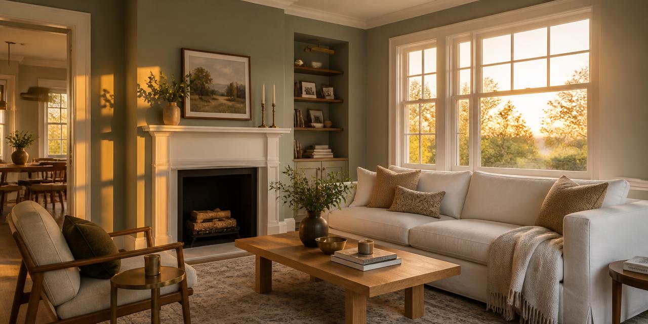
Best Paint Colors for a West-Facing Room: The Direct Answer
What are the best paint colors for a west-facing room? The short answer: cool-leaning neutrals and gray-greens with a Light Reflectance Value between 55 and 65. The top performers are Sherwin-Williams Sea Salt (#B2CBC3, LRV 63), Sherwin-Williams Repose Gray (#C2BDB5, LRV 58), Benjamin Moore Gray Owl (#CDD1CA, LRV 60) and Benjamin Moore Quiet Moments (#C3CACF, LRV 63). If you want drama rather than balance, Oyster Bay (#7E9E8C, LRV 44) and Evergreen Fog (#8B9E89, LRV 30) deepen gorgeously as the sun drops. And when you simply want a safe white, White Dove (#F3EFE0) never tips orange.
West-facing rooms are the trickiest exposure in the house — not because the light is bad, but because it is two entirely different lights. For most of the day the room is dim and cool, lit only by indirect north-and-south bounce. Then, for roughly one to two hours before sunset, it is flooded with the most saturated, golden-orange light nature produces. A paint color has to pass both auditions.
Why West-Facing Light Is Unique
Most orientation guides treat light as a single constant. West-facing rooms break that assumption in three ways.
1. The morning is cool and underlit. Until early afternoon, a west-facing room receives no direct sun at all. Colors read muted, slightly gray, and a shade darker than the chip suggested. This is why very dark or very low-LRV paints can make a west room feel gloomy for two-thirds of the day.
2. The evening amplifies warmth dramatically. Low-angle sunset light travels through far more atmosphere, which strips out blue wavelengths and leaves a strongly warm, orange-gold beam. That beam does not just illuminate your paint — it adds pigment to it. Any yellow, peach or red undertone hiding in the formula gets multiplied.
3. The shift happens fast. The golden window is short and intense. A wall that reads as an elegant greige at 2 PM can read as an unmistakable peach at 7 PM. This is the single most common west-facing paint regret, and it is entirely predictable once you know to look for it.
The practical rule that follows: LRV 55 to 65 is the sweet spot. High enough to keep the dim morning hours bright and livable, low enough that the evening sun does not blow the wall out into a glare. Below LRV 45 you are choosing drama on purpose; above LRV 70 you risk an uncomfortable evening flare.
Two Strategies: Balance or Amplify
Every successful west-facing scheme commits to one of two philosophies. Mixing them produces muddle.
Strategy 1 — Balance: Counteract the Golden Sun
Choose neutrals with a cool, green-gray or blue-gray bias. Their cool base absorbs the incoming warmth instead of compounding it. At noon they read as sophisticated, restful neutrals; at sunset the golden light neutralizes the coolness and the wall lands in perfect equilibrium. This is the low-risk path and the one most designers default to for living rooms, offices and bedrooms.
Balance colors: Sea Salt, Repose Gray, Gray Owl, Quiet Moments, White Dove.
Strategy 2 — Amplify: Lean Into the Glow
Instead of fighting the sunset, engineer the room around it. Deeper, earthier, saturated tones — gray-greens, clay, bronze, deep olive — look grounded and moody during the day, then ignite into something rich and cinematic during the golden hour. This works spectacularly in dining rooms, snugs and studies, which get their real use in the evening anyway.
Amplify colors: Oyster Bay, Evergreen Fog, and deeper earth tones paired with brass and wood.
The mistake to avoid sits between the two: warm yellow-based beiges such as Accessible Beige SW 7036. They look inoffensive on a chip and in a showroom, but west light finds the yellow and pushes the whole wall to peach or orange. If you want warmth, get it from an amplify color that owns its depth, not from a beige hoping to stay neutral.
The Best Paint Colors for a West-Facing Room: Full Breakdown
1. Sherwin-Williams Sea Salt (SW 6204) — #B2CBC3, LRV 63
A soft green-gray with a faint aquatic lean. Sea Salt is the quintessential balance color: its cool green base drinks up evening warmth without turning murky, while LRV 63 keeps the dim morning hours light and airy. In daylight it reads spa-like and serene; at sunset the green softens into something almost fog-colored.
- RGB: 178, 203, 195
- Best for: Bedrooms, bathrooms, living rooms
- Pair with: Creamy whites, driftwood, natural linen, aged nickel
2. Sherwin-Williams Repose Gray (SW 7015) — #C2BDB5, LRV 58
A true cool greige — enough warmth to feel hospitable, enough gray to resist the sunset. Where a yellow-based beige tips peach, Repose Gray merely warms a half-step, landing as a soft, flattering taupe in the evening. LRV 58 sits dead center in the west-facing sweet spot.
- RGB: 194, 189, 181
- Best for: Open-plan living, hallways, whole-house neutral schemes
- Pair with: Alabaster trim, charcoal textiles, warm gold hardware
3. Benjamin Moore Gray Owl (OC-52) — #CDD1CA, LRV 60
A light blue-gray with a green whisper. Gray Owl is the most direct counterweight to orange light on this list — blue sits opposite orange on the color wheel, so the incoming golden beam literally neutralizes the wall rather than tinting it. Ideal when you want crisp clarity rather than softness.
- RGB: 205, 209, 202
- Best for: Home offices, kitchens, laundry and utility spaces
- Pair with: Crisp white trim, navy cabinetry, white oak
4. Benjamin Moore Quiet Moments (1563) — #C3CACF, LRV 63
A gentle gray-blue-green that behaves like a chameleon in the best way. It holds its cool composure through the underlit morning, then accepts a warm glaze at sunset without ever shifting to peach. One of the most reliable bedroom colors for western exposure.
- RGB: 195, 202, 207
- Best for: Bedrooms, nurseries, guest rooms
- Pair with: White Dove trim, pale wood, soft grays, muted lavender accents
5. Sherwin-Williams Oyster Bay (SW 6206) — #7E9E8C, LRV 44
Sea Salt's deeper, moodier sibling. At LRV 44 it accepts the amplify strategy: daytime it reads as a confident, slightly weathered gray-green; in the golden hour it deepens and warms into something closer to a forest bronze. Excellent for rooms you inhabit after work.
- RGB: 126, 158, 140
- Best for: Dining rooms, studies, accent walls
- Pair with: Off-white trim, brass, walnut, terracotta accents
6. Sherwin-Williams Evergreen Fog (SW 9130) — #8B9E89, LRV 30
The most dramatic option here. A gray-green sage that is quiet, almost slate-like in flat morning light and then becomes genuinely rich at low sun. LRV 30 means you must commit: this room will feel cocooning rather than bright. In a west-facing dining room or library, that is exactly the point.
- RGB: 139, 158, 137
- Best for: Dining rooms, libraries, powder rooms, cabinetry
- Pair with: Warm brass, natural oak, cream, black accents
7. Benjamin Moore White Dove (OC-17) — #F3EFE0
The safe white. White Dove carries the smallest possible amount of warmth — enough to avoid the clinical chill of a pure blue-white in the dim morning, not enough for the sunset to push it orange. This is the default trim and ceiling color for every palette below.
- RGB: 243, 239, 224
- Best for: Trim, ceilings, whole-room bright schemes
- Pair with: Everything on this list
Colors to Avoid in a West-Facing Room
- Yellow-based beiges (Accessible Beige SW 7036 and its relatives): the classic peach-at-7pm failure.
- Warm-based whites with cream or buttery undertones: they turn distinctly yellow in the golden hour.
- High-LRV brilliant whites over 80: they can glare uncomfortably during the sunset window.
- Very dark warm browns in a room used mainly during daytime: the morning is already underlit.
Room-by-Room Guide
Living room. You need a color that is welcoming at 10 AM and gracious at 7 PM. Repose Gray and Sea Salt are the safest large-surface choices; both hold their character across the full light cycle. Keep trim in White Dove so the sunset has nothing yellow to grab onto.
Dining room. This is the room where the amplify strategy earns its keep — you use it in the evening, so design for the evening. Evergreen Fog or Oyster Bay with brass fixtures and natural wood delivers a genuinely atmospheric space when the low sun hits.
Home office. Focus benefits from cool light, and west rooms give you the opposite in late afternoon. Counteract with Gray Owl or Quiet Moments, add navy accents, and avoid anything warm. Position the desk so the setting sun is not directly on your screen.
Bedroom. Soft blue-greens and muted lavenders read restful in the dim morning and glow gently at sunset. Quiet Moments and Sea Salt are the two strongest picks. Mid-to-high LRV here matters: a dark bedroom in a west-facing room is dark for most of the waking day.
Data Table: West-Facing Room Color Reference
| Room/Space | Color Name | Brand + Code | HEX | Why It Works |
|---|---|---|---|---|
| Bedroom / Bath | Sea Salt | Sherwin-Williams SW 6204 | #B2CBC3 | Cool green base absorbs evening warmth; LRV 63 keeps mornings bright |
| Living / Open plan | Repose Gray | Sherwin-Williams SW 7015 | #C2BDB5 | True cool greige; sunset warms it softly instead of tipping peach |
| Home office | Gray Owl | Benjamin Moore OC-52 | #CDD1CA | Blue-gray sits opposite orange, neutralizing golden light |
| Bedroom | Quiet Moments | Benjamin Moore 1563 | #C3CACF | Holds cool in the morning, gentle glow at sunset |
| Dining / Study | Oyster Bay | Sherwin-Williams SW 6206 | #7E9E8C | Deeper gray-green that visibly deepens in evening light |
| Dining / Library | Evergreen Fog | Sherwin-Williams SW 9130 | #8B9E89 | Dramatic sage; richest and most saturated at low sun |
| Trim / Ceiling | White Dove | Benjamin Moore OC-17 | #F3EFE0 | Creamy but restrained — never tips orange |
Four Complete West-Facing Palettes
Palette 1: "Spa Calm" (Bedroom or Bathroom)
- Walls: Sea Salt #B2CBC3
- Trim & ceiling: White Dove #F3EFE0
- Materials: Driftwood, natural linen, woven seagrass
- Metals: Brushed nickel or unlacquered brass
The definitive balance scheme. Cool and restorative through the flat morning, quietly luminous when the sun drops.
Palette 2: "Sophisticated Greige" (Living Room)
- Walls: Repose Gray #C2BDB5
- Trim: Alabaster
- Accents: Charcoal upholstery, warm gold hardware
- Materials: Wool, leather, pale oak
A neutral that behaves at every hour. The charcoal anchors the morning dimness; the gold hardware catches the sunset instead of the walls.
Palette 3: "Moody Evening" (Dining Room)
- Walls: Evergreen Fog #8B9E89
- Trim: Soft off-white
- Accents: Warm brass lighting, natural wood table
- Materials: Velvet, stoneware, candlelight
Pure amplify strategy. Designed to peak exactly when you sit down to eat.
Palette 4: "Cool Focus" (Home Office)
- Walls: Gray Owl #CDD1CA
- Trim: Crisp white
- Accents: Navy shelving or a navy desk
- Materials: White oak, matte black fittings
Keeps the room mentally cool even when the afternoon light turns hot.
Practical Designer Tips
- Test at two times, not one. Paint your sample and look at it at 9 AM and at 6 PM. The evening reading is the one that decides. A color that survives both is the right color.
- Use large peel-and-stick samples. A 2-inch chip cannot show you undertone shift. Use A4-or-larger samples and move them between the sunlit and shaded walls.
- Stay mid-to-high LRV unless you are committing. LRV 55 to 65 prevents the morning gloom that plagues west rooms. Go below 45 only when you want an evening-focused, cocooning space.
- Avoid warm-based whites. Trim and ceilings in a cream or buttery white will read yellow at sunset and drag the whole scheme with them. White Dove or a neutral white is safer.
- Choose matte or eggshell finishes. Lower sheen diffuses the intense low-angle afternoon light. A satin or semi-gloss wall in a west room can produce a distracting hot spot of glare.
- Check undertones deliberately. Hold each candidate against a sheet of pure white paper to expose hidden yellow, pink or green before the sunset does it for you.
- Let textiles carry the warmth. If you love a warm scheme, deliver it through rust cushions, terracotta ceramics and wood — surfaces small enough that amplification reads as richness rather than as a mistake.
Conclusion
So, what are the best paint colors for a west-facing room? Colors chosen for the hour you cannot control. The balance route — Sea Salt #B2CBC3, Repose Gray #C2BDB5, Gray Owl #CDD1CA, Quiet Moments #C3CACF — uses cool green and blue bias to neutralize the golden beam and stay true all day. The amplify route — Oyster Bay #7E9E8C and Evergreen Fog #8B9E89 — designs the whole room around that beam and rewards you with a space that peaks at dinner time. Either way, keep trim in White Dove #F3EFE0, hold your LRV between 55 and 65 unless you are deliberately going dark, and test every sample at sunset before you commit a gallon.
Ready to build your own west-facing palette? Try the free Coloracci AI Palette Generator to generate harmonious combinations around any of these colors — with exact HEX codes, psychology insights, and export-ready palettes.
Related Resources
- Best Paint Colors for a North-Facing Room — warming up the coolest exposure
- Best Colors for an East-Facing Room — the mirror-image problem, solved
- Best Color Combinations for a South-Facing Room — designing for all-day warm light
- How to Identify Paint Color Undertones — the skill that prevents every peach-at-sunset surprise