Best Color Combinations for a South-Facing Room: A Designer's Guide
· Coloracci Team
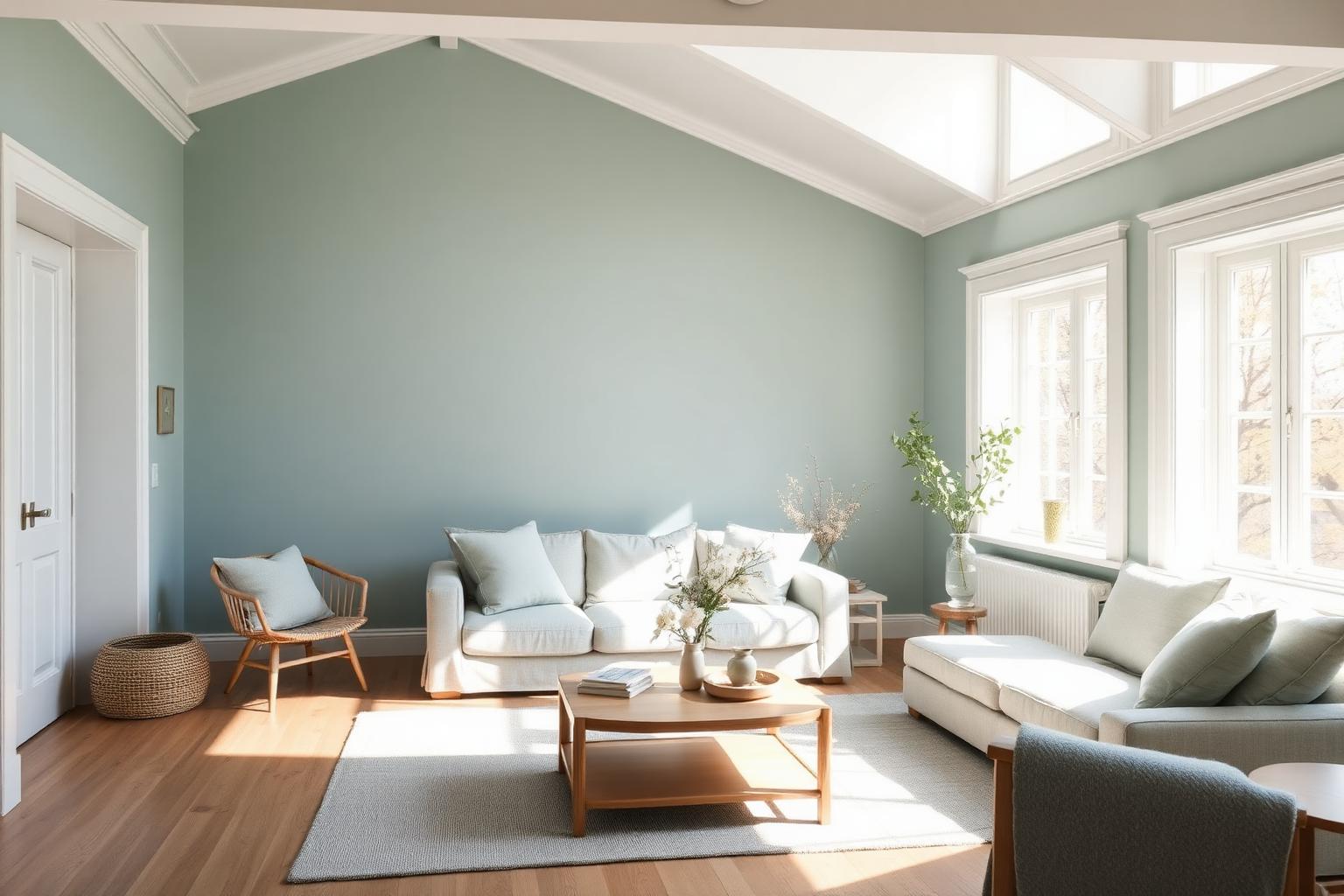
If your walls glow amber all afternoon, wash out into a hot yellow at noon, or make every "cool" gray you try look faintly beige — welcome to south-facing life. The best color combinations for a south-facing room are almost the mirror image of what works in a north-facing space. You have generous, warm, direct sunlight for most of the day, and your job as a designer is not to add warmth but to balance it, so the room reads as fresh, spacious, and calm instead of overheated.
South-facing rooms (in the Northern Hemisphere) receive direct sunlight from mid-morning through late afternoon. That light is naturally warm, biased toward gold and amber, and it amplifies every warm undertone in your paint. A "greige" that looks perfectly neutral in the showroom will read pink-beige at 2 p.m. A crisp white can go butter-yellow. The strategy — used by Benjamin Moore's and Sherwin-Williams' color consultants alike — is to lean into cooler hues with blue, green, or gray undertones, and to reserve warm tones for accents rather than dominant walls. This guide gives you the exact HEX codes, four complete palettes, and the color psychology behind every choice.
Why the Best Color Combinations for a South-Facing Room Skew Cool
Before we get to swatches, understand the physics. Sunlight coming from the south hits the room at a high, direct angle and carries a warm color temperature — think 3,000–4,500 K depending on the hour. That warm light does three predictable things to paint:
- It amplifies warm undertones. Reds, oranges, yellows, and pinks intensify. A soft beige becomes noticeably peach. A "warm white" turns cream.
- It flattens cool undertones just enough to keep them from turning icy. This is a gift: pale blues, greens, and gray-greens that would look frigid in a north-facing room become soft, atmospheric, and serene here.
- It boosts value and saturation. Colors read about half a shade brighter than the chip. That means you can pick a deeper, more pigmented cool color than you might otherwise dare — the sunlight will lift it.
The design solution is simple: choose cool-leaning hues as your dominant surfaces (walls, large upholstery, rugs) and let the natural warm light do the balancing. Warm colors still belong in the room — just as accents in art, throws, wood tones, and metallics.
Strategy 1: Cool, Airy Whites and Gray-Whites
The single biggest mistake in a south-facing room is defaulting to a "warm" white. In direct sun it will read yellow every time. Instead, choose whites with a faint gray, blue, or green undertone — they read as clean white under warm light rather than tipping into cream.
Best Whites for a South-Facing Room
- Decorator's White (BM CC-20)
#F6F7F2— A crisp, neutral white with just enough cool green in the base to stay clean under bright southern light. Ideal for trim, ceilings, and gallery-style walls. - Chantilly Lace (BM OC-65)
#F4F4EC— Slightly softer than Decorator's White, still cool-leaning, works beautifully as an all-over wall color where you want maximum brightness without glare. - Pure White (SW 7005)
#EDECE6— Sherwin-Williams' most versatile cool-white, popular in modern farmhouse and minimalist south-facing kitchens.
Pair these whites with warm oak or walnut floors, brass hardware, and cream textiles — the wood and metal supply the warmth so the walls don't have to.
Strategy 2: Soft Blues and Blue-Greens
Cool paint colors for south-facing rooms almost always start with the blue family. In a north-facing room these hues can feel cold, but in south sun they turn atmospheric, coastal, and calming. This is where south-facing rooms shine.
Best Blues and Blue-Greens
- Palladian Blue (BM HC-144)
#D0D9D0— A soft, airy blue-green that reads almost as a pale seafoam in warm light. Beloved by designers for south-facing bedrooms and living rooms because it never turns saccharine or cold. - Constellation (BM AF-540)
#D6E0E3— A cool, refreshing light blue with just a whisper of gray. Excellent in bathrooms and home offices where you want focus. - Tradewind (SW 6218)
#D6DFE1— A breezy coastal blue with a barely-there green cast. Reads as a clean, restful "sky" tone in sunny rooms. - Wickham Gray (BM HC-171)
#CED2C9— Technically a gray, but with soft blue-green undertones that make it behave like a chameleon: gray on cloudy days, cool sage in full sun.
These four hues are the workhorses of the south-facing palette. All four read as fresh and calm because the room's warm light neutralizes their coolness rather than exaggerating it.
Strategy 3: Green-Grays and Sage
Green is the most restful color for the human eye, and gray-greens are the second pillar of the best color combinations for a south-facing room. They connect indoors to the garden view many south-facing rooms enjoy, and they stay balanced under intense sunlight.
Best Green-Grays
- Sea Salt (SW 6204)
#DAE0D9— Sherwin-Williams' most-requested green-gray neutral. Barely green in shade, a soft coastal sage in full sun. - Comfort Gray (SW 6205)
#CFD6CC— A shade deeper than Sea Salt, with more visible green. Works beautifully in south-facing dining rooms and libraries. - Gray Owl (BM OC-52)
#D4D5CD— A light, warm gray that reads cooler under southern light — a great example of why swatches must always be tested in situ. Pairs seamlessly with white trim and warm wood.
Strategy 4: Warm Neutrals — With a Caveat
You can use warm neutrals in a south-facing room, but treat them as supporting players, not the star. In heavy sun they can push toward yellow, peach, or pink.
- Agreeable Gray (SW 7029)
#D3CDC6— A versatile greige that stays balanced in most south-facing rooms as long as it isn't the only warm color competing with sunlight. Works best on a single feature wall or in an open-plan zone that borders a cooler space.
Reserve richer warm accents — terracotta, mustard, ochre, burnt sienna — for pillows, art, ceramics, and area rugs. They will echo the sunlight rather than fight it.
Four Complete Palettes for South-Facing Rooms
Palette 1: Coastal Serene (Living Room)
- Walls: Palladian Blue
#D0D9D0 - Trim & ceiling: Decorator's White
#F6F7F2 - Sofa: soft linen white
- Accents: warm oak coffee table, brass lamp, terracotta throw
This is the classic south-facing living room combination — cool blue-green walls balanced by warm wood and one carefully placed warm accent.
Palette 2: Modern Sage Kitchen
- Cabinets: Sea Salt
#DAE0D9 - Walls: Chantilly Lace
#F4F4EC - Island: Comfort Gray
#CFD6CC - Accents: unlacquered brass, warm white marble, walnut cutting boards
Green-gray cabinets in a bright south-facing kitchen read as sophisticated and calming without ever going cold.
Palette 3: Focus-Ready Home Office
- Walls: Constellation
#D6E0E3 - Trim: Pure White
#EDECE6 - Desk: natural white oak
- Accent chair: Wickham Gray
#CED2C9upholstery - Small accent: mustard yellow desk lamp
Cool blues promote focus and lower cognitive stress — perfect for a south-facing workspace flooded with productive daylight.
Palette 4: Sunlit Bedroom Retreat
- Walls: Wickham Gray
#CED2C9 - Ceiling: Decorator's White
#F6F7F2 - Bedding: crisp white
- Accents: soft sage green throw, pale rattan bench, warm woven baskets
A gentle green-gray envelope that stays serene from morning through sunset, with natural texture supplying the warmth.
Color Psychology: Why These Hues Work
The best color combinations for a south-facing room are not just physically balanced — they are psychologically optimized for the way people use bright, sunlit spaces. See our full breakdown in the warm vs cool colors theory guide.
- Blues — Calming, serene, and proven to promote focus and lower blood pressure. In a south-facing room, the abundant light keeps blues from feeling detached or clinical.
- Greens — Restful and restorative, the color the human eye focuses on with the least effort. Green-grays connect indoors to nature and reduce visual fatigue in bright rooms.
- Grays with cool undertones — Neutral, sophisticated, and calming. In south sun they read as elegant rather than dreary.
- Cool whites — Clean, spacious, and airy. They amplify perceived square footage — a benefit we explore in what color palette makes a room look bigger.
- Warm accents (used sparingly) — Add warmth, comfort, and human energy without overwhelming the room. Think 10–15 percent of the visual field, not 50.
Practical Designer & Homeowner Takeaways
- Always sample at the peak-light hour. Paint a 2×2 ft board (never the wall) and observe it at noon and again at 4 p.m. — the two moments when southern light is most intense.
- Avoid "warm" whites unless your room faces north. In south sun they turn yellow, cream, or peach. Choose whites with faint blue, green, or gray in the base.
- Use the 60-30-10 rule with cool dominance. Aim for roughly 60% cool-neutral (walls + large upholstery), 30% mid-tone cool or warm neutral (rugs, secondary furniture, cabinetry), and 10% warm accents (art, pillows, ceramics).
- Bring in matte and eggshell finishes. Glossy finishes bounce warm light and can create glare in a south-facing room. Flat, matte, and eggshell absorb and diffuse it.
- Balance with natural materials. Linen, oak, rattan, brushed brass, and stone add warmth without competing with your cool palette — this is exactly why the coolest paint colors still feel inviting in a well-styled south-facing room.
- Consider the opposite exposure too. If your south-facing room adjoins a north-facing space, think about how the two palettes will transition — you often want a shared neutral to bridge them.
Data Table: South-Facing Room Color Reference
| Item | Color | Hex | Color Name | Psychological Meaning |
|---|---|---|---|---|
| Trim / Ceiling | ⬜ | #F6F7F2 |
Decorator's White (BM CC-20) | Clean, spacious, honest |
| All-over wall | ⬜ | #F4F4EC |
Chantilly Lace (BM OC-65) | Airy, expansive, calm |
| Modern white | ⬜ | #EDECE6 |
Pure White (SW 7005) | Fresh, minimal, focused |
| Living room wall | 🟦 | #D0D9D0 |
Palladian Blue (BM HC-144) | Serene, coastal, balanced |
| Office wall | 🟦 | #D6E0E3 |
Constellation (BM AF-540) | Focus, clarity, calm |
| Kitchen accent | 🟦 | #D6DFE1 |
Tradewind (SW 6218) | Breezy, restful, coastal |
| Bedroom wall | ⬛ | #CED2C9 |
Wickham Gray (BM HC-171) | Restorative, quiet, adaptable |
| Cabinets | 🟩 | #DAE0D9 |
Sea Salt (SW 6204) | Nature, freshness, calm |
| Deeper green-gray | 🟩 | #CFD6CC |
Comfort Gray (SW 6205) | Grounded, sophisticated, restful |
| Warm neutral accent | ⬛ | #D4D5CD |
Gray Owl (BM OC-52) | Sophisticated, adaptable |
| Bridge greige | ⬛ | #D3CDC6 |
Agreeable Gray (SW 7029) | Warm, versatile, welcoming |
Conclusion: Design With the Light, Not Against It
The best color combinations for a south-facing room start from a single premise: the sunlight is already doing the warming for you. Your paint palette's job is to keep the room feeling clean, balanced, and calm across every hour of a bright day. Lean cool — into soft blues, gray-greens, and cool-white neutrals — reserve warm hues for accents and natural materials, and always test your samples in the exact sunlight the room receives.
Once you know the two or three cool anchors you love, the fastest way to build a full, harmonious palette around them is to hand them to an AI that understands undertone, saturation, and contrast. Drop your favorite south-facing HEX code into the Coloracci AI Palette Generator and instantly get complementary neutrals, warm accent options, and gradient-ready secondary tones — all tuned for the light your room actually receives.
Bright, sunlit rooms are one of the great gifts of residential design. Choose the right cool combinations, and yours will feel serene from sunrise to dusk.