Best Colors for an East-Facing Room: Harnessing the Morning Sun
· Coloracci Team
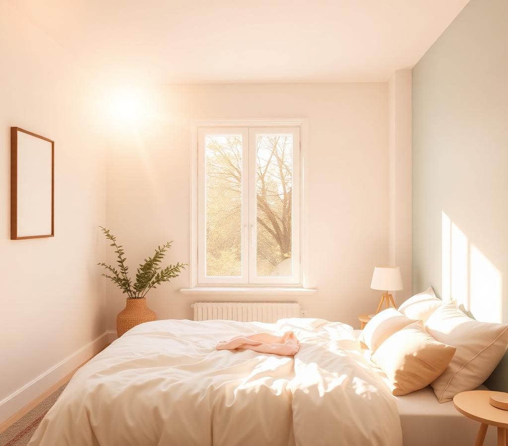
Best Colors for an East-Facing Room: The Direct Answer
What are the best colors for an east-facing room? The short answer: light, warm-leaning neutrals and soft cool hues with high Light Reflectance Values. East-facing rooms enjoy brilliant, golden morning sunlight that fades into cool, indirect blue light by early afternoon. The best performers are Benjamin Moore Ocean Air (#D3E1E1), a serene pale blue; Benjamin Moore Pleasant Pink (#EED4CE), a nurturing warm blush; Farrow & Ball Wimborne White (#F4F2E7), a softly warm off-white; and Sherwin-Williams Sea Salt (#CDD2CA), a mutable green-gray. These shades harness the morning sun beautifully and — critically — hold their character when the light turns cool and gray after midday.
East-facing exposure is one of the most demanding orientations in residential color design. Unlike south-facing rooms that bask in warm light all day, or north-facing rooms that deal with consistent coolness, an east-facing room experiences two completely different lighting personalities every single day. Choose a color that flatters only the morning, and your room will look flat and chilly every afternoon. This guide breaks down exactly how light behaves in eastern exposures, which colors thrive in both phases, and the palettes professional designers reach for.
Understanding East-Facing Room Lighting
Before choosing a single paint chip, you need to understand the two-act drama of east-facing room lighting:
Act 1 — Morning (6 AM to ~11 AM): Direct sunlight floods the room. This light starts warm and golden at sunrise, shifting toward bright, neutral white by mid-morning. Colors look vivid, saturated, and alive. Walls glow. This is when your room is at its most flattering.
Act 2 — Afternoon & Evening: The sun moves to the opposite side of the building. The room falls into indirect, cool-toned light with a distinctly blue-gray cast. Saturation drops. Warm colors survive this phase; stark whites and icy grays often look dull, shadowy, or flat.
The design implication is clear: your afternoon light is the constraint. A color that only works in morning sun is a half-day solution. The winning strategy is choosing shades with enough warmth or enough depth to carry the cool hours — which is precisely why the four research-backed colors below outperform generic "pretty" choices.
The Four Best Colors for an East-Facing Room
1. Benjamin Moore Ocean Air (2123-50) — #D3E1E1
Ocean Air is a light, neutral blue with balanced undertones and a high LRV of 71.84. That reflectance is the whole story: it bounces the abundant morning light around the room, amplifying the sunrise glow, and it keeps the space feeling airy rather than dim once the direct light departs.
In the morning, Ocean Air reads as a fresh, optimistic sky blue. In the afternoon, its neutral undertones prevent it from turning cold or clinical — it simply settles into a calm, misty gray-blue. Psychologically, it delivers serenity and spaciousness, making it an outstanding choice for color palette for east-facing bedroom applications, bathrooms, and home offices where calm focus matters.
- RGB: 211, 225, 225
- Best for: Bedrooms, bathrooms, home offices
- Pair with: Crisp white trim, warm oak floors, brushed brass accents
2. Benjamin Moore Pleasant Pink (2094-60) — #EED4CE
Pleasant Pink is the secret weapon of east-facing design. This gentle, light pink carries distinct warm undertones — and that warmth is precisely what counteracts the cool, blue-toned afternoon light that flattens so many eastern rooms. Where a stark white turns gray at 3 PM, Pleasant Pink stays soft, nurturing, and quietly optimistic.
Morning sun makes it glow like the inside of a seashell; afternoon shade turns it into a sophisticated, muted blush that never feels saccharine. This is one of the best warm neutrals for eastern exposure in the entire Benjamin Moore catalog, and it's remarkably versatile — reading as a near-neutral in adults' bedrooms, dining rooms, and living spaces.
- RGB: 238, 212, 206
- Best for: Bedrooms, dining rooms, nurseries, living rooms
- Pair with: Cream textiles, warm walnut, aged brass, soft sage accents
3. Farrow & Ball Wimborne White (No. 239) — #F4F2E7
If you want a white room, this is the white. Wimborne White is a soft off-white with a subtle yellow undertone, and that undertone is doing all the heavy lifting. Brilliant, blue-based whites look dazzling in the morning but turn flat, gray, and faintly depressing in afternoon shade. Wimborne White retains a gentle, creamy warmth throughout the entire day, making it the most reliable neutral for east-facing walls, ceilings, and trim.
It's the perfect backdrop for art, wood furniture, and layered textiles — clean without being sterile, timeless without being boring. For minimalist and Scandinavian-leaning interiors in eastern exposures, it is the professional default.
- RGB: 244, 242, 231
- Best for: Living rooms, kitchens, hallways, whole-room neutral schemes
- Pair with: Pale woods, linen, matte black accents, greenery
4. Sherwin-Williams Sea Salt (SW 6204) — #CDD2CA
Sea Salt is famously chameleonic — a soft green-gray with cool blue undertones that shifts personality with the light. In an east-facing room, that mutability becomes a feature rather than a bug. In bright morning sun, its green notes come forward, reading as a fresh, coastal sage. In the indirect afternoon light, it leans toward a subtle blue-gray, tranquil and misty.
Instead of fighting the room's daily light shift, Sea Salt dances with it. The result is a space that feels dynamic and interesting at every hour — never static, never flat. It's a top choice for bathrooms, bedrooms, and coastal-style interiors, and a masterclass in how light affects paint color.
- RGB: 205, 210, 202
- Best for: Bathrooms, bedrooms, coastal and transitional interiors
- Pair with: White subway tile, driftwood tones, woven textures, soft whites
Data Table: East-Facing Room Color Reference
| Item | Color | Hex | Color Name | Psychological Meaning |
|---|---|---|---|---|
| Serene Blue | ██████ | #D3E1E1 | Benjamin Moore Ocean Air | Calming, serene, airy |
| Warm Blush | ██████ | #EED4CE | Benjamin Moore Pleasant Pink | Nurturing, soft, optimistic |
| Warm Off-White | ██████ | #F4F2E7 | Farrow & Ball Wimborne White | Clean, gentle, timeless |
| Mutable Green-Gray | ██████ | #CDD2CA | Sherwin-Williams Sea Salt | Tranquil, natural, balanced |
| Accent Navy | ██████ | #2E3A4A | Sherwin-Williams Naval | Grounded, sophisticated |
| Earthy Sage | ██████ | #9CAF88 | Sage Green accent | Restorative, organic |
Three Designer Palettes for East-Facing Rooms
Palette 1: "Sunrise Serenity" (Bedroom)
- Walls: Ocean Air #D3E1E1
- Trim & ceiling: Wimborne White #F4F2E7
- Textiles: Pleasant Pink #EED4CE (duvet, cushions)
- Accent: Warm oak, brushed brass
This is the definitive color palette for east-facing bedroom design — cool and calming at night, glowing and warm each morning.
Palette 2: "Morning Light Minimalist" (Living Room)
- Walls: Wimborne White #F4F2E7
- Furniture: Natural linen, pale ash wood
- Accents: Sea Salt #CDD2CA (throws, ceramics), matte black
- Greenery: Abundant live plants
A Scandinavian-inspired scheme that maximizes morning brightness and stays warm through the afternoon shade.
Palette 3: "Coastal Dawn" (Bathroom)
- Walls: Sea Salt #CDD2CA
- Tile & fixtures: Crisp white, polished nickel
- Accents: Ocean Air #D3E1E1 (towels, accessories), driftwood
Spa-like tranquility that shifts from fresh green mornings to misty blue afternoons.
Color Psychology: What East-Facing Light Does to Mood
Morning light exposure is a documented regulator of circadian rhythm — and the colors surrounding that light shape the experience. Warm-leaning hues like Pleasant Pink amplify the sunrise's energizing, optimistic effect, making them ideal for rooms where you start the day. Cool, balanced hues like Ocean Air and Sea Salt support calm focus, perfect for meditation spaces and home offices that double as morning rooms.
The afternoon consideration is equally psychological: cool, flat light in a poorly chosen color scheme reads as gloomy. Choosing shades with warm undertones or high LRV is, in effect, choosing a better afternoon mood.
Colors to Approach with Caution in East-Facing Rooms
- Stark, blue-based whites (#FFFFFF): Brilliant at 8 AM, gray and lifeless by 2 PM.
- Cool blue-grays with no warmth: They compound the afternoon chill and can feel institutional.
- Very dark, saturated colors: They swallow the brief window of direct light and dominate the dim afternoons — unless dramatic moodiness is the explicit goal.
- Icy pastels without warm undertones: Lavenders and powder blues can turn steely after midday.
Practical Takeaways: Testing Before You Commit
- Paint large swatches (at least 12"×12") on two walls — one that gets direct morning sun, one that stays in shade.
- Observe at three fixed times: 8 AM, noon, and 4 PM. The 4 PM reading is the decisive one.
- Check undertones against pure white paper — a technique from our guide on identifying undertones — to reveal hidden pink, green, or blue biases before they surprise you.
- Consider sheen: an eggshell or satin finish reflects more of that precious morning light than matte, subtly extending the room's bright hours.
- Mind the trim: a warm white like Wimborne White on trim and ceilings harmonizes the whole scheme across both lighting phases.
Conclusion
So, what are the best colors for an east-facing room? Shades that celebrate the golden morning and survive the cool afternoon: the balanced serenity of Ocean Air (#D3E1E1), the nurturing warmth of Pleasant Pink (#EED4CE), the timeless softness of Wimborne White (#F4F2E7), and the chameleonic calm of Sea Salt (#CDD2CA). Choose for the afternoon constraint, and the morning will take care of itself.
Ready to build your own east-facing palette? Try the free Coloracci AI Palette Generator to generate harmonious combinations around any of these colors — with exact HEX codes, psychology insights, and export-ready palettes.
Related Resources
- Best Paint Colors for a North-Facing Room — strategies for the coolest exposure
- Best Color Combinations for a South-Facing Room — designing for all-day warm light
- How to Identify Paint Color Undertones — the skill that makes every swatch decision easier