Best Paint Colors for a North-Facing Room: Brighten Up Your Space
· Coloracci Team
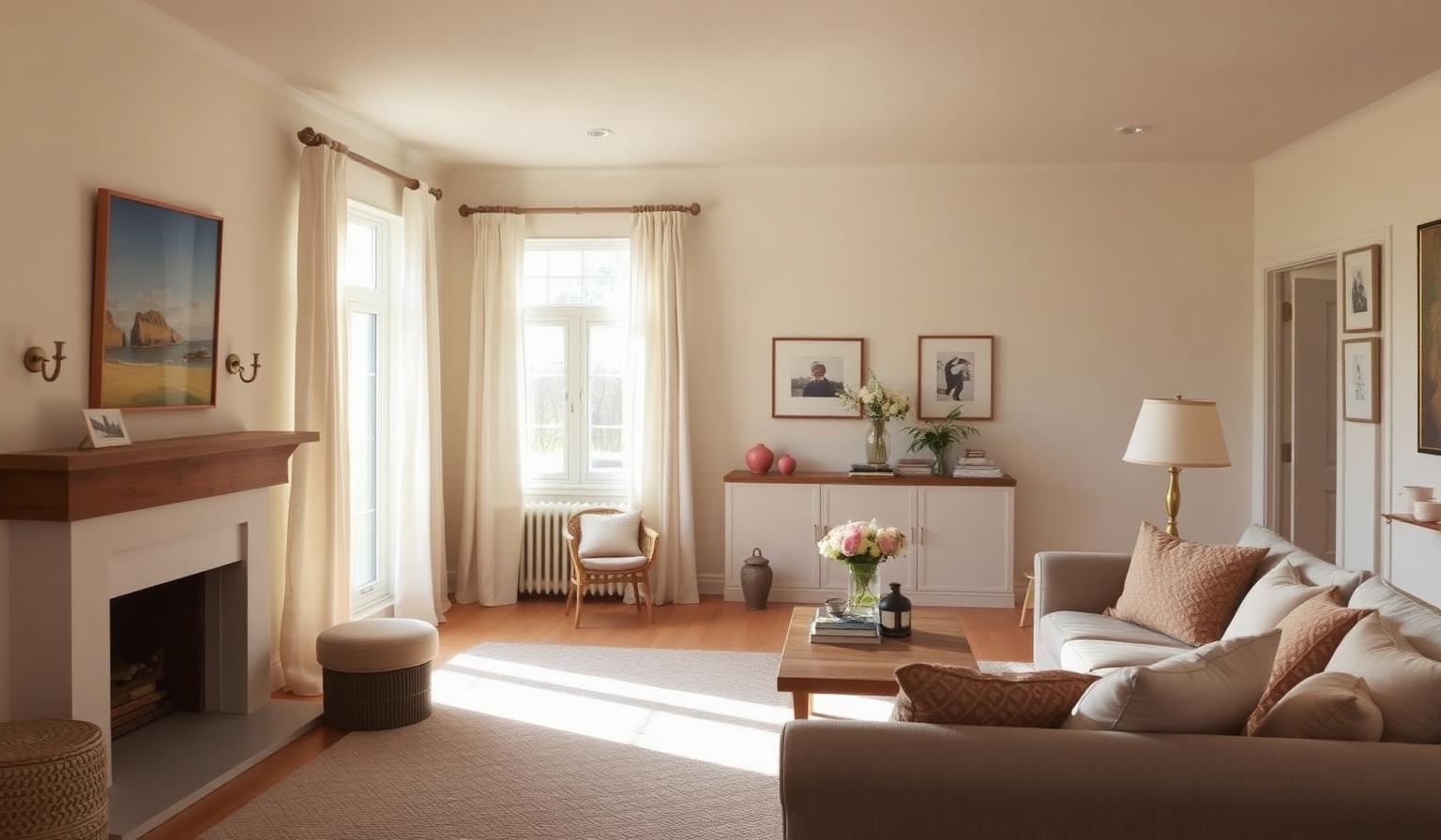
If you have ever painted a north-facing room a fresh, crisp white only to watch it turn gray, gloomy, and vaguely institutional by 3 p.m., you are not imagining things. The best paint colors for a north-facing room are almost never the ones that look brightest on the chip in the store — they are the ones engineered to fight the cool, blue-cast, indirect light that these rooms receive from morning until dusk.
North-facing rooms (in the Northern Hemisphere) never see direct sunlight. The light that enters is soft, ambient, and reflected off the sky, which biases it toward blue and gray. That is why cool grays turn dingy, pure whites look sickly, and pale blues can feel like a walk-in freezer. The strategy is straightforward: either counteract the cool light with warm, light-reflecting hues, or lean into the shadows and embrace a rich, dramatic, cocoon-like mood. This guide gives you both paths, with exact HEX codes, designer-approved combinations, and the color psychology behind every choice.
Why the Best Paint Colors for a North-Facing Room Behave Differently
Before we get to swatches, understand the physics. South-facing rooms bathe in warm, yellow direct sun. East rooms get warm morning light that cools by afternoon. West rooms glow amber at sunset. North-facing rooms get cool, constant, indirect light — think of it as looking through a soft blue filter all day.
That filter does two things to paint:
- It amplifies cool undertones. A gray with a blue base becomes noticeably chilly. A green with a blue base tips toward mint or aqua. A "warm" white with even a hint of gray reads as ash.
- It flattens value contrast. Colors look about half a shade darker and less saturated than they do in a sunlit showroom.
The design solution is either to inject warmth (Strategy 1) or to accept the low light and design around it with intentional depth (Strategy 2). Both work. Neither of them is stark white.
Strategy 1: Warm, Light & Bright Paint Colors for Rooms with Northern Exposure
This is the answer most homeowners want. If your goal is a bright, airy space that fights the gloom, you need warm whites, creamy off-whites, soft yellows, and pale peach or pink undertones. These are the workhorse warm paint colors for low-light rooms.
Benjamin Moore Navajo White (OC-95) — #F1E8D4
A creamy, buttery white with a soft yellow undertone. Navajo White is a classic for a reason: it reads as white in memory but as warm in real light, which is exactly what a north-facing room needs. It flatters skin tones, works with both traditional and modern furniture, and pairs beautifully with warm oak, brass, and linen. Psychology: inviting, classic, comforting.
Farrow & Ball Wimborne White (No. 239) — #F4F0E5
A soft, versatile off-white with a whisper of yellow. Wimborne White is the color designers reach for when a client says "white but not cold." It has enough warmth to survive a north window without ever tipping into cream. Psychology: calm, gentle, timeless.
Sherwin-Williams Alabaster (SW 7008) — #EDEAE0
Named Sherwin-Williams' Color of the Year for good reason, Alabaster is a balanced, soft white that avoids both the yellow trap and the icy trap. It reflects light generously without ever looking stark. It is one of the safest and most universally flattering answers to how to brighten a north-facing room. Psychology: peaceful, relaxing, sophisticated.
Benjamin Moore Weston Flax (HC-5) — #E4D7B2
A gentle, historic yellow that behaves like sunlight on the wall. In a north-facing kitchen or breakfast nook, Weston Flax literally simulates the warm morning light the room does not receive. Use it in rooms that feel dim by lunchtime. Psychology: cheerful, sunny, optimistic.
Farrow & Ball Setting Plaster (No. 231) — #E4D3C3
Dusty pink built on a yellow base — the color of aged Venetian plaster. Setting Plaster reads as a neutral in most light and a soft blush in bright light, which makes it magical in a cool north window. It is one of the most flattering wall colors ever made for portraits, photography, and human faces. Psychology: soft, warm, nurturing.
Benjamin Moore First Light (2102-70) — #F2E0D9
A rosy, airy pink named Benjamin Moore's Color of the Year in 2020. First Light is barely there — more of a warm glow than a "pink wall" — and it is one of the best paint colors for a north-facing bedroom because it counteracts the sallow effect of blue light on skin. Psychology: uplifting, tender, serene.
Strategy 2: Dark, Cozy & Dramatic Paint Colors for Rooms with Northern Exposure
Here is the counterintuitive truth: sometimes the best paint colors for a north-facing room are the darkest ones. If a room will never be bright, stop fighting it. Lean into the shadows and create a moody, intentional, enveloping space — a library, a study, a media room, a dinner-party dining room.
Dark colors in low light do not look "dark" the way they do in a bright room. They look rich. They absorb the cool cast instead of being ruined by it, and they turn a design problem into a design signature.
Benjamin Moore Hale Navy (HC-154) — #4F5A63
A timeless navy with gentle gray undertones. Hale Navy is one of the most popular designer picks for north-facing studies and dining rooms because it reads as sophisticated rather than aggressive. Pair with warm brass, cognac leather, and cream trim. Psychology: stable, sophisticated, dramatic.
Farrow & Ball Hague Blue (No. 30) — #2C3B40
Deep, dark, and slightly green — Hague Blue is the color of a lacquered library in a London townhouse. In a north-facing room it becomes almost black at night and a saturated ocean blue by day. Ideal for cabinetry, powder rooms, and small studies where drama is the point. Psychology: powerful, traditional, grounding.
Sherwin-Williams Iron Ore (SW 7069) — #4A4742
A very dark, soft charcoal gray with warm brown undertones. Iron Ore reads as "almost black" without the harshness of true black. It is a modern favorite for accent walls, exterior doors, and full-room treatments in north-facing dens. Psychology: bold, modern, secure.
The Two Winning Palettes
Combining the colors above gives you two turnkey schemes for a north-facing room.
Palette A — Warm & Luminous
- Walls: Sherwin-Williams Alabaster #EDEAE0
- Trim: Benjamin Moore Navajo White #F1E8D4
- Accent wall / built-ins: Farrow & Ball Setting Plaster #E4D3C3
- Textile accents: Benjamin Moore Weston Flax #E4D7B2
This is the palette for a light-filled living room, bedroom, or nursery. It is the most reliable way to make a cool room feel sunlit.
Palette B — Moody & Enveloping
- Walls: Farrow & Ball Hague Blue #2C3B40
- Trim: Benjamin Moore Navajo White #F1E8D4 (creamy contrast)
- Ceiling: Benjamin Moore First Light #F2E0D9 (a warm blush ceiling reflects a soft glow down)
- Metals: aged brass and antique gold
This is the palette for a study, home library, dining room, or media room. The warm cream trim keeps the dark walls from feeling oppressive, and the blush ceiling is a designer trick that quietly injects warmth without competing.
Color Psychology: Why Warmth Matters in Northern Exposure
Color psychology is not decorative theory — it is a measurable physiological response. Cool light and cool wall colors together lower a room's perceived temperature by several degrees, which is why north-facing rooms often feel "colder" even at the same thermostat setting. Warm hues on the wall trigger the opposite association: safety, hearth, dawn, human skin. That is why creams, blush pinks, and buttery yellows feel like a physical exhale in these rooms.
Dark, saturated colors work through a different mechanism. They create what psychologists call enclosure — the same reason candlelight and firelight feel intimate. In a room that will never sparkle with sunlight, embracing the shadow is emotionally honest, and the space rewards you with a specific, memorable mood that a bright white room can never achieve.
If you want to go deeper on how warm and cool tones interact, our warm vs. cool color theory guide breaks down the science and the design applications.
Colors to Avoid in a North-Facing Room
Every rule needs its "do not." In a north-facing room, avoid:
- Pure, stark whites (Decorator's White, Chantilly Lace at full strength). Without warm undertones, they look gray, hospital-cold, and slightly dirty in cool light.
- Cool grays with blue or green undertones. Repose Gray in the wrong light becomes lavender; Agreeable Gray can tip green. Test in your actual room, not the showroom.
- Very pale blues and pale greens. They read as chilly, damp, or "unfinished." Save these for east- or south-facing rooms where warm sun balances them.
- Cool taupes and greige with pink-blue undertones. They flatten into muddy purple under northern light.
For more on maximizing perceived light in dim spaces, see our companion guide on the best paint colors for a room with low natural light.
Practical Designer & Homeowner Takeaways
Six rules that separate a "great in the store, sad on the wall" mistake from a room you love:
- Always test with real paint, not a chip. Buy sample pots. Paint 2×2-foot squares on at least two different walls (one near the window, one across the room). Live with them for 48 hours.
- Look at the color at the darkest time of day. North-facing rooms are dimmest in late afternoon and on overcast days. If the color still looks good at 4 p.m. in November, it will look good all year.
- Use warm-white bulbs (2700K). Cool LED bulbs will fight even the best warm paint choice. Warm bulbs plus warm walls compound the effect.
- Paint the ceiling too. A dead-white ceiling can drag a warm wall color down. Try tinting the ceiling paint 25% of the wall color, or use First Light on the ceiling of a dark scheme.
- Bring in warm materials. Wood floors, brass hardware, jute rugs, linen curtains, and terracotta objects reinforce the warm-paint strategy on a physical level. See our guide on what color palette makes a room look bigger for how material and color choices multiply each other.
- Do not pick a color for the whole house. The same off-white will read as three different colors in your north-, south-, and east-facing rooms. Choose per room.
Data Table: The Complete North-Facing Room Paint Guide
| Item | Color | Hex | Color Name | Psychological Meaning |
|---|---|---|---|---|
| Warm White | #F1E8D4 | Benjamin Moore Navajo White (OC-95) | Inviting, classic, comforting | |
| Off-White | #F4F0E5 | Farrow & Ball Wimborne White (No. 239) | Calm, gentle, timeless | |
| Balanced White | #EDEAE0 | Sherwin-Williams Alabaster (SW 7008) | Peaceful, relaxing, sophisticated | |
| Soft Yellow | #E4D7B2 | Benjamin Moore Weston Flax (HC-5) | Cheerful, sunny, optimistic | |
| Dusty Pink | #E4D3C3 | Farrow & Ball Setting Plaster (No. 231) | Soft, warm, nurturing | |
| Rosy Blush | #F2E0D9 | Benjamin Moore First Light (2102-70) | Uplifting, tender, serene | |
| Navy Blue | #4F5A63 | Benjamin Moore Hale Navy (HC-154) | Stable, sophisticated, dramatic | |
| Deep Blue-Green | #2C3B40 | Farrow & Ball Hague Blue (No. 30) | Powerful, traditional, grounding | |
| Charcoal Gray | #4A4742 | Sherwin-Williams Iron Ore (SW 7069) | Bold, modern, secure |
Room-by-Room Application
- Living room: Alabaster walls + Navajo White trim + Setting Plaster on a fireplace wall.
- Bedroom: First Light walls + Wimborne White trim + brass sconces. Ideal for a north-facing primary suite.
- Kitchen: Weston Flax walls + Navajo White cabinets. Simulates morning sun where there is none.
- Home office / library: Hague Blue walls + Navajo White trim + built-in bookshelves in the same Hague Blue for a lacquer-cabinet effect.
- Dining room: Iron Ore walls + First Light ceiling + warm brass chandelier. Turns a dim north-facing dining room into a dinner-party destination.
- Bathroom: Setting Plaster walls + Navajo White trim + unlacquered brass fixtures.
Conclusion: Design With the Light You Have
The best paint colors for a north-facing room are chosen with intention, not habit. Reject the reflex to paint everything bright white. Instead, either honor the cool light with a warm, luminous palette (Alabaster, Navajo White, Setting Plaster, Weston Flax, First Light) or lean into the shadows with a rich, enveloping one (Hale Navy, Hague Blue, Iron Ore). Both approaches transform a room that "feels off" into a room that feels right.
The single biggest mistake homeowners make is picking a paint color without testing it in the actual room, at the actual time of day, under the actual light bulbs they use. Do that one thing and you will avoid 90% of paint regret.
Ready to design a full palette around your favorite north-facing paint color? Try the Coloracci AI palette generator — drop in a HEX code from this article and instantly build a coordinated wall, trim, accent, and textile palette that works with the light in your room. It is the fastest way to move from "I like this color" to "I have a complete, harmonious scheme I can hand to a painter."