What Colors Go With Rust in a Kitchen? A Designer's Guide
· Coloracci Team
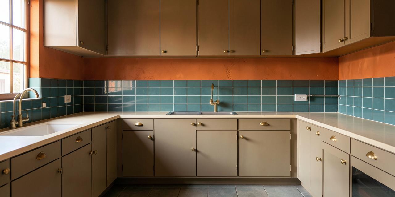
Rust is having a serious moment in kitchen design — and for good reason. So, what colors go with rust in a kitchen? The short answer: cool blue-greens like teal (#008080) and navy (#000080) create striking contrast, while earthy neutrals like cream (#FFFDD0), sage green (#B2AC88), and mustard yellow (#FFDB58) build a warm, grounded palette that feels straight out of nature. Rust (#B7410E) is a warm, earthy, slightly industrial color — reminiscent of autumn leaves, fired clay, and weathered metal — and it pairs beautifully with both moody, dramatic companions and soft, organic ones.
In this guide, I'll break down exactly which colors work with rust in a kitchen, why they work from a color-theory and psychology perspective, and how to combine them into real, livable kitchen schemes — from rust colored kitchen accessories to full terracotta kitchen ideas and industrial kitchen color schemes.
Understanding Rust: The Color Behind the Trend
Rust sits between burnt orange and terracotta on the color wheel — deeper than pumpkin, warmer than brick, and richer than copper. Its exact reference value, #B7410E, translates to a hue with strong red and orange undertones and just enough brown to keep it earthy rather than loud.
Psychologically, rust signals warmth, comfort, and authenticity. It evokes harvest season, handcrafted ceramics, and the patina of aged materials. In a kitchen — the most social room in most homes — that warmth translates directly into a welcoming, lived-in atmosphere. Unlike stark white or cold gray kitchens, a rust-accented kitchen feels instantly human.
The trade-off: rust is a dominant color. It absorbs light and commands attention, so the colors you pair with it determine whether your kitchen feels curated and designer-led, or heavy and dated. That's why the pairings below matter so much.
The Best Complementary Colors for a Rust Kitchen
On the color wheel, rust (an orange-red) sits directly opposite the blue-green family. These complementary pairings produce the highest contrast and the most dramatic, designer-favorite results.
Teal — #008080
Teal is rust's single best partner. The orange-blue contrast is the most naturally pleasing pairing in color theory (it's the same opposition cinematographers use in film color grading), and teal's green undertone keeps it feeling organic rather than synthetic.
- Where to use it: Teal backsplash tiles behind rust lower cabinets, a teal island against rust walls, or teal bar stools in an otherwise warm kitchen.
- The effect: Bold, contemporary, and endlessly photogenic. This is the pairing behind most viral rust kitchens on design platforms.
- Balance tip: Follow the 60-30-10 rule — let one color dominate (e.g., cream cabinets at 60%), use rust as the secondary (30%), and teal as the accent (10%).
Navy Blue — #000080
Navy is teal's moodier sibling. Where teal feels fresh and coastal, navy feels tailored, classic, and slightly formal — a perfect counterweight to rust's rustic warmth.
- Where to use it: Navy base cabinets with rust-colored walls or open shelving, navy range hoods, or navy-painted pantry doors.
- The effect: Sophisticated and grounded. Navy deepens rust's warmth instead of fighting it, making the whole kitchen feel intentional and high-end.
- Balance tip: Navy is dark and rust is saturated — anchor the scheme with plenty of cream or warm white on countertops and uppers so the room doesn't feel heavy.
Earthy and Analogous Pairings: Warm-on-Warm
If high contrast isn't your style, rust thrives in analogous schemes — palettes built from neighboring warm hues. This is the route to terracotta kitchen ideas and cozy, Mediterranean-inspired spaces.
Cream — #FFFDD0
Cream is the quiet workhorse of any rust kitchen. Its soft yellow undertone harmonizes with rust's warmth while reflecting enough light to keep the space airy.
- Where to use it: Cabinets, walls, countertops, and ceilings — anywhere you need breathing room around rust.
- The effect: Timeless and forgiving. Cream softens rust's intensity without sterilizing it the way a cold, blue-white would.
- Pro tip: Avoid stark pure white (#FFFFFF) next to rust — the cool undertone can make rust look muddy. Always choose a warm off-white.
Sage Green — #B2AC88
Sage green and rust are a match written by nature itself — think terracotta pots planted with herbs. Sage's muted, grayed-green cools the palette gently without the drama of teal.
- Where to use it: Sage upper cabinets with rust-colored tile, sage walls behind rust open shelving, or sage textiles and window treatments.
- The effect: Calm, organic, and quietly sophisticated — ideal for farmhouse, cottage, and organic-modern kitchens. For more on building around this hue, see our guide on what colors go with sage green walls.
Mustard Yellow — #FFDB58
Mustard amplifies rust's golden undertones and creates a retro-leaning, sun-drenched palette. It's a confident choice — a little goes a long way.
- Where to use it: Small appliances, pendant shades, dishware, or a single painted accent like a breakfast-nook bench.
- The effect: Cheerful, vintage, and energetic — very 1970s revival done right.
- Pro tip: Keep mustard to accessories and small surfaces; as a wall color next to rust it can tip the room into visual noise.
What Colors Go With Rust in a Kitchen? Four Designer Palettes
Here are four complete, ready-to-use schemes that answer the question in practical terms:
1. The Modern Contrast Kitchen Rust accent wall (#B7410E) + teal backsplash (#008080) + cream cabinets (#FFFDD0) + brushed brass hardware. High-impact and contemporary — the teal tile does the talking while rust warms the perimeter.
2. The Tailored Industrial Kitchen Rust lower cabinets (#B7410E) + navy uppers (#000080) + concrete-gray counters + matte black fixtures. This is the heart of industrial kitchen color schemes: warm metal tones against deep, structured color.
3. The Organic Mediterranean Kitchen Rust terracotta-look floor tile (#B7410E) + cream plaster walls (#FFFDD0) + sage green cabinetry (#B2AC88) + natural wood shelving. Soft, sun-baked, and timeless — a natural extension of the earthy industrial color palette philosophy.
4. The Retro Harvest Kitchen Rust walls (#B7410E) + mustard accessories (#FFDB58) + cream cabinets (#FFFDD0) + walnut open shelving. Warm-on-warm layering with a playful, vintage soul.
The Color Psychology of a Rust Kitchen
Understanding why these pairings work helps you adapt them to your own space:
- Rust + Teal/Navy: Cool tones psychologically "recede," which makes rust's warmth feel even cozier by contrast. Blue-greens also signal cleanliness and freshness — valuable associations in a room dedicated to food.
- Rust + Cream: Cream amplifies rust's associations with comfort, nourishment, and hospitality. This is the most appetite-friendly combination — warm neutrals are known to make dining spaces feel more inviting.
- Rust + Sage: Both colors are desaturated and nature-derived, producing calm and balance. This pairing lowers visual stimulation — ideal for open-plan kitchens that flow into living areas.
- Rust + Mustard: Analogous warm hues raise energy and optimism. Great for morning-focused spaces like breakfast nooks, but use restraint in kitchens you occupy all day.
The unifying thread: rust is emotionally warm and visually heavy, so every successful partner either cools it down (teal, navy, sage) or lightens it up (cream, mustard).
Practical Takeaways for Designers and Homeowners
- Start with accessories before committing. Rust colored kitchen accessories — kettles, utensil crocks, tea towels, pendant shades — let you test the color against your existing palette for almost no cost.
- Mind your lighting. Rust shifts dramatically: warm under incandescent and golden-hour sunlight, browner and flatter under cool LED. Sample it in your actual kitchen light at morning and evening before painting.
- Respect the 60-30-10 rule. Rust works best as either the 30% secondary (walls or one cabinet run) or the 10% accent (island, backsplash, accessories). It rarely succeeds at 60%.
- Choose warm whites, always. Cream (#FFFDD0) and warm off-whites harmonize; stark cool whites clash with rust's undertone.
- Repeat each color at least twice. A teal backsplash plus teal bar stools reads as a scheme; a single teal element reads as an accident.
- Borrow from adjacent rooms. If your kitchen opens to a living space with warm tones, echo them — the principles behind terracotta walls and furniture pairings translate directly to rust kitchens.
Quick Reference: Rust Kitchen Color Pairings
| Item | Color | Hex | Color Name | Psychological Meaning |
|---|---|---|---|---|
| Base | Rust | #B7410E | Rust / Burnt Orange | Warmth, earthiness, authenticity |
| Complement | Teal | #008080 | Teal | Freshness, balance, modern energy |
| Complement | Navy | #000080 | Navy Blue | Stability, sophistication, depth |
| Neutral | Cream | #FFFDD0 | Cream | Comfort, light, hospitality |
| Earthy | Sage | #B2AC88 | Sage Green | Calm, nature, organic balance |
| Accent | Mustard | #FFDB58 | Mustard Yellow | Optimism, warmth, retro energy |
Conclusion: Build Your Rust Kitchen Palette
So, what colors go with rust in a kitchen? The designer's answer is a choice between two moods: cool contrast — teal and navy for drama and modernity — or warm harmony — cream, sage, and mustard for earthy, sun-baked comfort. Either way, rust (#B7410E) rewards restraint: give it room to breathe with warm neutrals, repeat your accent colors deliberately, and always test under your own lighting.
Ready to experiment? Try our AI Color Palette Generator — enter rust (#B7410E) as your base and instantly generate harmonious palettes, check contrast ratios, and export HEX codes for your painter, cabinet maker, or tile supplier. Your dream rust kitchen is one palette away.