What Color Furniture Goes With Terracotta Walls? A Designer's Guide
· Coloracci Team
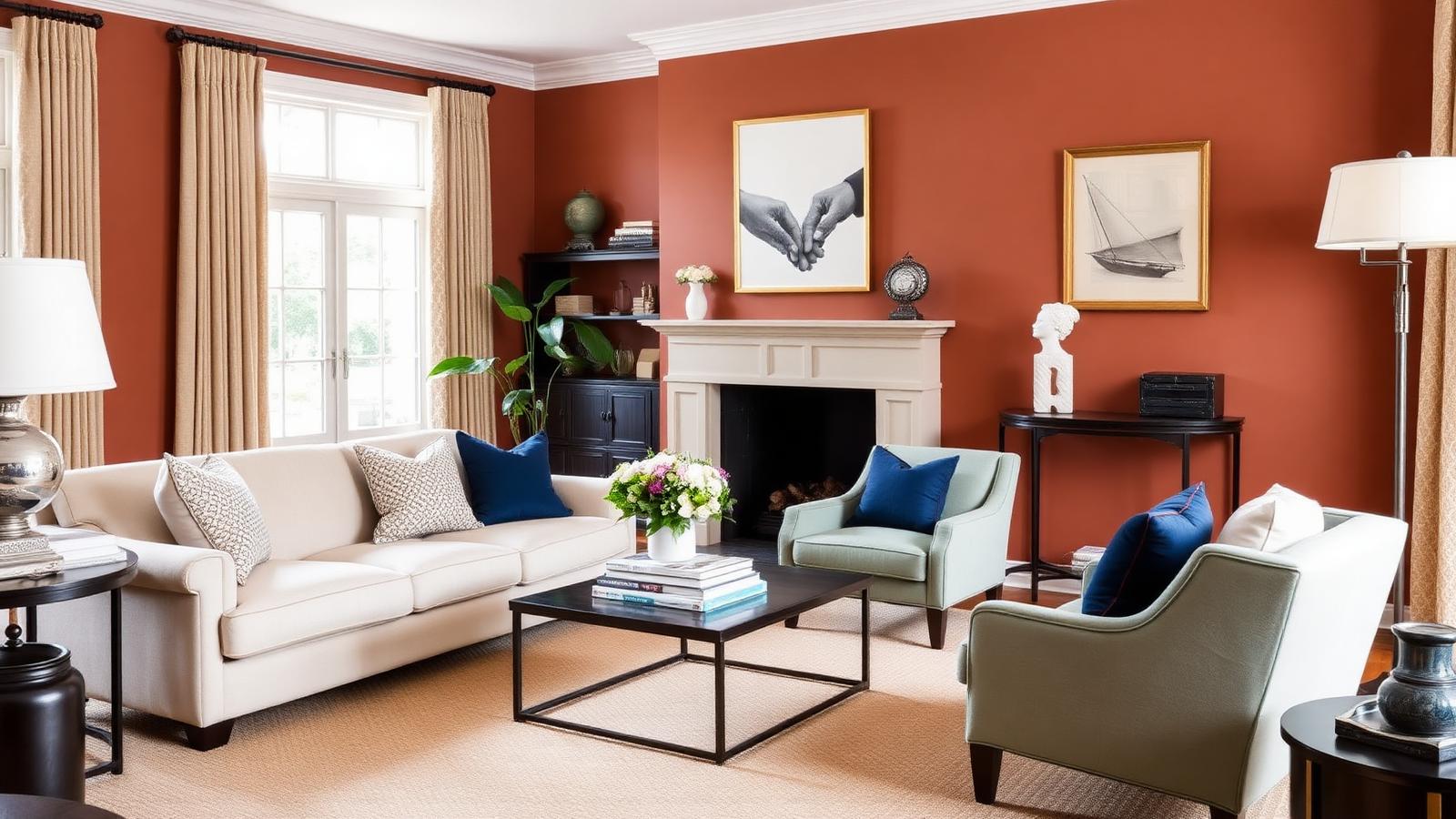
If you are asking what color furniture goes with terracotta walls, the short answer is this: cream and off-white for airiness, sage green for calm, navy blue for contrast, teal for eclectic energy, blush pink for softness, and charcoal or black for drama. Terracotta (#E2725B) is a warm, mid-value earth tone, which means it behaves less like a bold accent and more like a neutral with a pulse — it flatters almost any furniture color, provided you get the value and undertone right.
This guide breaks down each pairing with exact HEX codes, explains the color psychology behind why terracotta feels so grounding, and gives you the practical rules designers use to keep an orange-walled room feeling sophisticated rather than overheated.
Understanding Terracotta: The Base Color
Terracotta takes its name from the Italian for "baked earth" — the fired clay used for roof tiles, garden pots, and floor pavers for thousands of years. The canonical digital value is #E2725B, a soft red-orange sitting around hue 11° with roughly 68% saturation and 62% lightness.
Three properties define how it behaves on a wall:
It is a mid-value color. Terracotta is neither light nor dark. That means both lighter furniture (cream) and darker furniture (charcoal) read clearly against it. You rarely get the "furniture disappears into the wall" problem you face with beige or mid-gray walls.
Its undertone is warm but variable. Some terracottas lean pink-clay (#D98878), some lean burnt orange (#C75B39), and some lean brown-rust (#A0522D). Identify which direction your wall leans before choosing furniture — a pink-leaning terracotta pairs beautifully with blush and dusty rose, while a rust-leaning terracotta wants olive and brass.
It is highly reflective of ambient light. Terracotta bounces warm light around a room. In a south-facing space at golden hour, the walls will glow noticeably more saturated than the paint chip suggested. In north light, they read dustier and browner. Always test a large sample on the actual wall.
For the broader family of clay, ochre, umber, and olive shades that terracotta belongs to, our earth tone color palette guide covers the full spectrum and how these hues relate to each other.
What Color Furniture Goes With Terracotta Walls: The Six Core Palettes
1. Cream and Off-White — The Airy Default
Key HEX: Warm Cream #F3E2D2 · Soft Alabaster #F7F1E8 · Oat Linen #EADFCF
Cream is the safest and most flattering furniture color for terracotta walls. Because it shares terracotta's warm undertone, there is no clash — the two colors read as members of the same family, separated only by value. A cream linen sofa against a terracotta wall creates the sun-bleached Mediterranean look that has driven terracotta's popularity for the last decade.
Critically, avoid stark cool white (#FFFFFF). Pure white next to terracotta looks blue and clinical, and it makes the wall appear cruder and more orange by contrast. Choose whites with a yellow or pink bias instead.
Best for: Small rooms, rental apartments, anyone who wants terracotta walls to feel expansive rather than enclosing.
2. Sage Green — The Earthy Companion
Key HEX: Sage #B2AC88 · Muted Olive #8A9A5B · Eucalyptus #9CAF9A
Sage green sits nearly opposite terracotta on the color wheel but at a much lower saturation, which is exactly why it works. You get the energy of a complementary relationship without the vibration of a full-strength orange/green clash. The pairing also reads as deeply natural — clay and foliage are a combination the human eye has processed for the whole of our evolutionary history.
A sage velvet armchair, a set of olive-toned dining chairs, or a sage-painted sideboard all anchor a terracotta room with quiet confidence. If you want to understand the underlying mechanics of why opposing hues create this tension, our complementary colors designer's guide explains the 80/20 dominance rule that keeps these pairings elegant.
Best for: Living rooms and studies where you want calm rather than drama.
3. Navy Blue — The Sophisticated Anchor
Key HEX: Navy #000080 · Deep Indigo #1B263B · Prussian Navy #20334F
Navy is the strongest contrast play on this list and the one that most reliably makes a terracotta room look designed rather than decorated. Terracotta is warm and light-to-mid; navy is cool and very dark. That double contrast — temperature plus value — gives the eye a clear hierarchy to follow.
Use navy in weight, not in scatter: one navy sofa, one navy pair of armchairs, or a navy built-in bookcase. Navy sprinkled across ten small objects looks accidental. Navy in a single large mass looks intentional.
Best for: Formal living rooms, home offices, and any space that needs gravity.
4. Teal — The Bohemian Jewel
Key HEX: Teal #008080 · Peacock #00636B · Deep Turquoise #0E7C7B
Teal is navy's more extroverted cousin. Where navy anchors, teal energizes. The saturated blue-green sits opposite terracotta's red-orange with far more chroma than sage, producing the vivid, layered look associated with Moroccan, Mediterranean, and modern bohemian interiors.
Teal works best in medium doses — a velvet ottoman, a pair of accent chairs, a patterned rug threading teal through terracotta and cream. For a complete room scheme in this register, see our modern bohemian bedroom color palette.
Best for: Eclectic, layered, pattern-rich interiors.
5. Blush Pink — The Modern Softener
Key HEX: Blush #FADADD · Dusty Rose #D9A5A0 · Clay Pink #E8C4B8
Blush and terracotta are analogous — they sit beside each other on the wheel, sharing a red base. The result is a monochromatic-adjacent scheme with almost no tension, which reads as contemporary, soft, and slightly editorial. A blush boucle chair against a terracotta wall is one of the most photographed pairings in modern interior design for good reason.
The risk is flatness. Because the colors are so close, you must introduce value separation elsewhere — a walnut coffee table, black metal legs, or a deep charcoal rug will stop the scheme from turning into visual mush.
Best for: Bedrooms, dressing rooms, and creative studios.
6. Charcoal Gray and Black — The Contemporary Grounding
Key HEX: Charcoal #2F2A28 · Soft Black #1C1B1A · Graphite #3E3A38
Warm charcoal — note that #2F2A28 carries a brown bias rather than a blue one — grounds terracotta the way a picture frame grounds a painting. Black-framed windows, blackened steel shelving, charcoal upholstery, and dark stained wood all give the eye somewhere to rest.
Avoid cool blue-grays (#8E9AAF). Against terracotta they look dirty and slightly lilac. If you want gray, it must be warm.
Best for: Modern and industrial interiors, and any room with strong architectural lines worth emphasizing.
Complete Terracotta Furniture Color Reference Table
| Item | Color | Hex | Color Name | Psychological Meaning |
|---|---|---|---|---|
| Wall | #E2725B |
Terracotta | Warmth, comfort, connection to earth | |
| Sofa | #F3E2D2 |
Warm Cream | Openness, calm, spaciousness | |
| Armchair | #B2AC88 |
Sage Green | Balance, restoration, natural harmony | |
| Statement Sofa | #000080 |
Navy Blue | Authority, stability, trust | |
| Accent Ottoman | #008080 |
Teal | Creativity, vitality, individuality | |
| Accent Chair | #FADADD |
Blush Pink | Softness, approachability, intimacy | |
| Cabinetry / Frames | #2F2A28 |
Charcoal Gray | Sophistication, grounding, permanence | |
| Metals | #B08D57 |
Antique Brass | Craft, warmth, understated luxury | |
| Timber | #6E4B33 |
Walnut | Heritage, solidity, tactility |
The Color Psychology of Terracotta
Terracotta occupies a rare psychological position: it is a warm, energetic hue that nevertheless reads as calm. Pure orange (#FF7F00) is stimulating to the point of restlessness — it is used in fast food and clearance signage precisely because it accelerates the viewer. Terracotta is that same hue muted with brown and softened in saturation, which dampens the urgency and leaves the warmth behind.
The associations are physical and near-universal: sun-baked clay, unglazed pottery, brick, desert rock, roof tiles. These are materials of shelter and permanence. Rooms painted in terracotta consistently test as feeling cozier and safer than rooms in equivalent-value neutrals, and people report perceiving them as slightly warmer in temperature.
This is why furniture choice matters so much. Terracotta already supplies the emotional warmth of the room. Your furniture's job is to supply the missing register:
- Cream amplifies the calm and adds light.
- Sage adds restoration and lowers the room's overall arousal.
- Navy adds seriousness and prevents the space from feeling merely cozy.
- Teal adds creative energy and signals personality.
- Blush deepens the intimacy.
- Charcoal adds discipline and structure.
Choose based on what the room is for, not only on what looks good in a photograph.
Practical Takeaways for Designers and Homeowners
Apply the 60/30/10 split. Terracotta walls will typically account for the 60%. Give 30% to your dominant furniture color (cream, sage, or navy) and reserve 10% for a sharper accent (teal, brass, black). Skipping the 10% is the most common reason terracotta rooms feel unfinished.
Match undertone before you match color. A cream with a green undertone against a pink-leaning terracotta will look subtly wrong even though "cream goes with terracotta." Hold physical samples against the wall in daylight before committing.
Respect orientation. North-facing rooms drain warmth, so terracotta will read browner and heavier — lean into cream and blush furniture to lift it. South-facing rooms intensify terracotta, so navy, teal, or charcoal furniture will keep it in check.
Give the eye a dark anchor. Almost every successful terracotta room contains at least one genuinely dark element: black window frames, a walnut table, a charcoal rug, a dark bookcase. Without it the scheme floats.
Use texture as a second palette. Terracotta is a material as much as a color. Boucle, rattan, unglazed ceramic, jute, raw linen, and aged brass all reinforce the earthenware story and reduce the need for additional colors.
Keep the ceiling warm. A bright white ceiling above terracotta walls creates a hard, unflattering line. Choose an off-white with a hint of the wall color mixed in, or paint the ceiling a lighter tint of the terracotta itself.
Test at scale, not on a chip. Terracotta's saturation compounds across a large surface. A swatch that looks like a gentle clay can read as vivid orange across four walls. Paint a two-foot square and observe it across a full day.
Common Mistakes to Avoid
Pairing with cool gray. Blue-based grays (#A9AFB8) turn muddy and lifeless next to terracotta. Warm grays and greiges only.
Using pure white trim. It creates a chalky, high-contrast edge that makes the wall look cheaper. Warm the white.
Over-saturating. Terracotta walls plus a mustard sofa plus a rust rug plus burnt-orange curtains is not a scheme, it is a monotone. Every warm-dominant room needs a cool counterweight.
Ignoring the floor. Terracotta walls above orange-toned oak floors leave the room with no tonal break. Add a neutral rug — cream, jute, or charcoal — to separate the planes.
Conclusion
The answer to what color furniture goes with terracotta walls comes down to deciding what you want the room to feel like. Cream (#F3E2D2) opens it up. Sage (#B2AC88) calms it down. Navy (#000080) gives it authority. Teal (#008080) gives it personality. Blush (#FADADD) makes it intimate. Charcoal (#2F2A28) makes it modern. All six work because terracotta is a generous, near-neutral earth tone that shares warmth with almost everything and clashes with almost nothing except cold, blue-based grays and stark white.
Ready to build the exact scheme for your space? Use the Coloracci palette generator to enter your wall's precise terracotta HEX and generate harmonious furniture colors, complementary accents, and full tonal ranges in seconds — then export the codes straight to your designer, painter, or upholsterer.