Modern Bohemian Bedroom Color Palette: Your Complete 2026 Guide
· Coloracci Team
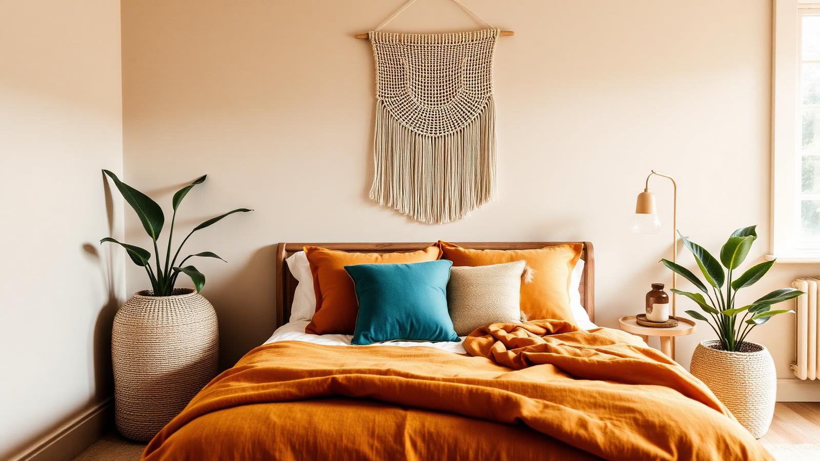
The Direct Answer: What a Modern Bohemian Bedroom Palette Actually Is
A modern bohemian bedroom color palette is built on a simple structural rule: two to three earthy base tones covering roughly 80% of the room, plus one or two saturated accents carrying the remaining 20%. The bases are almost always Cream (#F2E8D5), Sand (#C2B280) and Taupe (#483C32). The accents come from a short, disciplined list — Terracotta (#C36F4E), Mustard (#D4A017), Teal (#2A9D8F), Burnt Orange (#CC5500), Plum (#6A2E5D), Olive Green (#556B2F) and Rust (#B7410E).
That ratio is the entire difference between bohemian and modern bohemian. Traditional boho maximalism throws every saturated hue at the wall at once and relies on sheer abundance to hold it together. The modern interpretation keeps the same warm, well-traveled soul but edits ruthlessly: fewer colors, more texture, and a neutral envelope that lets each accent land as a deliberate decision rather than an accident.
This guide gives you every HEX code, four working palettes, the psychology behind each hue family, and the practical proportion rules designers use to keep the look warm rather than muddy.
The Complete HEX Reference for Modern Boho Bedrooms
Treat this as your vocabulary. Every palette later in the guide is assembled from these ten shades.
The Earthy Bases
- Cream —
#F2E8D5. A warm, yellow-leaning off-white. This is the correct boho white; a cool, blue-based white will fight every accent in the scheme and make natural fibers look gray. - Sand —
#C2B280. A dusty, mid-tone khaki. It behaves as a neutral but carries enough pigment to read as a color on large surfaces like walls or a wool rug. - Taupe —
#483C32. A deep, gray-brown anchor. Used on a headboard, a wardrobe or trim, it supplies the visual weight that keeps a light room from floating away. - Olive Green —
#556B2F. Technically a base, functionally a bridge. It sits comfortably beside every warm accent on this list and reads as "plant" to the eye even in a room with no plants in it.
The Warm Accents
- Terracotta —
#C36F4E. The signature modern boho hue: clay-red softened with brown. Warm without shouting, which is why it survives daily exposure in a bedroom. - Rust —
#B7410E. Terracotta's darker, more oxidized cousin. Better in small doses — cushions, a throw, ceramic — than across a full wall. - Burnt Orange —
#CC5500. The highest-energy shade in the family. Use it where you want a jolt: a single quilt, a pair of curtains, a piece of art. - Mustard —
#D4A017. Golden yellow with an earthy dampening. It performs the job white usually does — brightening — while staying inside the warm family.
The Cool Accents
- Teal —
#2A9D8F. Blue-green with a slightly gray undertone. The single most useful cool accent in boho because it is the direct visual opposite of terracotta. - Plum —
#6A2E5D. Deep, muted purple-red. It brings sophistication and depth, and it is the shade that most reliably makes a boho room feel adult rather than dorm-like.
Four Modern Bohemian Bedroom Color Palettes That Work
1. The Earthy Base Formula (Cream + Sand + Taupe)
This is the foundational modern bohemian bedroom color palette and the one to build first if you are starting from a blank room.
- Walls: Cream
#F2E8D5 - Large textiles (rug, bedding): Sand
#C2B280 - Anchors (headboard, dresser, trim): Taupe
#483C32 - Accent, 10% only: Terracotta
#C36F4E
The three neutrals share the same warm undertone, so they layer without visible seams. Because they differ mainly in value rather than hue, the room reads as calm and tonal, and a single terracotta cushion reads as a genuine focal point. If you are unfamiliar with how tonal neutral families behave together, our guide to the earth tone color palette covers the underlying undertone logic in depth.
2. Saturated Accents (Terracotta + Mustard + Teal on Cream)
The palette most people picture when they say boho, executed with restraint.
- Base 80%: Cream
#F2E8D5and Sand#C2B280 - Accent 1: Terracotta
#C36F4E - Accent 2: Mustard
#D4A017 - Accent 3, used sparingly: Teal
#2A9D8F
Terracotta and mustard are analogous — neighbors on the color wheel — so they harmonize automatically. Teal is roughly complementary to terracotta, which is exactly why it works: it supplies the contrast that stops an all-warm room from feeling like a sepia photograph. Keep teal to about 5% of visible surface. One cushion, one ceramic lamp base, one bound edge on a throw.
3. Soft Boho (Dusty Pinks + Tans)
The quieter, more romantic reading of the style, and the best choice for a small bedroom or one used primarily for sleep rather than work.
- Walls: Cream
#F2E8D5 - Textiles: Sand
#C2B280with a dusty rose derived from terracotta — take#C36F4Eand desaturate it toward#D9A796 - Accent: Plum
#6A2E5Din very small quantity
Soft boho works because it uses one hue family at multiple saturation levels rather than multiple hue families. The result is a room with obvious color identity and almost no visual noise — closer in spirit to a minimalist color palette than most people expect boho to get.
4. Modern Boho (Neutrals + Texture + Natural Materials)
The most contemporary interpretation, and the one that ages best.
- Envelope: Cream
#F2E8D5walls, Taupe#483C32structural elements - Color: Olive Green
#556B2Fas the only real hue - Everything else: material color — rattan, jute, unbleached linen, oak, terracotta clay, brass
Here the palette is deliberately thin because texture is carrying the load. Natural textures in interior design behave as colors that shift with the light: a jute rug is beige at noon and bronze at dusk. When you are working with only one or two pigments, the number of distinct surfaces in the room becomes the variable that determines whether it feels rich or empty. Aim for at least five: something woven, something rough, something smooth and matte, something with pile, and something reflective.
The Color Psychology Behind a Modern Bohemian Bedroom Color Palette
Earthy tones ground the room
Browns, tans and greens are the hues the human visual system evolved surrounded by. Environmental psychology consistently associates them with stability, safety and a felt connection to the natural world. In a bedroom — a room whose only functional requirement is that you can relax in it — that grounding effect is not decorative. Cream, Sand, Taupe and Olive lower the perceived stimulation of a space, which is precisely why they cover 80% of every palette above.
Warm accents supply energy and optimism
Terracotta, Burnt Orange, Rust and Mustard sit in the range associated with warmth, creativity and welcome. They raise a room's perceived temperature and its social openness. This is the free-spirited component of boho — the part that signals a room belonging to a person with a life, not a catalog. But energy is exactly what you don't want too much of at bedtime, which is the practical reason these hues are accents rather than field colors.
Cool accents add depth and sophistication
Teal and Plum do something the warm family cannot: they create tension. Both read as deeper and more considered than the warm accents, and both introduce a note of restrained luxury. Psychologically, they also cool the room's overall temperature back toward neutral, preventing the closed-in, overheated feeling that an all-warm bedroom can develop by the second week.
Item | Color | Hex | Color Name | Psychological Meaning
| Item | Color | Hex | Color Name | Psychological Meaning |
|---|---|---|---|---|
| Walls | Warm off-white | #F2E8D5 |
Cream | Openness, calm, a neutral canvas |
| Area rug | Dusty khaki | #C2B280 |
Sand | Warmth, natural grounding, softness |
| Headboard / dresser | Deep gray-brown | #483C32 |
Taupe | Stability, weight, quiet sophistication |
| Duvet or quilt | Clay red | #C36F4E |
Terracotta | Comfort, earthiness, welcome |
| Throw blanket | Golden yellow | #D4A017 |
Mustard | Optimism, creativity, brightness |
| Accent cushion | Blue-green | #2A9D8F |
Teal | Balance, depth, refreshment |
| Curtains | Vivid orange | #CC5500 |
Burnt Orange | Energy, sociability, vitality |
| Ceramics / vases | Oxidized red | #B7410E |
Rust | Age, craft, handmade authenticity |
| Velvet cushion or art | Muted purple-red | #6A2E5D |
Plum | Luxury, introspection, richness |
| Plants / upholstery | Muted green | #556B2F |
Olive Green | Nature, renewal, restfulness |
Practical Takeaways for Designers and Homeowners
Set the ratio before you shop. Decide your 80/20 split on paper first. Almost every failed boho bedroom fails the same way: accents accumulated one purchase at a time until they crossed 40% of the room and the neutrals stopped reading as a background. Our guide to adding color to a home walks through the room-by-room version of this discipline.
Test warm whites against your actual light. Cream #F2E8D5 reads clean and luminous in south-facing light and can drift yellow-green under warm LED bulbs. Paint a large sample board, move it around the room, and look at it at 8am, 2pm and 9pm before committing.
Limit yourself to two accent hues. Three is the maximum, and the third must be under 5% coverage. This single constraint is what separates modern boho from thrift-store chaos.
Buy texture, not more color. When a room feels flat, the instinct is to add another hue. The correct move is almost always to add another material: a bouclé cushion beside a linen one, a jute rug under a wool throw, a rough clay vessel beside glazed ceramic.
Anchor with something dark. Taupe #483C32 on a headboard, a wardrobe, a window frame or even a large piece of framed art gives the eye a resting point. Without it, light boho palettes read as unfinished.
Repeat every accent at least three times. A single mustard cushion looks like a mistake. Mustard in a cushion, a book spine on the nightstand and a thread in the rug looks like a scheme.
Conclusion: Build Your Palette Before You Buy Anything
The modern bohemian bedroom color palette is not a list of colors — it is a proportion. Cream, Sand and Taupe do the structural work; terracotta, mustard, teal and plum do the personality work; texture does the rest. Get the 80/20 balance right and almost any combination from the ten HEX codes above will hold together.
The fastest way to check a combination is to look at it before it exists in your room. Drop your base and accent HEX codes into the Coloracci palette generator to see how they distribute across a real layout, adjust the saturation until the accents feel like punctuation rather than shouting, and export the finished palette to take shopping.
Your bedroom should feel collected, warm and calm at the same time. That is entirely a question of ratio — and ratio is something you can decide in five minutes before you spend a single dollar.