Tesla Brand Colors: Complete Color Palette, Hex Codes & Psychology Behind the EV Giant's Visual Identity
· Coloracci Team
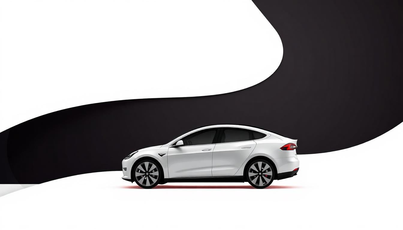
Tesla Brand Colors: Complete Color Palette, Hex Codes & Psychology Behind the EV Giant's Visual Identity
Tesla's visual identity is a masterclass in minimalist brand design. In an automotive industry dominated by chrome badges and busy color palettes, Tesla stripped everything back to a stark, futuristic aesthetic that mirrors its mission: accelerate the world's transition to sustainable energy. The result is one of the most recognizable and psychologically powerful brand identities of the 21st century.
Tesla's Primary Brand Color Palette
| Color Name | Hex Code | RGB | Usage |
|---|---|---|---|
| Tesla Red | #CC0000 | 204, 0, 0 | Primary brand accent, logo |
| Tesla Black | #000000 | 0, 0, 0 | Dominant brand color, UI |
| Tesla White | #FFFFFF | 255, 255, 255 | Background, contrast |
| Dark Charcoal | #171A20 | 23, 26, 32 | Website background |
| Silver Gray | #5C5E62 | 92, 94, 98 | Secondary text, accents |
| Light Gray | #F4F4F4 | 244, 244, 244 | Section backgrounds |
Why Tesla Chose Red as Its Signature Color
Tesla's red (#CC0000) is not the warm, inviting red of Coca-Cola or the energetic red of YouTube. It's a deep, engineering red — closer to the red of precision instruments and racing heritage. This specific shade communicates:
- Passion for innovation: Red is the color of disruption and bold vision
- Performance and speed: Subconsciously connects to motorsport heritage
- Urgency of mission: Climate action requires bold, immediate action
- Premium positioning: This specific red shade reads as luxury, not discount
Research in color psychology shows that red increases heart rate and creates excitement — exactly the emotional response Tesla wants when unveiling new vehicle models or technology features.
The Black & White Foundation
Tesla's heavy reliance on black and white creates what designers call "tech minimalism" — a visual language that says "we let our products speak for themselves."
Black (#000000 / #171A20)
- Dominates Tesla's website, app, and UI
- Creates a cinematic, premium feel — like an OLED screen
- Eliminates visual noise, focusing attention on the product
- Associates with sophistication, power, and the future
White (#FFFFFF / #F4F4F4)
- Vehicle configurator backgrounds — makes cars the hero
- Clean energy association — white = purity = sustainability
- High contrast against black creates maximum visual impact
- Apple-inspired design aesthetic that signals innovation
Tesla's Color Evolution: From Startup to Global Giant
| Era | Primary Colors | Design Philosophy |
|---|---|---|
| 2003-2010 | Red + Silver | Traditional automotive with tech edge |
| 2010-2017 | Red + White + Gray | Cleaner, Apple-influenced minimalism |
| 2017-2023 | Red + Black + White | Full dark mode, premium tech aesthetic |
| 2023-Present | Black + White (red accent) | Ultra-minimal, AI/autonomous focus |
Tesla's color evolution mirrors the broader trend toward digital-first brand design. As the company shifted from a car company to a technology platform, its palette became increasingly digital and screen-optimized.
How Tesla Uses Color Across Touchpoints
Website & App
The Tesla website is among the most minimal in the automotive industry — almost entirely black (#171A20) with white text and occasional red CTAs. This creates an immersive, cinematic experience that feels more like a movie trailer than a car configurator.
Vehicle Colors
Tesla's vehicle color options are deliberately limited (typically 5-6 options vs. 15+ for traditional automakers). This constraint:
- Simplifies the buying decision — reducing choice paralysis
- Creates production efficiency — aligning with Tesla's manufacturing philosophy
- Makes certain colors feel exclusive — Multi-Coat Red is Tesla's signature
Showroom Design
Tesla showrooms (called "galleries") use:
- White floors and walls: Gallery-like, not dealership-like
- Warm accent lighting: 3500K — warmer than typical retail
- Red accent details: Subtle nods to the brand color in signage and displays
Tesla vs. Competitors: Color Strategy Comparison
| Brand | Primary Color | Strategy | Personality |
|---|---|---|---|
| Tesla | Red + Black | Tech minimalism | Futuristic disruptor |
| BMW | Blue + White | Heritage pride | German precision |
| Mercedes | Silver + Black | Luxury authority | Timeless elegance |
| Porsche | Red + Black | Racing heritage | Performance luxury |
| Rivian | Orange + Green | Eco-adventure | Outdoor exploration |
| Lucid | Purple + Gray | Ultra-luxury tech | Quiet sophistication |
Design Lessons from Tesla's Color Strategy
- Constraint creates identity: Fewer colors = stronger recognition. Use the AI Color Palette Generator to find your minimal palette
- Dark mode communicates premium: Black backgrounds make products look expensive
- One accent color is enough: Tesla proves a single red accent can carry an entire brand
- Digital-first design: Design for screens, not print — as explored in our dark mode design guide
- Let products be the hero: Neutral backgrounds showcase what you sell
Recreating Tesla's Design Aesthetic
Want to capture Tesla's futuristic minimalism for your brand?
- Use the Color Contrast Checker to ensure your dark backgrounds maintain WCAG accessibility
- Try the Light/Dark Mode Generator to create Tesla-style dark interfaces
- Extract exact colors from Tesla's website using the Image Color Extractor
- Build a complete palette around your accent color with Color Harmony tools
Tesla's color strategy proves that in branding, less is dramatically more. By committing fully to a minimal palette, Tesla created a visual identity that's instantly recognizable, infinitely scalable, and perfectly aligned with its mission of technological elegance.
For more brand color analyses, explore our guides on Apple, Google, Nike, and Spotify.