Creating a Serene Color Palette for Your Meditation Room
· Coloracci Team
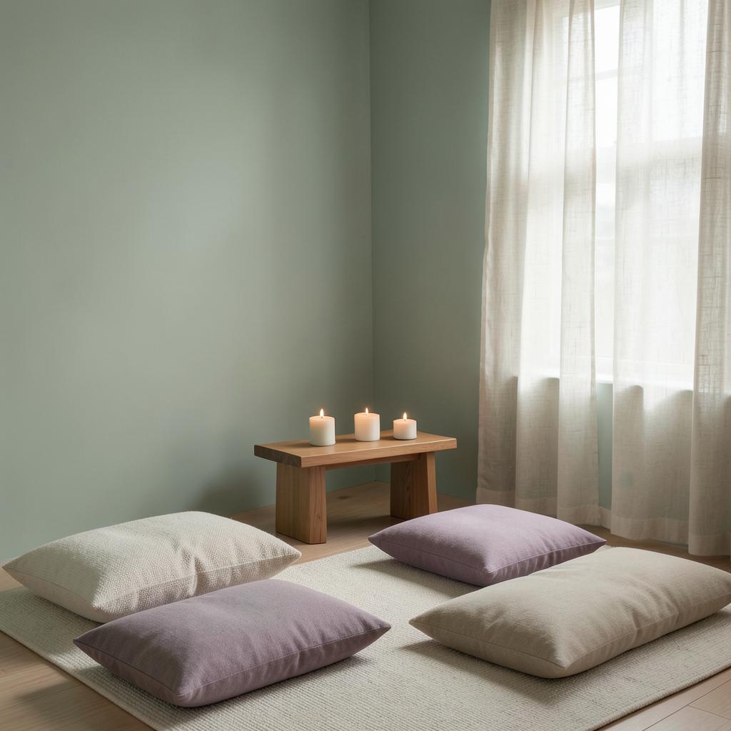
Creating a Serene Color Palette for Your Meditation Room
Learning how to create a serene color palette for a meditation room starts with one principle: every color should lower stimulation, not raise it. The most effective meditation spaces rely on muted, desaturated hues — sage greens (#9CAF88), warm whites (#FAF9F6), dusty lavenders (#C8B8D8), and soft earth tones (#C3B091) — applied in low-contrast layers that let the nervous system settle within seconds of entering the room. This guide gives you the exact HEX codes, palettes, and psychology to build that environment from scratch.
Unlike living rooms or home offices, a meditation room has a single job: support inward attention. That singular purpose makes color selection simpler in one way and stricter in another. There is no room for energizing accents, high-contrast feature walls, or trend-driven statements. Every swatch must earn its place by measurably reducing arousal — heart rate, cortisol, visual noise.
The Science of Serenity: How Color Calms the Nervous System
Color affects the autonomic nervous system through two channels: wavelength and association.
Wavelength effects. Long-wavelength colors (reds, oranges) measurably increase heart rate and blood pressure. Short-to-mid wavelength colors (blues, greens) do the opposite — research in environmental psychology consistently shows green environments reduce cortisol and slow respiration. This is why green sits at the core of nearly every meditation palette.
Associative effects. Colors carry learned meaning. Blue reads as water and sky — openness without threat. Soft violet connects to twilight, the day's natural transition toward rest. Warm neutrals echo sand, linen, and unbleached wool — materials the brain reads as safe and organic.
| Color Family | Hex Example | Nervous System Effect | Meditation Suitability |
|---|---|---|---|
| Sage / muted green | #9CAF88 | Lowers heart rate, reduces cortisol | Excellent — core palette color |
| Dusty blue | #A8C0CE | Slows breathing, cools perception | Excellent |
| Soft lavender | #C8B8D8 | Calms without sedating | Very good |
| Warm off-white | #FAF9F6 | Visual rest, light amplification | Essential base |
| Warm beige / oatmeal | #C3B091 | Grounding, organic safety | Very good |
| Muted terracotta | #C97C5D | Gentle warmth, earth connection | Good in small doses |
| Charcoal / deep indigo | #2F3645 | Depth, inward focus (dim zones) | Accent / floor zone only |
| Bright red / orange | #E63946 | Raises arousal, alertness | Avoid |
How to Create a Serene Color Palette for a Meditation Room: The 4-Step Method
Step 1: Choose a Calming Base (60% of the Room)
The base color dominates walls and large surfaces. For meditation rooms, base colors must be light-reflective but not stark — a Light Reflectance Value (LRV) between 60 and 80 is the sweet spot. Three proven options:
- Sage Mist (#B5C4A8): a grayed green that reads as foliage in soft light. Works in both north- and south-facing rooms because its gray component prevents it from turning sour in cool light.
- Warm Linen (#EFE9DD): an off-white with beige warmth. The safest choice — it disappears as a "color" and lets textiles and objects carry the palette.
- Pale Fog Blue (#C6D4DA): a whisper of blue that keeps small rooms feeling open while adding a perceptible coolness ideal for breathwork.
Step 2: Add a Secondary Grounding Tone (30%)
The secondary tone anchors the room — flooring, a low bench, large floor cushions, or one feature surface at sitting-eye level (since meditation happens on the floor, the visual center of gravity is lower than in any other room).
- Oak / honey wood (#C9A96A): warmth and craft; the natural color of exposed timber.
- Warm stone gray (#A69E93): permanence and weight without darkness.
- Muted clay (#C08B6D): an earthy midpoint between beige and terracotta that grounds without stimulating.
Step 3: Introduce One Contemplative Accent (10%)
The accent is where most meditation rooms go wrong — too bright, too large, or both. Keep the accent desaturated and small: a cushion, a singelling bowl cloth, a piece of art.
- Dusty lavender (#B4A4C8): twilight calm, crown-chakra association for practitioners who reference that system.
- Deep indigo (#3A4157): for the meditation cushion or a low cabinet — depth that draws the gaze inward.
- Soft moss (#7D8F69): a deeper green than the base, echoing forest floor.
Step 4: Audit Under Real Light
A serene palette fails if it only works at noon on the paint card. Test swatches on the wall and observe them at three moments: morning, midday, and the hour you actually meditate — for most people, dawn or dusk, when light is warm and dim. A color that reads as tranquil gray-green at noon can turn muddy olive at 6 a.m. For a full method on reading hidden hues, see our guide on how to identify paint color undertones.
Three Complete Serene Palettes
Palette 1: The Zen Minimalist
Built on near-neutrality — the closest a room can get to silence in color form. This is effectively a monochromatic color scheme built on warm gray.
| Role | Color Name | Hex | Application |
|---|---|---|---|
| Base (walls) | Warm Linen | #EFE9DD | All walls, ceiling |
| Secondary | Warm Stone Gray | #A69E93 | Floor cushions, bench |
| Accent | Dusty Lavender | #B4A4C8 | Single cushion, altar cloth |
| Trim | Pure Soft White | #FAF9F6 | Trim, door, ceiling edge |
Psychology: emptiness, spaciousness, zero visual demand. Best for experienced practitioners whose practice depends on minimal external reference, and for small rooms that need to feel larger.
Palette 2: The Forest Bath (Shinrin-Yoku)
Built on green's measurable physiological calm, layered with earth.
| Role | Color Name | Hex | Application |
|---|---|---|---|
| Base (walls) | Sage Mist | #B5C4A8 | Walls |
| Secondary | Oak Honey | #C9A96A | Wood floor, bench, altar |
| Accent | Soft Moss | #7D8F69 | Cushions, a single plant corner |
| Trim | Warm Cream | #F5F0E1 | Ceiling, window frames |
Psychology: nature immersion, breath support, restoration. Green requires the least retinal effort of any color, which is why this palette produces the fastest "drop" into a settled state. Best for breathwork, yoga-meditation hybrids, and rooms with a window facing greenery.
Palette 3: The Twilight Contemplative
Built for evening practice — cool, dim-adapted, inward.
| Role | Color Name | Hex | Application |
|---|---|---|---|
| Base (walls) | Pale Fog Blue | #C6D4DA | Walls |
| Secondary | Warm Stone Gray | #A69E93 | Rugs, floor layer |
| Accent | Deep Indigo | #3A4157 | Meditation cushion, low shelf |
| Trim | Warm Linen | #EFE9DD | Ceiling, trim — keeps the blue from feeling cold |
Psychology: depth, introspection, the visual equivalent of lowering your voice. Best for seated stillness practices, body scans, and end-of-day decompression. Note the analogous blue-gray-lavender relationships — for more on neighboring-hue harmony, see analogous colors with examples.
Color Psychology in the Meditation Room: What Each Hue Actually Does
Greens (#9CAF88, #7D8F69, #B5C4A8): The only family that is simultaneously calming and restorative rather than sedating. Green signals safety at a pre-cognitive level — an environment with growing things is an environment that can sustain you. This is why green reads as "neutral nature."
Blues (#C6D4DA, #A8C0CE): Cooling and slowing. Blue lowers perceived temperature by 2–3°C, which matters in a room where you sit still and your body cools. In dim or north-facing light, pure blues can tip toward melancholy — always choose blues with gray or green in them for meditation spaces.
Lavender and soft violet (#B4A4C8, #C8B8D8): The bridge hue — blue's calm warmed by a trace of red. Long associated with contemplative traditions, lavender calms without the drowsiness deep blue can induce. Keep it dusty; saturated purple reads as dramatic, not serene.
Warm neutrals (#EFE9DD, #C3B091, #A69E93): The unsung heroes. Beige, oatmeal, and stone carry zero symbolic charge, which is precisely their value — they ask nothing of the viewer. A meditation room can be built almost entirely from warm neutrals and succeed.
Colors to avoid: saturated red (#E63946) raises heart rate; bright orange (#F4A261) stimulates appetite and social energy; pure brilliant white (#FFFFFF) creates glare and clinical coldness; high-chroma yellow demands attention. Even black, used as more than a small accent, adds visual weight that works against lightness of mind.
Practical Designer and Homeowner Takeaways
Match the palette to your practice time. Dawn meditators should lean warm (Palette 1 or 2) because morning light is already cool in east-facing rooms. Evening practitioners can handle the cooler Twilight palette because warm lamplight will rebalance it. Understanding exposure matters — see our guides to east-facing room colors and broader home interior color psychology.
Design for sitting-eye level. In a normal room you design for a standing viewer; in a meditation room the primary viewpoint is 24–36 inches off the floor. That means the floor, the lowest two feet of wall, and whatever sits on them carry more psychological weight than the upper walls. Put your calmest, most resolved color relationships at that level.
Texture is a color multiplier. A sage wall in flat matte paint reads cooler and grayer than the same hex in lime plaster or grasscloth. Matte and eggshell finishes absorb light and soften every color; satin and gloss add energy — avoid them here except on trim.
Let lighting finish the palette. A 2700K bulb adds amber to every color in the room; a 5000K bulb adds blue. For meditation rooms, 2200–2700K dimmable sources are standard. The paint color is only half the palette — the light temperature is the other half.
Test with a 20-minute sit. The only true validation is physiological: sit in the room for a full session. If your eyes keep finding a specific object or surface, that element is too high in contrast. Remove or mute it, regardless of how beautiful it is.
Data Table: Serene Meditation Palette Reference
| Item | Color | Hex | Color Name | Psychological Meaning |
|---|---|---|---|---|
| Wall base | ■ | #B5C4A8 | Sage Mist | Restoration, breath support, nature safety |
| Wall base | ■ | #EFE9DD | Warm Linen | Emptiness, spaciousness, visual rest |
| Wall base | ■ | #C6D4DA | Pale Fog Blue | Openness, cooling, gentle detachment |
| Secondary | ■ | #A69E93 | Warm Stone Gray | Grounding, permanence, stability |
| Secondary | ■ | #C9A96A | Oak Honey | Warmth, craft, organic connection |
| Secondary | ■ | #C08B6D | Muted Clay | Earth anchoring, gentle warmth |
| Accent | ■ | #B4A4C8 | Dusty Lavender | Twilight calm, contemplation |
| Accent | ■ | #3A4157 | Deep Indigo | Inward focus, depth |
| Accent | ■ | #7D8F69 | Soft Moss | Forest floor, quiet vitality |
| Trim | ■ | #FAF9F6 | Soft White | Cleanliness, light amplification |
| Avoid | ■ | #E63946 | Saturated Red | Arousal, alertness — disrupts practice |
| Avoid | ■ | #F4A261 | Bright Orange | Social energy, stimulation |
Conclusion
How to create a serene color palette for a meditation room comes down to disciplined restraint: a light, muted base; a grounding natural secondary; one desaturated contemplative accent; and warm, dimmable light to fuse them. Whether you choose the near-silent Zen Minimalist, the restorative Forest Bath, or the introspective Twilight palette, the test is always the same — the room should disappear the moment you close your eyes, and settle you even before you do.
Ready to build your own meditation palette? Open the Coloracci AI Palette Generator and generate harmonious combinations from any of the HEX codes in this guide — then refine proportions with the 60-30-10 rule built into every palette.