The Perfect Persimmon Color Palette For An Unforgettable Autumn Wedding
· Coloracci Team
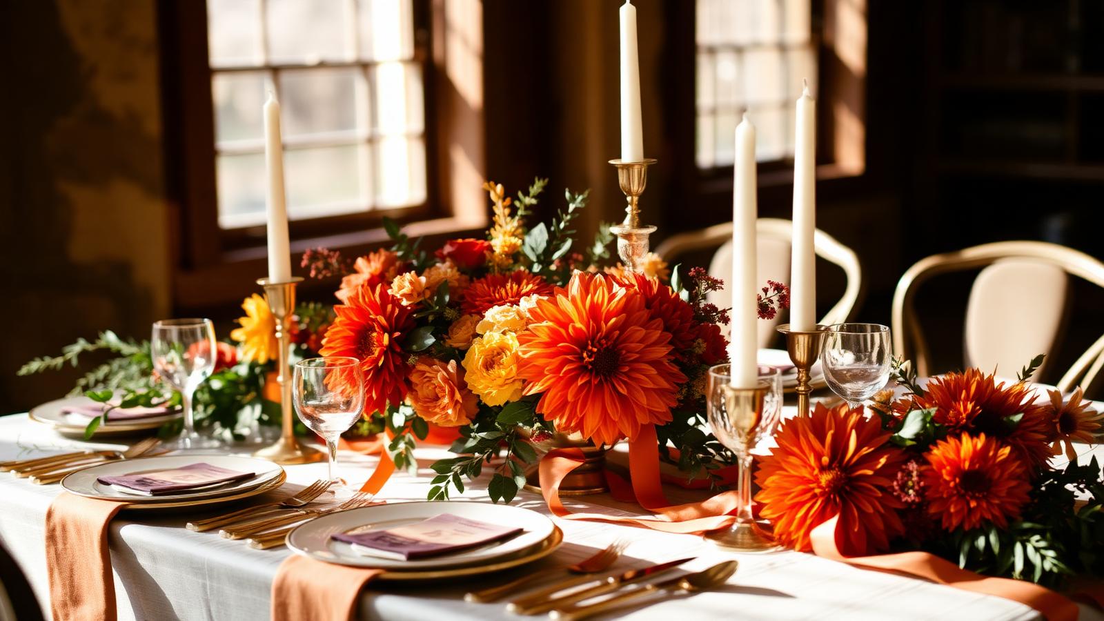
If you are searching for a persimmon color palette for an autumn wedding, here is the short answer: build the day around persimmon (#EC5800) as your hero, ground it with deep rust (#A8542A) and cream (#FFFDD0), lift it with gold (#FFD700), and add contrast with forest green (#228B22) and charcoal gray (#36454F). That six-color system photographs beautifully in October light, works from invitations to table linens, and reads warm and celebratory without tipping into Halloween.
Persimmon is the most underused color in fall weddings. Everyone reaches for burgundy or terracotta; persimmon sits between them — brighter than rust, more sophisticated than pumpkin, and far more photogenic than pure orange. Below is the complete palette, the exact codes, the psychology behind each hue, and how to apply it across every element of the day.
The Complete Persimmon Autumn Wedding Palette
Persimmon takes its name from the fruit that ripens in late autumn — a saturated reddish-orange with a hint of red depth. Technically it sits around 22° on the hue wheel with high saturation and mid-range luminance, which is exactly why it holds its identity in both bright afternoon sun and warm candlelight.
The Six Core Colors
| Color Name | HEX | RGB | Role in the Palette |
|---|---|---|---|
| Persimmon | #EC5800 | 236, 88, 0 | Hero accent — florals, ribbon, stationery |
| Deep Rust | #A8542A | 168, 84, 42 | Grounding mid-tone — bridesmaid dresses, velvet |
| Gold | #FFD700 | 255, 215, 0 | Metallic lift — flatware, candlesticks, foil |
| Forest Green | #228B22 | 34, 139, 34 | Complementary contrast — foliage, groomsmen |
| Cream | #FFFDD0 | 255, 253, 208 | Base neutral — linens, gown, paper stock |
| Charcoal Gray | #36454F | 54, 69, 79 | Anchor neutral — suits, typography, signage |
Why This Combination Works
Persimmon is a warm advancing color: it visually moves toward the viewer, which is precisely what you want in a hero accent. Left alone across an entire venue it becomes overwhelming, so the palette applies a classic proportional system:
- 60% cream and charcoal — the neutral field that lets everything breathe
- 30% deep rust and forest green — the supporting mid-tones that add depth
- 10% persimmon and gold — the accents that carry the eye through the room
This is the same distribution logic behind well-built brand systems, and it is the reason a persimmon color palette for an autumn wedding feels intentional rather than seasonal-by-default. For the wider seasonal context, our guide to autumn warm colors and fall palette psychology breaks down how each warm family behaves across the season.
Color Psychology: What Persimmon Communicates
Color psychology matters more at a wedding than at almost any other event, because guests are reading the room emotionally within seconds of arriving.
Persimmon (#EC5800) sits at the intersection of red's passion and orange's sociability. Research on warm hues consistently associates this range with:
- Warmth and hospitality — orange-reds increase perceived room temperature by several degrees
- Energy and enthusiasm — elevated arousal without red's aggression
- Optimism and joy — strong positive-affect associations across Western cultures
- Appetite stimulation — a genuine advantage for a seated dinner
Deep Rust (#A8542A) adds the maturity persimmon lacks on its own. Desaturated and earth-anchored, it signals stability, heritage and permanence — the exact emotional register you want under a ceremony.
Gold (#FFD700) carries associations of celebration, achievement and value. Used sparingly in metallics rather than as a flat color, it reads as luxury; used broadly it reads as costume.
Forest Green (#228B22) provides restorative balance. As the near-complement of persimmon, it creates maximum visual contrast while remaining natural — which is why foliage-heavy tablescapes make orange florals look more expensive than they are.
Cream (#FFFDD0) softens the whole system. Pure white against persimmon creates a slightly harsh, high-contrast edge; cream's yellow undertone bridges the two.
Charcoal Gray (#36454F) is the modern alternative to black. Its subtle blue undertone quietly cools the palette and keeps the warm colors from turning muddy in photographs.
Five Ready-to-Use Persimmon Wedding Palettes
1. Rustic Harvest
| Role | Color | HEX |
|---|---|---|
| Primary | Persimmon | #EC5800 |
| Secondary | Deep Rust | #A8542A |
| Accent | Gold | #FFD700 |
| Neutral | Cream | #FFFDD0 |
| Grounding | Walnut Brown | #5C4033 |
Barn venues, wooden farm tables, dried grasses, brass candlesticks. The warmest and most traditional expression of a fall wedding palette.
2. Modern Persimmon & Charcoal
| Role | Color | HEX |
|---|---|---|
| Primary | Persimmon | #EC5800 |
| Secondary | Charcoal Gray | #36454F |
| Accent | Cream | #FFFDD0 |
| Detail | Brushed Gold | #C6A15B |
City lofts and contemporary venues. Charcoal suits, cream stationery, single-stem persimmon florals. Graphic, editorial and unmistakably current.
3. Persimmon & Forest (Complementary)
| Role | Color | HEX |
|---|---|---|
| Primary | Persimmon | #EC5800 |
| Complement | Forest Green | #228B22 |
| Depth | Deep Rust | #A8542A |
| Neutral | Ivory | #FFFFF0 |
The highest-contrast option and the strongest photographic performer. Ideal for outdoor ceremonies where evergreens are already in frame.
4. Persimmon & Teal (Cool Complement)
| Role | Color | HEX |
|---|---|---|
| Primary | Persimmon | #EC5800 |
| Complement | Deep Teal | #14595E |
| Accent | Gold | #FFD700 |
| Neutral | Cream | #FFFDD0 |
For couples who want autumn warmth without the expected fall clichés. Teal cools the palette by roughly 180° on the wheel and makes persimmon read as a deliberate design choice.
5. Soft Persimmon & Dusty Rose (Analogous)
| Role | Color | HEX |
|---|---|---|
| Primary | Persimmon | #EC5800 |
| Analogous | Dusty Rose | #C08081 |
| Analogous | Terracotta | #E2725B |
| Neutral | Cream | #FFFDD0 |
The romantic, low-contrast interpretation. All colors sit within about 40° of each other, producing a soft gradient effect that photographs like a watercolor. If you want to compare this against other seasonal systems, see our roundup of wedding color palettes and combinations.
Applying the Persimmon Color Palette Across the Day
Stationery and Save-the-Dates
Persimmon at full saturation on cream stock is striking, but on screen and in print it behaves differently: printers tend to shift #EC5800 slightly toward red. Ask for a proof, and consider printing charcoal type with persimmon as an accent line, envelope liner or wax seal rather than as full background flood.
Bridal Party Attire
Persimmon at dress scale — several square meters of fabric — is a lot of saturation next to skin tones. The reliable approach:
- Bridesmaids in deep rust (#A8542A) or terracotta (#E2725B) — the muted mid-tones flatter the widest range of complexions
- Persimmon reserved for accessories — bouquets, sashes, shoes, earrings
- Groomsmen in charcoal (#36454F) with persimmon pocket squares or ties
An ombré arrangement across rust, terracotta and persimmon also works beautifully in group photographs while letting each person choose their most flattering shade.
Florals
Persimmon has real botanical support in autumn: dahlias, marigolds, ranunculus, garden roses, zinnias and chrysanthemums all appear in this exact range. Pair them with eucalyptus and olive branches for forest-green contrast, and add dried grasses or wheat for gold texture.
Tablescapes
| Element | Recommended Color | HEX |
|---|---|---|
| Tablecloth | Cream | #FFFDD0 |
| Napkins | Persimmon | #EC5800 |
| Runner | Deep Rust | #A8542A |
| Candles | Ivory | #FFFFF0 |
| Flatware | Gold | #FFD700 |
| Menu type | Charcoal | #36454F |
The single most effective trick: keep the linen neutral and put the persimmon in the napkin. It gives every place setting a repeating accent that reads as designed rather than decorated.
Lighting
Warm lighting around 2700K amplifies persimmon and gold beautifully. Cooler LED lighting above 4000K pushes persimmon toward a flat, plasticky orange. Specify warm-white uplighting with your venue and test it at the same hour as your reception.
Practical Takeaways for Designers and Couples
- Test in venue lighting, not on screen. A monitor renders #EC5800 with backlit brilliance; fabric and paint absorb light instead. Always evaluate physical samples.
- Order fabric swatches early. Dye lots vary; the same "persimmon" from two vendors can differ by 10–15 HEX points.
- Limit yourself to three colors per element. Six colors sitewide is right; six colors on a single invitation is chaos.
- Check contrast on printed text. Charcoal on cream passes accessibility comfortably; persimmon body text on cream does not — keep persimmon for headlines and accents.
- Photograph your palette outdoors at your ceremony's exact hour. Autumn golden hour adds warmth that can push persimmon toward red.
- Use metallics as texture, not color. Gold works best as reflective material — brass, foil, gilded rims — rather than as a printed flat.
- Leave one element neutral. Every strong palette needs a resting point; cream linen or an unadorned charcoal wall gives the eye somewhere to land.
Persimmon Palette Reference Table
| Item | Color | Hex | Color Name | Psychological Meaning |
|---|---|---|---|---|
| Bridal bouquet | ● | #EC5800 | Persimmon | Joy, warmth, celebration |
| Bridesmaid dresses | ● | #A8542A | Deep Rust | Stability, heritage, grounding |
| Flatware & candlesticks | ● | #FFD700 | Gold | Luxury, achievement, festivity |
| Foliage & greenery | ● | #228B22 | Forest Green | Renewal, balance, nature |
| Table linens & gown | ● | #FFFDD0 | Cream | Softness, purity, calm |
| Groomsmen suits | ● | #36454F | Charcoal Gray | Modernity, authority, restraint |
| Invitation accents | ● | #E2725B | Terracotta | Artisanal warmth, craft |
| Escort card details | ● | #C08081 | Dusty Rose | Romance, tenderness |
Common Mistakes to Avoid
Pairing persimmon with black. Pure black (#000000) plus saturated orange reads as Halloween. Charcoal (#36454F) delivers the same anchoring weight without the association.
Over-saturating the room. If persimmon appears on the linens, chairs, florals, lighting and bar, guests experience visual fatigue within an hour. Keep it near 10% of the visual field.
Ignoring the venue's fixed colors. Red brick, warm oak and terracotta tile already contribute to the warm side of the palette. Increase forest green and charcoal to compensate.
Treating orange as a single color. Persimmon, terracotta, rust and pumpkin behave very differently in psychology and in print. The same nuance drives commercial color decisions — our analysis of orange in branding, from playful to professional covers how small hue shifts change perception entirely.
Conclusion
A persimmon color palette for an autumn wedding gives you everything the season promises — warmth, abundance, celebration — with a distinctive edge that burgundy and blush simply cannot match. Anchor on persimmon #EC5800, support it with deep rust #A8542A and cream #FFFDD0, lift with gold #FFD700, and contrast with forest green #228B22 and charcoal #36454F. Hold the 60/30/10 proportions, test everything in real venue light, and the palette will hold together across every photograph, place setting and printed piece.
Ready to make it yours? Build a custom version of this palette — adjusted for your venue, your skin tones and your florals — with the Coloracci AI palette generator. Drop in #EC5800, generate harmonious variations in seconds, and export the exact HEX codes for your stationer, florist and planner.