Autumn Warm Colors: Fall Palette Psychology and Seasonal Design Guide
· Coloracci Team
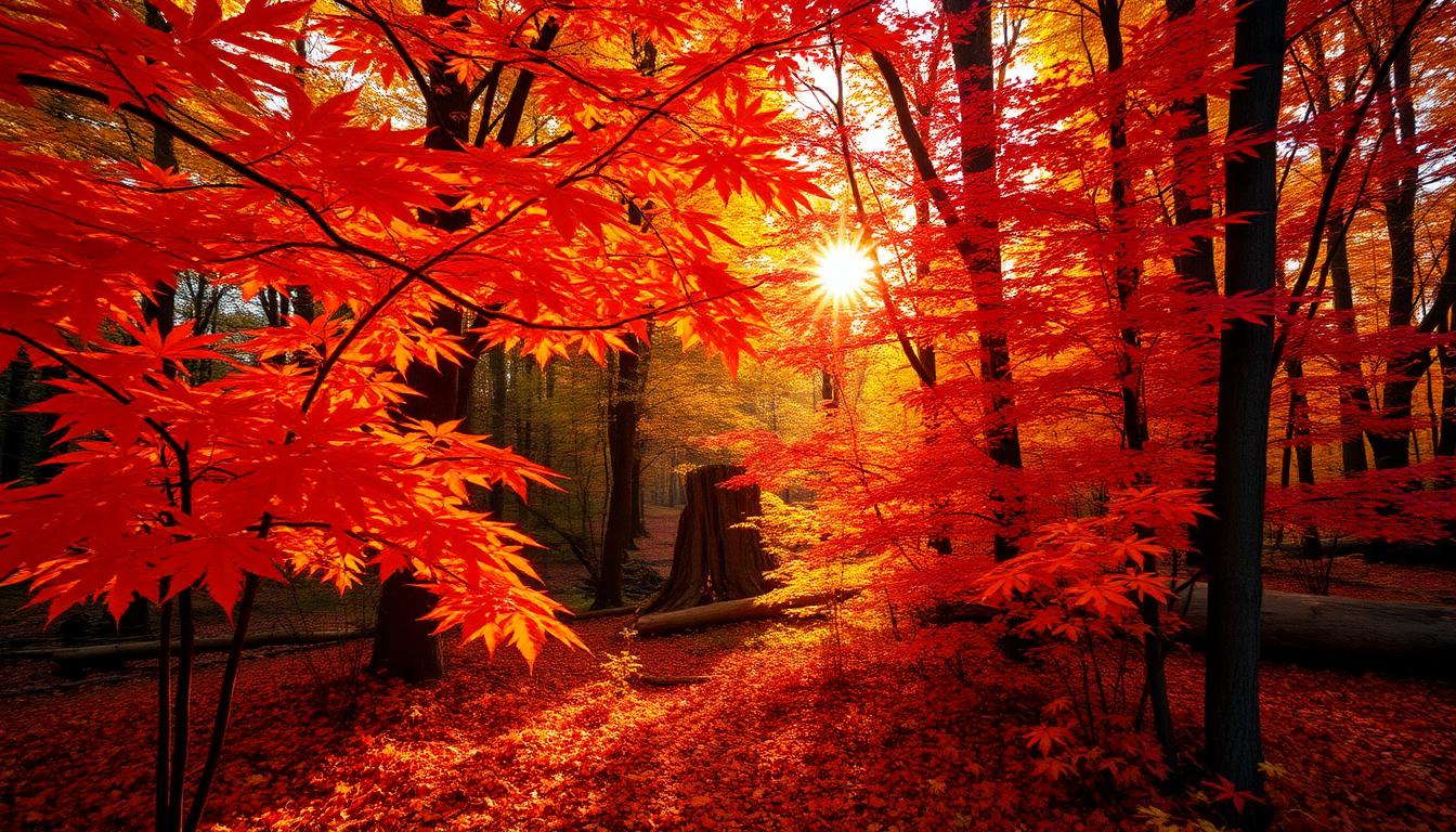
The Psychology of Autumn Colors
Autumn colors carry unique psychological weight derived from natural seasonal transitions. Unlike arbitrary color choices, fall palettes connect to deep evolutionary associations with harvest abundance, preparation for winter, and the bittersweet beauty of transformation.
Why Autumn Colors Resonate
Research in environmental psychology demonstrates that autumn colors trigger specific emotional and behavioral responses:
| Autumn Color | Primary Emotion | Behavioral Effect | Marketing Application |
|---|---|---|---|
| Burnt Orange | Comfort, warmth | Increased dwell time | Restaurant interiors |
| Deep Red | Passion, intensity | Elevated heart rate | Urgency, limited offers |
| Golden Yellow | Optimism, abundance | Positive associations | Retail, food products |
| Rust Brown | Stability, earthiness | Trust formation | Outdoor brands |
| Olive Green | Balance, nature | Calm contemplation | Wellness, sustainability |
These responses aren't coincidental—they reflect millennia of human adaptation to seasonal changes and harvest cycles.
Burnt Orange: The Heart of Autumn
Burnt orange (#CC5500) sits at the center of autumn color psychology, offering unique warmth without aggressive red intensity.
Burnt Orange Psychology Research:
| Finding | Study Context | Design Application |
|---|---|---|
| 18% increase in perceived warmth | Interior design study | Restaurant ambiance |
| 12% longer browsing time | E-commerce research | Seasonal website themes |
| Higher appetite stimulation | Food psychology | Fall menu design |
| Comfort association 87% | Color survey data | Hospitality branding |
Optimal Burnt Orange Spectrum:
| Shade Name | Hex Code | RGB | Best Applications |
|---|---|---|---|
| Classic Burnt Orange | #CC5500 | 204, 85, 0 | Primary autumn branding |
| Rust Orange | #B7410E | 183, 65, 14 | Sophisticated fall |
| Pumpkin | #FF7518 | 255, 117, 24 | Playful, festive |
| Terracotta | #E2725B | 226, 114, 91 | Earthy, artisanal |
| Spice | #D2691E | 210, 105, 30 | Culinary applications |
Why Burnt Orange Works:
- Temperature Balance: Warmer than red, cooler than yellow—perfect autumn equilibrium
- Saturation Sweet Spot: High enough for energy, muted enough for sophistication
- Natural Prevalence: Dominates actual fall foliage
- Cultural Universality: Positive associations across Western cultures
Deep Red: Autumn Intensity
Autumn reds differ from spring/summer reds through their depth and earthiness:
Autumn Red Spectrum:
| Shade Name | Hex Code | RGB | Psychological Effect |
|---|---|---|---|
| Crimson | #DC143C | 220, 20, 60 | Passion, drama |
| Maroon | #800000 | 128, 0, 0 | Sophistication |
| Burgundy | #800020 | 128, 0, 32 | Luxury, depth |
| Oxblood | #4A0404 | 74, 4, 4 | Edgy autumn |
| Maple Red | #C04000 | 192, 64, 0 | Natural authenticity |
Deep autumn reds signal abundance (apples, cranberries, wine) while carrying sophistication lacking in brighter reds. This makes them ideal for premium fall product positioning.
Golden Yellow: Harvest Abundance
Autumn yellows shift from spring's bright optimism to rich, warm gold tones:
Golden Yellow Psychology:
- Abundance and prosperity associations
- Warmth without aggressive energy
- Nostalgia for harvest traditions
- Premium quality signaling
Autumn Yellow Spectrum:
| Shade Name | Hex Code | RGB | Best Applications |
|---|---|---|---|
| Harvest Gold | #DA9100 | 218, 145, 0 | Primary fall branding |
| Mustard | #FFDB58 | 255, 219, 88 | Fashion, accessories |
| Amber | #FFBF00 | 255, 191, 0 | Warmth, energy |
| Goldenrod | #DAA520 | 218, 165, 32 | Natural, soft |
| Honey | #EB9605 | 235, 150, 5 | Food, sweetness |
Complete Autumn Color Palettes
Traditional Harvest Palette
| Role | Color | Hex Code | Percentage |
|---|---|---|---|
| Primary | Burnt Orange | #CC5500 | 40% |
| Secondary | Deep Red | #8B0000 | 25% |
| Accent | Golden Yellow | #DAA520 | 20% |
| Neutral | Warm Brown | #8B4513 | 10% |
| Base | Cream | #FFFDD0 | 5% |
This palette mirrors natural fall foliage composition, creating immediate seasonal recognition.
Modern Sophisticated Autumn
| Role | Color | Hex Code | Vibe |
|---|---|---|---|
| Primary | Terracotta | #E2725B | Earthy warmth |
| Secondary | Olive | #808000 | Grounding |
| Accent | Cream | #FFFDD0 | Lightness |
| Neutral | Charcoal | #36454F | Modern edge |
| Pop | Rust | #B7410E | Autumn anchor |
Updated autumn for contemporary brands seeking seasonal relevance without traditional clichés.
Moody Autumn Atmosphere
| Role | Color | Hex Code | Mood |
|---|---|---|---|
| Primary | Oxblood | #4A0404 | Dark drama |
| Secondary | Forest Green | #228B22 | Deep nature |
| Accent | Burnished Gold | #D4AF37 | Refined warmth |
| Neutral | Espresso | #3D2817 | Rich depth |
| Highlight | Copper | #B87333 | Metallic interest |
For luxury brands seeking autumn associations with sophisticated darkness.
Industry-Specific Autumn Color Strategies
Food and Beverage
Autumn colors drive 30-40% of seasonal food sales through psychological priming:
| Category | Recommended Lead Color | Supporting Palette |
|---|---|---|
| Pumpkin spice | Burnt Orange | Cream, nutmeg brown |
| Apple products | Deep Red | Gold, green |
| Comfort foods | Golden Yellow | Brown, cream |
| Craft beverages | Amber | Copper, brown |
| Baked goods | Warm Brown | Honey, cream |
Starbucks Seasonal Strategy:
- Pumpkin Spice Latte: Orange cup (#FF7518) triggers immediate seasonal recognition
- Increased social sharing by 45% vs. standard white cups
- Color alone drives 20% of purchase intent for seasonal items
Fashion and Retail
Autumn color adoption in fashion follows predictable patterns:
| Week of Season | Color Focus | Consumer Behavior |
|---|---|---|
| Early September | Golden Yellow | Transition pieces |
| Late September | Burnt Orange | Full autumn embrace |
| October | Deep Red | Halloween adjacent |
| November | Brown, Olive | Thanksgiving, grounding |
| Late November | Burgundy | Holiday transition |
Retail Display Psychology:
- Window displays using full autumn palettes increase foot traffic 15-25%
- Mannequin grouping in warm colors extends browsing time
- Autumn color digital campaigns show 18% higher click-through rates
Home Decor and Interior Design
| Space Type | Autumn Palette Approach | Psychological Goal |
|---|---|---|
| Living rooms | Burnt orange accents | Warmth, gathering |
| Bedrooms | Deep red + cream | Cozy intimacy |
| Kitchens | Golden yellow | Appetite, energy |
| Dining rooms | Full autumn spectrum | Abundance, celebration |
| Entryways | Rust + olive | Natural welcome |
Digital Design: Autumn Website and App Themes
Seasonal Color Implementation
| Element | Standard Color | Autumn Override | Implementation |
|---|---|---|---|
| Primary buttons | Brand color | Burnt orange | October-November |
| Hero backgrounds | White/varied | Autumn gradient | Full season |
| Accent highlights | Blue/green | Golden yellow | Selective use |
| Sale badges | Red | Deep orange | Urgency + seasonal |
E-commerce Autumn Performance:
| Color Strategy | Conversion Impact | Best Practice |
|---|---|---|
| Full autumn retheme | +8-12% seasonal sales | Major brands only |
| Autumn accent overlays | +5-8% with minimal dev | Recommended for all |
| Product photography only | +3-5% low cost | Photography update |
Social Media Autumn Content
| Platform | Optimal Autumn Colors | Content Type |
|---|---|---|
| Saturated warm tones | Lifestyle, products | |
| Rich, deep autumn | DIY, recipes | |
| TikTok | Bright orange, yellow | Trending content |
| Classic harvest palette | Community, events |
Autumn content typically generates 20-35% higher engagement than equivalent non-seasonal posts.
Cultural and Geographic Autumn Variations
Regional Color Preferences
| Region | Preferred Autumn Lead | Cultural Context |
|---|---|---|
| New England | Maple Red | Iconic foliage |
| Pacific Northwest | Olive + Rust | Evergreen balance |
| Midwest | Golden Yellow | Harvest country |
| South | Burnt Orange | Extended warmth |
| Southwest | Terracotta | Desert autumn |
International Autumn Equivalents
| Country/Region | Seasonal Color Focus | Cultural Meaning |
|---|---|---|
| Japan | Red, Gold (Momiji) | Maple viewing tradition |
| Germany | Golden Yellow | Oktoberfest, harvest |
| UK | Copper, Brown | Bonfire Night, transition |
| Canada | Maple Red | National identity symbol |
| France | Wine colors | Harvest, vendange |
Measuring Autumn Color Effectiveness
Brand Performance Metrics
Track autumn color strategy success:
| Metric | Measurement Approach | Typical Autumn Lift |
|---|---|---|
| Seasonal sales | Year-over-year comparison | +15-40% |
| Social engagement | Likes, shares, comments | +20-35% |
| Email open rates | Subject line color testing | +8-15% |
| Website dwell time | Analytics tracking | +12-20% |
| Brand recall | Post-campaign surveys | +18-25% |
Color Psychology Testing
A/B Test Priorities:
- CTA button colors (orange vs. standard)
- Hero image color grading
- Product photography backgrounds
- Email template autumn integration
Conclusion
Autumn warm colors offer designers and marketers a psychologically powerful, culturally resonant palette that drives measurable business results. The combination of burnt orange's comfort, deep red's passion, and golden yellow's optimism creates seasonal experiences that consumers actively seek and emotionally embrace.
Whether implementing a complete autumn brand transformation or simply adding seasonal accents, understanding the psychology behind these colors ensures authentic connection with audience expectations. In a crowded marketplace, autumn colors provide both differentiation and universal appeal—a rare combination that makes them invaluable for seasonal strategy.
The data consistently supports autumn color investment: higher engagement, increased sales, stronger brand recall, and positive emotional associations that extend well beyond the season itself. For brands seeking to harness seasonal psychology, autumn warm colors are the ultimate strategic asset.