Wedding Color Palettes: Top 20 Combinations
· Coloracci Team
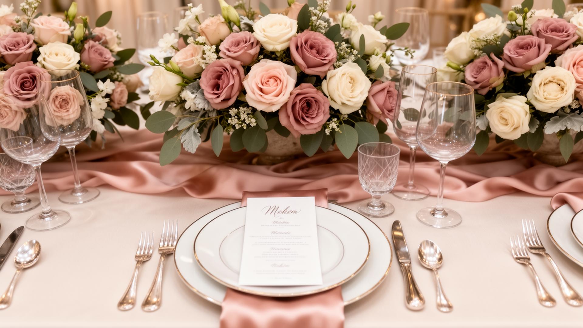
Your wedding color palette is the single design decision that touches every element of your celebration — from the invitations that arrive in mailboxes months before the event to the last dance floor lights that close the evening. Flowers, linens, bridesmaids' dresses, groomsmen's ties, cake frosting, table runners, signage, and even the lighting itself all take direction from the colors you choose. A cohesive palette transforms a collection of individual decisions into a unified visual experience. A disjointed one makes even expensive elements feel uncoordinated.
This guide presents the 20 most effective wedding color palettes organized by style and season, provides exact hex codes for communicating your vision to vendors, and offers practical guidance for choosing the combination that reflects your personality, venue, and time of year.
Classic Combinations That Never Date
Some palettes endure because they are rooted in visual principles that transcend trends. These combinations have worked for decades and will continue working for decades more. If you want a wedding that looks timeless in photographs twenty years from now, start here.
1. Ivory and Gold
The definitive classic. Ivory #FFFFF0 provides warmth that pure white lacks, while gold #D4AF37 adds richness without competing for attention. This palette works in virtually any venue, from grand ballrooms to garden tents. Add depth with champagne #F7E7CE for linens and antique gold #C5A55A for metallic accents.
2. Navy and Blush
Navy #1B2A4A grounds the palette with sophistication while blush #F4C2C2 provides softness and romance. This combination photographs beautifully because the contrast between dark and light creates visual interest without harshness. Bridesmaids in navy with blush bouquets, or blush dresses with navy ribbon details — both directions work equally well.
3. Black and White with Greenery
The ultimate in modern elegance. Crisp white #FFFFFF, deep black #1A1A1A, and natural greenery #4A7C59 create a palette that is simultaneously dramatic and organic. The greenery prevents the black and white from feeling sterile. Eucalyptus garlands, fern arrangements, and olive branch accents bring this palette to life.
4. Burgundy and Cream
Rich burgundy #722F37 paired with warm cream #FFFDD0 creates old-world romance. This palette references wine, velvet, and candlelight — sensory associations that make guests feel enveloped in warmth. Add dusty rose #DCAE96 as a bridge tone between the deep burgundy and light cream.
5. Dusty Blue and Silver
Dusty blue #6B8EA6 with silver #C0C0C0 creates a palette that feels both refined and relaxed. This combination works particularly well in coastal venues and winter weddings. The muted quality of dusty blue prevents it from reading as childish, while silver adds luminosity without the warmth of gold.
Seasonal Palettes: Working With Nature
The most visually cohesive weddings align their color palette with the natural environment of their season. Fighting against the season — choosing autumnal oranges for a June garden wedding, or icy blues for an August beach celebration — creates a subtle disconnect that guests feel even if they cannot articulate it.
Spring Palettes (March–May)
6. Lavender, Sage, and Cream
Lavender #B4A7D6, sage green #B2C7A8, and soft cream #FFF8E7 capture the gentle renewal of spring. This palette mirrors the early garden — wisteria, new leaves, and soft morning light. It works beautifully with natural linen textures and wildflower arrangements.
7. Peach, Coral, and Gold
Peach #FFCBA4 and coral #FF7F7F bring the warmth of late spring blossoms, while gold #D4AF37 adds celebration. This palette is energetic without being loud — it suggests joy and warmth. Peonies, ranunculus, and garden roses are the natural floral partners.
8. Soft Pink, Mint, and White
Pink #F8C8DC, mint #98D8C8, and white #FFFFFF create a fresh, youthful palette that feels like the first warm weekend of the year. This combination works best in outdoor venues where natural light amplifies the pastel softness.
Summer Palettes (June–August)
9. Terracotta, Burnt Orange, and Ivory
Terracotta #C67B5C, burnt orange #CC5500, and ivory #FFFFF0 bring Mediterranean warmth to summer celebrations. This palette has surged in popularity because it photographs with a golden-hour quality regardless of the actual time of day. Dried florals, pampas grass, and clay vessels complete the aesthetic.
10. Ocean Blue, Sandy Beige, and White
Ocean blue #0077B6, sandy beige #D4B896, and white #FFFFFF are the natural palette of any coastal wedding. The key is choosing a blue that reads as natural ocean rather than corporate — medium-depth blues with a slight green undertone feel most authentic. Driftwood, shells, and sea glass serve as organic accent pieces.
11. Sunflower Yellow, White, and Green
Sunflower yellow #FFD700, bright white #FFFFFF, and leaf green #4CAF50 create a celebration that radiates happiness. This palette demands confidence — yellow is bold and attention-grabbing. It works best in rustic venues, barns, and garden settings where the natural surroundings provide a grounding contrast.
Fall Palettes (September–November)
12. Burgundy, Burnt Orange, and Mustard
Burgundy #722F37, burnt orange #CC5500, and mustard #DAA520 are the definitive autumn palette. These colors mirror the changing foliage and create a sense of abundance and warmth. Add deep plum #4E2A4A as an accent for even more depth. Dahlias, chrysanthemums, and dried leaves are the ideal floral elements.
13. Sage Green, Mauve, and Taupe
Sage #9CAF88, mauve #C9A0DC, and taupe #B8A99A create an early autumn palette that is sophisticated and understated. This combination avoids the expected fall oranges in favor of the muted tones that appear in nature during the transition from late summer to early fall.
14. Plum, Gold, and Forest Green
Deep plum #4E2A4A, gold #D4AF37, and forest green #2D5F2D create a rich, jewel-toned palette that feels regal. This combination works best in evening celebrations where candlelight makes the deep tones glow. Velvet textures in plum, metallic gold charger plates, and deep green garlands bring this palette to its fullest expression.
Winter Palettes (December–February)
15. Emerald, Gold, and Ivory
Emerald green #046A38, gold #D4AF37, and ivory #FFFFF0 create a winter palette that is festive without being Christmas-themed. The key is using a true emerald rather than a holiday green — deeper and more sophisticated. Velvet emerald table runners, gold flatware, and ivory candles make this palette sing.
16. Dusty Rose, Silver, and White
Dusty rose #DCAE96, silver #C0C0C0, and white #FFFFFF bring softness to winter weddings. This palette captures the quality of winter light — silvery, gentle, and luminous. It pairs beautifully with bare branch centerpieces, mercury glass votives, and frost-inspired details.
Trending 2026 Combinations
Wedding color trends in 2026 reflect broader design movements toward richness, intentionality, and unexpected pairings.
17. Butter Yellow and French Blue
Butter yellow #F5D76E with French blue #318CE7 is the breakout combination of 2026. Inspired by Mediterranean ceramics and Provençal interiors, this palette is cheerful, sophisticated, and photographically striking. The warm-cool contrast creates visual energy that keeps imagery dynamic. Lemon and citrus accents, blue-and-white pottery, and striped linens complete the look.
18. Espresso Brown and Blush
Espresso #3C1414 with blush #F4C2C2 is the palette that fashion-forward couples are choosing in 2026. Brown has returned as a luxury neutral after decades of being dismissed, and when paired with soft pink, it creates a combination that feels both earthy and romantic. Chocolate velvet suits, blush silk dresses, and raw wood textures ground this palette.
19. Olive Green and Terracotta
Olive #6B7B3A and terracotta #C67B5C capture the organic, Mediterranean aesthetic that dominates 2026 wedding design. This palette feels grounded and natural without the fragility of pastel combinations. It is particularly effective in vineyard, desert, and mountain venues. Add cream #FFF8E7 for contrast and warmth.
20. Moody Mauve and Charcoal
Mauve #915F6D and charcoal #36454F create a dramatic, editorial palette for evening weddings. This combination rejects the traditional light-and-bright wedding aesthetic in favor of something moodier and more intimate. Deep-toned florals — ranunculus, anemones, and garden roses in plum and burgundy — provide textural richness against the dark background.
How to Choose Your Wedding Colors
Selecting your wedding color palette is one of the most personal and consequential design decisions of the entire planning process. These practical guidelines will help you narrow thousands of possibilities to the combination that feels right.
1. Start with your venue, not Pinterest. The most common mistake couples make is falling in love with a color palette that conflicts with their venue. A venue with warm wood tones and exposed brick will fight a cool blue and silver palette. Visit your venue at the time of day your wedding will take place, photograph the walls, floors, and natural surroundings, and build your palette to complement what already exists.
2. Choose one dominant color and two to three supporting colors. A palette of five equally weighted colors creates visual chaos. Select your hero color — the one that will appear on bridesmaids' dresses and major floral installations — and then choose supporting tones that complement without competing. The 60-30-10 rule applies: 60% dominant, 30% secondary, 10% accent.
3. Test colors on fabric, not screens. Digital colors and fabric colors behave completely differently. A hex code that looks perfect on your laptop may translate to a completely different tone in chiffon, satin, or linen. Order fabric swatches in your chosen colors before committing. Hold them together in natural light and artificial light.
4. Consider your complexion and your wedding party's. Your color palette will be worn by real people with diverse skin tones. Colors that wash out lighter complexions or fail to complement darker complexions will produce disappointing photographs. Dusty tones (#DCAE96 dusty rose, #6B8EA6 dusty blue, #9CAF88 sage) tend to flatter the widest range of skin tones.
5. Think about the emotional temperature. Warm palettes (burgundy #722F37, gold #D4AF37, terracotta #C67B5C) create feelings of intimacy and coziness. Cool palettes (dusty blue #6B8EA6, silver #C0C0C0, lavender #B4A7D6) create feelings of elegance and calm. Choose the emotional experience you want your guests to have.
6. Plan for photography. Your colors will live forever in photographs. Deep, saturated colors photograph with more drama. Pastels photograph with more softness. Dark venues with dark palettes require strong photographic lighting. Light venues with light palettes can feel washed out without a contrasting accent. Discuss your palette with your photographer before finalizing.
7. Give vendors exact hex codes. "Dusty blue" means something different to every florist, baker, and stationer. Providing exact hex codes — #6B8EA6 rather than "dusty blue" — eliminates interpretation and ensures that every vendor is working toward the same vision. Print color swatches on quality paper and include them with every vendor brief.
Your wedding colors are not just decoration — they are the visual thread that weaves every element of your celebration into a single, coherent story. Choose them with intention, communicate them with precision, and trust that the right palette will make every detail feel like it belongs.