A Designer's Guide to Paint Colors with a Cool Blue Undertone
· Coloracci Team
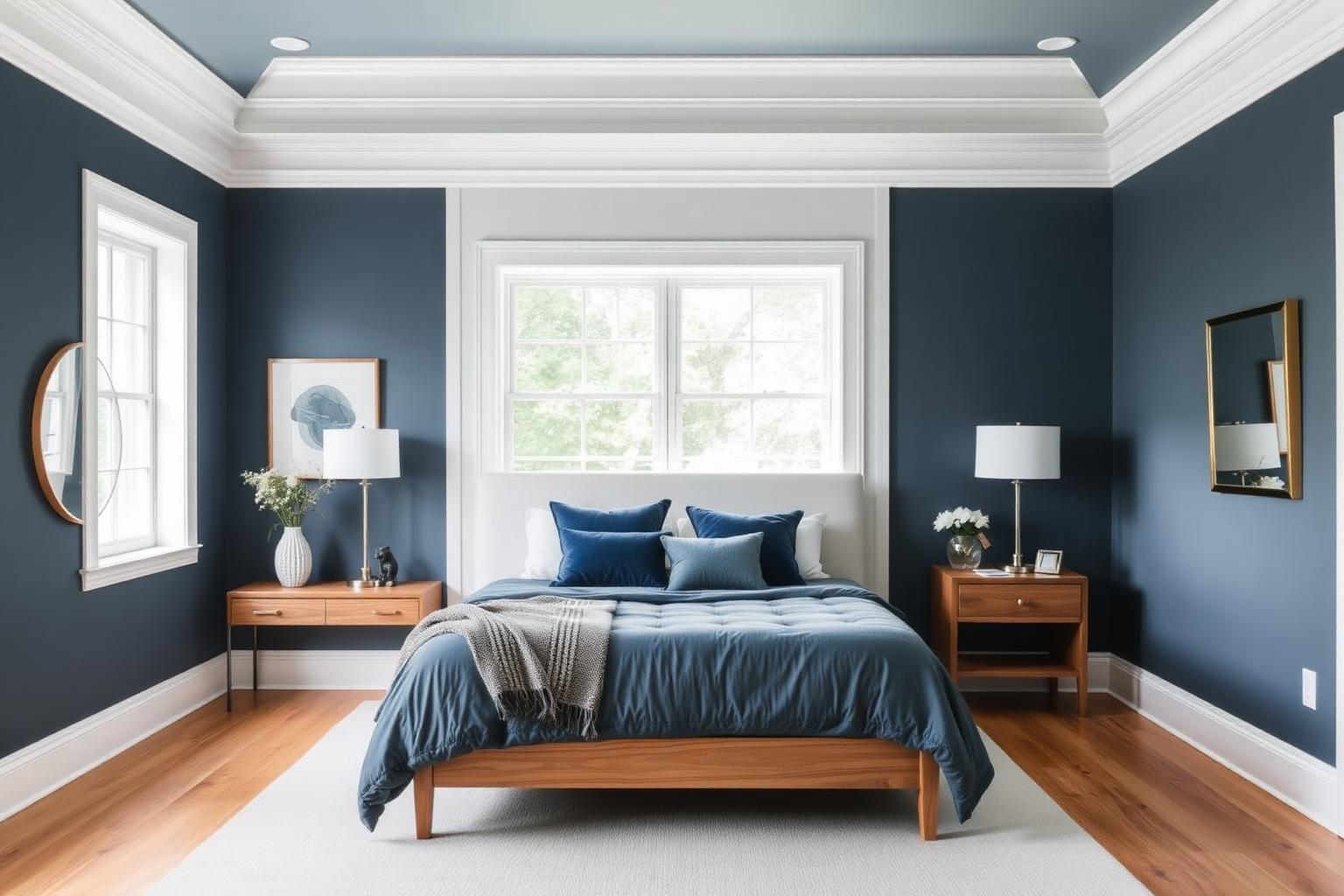
Paint Colors With a Cool Blue Undertone: The Complete Designer's Guide
If you are searching for paint colors with a cool blue undertone, here is the direct answer: the most reliable choices are Sherwin-Williams Naval (#343940), Sherwin-Williams Aleutian (#8092A1), Sherwin-Williams Stardew (#C5D0C9), and Benjamin Moore Boothbay Gray (#AAB2B5). These four cover the full value range — deep navy, mid-tone slate blue, whisper-soft blue-green gray, and a balanced cool gray — and every one of them reads distinctly cool rather than muddy or violet in daylight. Build from those anchors and you will not go wrong.
A cool blue undertone is not the same thing as "a blue paint." Undertone is the secondary pigment sitting underneath the surface color — the quiet bias that decides whether a gray looks crisp and architectural or dingy and beige. Paint colors with a cool blue undertone contain enough blue pigment to pull the hue toward the 200-230° range on the color wheel, even when the surface reads as gray, greige, or near-white. That subtlety is exactly why these colors are so useful, and exactly why so many homeowners get burned by them.
What Are Blue Undertones in Paint?
Every neutral paint is mixed from a white base plus tint. The tint formula determines the undertone. When a formula leans on blue, black, and a touch of green pigment, you get a cool cast: the color appears to recede, edges feel sharper, and whites nearby look brighter by contrast.
Three practical tests separate a genuine cool blue undertone from a warm imposter:
- Compare against pure hues. Place the chip next to a pure blue (#2E5EAA) and a pure warm beige. A cool blue undertone will look softer than the blue but clearly opposed to the beige. A warm gray placed next to that same blue turns visibly brown.
- Read the darkest chip on the strip. Manufacturers stack a color family on one strip. The bottom (most saturated) chip exposes the undertone that the lighter chips hide. If the bottom chip is slate or navy, the pale chips above it carry blue.
- Test against pure white paper. Against a sheet of printer white, a cool blue undertone reads slightly steely; a warm gray reads slightly tan.
For a full walkthrough of this diagnostic method across every undertone family, see our guide to identifying paint color undertones.
The Core Palette: Exact Colors and HEX Codes
These are the workhorses. Each one has been specified in real projects thousands of times, and each occupies a distinct slot in the value scale.
Sherwin-Williams Naval (SW 6244) — #343940
Naval is the deep anchor. It is a navy with a graphite core, which means it never tips purple in artificial light — the failure mode of cheaper navies. Use it on a single feature wall, on kitchen island cabinetry, on a library's built-ins, or on an exterior front door. Its light reflectance value is low enough to swallow a small room if used on all four walls without generous natural light, so treat it as a statement rather than a default.
Sherwin-Williams Aleutian (SW 6241) — #8092A1
Aleutian is the mid-tone diplomat: a dusty slate blue that is saturated enough to register as a color but muted enough to function as a neutral. This is the single most flexible entry in the cool blue undertone family. It works on full bedroom walls, on bathroom vanities, and on shaded exteriors where a brighter blue would look cartoonish.
Sherwin-Williams Stardew (SW 9138) — #C5D0C9
Stardew is where blue meets green in the palest possible register. In north light it reads as a soft blue; in south light the green comes forward and it turns sage-adjacent. That shift is a feature, not a flaw — it keeps a room from feeling clinical. Ideal for bedrooms, powder rooms, and ceilings where you want tint without commitment.
Benjamin Moore Boothbay Gray (HC-165) — #AAB2B5
Boothbay Gray is the cool gray that behaves. It is the classic coastal-adjacent neutral: blue enough to feel crisp, gray enough to pair with anything. Use it as the whole-house body color when you want a cool envelope and plan to introduce warmth through wood and textiles.
Adriatic Sea
Adriatic Sea occupies the saturated blue-teal zone — noticeably more chromatic than Aleutian, less severe than Naval. Reserve it for spaces that can carry a mood: a home office you want to feel focused in, a dining room, a bathroom with strong natural light.
Supporting hues
- True cool blue — #2E5EAA. The reference blue. Rarely used on walls; invaluable as a comparison chip and as an accent in art, tile, or upholstery.
- Teal — #1B8A8F. Bridges blue and green. Excellent for cabinetry and tile when a pure blue would feel too cold.
- Slate — #5C6B7A. The transitional mid-dark. Perfect for trim on a light cool wall, or for exterior shutters.
Cool Blue Gray Paint: The Most Requested Subfamily
Search volume for "cool blue gray paint" outpaces almost every other undertone query, and for good reason — it is the safest way to get blue into a home without committing to a blue room. The rule for cool blue gray is proportion: aim for roughly 15-25% perceived chroma. Below that, the color collapses into a flat institutional gray. Above it, you have simply painted the room blue.
Boothbay Gray (#AAB2B5) sits almost exactly in the middle of that window. Aleutian (#8092A1) sits at the upper edge. Stardew (#C5D0C9) sits at the lower edge with a green assist. Together they form a three-step ladder you can apply across a whole floor plan — Stardew in bedrooms, Boothbay Gray in hallways and living spaces, Aleutian in a study or bath — and the house will read as one coherent scheme rather than a series of unrelated decisions.
Palettes and Combinations That Work
Palette 1 — Coastal Architectural
Boothbay Gray (#AAB2B5) walls, crisp white trim (#F7F9FA), Naval (#343940) on interior doors, natural white oak flooring, brushed nickel hardware. Calm, resale-safe, and photographs beautifully. This is the palette to choose if you are painting to sell.
Palette 2 — Deep Study
Naval (#343940) on all four walls, Slate (#5C6B7A) on trim for a tone-on-tone envelope, Stardew (#C5D0C9) on the ceiling to lift it, brass or aged bronze accents, walnut desk. Enveloping and serious — the standard formula for a home office that supports concentration.
Palette 3 — Serene Bedroom
Stardew (#C5D0C9) walls, off-white ceiling with a blue hint (#F2F5F4), Aleutian (#8092A1) on a headboard wall or built-in, linen textiles in oatmeal, one warm accent in terracotta. The warm accent is what keeps the room from feeling like a hospital.
Palette 4 — Spa Bathroom
Aleutian (#8092A1) walls, Teal (#1B8A8F) on the vanity, white subway tile, chrome fittings, pale oak shelving. Wet-room lighting is typically cool and bright, which mutes blue further, so it is safe to go a step more saturated than you would elsewhere.
Palette 5 — Contemporary Contrast
Boothbay Gray (#AAB2B5) as the field, Naval (#343940) as the anchor, and a single warm counterpoint at 5-10% coverage: mustard yellow (#D4A017) in a chair, coral (#E8735A) in art, or terracotta (#C1613C) in pottery. Cool schemes need one warm interruption to feel inhabited rather than staged. For more on structuring blue-led rooms, see our cool blue color combinations for living rooms.
The Color Psychology of Cool Blue Undertones
Blue is the most consistently preferred hue across cultures and demographics, and the cool undertone family inherits that goodwill while avoiding blue's tendency toward childishness. Three documented effects matter for interiors:
Calm and lowered arousal. Blue wavelengths correlate with reduced heart rate and lowered perceived stress. This is why bedrooms painted in soft blue register subjectively as better sleep environments. Stardew and Aleutian are the two best candidates for a room whose primary job is recovery.
Stability and trust. Deep blues signal reliability — the reason financial and institutional branding leans on them so heavily. In a home, Naval on built-ins or a home-office wall borrows that same authority. Our deep dive into the psychology of blue in design covers the mechanism in detail.
Perceived spaciousness. Cool colors optically recede. A wall painted in a cool blue undertone appears fractionally further away than the same wall in a warm tone of identical lightness. In small rooms this is genuinely useful — pale cool blues are among the most effective tools for making a room look bigger, especially when paired with a ceiling painted one or two steps lighter than the walls.
The counterweight: cool blue undertones can read cold, austere, or unwelcoming when used without contrast. The fix is texture and material warmth, not a different paint color. Wood, wool, leather, and warm metals do the work that a warmer wall would otherwise have to do.
Light Orientation: Where These Colors Belong
Undertone behavior is entirely dependent on light direction. This is the single most common reason a sample looks wrong on the wall.
- South-facing rooms receive warm, abundant light for most of the day. That warmth neutralizes excess blue, so cool blue undertones perform exceptionally well here — they balance the golden cast rather than fighting it. Aleutian and Naval both hold their character in south light.
- North-facing rooms receive cool, even, indirect light that amplifies blue. A cool blue undertone in north light can tip toward gray-cold. Choose the greener members of the family — Stardew is the safe pick — or accept the cool and lean into it with warm lighting and materials.
- East-facing rooms are warm in the morning and cool by afternoon. Cool blue undertones shift noticeably across the day here; test at both hours.
- West-facing rooms run cool until the late golden hour, when they warm dramatically. Naval performs well because it is dark enough to absorb rather than reflect that shift.
Data Table: Cool Blue Undertone Reference
| Item | Color | Hex | Color Name | Psychological Meaning |
|---|---|---|---|---|
| Deep anchor | Navy graphite | #343940 | Naval (SW 6244) | Authority, depth, stability |
| Mid-tone field | Dusty slate blue | #8092A1 | Aleutian (SW 6241) | Calm competence, quiet focus |
| Pale wall | Blue-green whisper | #C5D0C9 | Stardew (SW 9138) | Serenity, restoration, softness |
| Neutral body | Cool balanced gray | #AAB2B5 | Boothbay Gray (HC-165) | Clarity, order, timelessness |
| Saturated feature | Blue-teal | #1B8A8F | Teal | Refreshment, balance, vitality |
| Transitional trim | Blue-gray mid-dark | #5C6B7A | Slate | Grounding, understated strength |
| Reference blue | True cool blue | #2E5EAA | Cool Blue | Trust, dependability, openness |
| Warm counterpoint | Burnt orange | #C1613C | Terracotta | Warmth, earthiness, human comfort |
| Warm accent | Golden yellow | #D4A017 | Mustard | Optimism, energy, contrast |
| Warm accent | Soft red-orange | #E8735A | Coral | Approachability, liveliness |
Practical Takeaways for Designers and Homeowners
Sample large, sample vertically. A 2-inch chip is useless for judging undertone. Paint two coats on a 2x2-foot poster board and move it around the room — against trim, against flooring, in the darkest corner. Never judge a cool blue undertone from a swatch lying flat on a counter, where it picks up reflected floor color.
Check your trim white first. A cool blue undertone next to a creamy white trim will make the trim look yellow and dirty. Pair cool blues with a neutral or cool-leaning white (#F7F9FA territory). Getting the white wrong ruins more cool schemes than getting the blue wrong.
Mind your bulb temperature. 2700K bulbs will warm and mute a cool blue undertone significantly; 4000K will sharpen it toward steel. Decide the lighting before you finalize the paint, not after.
Use the 60-30-10 split. 60% dominant cool neutral, 30% secondary in a related blue or natural wood, 10% warm accent. That single warm 10% is non-negotiable in a cool scheme.
Respect fixed elements. Existing flooring, stone, and tile carry their own undertones. A cool blue wall above a warm honey-toned oak floor creates a visible tension. It can be resolved — usually by adding a mid-tone gray rug and repeating the wood tone in furniture — but it must be resolved deliberately.
Go darker than instinct on small accent surfaces. People consistently under-select saturation on doors, islands, and built-ins. Naval on a powder-room vanity looks far better than a timid mid-blue.
Choosing Your Cool Blue Undertone: A Simple Decision Path
- Want a whole-house neutral that reads crisp? Boothbay Gray (#AAB2B5).
- Want a bedroom that feels restorative without looking icy? Stardew (#C5D0C9).
- Want a room with real personality that still behaves as a neutral? Aleutian (#8092A1).
- Want drama, depth, or a statement surface? Naval (#343940).
- Want blue with more life and less severity? Adriatic Sea or Teal (#1B8A8F).
Conclusion
Paint colors with a cool blue undertone give you the rarest combination in residential design: colors that are calm and colors that are interesting. Naval, Aleutian, Stardew, and Boothbay Gray form a complete, coordinated ladder from near-white to near-black, all sharing the same underlying blue bias — which means they will always look intentional together. Add crisp white trim, natural wood, brushed nickel or chrome, and one disciplined warm accent, and the scheme resolves itself.
Ready to build your own version? Drop any of these HEX codes into the Coloracci palette generator to generate coordinated tints, shades, and accent suggestions, and check contrast before you commit to a single gallon.