Cool Blue Color Combinations: Creating a Serene Living Room Oasis
· Coloracci Team
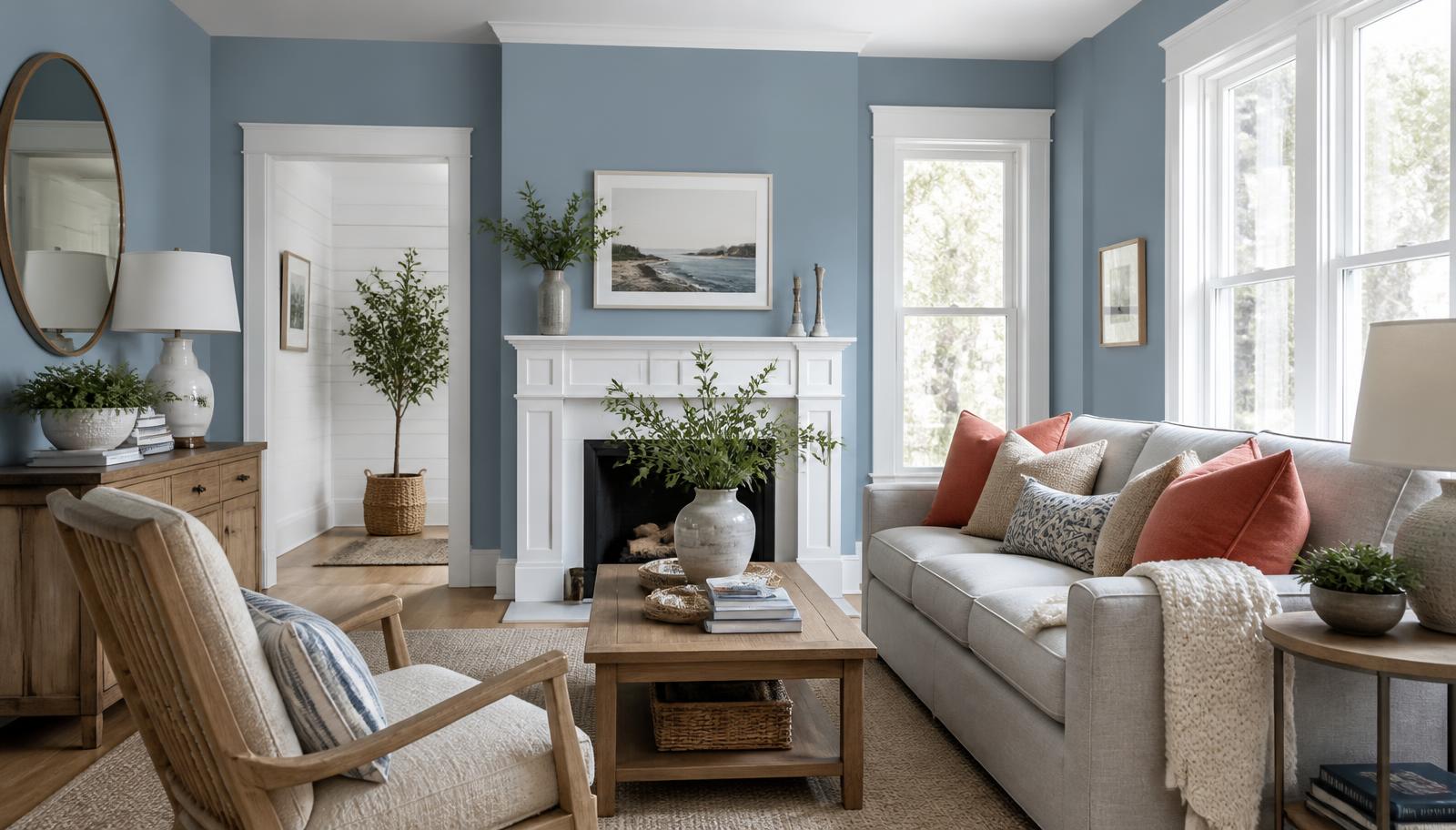
The Direct Answer: The Best Cool Blue Color Combinations for a Living Room
If you are searching for cool blue color combinations for living room schemes, the short professional answer is that cool blue almost never works alone — it works in pairs. The five combinations that consistently deliver a serene, finished room are: cool blue with crisp white (#A6C8FF + #FFFFFF), cool blue with soft gray (#6A7B9D + #D3D3D3), cool blue with sandy beige (#87CEEB + #F5F5DC), cool blue with muted green (#008080 + #B2AC88), and cool blue with coral (#2A52BE + #FF6F61).
Each of those pairings solves the same underlying problem in a different way. Blue is the coolest hue on the wheel in both temperature and psychology; left unbalanced it drifts from calming into cold, and a living room — the one space in a house explicitly designed for gathering — cannot afford to feel cold. The partner color is what supplies the warmth, the contrast, or the grounding weight that turns a blue room into a blue oasis.
This guide breaks down all five palettes with exact HEX values and color names, explains the psychology driving each one, and gives you the proportional rules designers use to keep serene living room colors from tipping into clinical.
Why Cool Blue Is the Default Choice for a Serene Living Room
Blue is the most commonly named favorite color across virtually every culture surveyed, and the reason is at least partly physiological. Blue wavelengths are associated in environmental psychology studies with measurable reductions in heart rate and self-reported stress. Rooms painted in blue are consistently described by occupants as feeling more spacious, quieter, and cooler in temperature than identically sized rooms in warm hues.
For a living room, that matters more than in almost any other space. This is the room where people decompress after work, where guests are received, where a household spends its unstructured hours. Calming blue paint colors do real work here — not decorative work, behavioral work.
But there is a catch that separates amateur blue rooms from professional ones. Cool blue reflects less warm light back into a space. In a north-facing living room with weak, blue-shifted daylight, a cool blue on all four walls compounds the coolness and the room reads gray and lifeless by four in the afternoon. The fix is never to abandon blue; it is to select the correct blue value and to pair it deliberately. That is what the following combinations do.
The Complete HEX Reference for Cool Blue Living Rooms
Before the palettes, here is the vocabulary. These are the specific shades used throughout this guide.
The Blues
- Periwinkle —
#A6C8FF. A pale, luminous blue with a faint violet cast. It behaves almost like a tinted white on walls, which makes it the safest cool blue for rooms with limited natural light. - Slate Blue —
#6A7B9D. A mid-tone, gray-dampened blue. This is the sophisticated workhorse of the category: strong enough to read clearly as a color, muted enough never to feel juvenile. - Sky Blue —
#87CEEB. Light, clean, and openly cheerful. Its higher saturation demands a warm partner or it can feel like a nursery. - Teal —
#008080. Blue pulled toward green. Sits at the boundary between cool and balanced, which makes it the most forgiving deep blue for a living room. - Cerulean Blue —
#2A52BE. A vivid, high-chroma blue. Reserve it for accent walls, cabinetry, and upholstery rather than full-room coverage.
The Partners
- Pure White —
#FFFFFF. Maximum contrast, maximum air. - Light Gray —
#D3D3D3. A neutral bridge that softens the jump between blue and white. - Charcoal Gray —
#36454F. The anchoring dark. Note its blue undertone — it belongs to this family rather than fighting it. - Beige —
#F5F5DC. Warm, low-contrast, sand-like. - Sage Green —
#B2AC88. Muted, dusty, organic. - Wheat —
#F5DEB3. A warm cream accent for textiles and wood tones. - Dark Khaki —
#BDB76B. A grounded gold-green for accessories. - Burlywood —
#DEB887. The color of light oak and rattan. - Living Coral —
#FF6F61. Blue's warm complement. - Gold —
#FFD700. Metallic punctuation.
The Five Cool Blue Color Combinations for Living Room Design
1. Cool Blue + Crisp White: The Coastal Classic
Palette: Periwinkle #A6C8FF · Pure White #FFFFFF · Wheat #F5DEB3
This is the palette most people picture when they imagine coastal living room palettes: airy, bright, and effortless. Periwinkle on the walls, pure white on trim, ceiling, and slipcovers, and wheat carried through jute rugs, oak furniture, and linen curtains.
The reason it works is value contrast rather than hue contrast. Periwinkle and white sit close on the color wheel but far apart in lightness, which produces crispness without visual noise. The wheat accent is doing quiet but essential work: without it, the room reads as a photograph with the saturation slider pulled down.
Use it when: your living room has good natural light, high ceilings, or an open plan you want to feel even more expansive. This scheme shares its DNA with the wider Mediterranean and coastal color story, where sun-bleached blue and lime-washed white are the historic default.
2. Cool Blue + Soft Gray: The Sophisticated Modern
Palette: Slate Blue #6A7B9D · Light Gray #D3D3D3 · Charcoal Gray #36454F
This is the most frequently requested of all blue and grey living room ideas, and the most commonly executed badly. The failure mode is monotony: three cool neutrals of similar weight produce a room that looks like an office lobby.
The correction is a deliberate value ladder. Light gray on the largest surfaces, slate blue on a feature wall or on the sofa, charcoal reserved for roughly ten percent — a media console, window frames, a fireplace surround. That descending sequence gives the eye somewhere to travel.
Because every color in this palette is cool, texture becomes the entire warmth budget. Wool bouclé, a walnut coffee table, brushed brass lighting, and a deep-pile rug supply the tactile warmth the hues withhold. Skip that step and the room is technically correct and emotionally empty.
Use it when: the architecture is contemporary, the room is south-facing, or you want a backdrop that will not date.
3. Cool Blue + Sandy Beige: The Natural Beach Palette
Palette: Sky Blue #87CEEB · Beige #F5F5DC · Dark Khaki #BDB76B
Where white makes blue crisp, beige makes it comfortable. Sky blue at full strength is a saturated, energetic color; pairing it with the low-chroma warmth of beige immediately domesticates it.
Practically, this means beige on the walls and sky blue in the soft furnishings — the reverse of most people's instinct. Beige walls create an enveloping, sand-toned shell; blue then appears as cushions, art, ceramics, and a single upholstered chair. Dark khaki appears in baskets, olive-toned plant foliage, and leather.
This combination is also the most forgiving of imperfect light. Beige carries yellow, so it actively reintroduces warmth in a dim room in a way that gray cannot.
Use it when: you want the coastal feeling without the crispness, or your living room faces north and needs warming.
4. Cool Blue + Muted Green: Earthy and Tranquil
Palette: Teal #008080 · Sage Green #B2AC88 · Burlywood #DEB887
This is an analogous scheme — teal and sage are neighbors on the wheel — which is why it feels so unforced. Analogous palettes read to the eye as a single expanded color rather than as a combination, and the effect is deep tranquility.
Teal is the strategic choice here. Because it contains green, it is warmer than any pure blue at the same darkness, which means it can be used generously — full walls, built-in shelving, a large sofa — without chilling the room. Sage green then appears in textiles and planting, and burlywood carries the whole thing through rattan, light oak, and natural fiber.
The palette borrows its logic from landscape: water, foliage, and driftwood. That is not a metaphor so much as a specification. When you struggle to place an accent, ask what would exist in that landscape.
Use it when: you want a living room that feels grounded and biophilic rather than decorated, or when the room opens onto a garden.
5. Cool Blue + Coral: The Bold Complement
Palette: Cerulean Blue #2A52BE · Living Coral #FF6F61 · Gold #FFD700
Blue and orange sit opposite each other on the color wheel, which makes this a textbook complementary pairing — see our breakdown of complementary color combinations for the underlying theory. Coral is orange softened with pink and white, which takes the aggression out of the contrast while keeping the vibrancy.
The discipline this palette requires is proportion. Cerulean is intense; coral is intense. Split them evenly and they compete, and the room becomes exhausting. The working ratio is heavily blue-dominant — cerulean on a single feature wall or on the sofa, coral in perhaps three placements (two cushions and a piece of art), gold as metallic punctuation on lamp bases, frames, and hardware.
Use it when: the living room is otherwise architecturally plain and needs personality, or when you want a serene base with a genuine jolt of energy.
Color Psychology Behind Each Choice
Understanding why these combinations feel the way they do makes it far easier to adjust them for your own room.
Blue is the color of calm, stability, and trust. It slows perceived time and reduces reported stress, which is precisely why it dominates bedrooms and living rooms. Its liability is emotional distance — the same restraint that reads as serene can read as unwelcoming at high volume.
White signals purity, cleanliness, and space. It functions as visual breathing room, letting a saturated blue exist without pressure.
Gray communicates balance, neutrality, and sophistication. It is the diplomat of the palette, capable of bridging any two colors, but in excess it flattens emotional response entirely.
Beige carries warmth, comfort, and simplicity. In a blue scheme it is the thermostat: every increment of beige raises the felt temperature of the room.
Green speaks of nature, tranquility, and health. Adjacent to blue it deepens the restorative quality rather than adding contrast.
Coral brings energy, warmth, and playfulness. Because it is blue's complement, small amounts create maximum perceptual impact — the eye seeks it out involuntarily.
Data Table: Cool Blue Living Room Palette Reference
| Item | Color | Hex | Color Name | Psychological Meaning |
|---|---|---|---|---|
| Walls (low-light room) | Pale blue | #A6C8FF |
Periwinkle | Calm, spaciousness, gentle optimism |
| Trim & ceiling | White | #FFFFFF |
Pure White | Purity, cleanliness, openness |
| Feature wall / sofa | Mid blue | #6A7B9D |
Slate Blue | Stability, sophistication, quiet authority |
| Large soft surfaces | Light neutral | #D3D3D3 |
Light Gray | Balance, neutrality, restraint |
| Anchoring accents | Dark neutral | #36454F |
Charcoal Gray | Grounding, depth, seriousness |
| Warm wall alternative | Warm neutral | #F5F5DC |
Beige | Comfort, simplicity, welcome |
| Accent textiles | Light blue | #87CEEB |
Sky Blue | Freshness, clarity, ease |
| Built-ins / deep walls | Blue-green | #008080 |
Teal | Renewal, tranquility, balance |
| Plants & fabrics | Muted green | #B2AC88 |
Sage Green | Nature, health, restoration |
| Wood & rattan | Warm tan | #DEB887 |
Burlywood | Organic warmth, craft, honesty |
| Curtains & rugs | Warm cream | #F5DEB3 |
Wheat | Softness, natural light, ease |
| Baskets & leather | Gold-green | #BDB76B |
Dark Khaki | Earthiness, durability |
| Bold accent | Warm coral | #FF6F61 |
Living Coral | Energy, playfulness, human warmth |
| Statement blue | Vivid blue | #2A52BE |
Cerulean Blue | Confidence, focus, depth |
| Metallic details | Metallic yellow | #FFD700 |
Gold | Luxury, warmth, reflected light |
Practical Takeaways for Designers and Homeowners
Apply the 60-30-10 rule strictly. Sixty percent dominant color on walls and large surfaces, thirty percent secondary on upholstery and window treatments, ten percent accent on cushions, art, and hardware. Blue schemes fail more often from proportion errors than from bad color choices — a full explanation lives in our guide to the 60-30-10 color proportion rule.
Match the blue's lightness to your natural light. Rooms with weak or north-facing light need blues above roughly 70 percent lightness (periwinkle, sky blue). South-facing rooms with abundant warm light can carry slate blue, teal, and cerulean without going dim.
Budget for warmth deliberately. Every cool-dominant room needs a warm allowance: wood tones, brass or gold metals, wheat or beige textiles, or a coral accent. Decide where that warmth lives before you buy paint, not after.
Let texture do half the work. In a monochromatic blue-gray scheme, the difference between flat and luxurious is entirely tactile — linen, bouclé, raw wood grain, hammered metal, wool pile. Cool palettes reward texture more than warm palettes do.
Test large samples on multiple walls. Blue is unusually sensitive to reflected light. A swatch that looks perfect on the north wall can turn lavender or gray on the south wall. Paint at least a two-foot square on each wall and evaluate at morning, midday, and evening.
Layer rather than match. Three shades of the same blue at different values will always look more considered than three unrelated blues. Build the palette as a family with one clear parent hue.
Conclusion: Build Your Own Serene Blue Palette
The best cool blue color combinations for living room design are not random pairings — they are structured relationships. White supplies air, gray supplies sophistication, beige supplies warmth, green supplies grounding, and coral supplies energy. Pick the quality your room is missing, then choose the partner that delivers it.
The last step is precision. Once you know which of these five directions suits your space, you need the exact tints, shades, and accent variations that work together at the specific lightness levels your room demands.
Generate your own custom cool blue palette with the Coloracci palette generator — enter any of the HEX codes above as a starting point and get mathematically harmonious companions, ready to export for your paint chart, mood board, or design file.