What Colors Go With Olive Green? A Guide to Perfect Pairings in Interior Design
· Coloracci Team
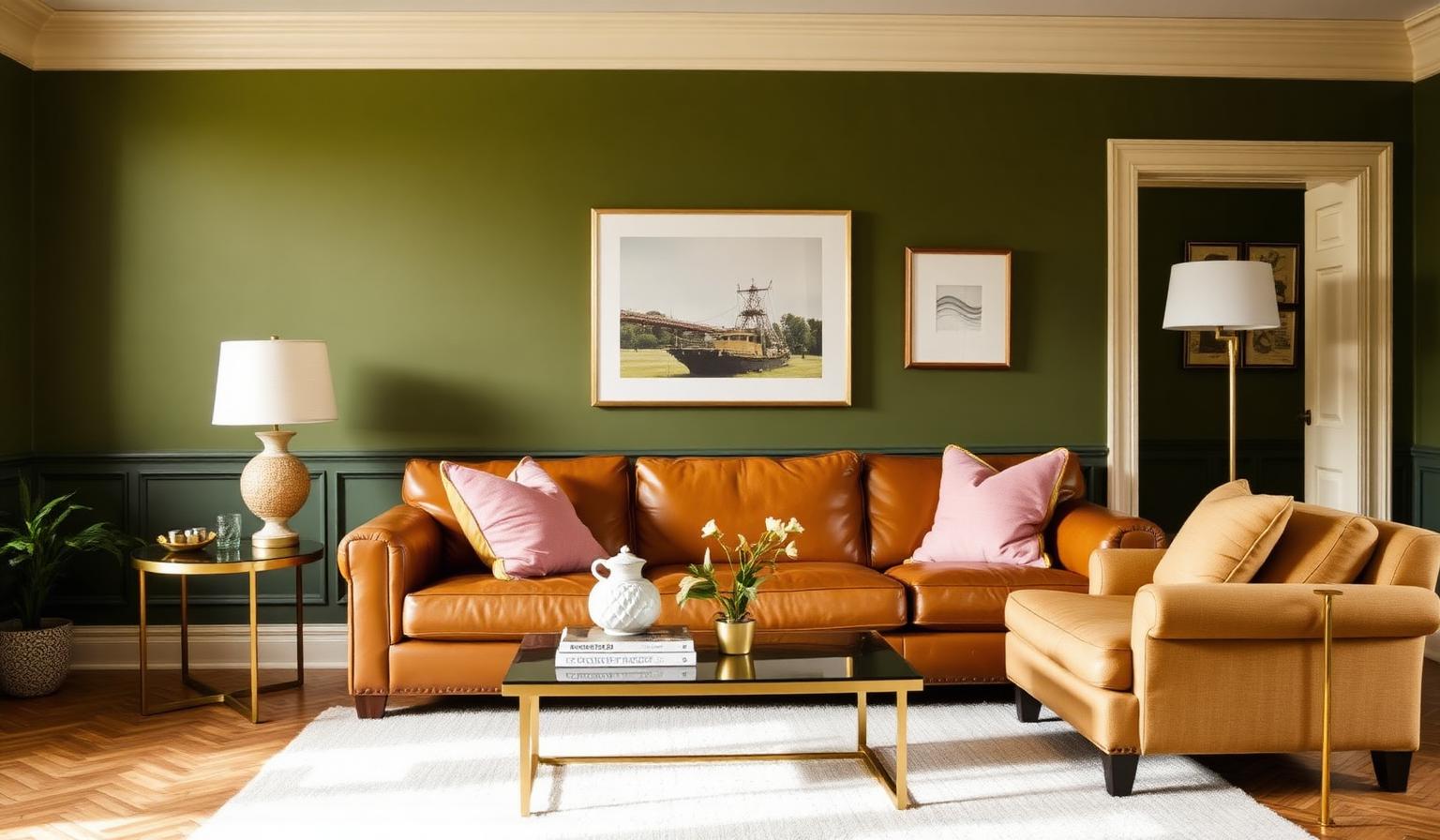
The Direct Answer: Interior Design Colors That Go With Olive Green
The best interior design colors that go with olive green (#636B2F) are warm neutrals (Creamy White #F5F5DC, Tan #D2B48C, Charcoal #36454F), earthy accents (Terracotta #E2725B, Chocolate Brown #D2691E), soft romantics (Powder Pink #FFDDF4, Dusty Rose #DCAE96), and confident jewel tones (Burgundy #800020, Navy Blue #000080, Mustard Yellow #FFDB58). Olive is a natural neutral disguised as a color — which is why it pairs beautifully across almost every design mood, from quiet and grounded to bold and maximalist.
This guide breaks down the exact palettes designers reach for when building rooms around olive green, the psychology behind why they work, and practical takeaways for walls, furniture, cabinetry, and accessories.
Why Olive Green Behaves Like a Neutral
Olive green sits in the yellow-green quadrant of the color wheel, but its low saturation and warm undertone give it the same versatility as beige or greige. It absorbs light instead of bouncing it, which is why olive rooms feel enveloping rather than energetic. Think of it as the tailored, botanical cousin of camel: it grounds a space, flatters wood tones, and lets textural materials — linen, leather, brass, marble — do the talking.
The reference HEX for the olive green we recommend throughout this guide is #636B2F, a mid-tone, slightly warm olive that reads as sophisticated at any scale.
Color Psychology: What Olive Green Communicates
Color psychology is pattern recognition. Olive triggers associations with:
- Nature and restoration — forests, herbs, uniforms, weathered leaves.
- Calm and harmony — its low chroma quiets the nervous system, ideal for bedrooms and reading spaces.
- Sophistication and heritage — olive has centuries of use in libraries, gentlemen's clubs, and European drawing rooms.
- Grounding and confidence — unlike energetic greens (emerald, wasabi), olive feels settled and mature.
Used well, olive creates a grounding and restorative atmosphere. Used carelessly — in cool light or paired with the wrong grays — it can drift toward muddy or military. The palettes below solve for both.
Palette 1 — Warm Neutrals: The Classic Olive Green Color Palette
This is the default answer to what colors complement olive green in most rooms. It is timeless, forgiving, and photographs beautifully in every light.
- Walls: Olive Green #636B2F
- Trim and ceiling: Creamy White #F5F5DC
- Upholstery / rug: Tan #D2B48C
- Anchor and drama: Charcoal Gray #36454F
- Warm metals: aged brass, unlacquered bronze
Why it works. Cream softens olive's density without introducing a competing hue. Tan is a value-cousin of olive — same warm temperature, half the saturation — so the two blend like a well-cut suit. Charcoal supplies the weight that keeps the composition from floating, and brass adds the shimmer olive needs to feel elevated rather than earthy.
Where to use it. Living rooms, home libraries, hotel suites, boutique retail. If you have dark wood floors, this palette is especially forgiving — see our guide to the best paint colors for rooms with dark wood floors for how to balance value and undertone.
Palette 2 — Earthy & Grounded: Olive Green With Terracotta and Chocolate Brown
For an olive green living room with warmth and texture, lean into earth tones. This is the palette of Tuscan villas, artisan pottery studios, and modern desert interiors.
- Hero: Olive Green #636B2F
- Warm accent: Terracotta #E2725B
- Deep anchor: Chocolate Brown #D2691E
- Neutral base: Creamy White #F5F5DC
- Optional pop: mustard yellow textiles, black iron hardware
Why it works. Terracotta and olive are analogous-adjacent — both born from clay and pigment — and their warm undertones amplify each other. Chocolate brown carries the same red-orange DNA as terracotta at a deeper value, creating a natural gradient from wall to accent to floor. The result is a room that feels lived-in from day one.
Where to use it. Dining rooms, kitchens with open shelving, moody bedrooms, mudrooms. This palette overlaps with the mood we explore in our earthy industrial color palette for a living room guide — a useful next read if you want to add raw concrete or blackened steel.
Palette 3 — Soft & Romantic: Olive Green and Pink Decor
The unexpected favorite. Olive green and pink decor works because olive's yellow undertone is the natural complement to pink's cool undertone; they cancel each other's flaws and amplify each other's beauty. Skin tones look better in this palette than almost any other.
- Hero: Olive Green #636B2F
- Soft accent: Powder Pink #FFDDF4
- Warm romantic: Dusty Rose #DCAE96
- Cool contrast: pale blue or sage
- Neutral: warm white, natural oak
Why it works. Powder pink is high-value and low-chroma — exactly what olive needs to breathe. Dusty rose bridges the two with a shared earthiness. Together they feel modern, feminine without being sweet, and photograph exceptionally well on Instagram and in print.
Where to use it. Bedrooms, nurseries, boutique retail, feminine home offices, wedding branding. An olive green sofa with powder pink and mustard yellow cushions is a modern designer classic — try it before you dismiss it.
Palette 4 — Bold & Jewel-Toned: Confident Contrast
When you want the room to make a statement, pair olive with saturated jewel tones. This is the palette of speakeasies, private members' clubs, and maximalist townhouses.
- Hero: Olive Green #636B2F
- Deep drama: Burgundy #800020
- Cool anchor: Navy Blue #000080
- Warm pop: Mustard Yellow #FFDB58
- Neutral relief: cream or unbleached linen
Why it works. Burgundy and olive are split-complementary — the tension is intentional and sophisticated, not chaotic. Navy adds cool weight, mustard adds warm energy, and cream provides the visual pauses that make the maximalism readable.
Where to use it. Dining rooms, home bars, primary bedrooms, brand identities for heritage spirits, hospitality, or editorial media. Follow the 60-30-10 rule for color proportions rigorously here — 60% olive (or cream), 30% burgundy or navy, 10% mustard — otherwise the palette tips into costume.
Practical Designer & Homeowner Takeaways
Test Olive in Your Actual Light
Olive is more light-sensitive than almost any other neutral. Under 2700K warm bulbs it reads rich and grounded. Under 5000K cool daylight it can drift gray or khaki. Always sample olive paint at three times of day — morning, mid-afternoon, and lamp-lit evening — before committing.
Match Undertones, Not Just Values
The most common mistake with olive is pairing it with the wrong white. Pure bright whites (like Chantilly Lace) can make olive look dingy. Choose a warm cream (#F5F5DC / Benjamin Moore White Dove, Sherwin-Williams Alabaster) so the two share a yellow undertone.
Use the 60-30-10 Rule for Balance
Even in a bold jewel-tone room, restraint reads as luxury. Let olive occupy either the 60% (walls, large upholstery) or the 30% (cabinetry, sofa) role — never both.
Materials That Flatter Olive Green
- Aged brass, unlacquered bronze, antique gold — the ideal metals.
- Walnut, oak, and rattan — warm woods that echo olive's undertone.
- Linen, wool bouclé, velvet — soften olive's density; avoid high-gloss synthetics that make it look plastic.
- White marble, travertine, terracotta tile — countertop and floor partners that flatter olive cabinetry.
- Leather (tan, cognac, oxblood) — the classic olive companion.
Room-by-Room Application
- Living room: Olive walls, cream trim, tan leather sofa, charcoal armchair, brass floor lamp.
- Kitchen: Olive lower cabinets, cream uppers, brass hardware, white marble counters, walnut floors.
- Bedroom: Olive headboard wall, powder pink and dusty rose bedding, warm oak nightstands, cream ceiling.
- Bathroom: Olive zellige tile, unlacquered brass fixtures, warm white walls, black slate floor.
- Home office: Charcoal walls, olive built-in bookshelves, tan leather chair, brass task lamp.
- Dining room: Olive walls, burgundy velvet chairs, mustard drapery, navy rug, brass chandelier.
Avoid These Common Mistakes
- Painting the ceiling olive too — it closes the room in. Keep ceilings warm white.
- Pairing olive with cool blue-grays — the temperature clash makes olive look muddy. Choose greige.
- Using cheap 5000K LEDs — they turn olive into military green. Specify 2700–3000K CRI 90+ bulbs.
- Over-accessorizing — olive is already a "flavor." Let it lead; add three accent colors maximum.
- Ignoring texture — olive on flat drywall reads dull. Use limewash, roman clay, or bouclé to give it life.
Complete Color Reference Table
| Item | Color | Hex | Color Name | Psychological Meaning |
|---|---|---|---|---|
| 1 | #636B2F | Olive Green | Hero | Grounded, calm, sophisticated, natural |
| 2 | #F5F5DC | Creamy White | Neutral | Softness, warmth, openness, timelessness |
| 3 | #D2B48C | Tan | Neutral | Comfort, warmth, honesty, ease |
| 4 | #36454F | Charcoal Gray | Neutral | Weight, focus, elegance, contrast |
| 5 | #E2725B | Terracotta | Earthy Accent | Warmth, craft, hospitality, hearth |
| 6 | #D2691E | Chocolate Brown | Earthy Accent | Richness, security, heritage, grounding |
| 7 | #FFDDF4 | Powder Pink | Soft Accent | Tenderness, romance, calm, welcome |
| 8 | #DCAE96 | Dusty Rose | Soft Accent | Nostalgia, warmth, feminine confidence |
| 9 | #800020 | Burgundy | Jewel Tone | Depth, luxury, appetite, drama |
| 10 | #000080 | Navy Blue | Jewel Tone | Authority, calm, trust, sophistication |
| 11 | #FFDB58 | Mustard Yellow | Jewel Tone | Optimism, warmth, creativity, energy |
Olive Green in 2026: Why It Keeps Winning
Olive is having a long moment — and unlike trend colors that spike and vanish, it has staying power because it behaves like a neutral. It flatters biophilic design, works in every architectural style from Colonial to modernist, and photographs well across every social platform. Expect to see it dominate cabinetry, upholstery, and paint through the rest of the decade.
Conclusion: Build Your Room Around Olive Green
The best interior design colors that go with olive green depend on the mood you want: cream and tan for timeless calm, terracotta and chocolate for earthy warmth, powder pink and dusty rose for modern romance, or burgundy and navy for confident drama. Use #636B2F as your anchor, respect the 60-30-10 rule, and choose partners that share olive's warm undertone.
When you are ready to build and export a complete, balanced palette around olive green — or extract one from a room photo — try the Coloracci AI palette generator. It translates your starting color into designer-ready combinations for walls, upholstery, and accents in seconds.