The Ultimate Guide: Best Paint Colors for Rooms with Dark Wood Floors
· Coloracci Team
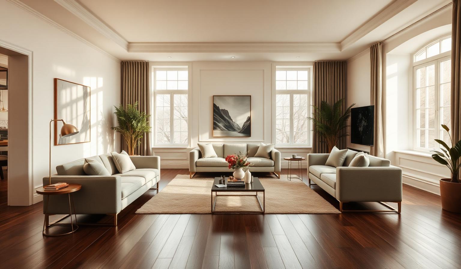
Dark wood floors are one of the most beautiful—and most demanding—foundations a room can have. Walnut, ebony-stained oak, dark hickory, and rich espresso engineered planks absorb light instead of reflecting it, which means the walls above them have to do double duty: adding brightness, balancing the wood's warmth, and letting the grain read as luxurious rather than heavy. Choosing the best paint colors for rooms with dark wood floors is not about picking a "safe" white and hoping for the best. It is a deliberate exercise in contrast, undertone matching, and light reflectance.
In this guide we translate the advice of professional interior designers into a practical playbook: the exact hex codes, the color names you can ask for at Benjamin Moore or Sherwin-Williams, the psychology behind each pick, and the room-by-room palettes that make dark hardwood look intentional rather than accidental. Whether you are hunting for interior paint for dark floors, deciding on wall colors with dark hardwood, or generally decorating with dark wood floors, the palette below will give you a defensible starting point.
Why Dark Floors Change the Rules
Before we look at specific colors, it helps to understand what dark hardwood does to a room's light. A polished walnut floor with a Light Reflectance Value (LRV) around 10 absorbs roughly 90% of the light that hits it. That absorbed light never reaches your walls, ceiling, or eye, so the room reads as darker, heavier, and often smaller than the same footprint with a light oak floor.
That single fact drives every recommendation in this guide. The primary goal when choosing the best paint colors for rooms with dark wood floors is to create either a pleasing high-contrast lift (walls that give back the light the floor took) or a deliberate, saturated harmony (walls that lean into the drama and turn the room into a jewel box). The mid-tone beige compromise almost never works: it fights the floor's warmth without adding either brightness or depth.
If you want a wider primer on how to layer color into a home in the first place, our companion piece on how to add color to your home walks through the philosophy of building a whole-house palette before you commit to a single wall.
Palette 1: Warm Whites and Off-Whites — The Reliable Lift
This is the most-specified strategy for dark hardwood, and for good reason. Warm off-whites bounce the maximum amount of light back into the room while sharing an undertone family with the floor—so the wood reads as intentional and the walls read as luminous rather than clinical.
The trick is warm. A pure cool white above a dark walnut floor looks like a lab coat over a leather boot. You want a whisper of yellow, cream, or greige in the pigment so the wall temperature agrees with the floor temperature.
1. Swiss Coffee — #F3F0E8
The single most popular warm off-white in North American design. Swiss Coffee has just enough cream to feel soft, but its LRV of ~83 makes it almost as reflective as pure white. Above an espresso oak floor, #F3F0E8 walls glow at every hour of the day.
Psychology: cleanliness, quiet luxury, and unforced warmth. Swiss Coffee reads as "linen sheets and unbleached paper"—understated, expensive, and calm.
2. Creamy White — #F5F5DC
A hair warmer than Swiss Coffee, Creamy White (#F5F5DC) leans into the buttery end of the neutral spectrum. It is the shade to reach for when your dark floor has strong red-brown undertones (Brazilian cherry, mahogany, dark hickory) because the yellow-cream pigment pulls the whole room into visual harmony.
Psychology: comfort, hospitality, softness. This is the wall color of country farmhouses and boutique hotels—inviting rather than sharp.
3. Greek Villa — #F0EBE3
Sherwin-Williams Greek Villa is a designer-favorite warm white with a barely-there pink undertone. Above dark walnut it reads as sun-warmed plaster—Mediterranean, restful, quietly sophisticated.
Psychology: serenity, warmth, timeless elegance.
4. Natural Linen — #EDEAE2
Slightly greyer than Swiss Coffee and slightly cooler than Creamy White, Natural Linen (#EDEAE2) is the safest choice when a room has a mix of wood tones—dark floors, medium walnut furniture, oak trim. It sits in the middle of the neutral spectrum and refuses to fight any of them.
Psychology: balance, versatility, understated modernity.
5. Greige — #BEBDB8
Greige is a step darker than the four whites above (LRV around 55) and works as an accent wall or in rooms with abundant natural light. Above a dark floor, #BEBDB8 creates a modern, monochromatic layering that reads more sophisticated than pure white on ebony ever will.
Psychology: modern, grounded, editorial.
Palette 2: Light and Cool Grays — The Contemporary Balance
If your dark floor leans warm (chestnut, walnut, red-brown mahogany) and you want a chic, contemporary contrast, cool-leaning light greys are your best friend. They temperature-balance the room: the warm floor and the cool wall meet somewhere in the visual middle, and the whole space reads as calm, curated, and modern.
6. Light French Gray — #D8D8D8
Behr Light French Gray is a true cool-grey with no strong undertone. Above a warm dark floor, #D8D8D8 walls read as slate, silver, or dove depending on the light hour—a chameleon in the best possible way. Ideal for open-plan living rooms and modern kitchens.
Psychology: modern sophistication, focus, clarity.
7. Silver Drop — #E3E1DB
Behr Silver Drop is the "quiet grey" version of the same idea: paler, warmer than Light French Gray, and easier to layer with brass and warm textiles. Above dark walnut, #E3E1DB is one of the most-photographed pairings in modern residential design.
Psychology: elegance, restraint, quiet luxury.
Palette 3: Earthy Greens and Cool Blues — Nature-Inspired Harmony
Dark hardwood is, at heart, nature—a tree cut, sawn, and stained. Painting the walls in colors drawn from other parts of the natural world (foliage, sky, sea, stone) creates one of the most restful, timeless rooms a home can offer.
8. Sage Green — #B2AC88
Sage is the single most versatile "colored neutral" for dark floors. #B2AC88 is warm enough to agree with walnut and cool enough to feel fresh. In bedrooms and living rooms it reads as calm and grounded; in home offices and libraries it reads as smart and confident.
Psychology: balance, tranquility, connection to nature. Green is the wavelength the human eye reads most easily, which is why sage-painted rooms feel restful within seconds.
9. Sea Salt — #DAE0D9
Sherwin-Williams Sea Salt is a barely-there green-blue-grey that behaves like a warm neutral. Above a dark floor it does the impossible: it makes the room feel airier without going pure white, and it flatters brass, oak, brushed nickel, and matte black in equal measure.
Psychology: serenity, freshness, coastal calm.
10. Light Blue — #ADD8E6
For a bedroom or a guest bath with dark wood, a genuine pale blue like #ADD8E6 creates a "sky above earth" effect that feels grounded and restful. Because blue is a receding wavelength, the walls appear to sit farther back than they physically are—a subtle enlarging trick for smaller rooms.
Psychology: rest, spaciousness, mental calm. If you want the full research on why blue is such a powerful design shade, our deep dive on the psychology of blue in design unpacks the neurology and cultural history behind the color.
Palette 4: Bold and Moody — The Jewel Box Approach
The counter-intuitive move—and one that has driven the entire dark-paint movement of the last decade—is to stop trying to lift the room and instead lean all the way in. When a room has dark floors, dark walls turn the whole space into an intentional, cocoon-like retreat. The floor and wall stop competing and start reading as a single, enveloping envelope of color.
This strategy works best in rooms with a defined purpose: dining rooms, dens, home libraries, powder rooms, and primary bedrooms are the classic candidates. It works less well in kitchens and workspaces that need task visibility.
11. Navy Blue — #000080
A true, saturated navy above a dark walnut floor is one of the most photographed pairings in modern design. #000080 creates a formal, confident, almost architectural room. Add brass hardware, cream upholstery, and unlacquered bronze lighting for a "gentleman's club" feel that never dates.
Psychology: authority, sophistication, drama.
12. Charcoal Gray — #36454F
Charcoal is the "quieter navy"—all the drama, none of the color commitment. Above dark hardwood, #36454F walls read as slate, graphite, or storm depending on the light. It is the ideal moody neutral: bold enough to make a statement, restrained enough to layer with any accent color.
Psychology: modern intimacy, grounded confidence, focus.
13. Forest Green — #228B22
The most romantic of the moody options. #228B22 above a walnut floor creates a room that feels like a library in an old country manor: green walls, dark wood, brass fixtures, leather chairs. In dining rooms and home offices it is unmatched for atmosphere.
Psychology: wealth, tradition, luxurious calm.
The Complete Reference Table
| Item | Color | Hex | Color Name | Psychological Meaning |
|---|---|---|---|---|
| Warm white wall | Warm cream white | #F3F0E8 | Swiss Coffee | Cleanliness, quiet luxury, warmth |
| Warm white wall | Buttery cream | #F5F5DC | Creamy White | Comfort, hospitality, softness |
| Warm white wall | Warm plaster white | #F0EBE3 | Greek Villa | Serenity, timeless elegance |
| Warm white wall | Balanced off-white | #EDEAE2 | Natural Linen | Balance, versatility, calm |
| Warm neutral wall | Warm greige | #BEBDB8 | Greige | Modern, grounded, editorial |
| Cool light wall | True cool grey | #D8D8D8 | Light French Gray | Modern sophistication, clarity |
| Cool light wall | Quiet warm-cool grey | #E3E1DB | Silver Drop | Elegance, restraint, luxury |
| Nature-inspired | Muted olive-green | #B2AC88 | Sage Green | Balance, tranquility, nature |
| Nature-inspired | Green-blue-grey | #DAE0D9 | Sea Salt | Serenity, freshness, calm |
| Nature-inspired | Pale sky blue | #ADD8E6 | Light Blue | Rest, spaciousness, mental calm |
| Moody wall | Saturated navy | #000080 | Navy Blue | Authority, sophistication, drama |
| Moody wall | Deep charcoal | #36454F | Charcoal Gray | Modern intimacy, focus |
| Moody wall | Rich green | #228B22 | Forest Green | Wealth, tradition, luxurious calm |
Designer-Approved Palette Combinations
A single color choice is easy. Building a coordinated palette across walls, trim, ceiling, and accents is where most rooms with dark wood floors succeed or fail. Below are three combinations professional designers actually specify.
Combination A — "Quiet Glow" (Warm White Strategy, Living Room)
- Walls: Swiss Coffee #F3F0E8
- Trim: Swiss Coffee #F3F0E8 (color-drenched for a modern seamless look)
- Ceiling: Swiss Coffee #F3F0E8, one shade lighter
- Accent textile: Sage Green #B2AC88
- Effect: The room lifts uniformly around the dark floor; the sage textiles echo the room's connection to nature and prevent the palette from reading as sterile.
Combination B — "Modern Contrast" (Cool Grey Strategy, Open-Plan)
- Walls: Light French Gray #D8D8D8
- Trim: Swiss Coffee #F3F0E8
- Kitchen island / accent wall: Charcoal Gray #36454F
- Effect: The cool grey balances the warm floor; the charcoal accent grounds the whole space and pulls the dark hardwood's undertone up into the eye level of the room.
Combination C — "Library at Dusk" (Moody Strategy, Home Office / Dining)
- Walls: Forest Green #228B22 (drop the value slightly for very dim rooms)
- Trim and built-ins: Forest Green #228B22 (color-drenched)
- Ceiling: Creamy White #F5F5DC (a "lift" that prevents claustrophobia)
- Accents: Brass hardware, cream upholstery, dark walnut
- Effect: The green envelops the room; the warm ceiling prevents heaviness; the floor becomes part of a single, unified envelope of color rather than a separate element.
To build a room where these combinations feel proportioned rather than accidental, apply the 60-30-10 color rule—it is the single most useful framework for deciding how much wall, trim, and accent color a space needs.
Color Psychology Above Dark Hardwood
Color psychology is amplified in rooms with dark wood floors because the floor itself is such a strong emotional signal. Dark hardwood reads to the eye as established, permanent, and serious—the flooring of libraries, banks, and old-world homes. Whatever color goes on the wall gets read against that emotional baseline.
Warm whites (Swiss Coffee, Creamy White, Greek Villa) soften that seriousness. They tell the room to relax. A dark-floored room in Swiss Coffee reads as heritage-meets-modern: grounded but airy, expensive but approachable.
Cool greys (Light French Gray, Silver Drop) sharpen it. They tell the room to look forward, not backward. A dark-floored room in Light French Gray reads as gallery, boutique hotel, or architect's studio—curated, current, deliberately quiet.
Earthy greens and cool blues (Sage, Sea Salt, Light Blue) contextualize it. They place the dark wood inside the larger story of the natural world. The room stops being "a floor" and starts being "a landscape."
Moody colors (Navy, Charcoal, Forest Green) commit to it. They stop apologizing for the dark floor and instead double the drama. Research on interior color perception consistently shows that deep, saturated rooms lower heart rate and encourage lingering—which is why so many restaurants, cocktail bars, and boutique hotels use dark-floor + dark-wall combinations for their most memorable rooms.
Practical Takeaways for Designers and Homeowners
- Match undertones before you match colors. Look at your dark floor in three different lights: morning, noon, and lamplight. Note whether the wood pulls red, yellow, or grey. Then pick a wall color that shares that undertone. A red-brown floor loves warm whites; a grey-brown floor loves cool greys.
- Sample on the wall, not on paper. Paint a 2-foot square on the wall directly above the darkest section of the floor. Live with it for 48 hours. Colors change dramatically once they sit in context.
- Do not fight the floor with the mid-tone. Beige, tan, and warm mid-grey walls almost always look muddy above dark hardwood. Commit to either high-reflectance (LRV > 75) or genuinely moody (LRV < 25).
- Warm your bulbs. Use 2700K–3000K bulbs throughout. Cool 4000K–5000K bulbs make warm whites read as grey and turn moody navies into muddy blues.
- Rugs are non-negotiable. A large, warm-toned rug (cream, sisal, oatmeal, faded Persian) breaks up the dark floor and instantly makes the room read as lighter and larger.
- Consider color-drenching. Painting the trim and ceiling the same color as the walls dissolves the visual edge and lets the dark floor become the room's single strong statement.
- Test brass or warm-metal fixtures. Cool chrome and stainless can amplify the heaviness of dark wood. Brass, unlacquered bronze, and antique nickel warm the whole room.
Conclusion: The Best Paint Colors for Rooms with Dark Wood Floors
The best paint colors for rooms with dark wood floors are the ones that stop treating the floor as a problem and start treating it as a foundation. If your instinct is to lift the room, commit to a warm off-white anchored by Swiss Coffee #F3F0E8, Creamy White #F5F5DC, or Greek Villa #F0EBE3. If your instinct is modern and cool, reach for Light French Gray #D8D8D8 or Silver Drop #E3E1DB. If you want the room to feel like a landscape, choose Sage Green #B2AC88, Sea Salt #DAE0D9, or Light Blue #ADD8E6. And if you want drama, commit fully to Navy Blue #000080, Charcoal Gray #36454F, or Forest Green #228B22.
Ready to build a full palette around your favorite hex code above? Head to the Coloracci palette generator to explore harmonies, contrast pairings, and accent suggestions that match any of the thirteen colors in this guide. Drop in #F3F0E8 or #228B22 and let the AI build the coordinating trim, textile, and accent palette for you—so your dark-floored room ends up looking not just intentional, but unforgettable.