Brewery and Winery Color Psychology: Crafting Atmosphere Through Color
· Coloracci Team
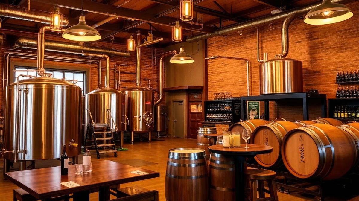
The craft beverage revolution has transformed brewery and winery design from functional production spaces into sophisticated destinations. Color psychology plays a critical role in how visitors perceive taste, quality, and authenticity. The right palette can literally make beverages taste better — research on crossmodal perception confirms that environmental color influences flavor perception.
The Amber Spectrum: Beer's Natural Palette
Amber (#FFBF00 to #CC7722) dominates brewery design because it mirrors the product itself.
Why Amber Works for Breweries
- Product reference: Amber tones echo the visual color of beer, creating environmental harmony
- Warmth creation: Amber lighting makes spaces feel inviting and encourages longer stays
- Appetite stimulation: Warm tones activate appetite centers, promoting food and beverage consumption
- Nostalgia activation: Amber light references pub tradition, gaslight era, and gathering culture
- Flavor enhancement: Research suggests warm ambient color enhances perception of malty, caramel flavors
The Beer Color Scale
Breweries can align interior color to their product specialty:
| Beer Style | SRM Range | Ambient Color | Hex | Psychological Effect |
|---|---|---|---|---|
| Pilsner/Lager | 2-4 | Pale gold | #F5DEB3 | Light, refreshing, approachable |
| Pale Ale | 5-10 | Golden amber | #DAA520 | Warm, balanced, inviting |
| IPA | 6-14 | Deep amber | #CC7722 | Bold, adventurous, craft |
| Brown Ale | 15-22 | Chestnut | #954535 | Comfortable, traditional, hearty |
| Stout/Porter | 25-40+ | Dark espresso | #3C1414 | Intense, sophisticated, contemplative |
Winery Color Psychology: The Terroir Palette
Wineries face different color challenges than breweries, with expectations of elegance and terroir expression.
The Wine Color Language
Wine already has its own color vocabulary that influences interior design:
- Burgundy (#800020): The most classic wine color, communicating depth and tradition
- Bordeaux (#4C0013): Darker, more serious, old-world associations
- Rosé pink (#FF007F to #FFB6C1): Modern, approachable, summer lifestyle
- Champagne (#F7E7CE): Celebration, luxury, effervescence
- Sauvignon blanc (#F0E68C): Crisp, fresh, light
Tasting Room Color Strategies
| Winery Style | Primary Palette | Accent | Atmosphere |
|---|---|---|---|
| Old-world traditional | Stone gray, deep burgundy | Gold details | Gravitas, heritage |
| Modern minimalist | White, pale wood | Single wine color | Clean, focused |
| Rustic farmhouse | Warm earth, olive green | Copper, iron | Authentic, terroir |
| Urban wine bar | Charcoal, black | Neon or vivid accent | Contemporary, social |
| Luxury estate | Cream, navy, gold | Crystal, mirror | Premium, exclusive |
Material Color: The Industrial Aesthetic
Craft beverages have embraced an industrial-rustic aesthetic where material colors are design features.
Copper: The Hero Material
Copper (#B87333) serves multiple functions:
- Production reference: Copper kettles and stills are actual brewing/distilling equipment
- Warm glow: Copper reflects warm light, creating flattering ambient conditions
- Aging metaphor: Copper patina symbolizes the craft of aging and time
- Antimicrobial signaling: Copper's cleanliness associations support food-safe perception
- Premium positioning: Copper communicates investment, craft, and quality
Steel and Concrete
Industrial materials provide neutral counterpoints:
- Brushed steel (#C0C0C0): Modern, clean, precision brewing
- Raw concrete (#B4B4B4): Honest, no-frills, substance over style
- Blackened steel (#2C2C2C): Dramatic, moody, craft intensity
- Reclaimed wood (#8B6914): History, authenticity, environmental consciousness
Lighting and Color Temperature
Beverage environments are especially sensitive to lighting color temperature because it directly affects how drinks look in the glass.
The Golden Hour Effect
The most successful tasting rooms create perpetual "golden hour" lighting:
- 2700K warm white: Ideal for most tasting environments, enhancing amber and red tones
- Candlelight zones: 2200K areas for intimate conversation and premium wine service
- Edison bulb aesthetic: Visible warm filaments creating atmosphere and visual interest
- Natural daylight integration: Windows allowing shifting natural light throughout the day
Color Rendering and Beverage Perception
High Color Rendering Index (CRI) lighting is critical:
- CRI 90+: Essential for wine tasting where visual color assessment is part of evaluation
- CRI 80-90: Acceptable for casual brewery environments
- Below CRI 80: Problematic — beer and wine colors appear distorted, undermining quality perception
Tap Room vs. Tasting Room: Different Color Strategies
Brewery Tap Rooms
Brewery tap rooms prioritize:
- Social energy: Warmer, more saturated colors encouraging conversation
- Volume tolerance: Colors that feel comfortable at high occupancy
- Food pairing: Appetite-stimulating warm tones
- Brand immersion: Strong brand color presence throughout
- Flexibility: Colors that work for events, live music, and daily operations
Winery Tasting Rooms
Winery tasting rooms emphasize:
- Contemplation: More muted, sophisticated palettes enabling focus on wine
- Light control: Colors that manage natural light without competing with wine color
- Landscape connection: Palettes referencing surrounding vineyard terrain
- Seasonal adaptation: Colors that shift with harvest seasons
- Purchase psychology: Subtle luxury cues that justify premium pricing
Outdoor Spaces: Patio and Garden Color
Beverage destination patios present unique color opportunities:
The Vineyard Palette
- Grapevine green (#228B22): Connecting to the agricultural source
- Terracotta (#E2725B): Mediterranean warmth and clay soil reference
- Lavender (#B57EDC): Provence association, aromatic garden complement
- Stone gray (#8E8E8E): Grounded, natural, unobtrusive
The Beer Garden Palette
- Picnic table natural (#DEB887): Unpainted wood warmth
- Hop vine green (#6B8E23): Agricultural connection, freshness
- Festival colors: Bright primary accents for seasonal events
- String light warm (#FFE4B5): Evening atmosphere, extended visit encouragement
Label and Packaging Color Psychology
The color bridge between product packaging and environment is crucial for brand coherence.
Craft Beer Label Trends
- Bold illustration: Maximalist color, detailed artwork, shelf differentiation
- Minimal modern: Single-color typography on white or kraft, premium positioning
- Retro revival: Vintage color palettes, nostalgia marketing
- Dark and moody: Black labels with metallic accents, imperial/premium styles
Wine Label Color Signals
Wine labels use color to communicate before the bottle is opened:
| Label Color | Message | Target Consumer |
|---|---|---|
| White/cream | Classic, traditional, serious | Collectors, traditionalists |
| Black | Bold, premium, modern | Younger premium buyers |
| Kraft/natural | Organic, sustainable, authentic | Health-conscious, eco-aware |
| Bright color | Fun, approachable, casual | New wine drinkers, events |
| Metallic | Luxury, celebration, gift | Special occasion buyers |
Seasonal Color Adaptation
Successful beverage destinations adapt their color environment seasonally:
Harvest Season (Autumn)
- Warm intensification: More amber, gold, and burgundy
- Harvest references: Sheaf yellow, grape purple, apple red
- Extended evening: Warmer lighting as days shorten
- Menu color alignment: Seasonal food offerings reflected in table settings
Summer Season
- Lighter palette: More white, pale gold, light green
- Outdoor emphasis: Patio and garden color activation
- Refreshment colors: Cool blues and whites for lighter beverages
- Extended daylight: Managing natural light in tasting spaces
Measuring Color Success in Beverage Environments
Key metrics for evaluating color effectiveness:
- Average visit duration: Warm colors should increase time spent
- Per-visit spending: Does the environment encourage additional purchases?
- Taste satisfaction scores: Do wines/beers score higher in optimized environments?
- Social media sharing: Do colors create Instagram-worthy moments?
- Return visit rate: Does the atmosphere motivate repeat visits?
- Event booking: Is the space chosen for private events based on atmosphere?
The most successful brewery and winery environments create color coherence between product, space, brand, and experience. When a visitor looks at their glass and the room around them and feels they belong together — that's color psychology working at its finest.