What Color Is Hermès Orange? HEX & Pantone Codes — Hermès Orange Color Code
· Coloracci Team
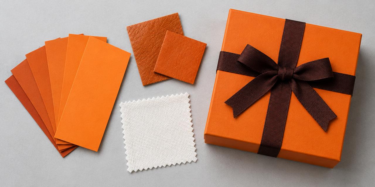
An orange Hermès box and its dark ribbon present a deceptively simple production problem: two surfaces, two textures, and a color relationship that a single screen sample cannot capture. The Hermès Orange Color Code most often used as a digital starting point is #F37021. It is a useful sRGB reference—not evidence of an official Hermès formula, and not a universal specification for paper, leather, or fabric.
The short answer: use #F37021 for an explicitly labeled digital approximation. Consider PANTONE Orange 021 C as a coated-print comparison candidate and PANTONE 16-1448 TCX as a textile comparison candidate, but do not call either an official equivalent or a proven closest match without a defined dataset and physical verification.
This guide addresses the designer's practical question: what should go into a color specification, and what should remain a qualified reference? For the wartime packaging story and its wider branding lessons, read our separate Hermès Orange history article.
Hermès Orange Color Code: What #F37021 Actually Defines
HEX notation describes channel values, not an ink recipe. Interpreted as sRGB, #F37021 means RGB 243, 112, 33. Its approximate HSL coordinates are 23°, 90%, 54%: a strongly saturated orange with considerable red influence, rather than a yellow-orange or a muted terracotta.
That distinction explains its visual punch. The relatively high red channel gives it heat, while enough green keeps it recognizably orange. The low blue component prevents the dusty, subdued appearance of a brownish neutral. On a screen, it is an assertive mid-light orange, not a pastel and not a metallic copper.
However, a screen's emitted light is fundamentally different from the reflected light of a box. Even two displays can disagree because of calibration, brightness, ambient illumination, or unmanaged profiles. A screenshot sampled on one device should therefore never become an unquestioned production master.
For a digital style sheet, write “Hermès-inspired orange approximation, sRGB #F37021.” For genuine brand-authorized work, obtain the supplied artwork and applicable material standards instead. A publicly repeated HEX reference does not override the requirements of the rights holder or its approved suppliers.
Is the color called Orange, Orange H, or Vivid Tangelo?
Hermès uses orange terminology across its packaging and products; Orange H also appears in product-color vocabulary. Those words do not prove that every orange leather accessory, shopping bag, and box shares one measured spectral target. Material and finish remain part of the description.
“Vivid Tangelo” is a descriptive name associated with #F37021 in some online color references. It is not a standardized CSS named color. Typing that phrase into a stylesheet will not produce this orange. CSS orange resolves to #FFA500, which is substantially more yellow; darkorange resolves to #FF8C00, which is also not this reference.
Use names for conversation and numeric values with an identified color space for implementation. This small discipline prevents a developer, printer, or supplier from silently substituting a familiar orange for the intended one.
A Working Palette: Orange, Ébène-Like Brown, and White
The strength of the familiar orange-and-brown pairing is relational. Orange supplies recognition; a dark, slightly reddish brown supplies structure. White can provide clean contrast in a supporting digital composition, but should not be described as the universal logo color on actual Hermès boxes: familiar packaging commonly carries dark printing.
The supplied #442B2D is an approximate Ébène-like brown reference. Ébène is also used as a Hermès product-color name; that does not authenticate this HEX as the exact ribbon or logo specification. A woven ribbon reflects light differently from flat printed ink, even when both look “brown.”
The following table separates the principal references from deliberate comparison colors and supporting neutrals. Every HEX is exact as a digital value; its association with a physical brand object remains approximate.
| Item | Color | Hex | Name | Meaning |
|---|---|---|---|---|
| Main digital starting point | Saturated red-orange | #F37021 | Hermès-inspired orange / Vivid Tangelo reference | Recognition and energy; not an authenticated formula |
| Ribbon and lettering study | Deep reddish brown | #442B2D | Ébène-like approximation | Structure, restraint, and a tactile counterweight |
| Supporting digital background | White | #FFFFFF | White | Clear space; not a claim about every packaging logo |
| Historical packaging study | Pale cream | #F5E8D3 | Illustrative cream-beige | A visual reference to earlier boxes, not an archival measurement |
| Orange comparison chip | More saturated orange | #FF7900 | Alternate digital orange | Shows how a small hue shift changes the palette |
| Darker orange study | Muted orange | #DE6A1D | Material/shadow study | Demonstrates a darker appearance without redefining the master |
| Secondary warm study | Redder orange | #E86221 | Alternate digital approximation | Tests red influence and local contrast |
| Digital text support | Near-black | #211A18 | Warm ink | A supporting neutral for readable editorial layouts |
Do not distribute these alternatives as interchangeable “official codes.” A palette document should identify #F37021 as the chosen digital master and label the others by their function. Otherwise a supplier can select whichever orange happens to look convenient.
Hermès Orange Color Code and Pantone: Candidates, Not Equivalents
There is no single publicly established official Pantone assignment that can safely be applied to every Hermès orange object. The question “What is the Pantone?” is incomplete until it specifies the material, library, viewing condition, and approval source.
PANTONE Orange 021 C belongs to the graphics/printing context and is a commonly discussed comparison candidate for a vivid orange on coated paper. PANTONE 16-1448 TCX, Burnt Orange, belongs to the Fashion, Home + Interiors cotton context. Its textile swatch is not a substitute for a coated-paper ink specification.
The candidates also need not be equally close to #F37021. They may differ visibly in lightness, saturation, and red/yellow balance. Mentioning both reflects two different production contexts, not a universal consensus demonstrated by one calculation.
| Reference | Production context | Appropriate use | What it does not establish |
|---|---|---|---|
| #F37021 in sRGB | Screens and digital artwork | A declared digital approximation | A physical ink, dye, or leather recipe |
| PANTONE Orange 021 C | Graphics, coated-paper reference | A physical comparison candidate for print | Official Hermès approval or an identical uncoated result |
| PANTONE 16-1448 TCX | Cotton textile reference | A fabric comparison candidate | A coated-print specification or guaranteed leather match |
Start with our HEX-to-Pantone converter, enter #F37021, and examine several nearby results. Record which library the result belongs to before adding it to a handoff. A numerically close textile entry is not automatically the right answer for a carton.
For a more detailed explanation of why these systems serve different jobs, see Pantone vs. HEX: when to use each color system. The professional result is a documented production decision, not a confident-looking conversion pasted into a mood board.
Why the closest Delta E result can change
Delta E expresses color difference after colors have been represented in a suitable comparison space, typically CIELAB. It does not measure ownership, authenticity, or whether a printer can reproduce a result on your chosen stock.
Coloracci's matching utility compares sRGB-derived Lab values with CIE76 Delta E. It ranks the digital approximations in its available library. A dataset with different reference values, a different illuminant, or a method such as CIEDE2000 can produce a different shortlist. CIE76 numbers should not be treated as identical to CIEDE2000 numbers.
For a rigorous physical comparison, use measured or licensed reference data with consistent measurement conditions. A cotton swatch and a coated paper chip cannot become interchangeable merely because both have RGB previews on a website. Nor can an RGB preview guarantee the appearance of a highly saturated printed orange.
This is why this article does not publish a fabricated Delta E score or crown either candidate the mathematical winner. A claim of “closest” must identify the data, candidate set, formula, and conditions that generated it.
Why the Box, Ribbon, and Leather Never Behave Identically
A matte box scatters light broadly. A woven ribbon contains fibers, small shadows, and directional sheen. Leather adds grain, surface treatment, and sometimes a glossy finish. Photograph all three under one lamp and their sampled values can diverge without any production error.
In print, the substrate's white point influences the result. A warm paper can push orange toward a softer appearance; coating changes how the ink sits and how the surface reflects light. The C suffix identifies the coated-paper reference. An uncoated application requires its own evaluation, not a casual suffix replacement.
In textiles, fiber, dye process, weave, and finishing matter. In leather, tanning and surface finishing introduce additional variables. A paper chip is useful for conversation, but a real leather sample should be the approval object for a leather job.
Metamerism adds another complication: materials may look close under one illuminant and separate under another. Evaluate print under appropriate controlled lighting, commonly D50, and also inspect the finished object in its intended environment. For textiles, follow the supplier's agreed viewing and measurement standard rather than automatically borrowing the print convention.
A Brief History That Explains the Technical Problem
Hermès' own account places the orange box's adoption during wartime shortages, when its earlier packaging was no longer readily available. The temporary material solution became a permanent recognition device. Earlier packaging evolved through more than one appearance, so “cream became orange overnight” is a simplified version of a longer story.
The useful lesson here is not that one HEX value survived unchanged since the 1940s. It is that consistent color relationships and repeated physical experiences can build recognition even when materials vary. The brown ribbon, orange surface, and controlled typography function as a system.
That system also requires legal care. Studying a palette does not grant permission to reproduce a house's marks or create confusingly similar packaging. Protection depends on jurisdiction and context; an educational color reference is not a license for counterfeit presentation.
For another luxury-color problem where public matching candidates must be distinguished from a proprietary reference, read the closest Pantone to Tiffany Blue. The shared design lesson is to separate an accessible approximation from an authorized production standard.
Hermès Orange Color Code: A Reliable Designer Handoff
1. Establish the job before choosing a swatch
Ask whether the deliverable is a digital editorial illustration, independent luxury packaging, a textile sample, or approved brand work. Only the last category can rely on the brand's authorized standards. For independent work, describe the palette as inspired and build an identity with its own typography, geometry, and proportions.
2. Preserve the digital master
Keep #F37021 in a named sRGB token; record RGB 243, 112, 33 alongside it. Avoid passing a screenshot as the only reference. If the artwork moves between applications, preserve its profile and check export settings. Use the color picker to inspect values, not to certify physical matching.
3. Shortlist within the correct production library
For coated print, compare suitable graphics chips, including Orange 021 C where appropriate. For cotton, compare textile swatches, including 16-1448 TCX as a candidate. Ask the producer which standard they can actually use. Never write “021 C / 16-1448 TCX” as if the slash meant equality.
4. Approve the complete material relationship
Obtain a drawdown, strike-off, or finished sample on the actual substrate. Place it beside the ribbon or supporting brown, not in isolation. Decide whether the orange is too yellow, too red, too dark, or too dull before discussing acceptable tolerances with the supplier.
5. Check digital contrast independently
The approximate contrast of white against #F37021 is 2.94:1, below WCAG AA requirements for normal text and below 3:1 for large text. The #442B2D brown is approximately 4.39:1 against the orange: sufficient for qualifying large text, but below 4.5:1 for normal text. Recheck actual values and states rather than assuming a dark-looking brown is automatically readable.
Use our Color Contrast Checker before placing labels or controls on orange. A warm near-black can provide additional contrast headroom. Brand recognition and interface readability are separate tests; a beautiful box is not automatically an accessible button.
6. Write approval language that survives production
A useful handoff states: “Digital reference: sRGB #F37021. Physical target: approved sample on specified stock. Pantone comparison: candidate only, subject to proof approval. Supporting brown: digital approximation #442B2D; ribbon approved separately.” Include the sample identifier, finish, measurement conditions, and agreed tolerances where applicable.
That wording is more valuable than a decorative list of HEX, RGB, CMYK, and Pantone numbers that pretends they are equivalent. If CMYK is required, request a profile-specific conversion from the production workflow; an unqualified percentage recipe cannot predict every press and paper.
Conclusion: Specify the Color, Not the Myth
Hermès orange is an intensely recognizable red-orange whose familiar digital starting point is #F37021. Its power comes from the relationship between vivid orange, restrained brown, and carefully controlled materials—not from a universally interchangeable code.
Use HEX for the screen reference, the appropriate Pantone library for shortlisting, and a physical approved sample for production. Keep Orange 021 C and 16-1448 TCX clearly labeled as candidates, never official equivalents. That distinction turns a color lookup into a defensible design decision.
Build your own production shortlist now: open the HEX-to-Pantone converter, enter #F37021, compare the nearby references, and take the correct physical swatches to your supplier before approving the final material.
Reference and verification notes
- Hermès' orange-box story supplies the house's wartime packaging account.
- PANTONE 16-1448 TCX, Burnt Orange identifies the textile candidate.
- PANTONE Orange 021 C identifies the graphics candidate.
- Pantone color systems explains the distinction between graphics and Fashion, Home + Interiors references.
- W3C CSS named colors establishes why “Vivid Tangelo” is not a CSS keyword.
- WCAG contrast minimum supplies the accessibility thresholds used here.