Dopamine Decor Colors: The Psychology of Bold Hues That Boost Your Mood
· Coloracci Team
Dopamine Decor Colors: The Psychology of Bold Hues That Boost Your Mood

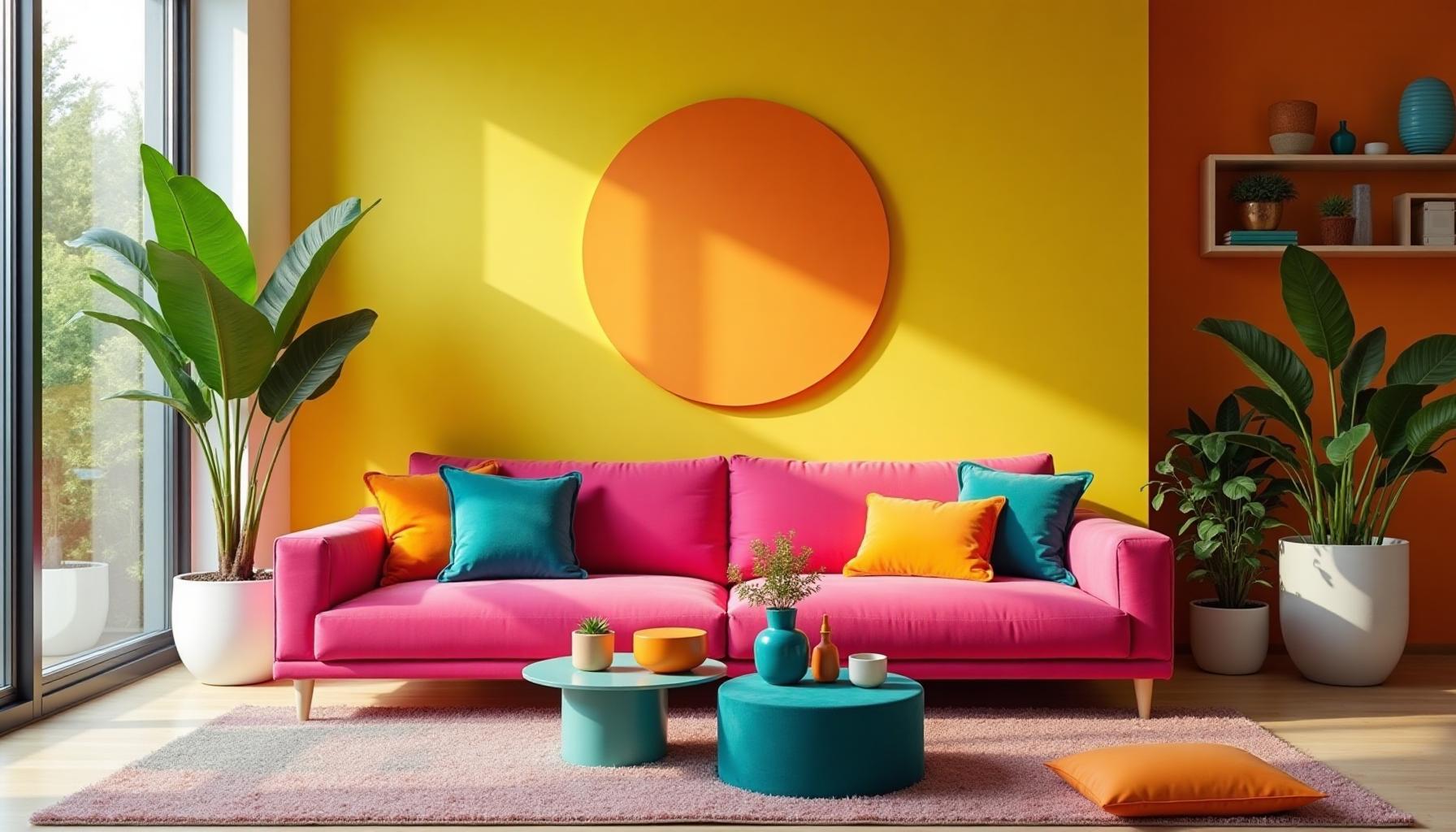
In the aftermath of minimalism's muted reign, a colorful revolution has emerged. Dopamine decor isn't just a trend—it's a scientific approach to interior design that uses bold, vibrant colors to literally make you feel better. As we spend more time in our homes than ever before, the spaces we inhabit have become crucial to our mental wellbeing.
This comprehensive guide explores the neuroscience behind color and mood, provides curated dopamine color palettes for every room, and shows you how to embrace bold hues without overwhelming your space.
The Science: How Colors Trigger Dopamine Release

The connection between color and emotion isn't metaphorical—it's neurological. When we perceive color, our brains trigger a cascade of chemical reactions that affect everything from heart rate to hormone production.
The Neuroscience of Color Perception
Research from the University of Rochester found that exposure to warm colors like red and orange increases heart rate and stimulates adrenaline production. Meanwhile, studies published in the Journal of Environmental Psychology demonstrated that people in brightly colored rooms reported higher levels of energy and positive emotions.
Key findings from color psychology research:
- Yellow stimulates the production of serotonin, the "happiness hormone"
- Orange triggers dopamine release associated with reward and pleasure
- Pink (specifically Baker-Miller Pink
#FF91AF ) has been shown to reduce aggression - Blue-green combinations activate parasympathetic relaxation while maintaining alertness
- Saturated colors create stronger emotional responses than muted tones
The term "dopamine decor" comes from this direct connection between visual stimulation and neurotransmitter release. When you see a color you love—especially in high saturation—your brain literally rewards you with a hit of dopamine.
Why Bold Colors Make Us Happy
The psychology is beautifully simple: bold colors demand attention, and attention creates engagement. When we engage positively with our environment, our brains release dopamine as a reward signal.
This is why children's spaces are traditionally colorful—designers intuitively understood what neuroscience now confirms. But somewhere along the way, we decided adults should "grow out of" joyful color. Dopamine decor challenges that assumption.
The Rise of Dopamine Decor (2020-2025)

The dopamine decor movement emerged as a direct response to the global pandemic lockdowns. When the outside world became restricted, people began reimagining their interior spaces as sources of joy rather than just functionality.
A Timeline of the Trend
2020: The Pandemic Catalyst Confined to homes, people began painting accent walls in bold colors. TikTok searches for "colorful rooms" increased 340%.
2021: Maximalism Returns Interior design magazines declared minimalism "dead." Neobrutalism emerged in digital design, bringing bold colors to websites.
2022: The "Joyful Home" Movement Retailers reported 200% increases in colorful furniture sales. Yellow sofas became the defining piece of the era.
2023: Scientific Validation Multiple studies confirmed the mental health benefits of colorful interiors. The term "dopamine decor" was coined.
2024-2025: Mainstream Adoption Major brands like IKEA and West Elm launched dedicated "joyful living" collections. Color psychology became standard in interior design education.
Dopamine Decor vs. Maximalism
While related, dopamine decor and maximalism aren't identical:
| Dopamine Decor | Maximalism |
|---|---|
| Focus on color saturation | Focus on pattern and texture |
| Strategic placement | More-is-more approach |
| Psychology-driven | Aesthetics-driven |
| Can work in minimal spaces | Requires layering |
| Goal: emotional response | Goal: visual richness |
Dopamine Color Palettes for Every Room
Understanding Each Palette
Electric Sunrise brings the energy of a new day into your living room. The combination of
Candy Shop embraces pure playfulness—perfect for children's spaces or creative studios. The
Tropical Paradise brings vacation vibes to your bathroom. The
Retro Arcade channels 80s nostalgia for home offices. Studies show that nostalgic environments improve creative problem-solving. The
Joyful Primary uses pure primary colors for kitchens—spaces where we gather and create. The bold
Sunset Dreams offers a softer dopamine hit for bedrooms. The warm
The Psychology of Individual Dopamine Colors

Not all colors trigger dopamine equally. Here's what the research tells us about specific hues:
Yellow: The Serotonin Booster
Yellow is the color most strongly associated with happiness across cultures. It stimulates the production of serotonin while also triggering dopamine release. However, pure yellow
Best applications:
- Accent walls in home offices
- Kitchen accessories and small appliances
- Throw pillows and textiles
- Art and wall decor
Recommended shades:
- Mustard
#FFDB58 - rich and warm - Canary
#FFEF00 - bright and cheerful - Marigold
#EAA221 - sophisticated warmth
Pink: The Calming Energizer
Pink uniquely combines calming effects with energy. Baker-Miller Pink
Best applications:
- Living room statement furniture
- Bathroom tiles or paint
- Bedroom accent walls
- Home office accessories
Orange: Pure Dopamine
Orange is the most directly linked to dopamine release. It combines the energy of red with the happiness of yellow.
Best applications:
- Dining room accents (stimulates appetite)
- Exercise spaces
- Creative studios
- Kitchen backsplashes
Turquoise & Teal: Calm Energy
The blue-green family offers a unique combination: the calming effects of blue with the energizing properties of green.
Best applications:
- Bathrooms
- Home spas
- Reading nooks
- Meditation spaces
Balancing Dopamine Colors Without Overwhelm

The key to successful dopamine decor isn't painting every surface hot pink—it's strategic placement that maximizes impact without creating visual chaos.
The 70-20-10 Rule for Dopamine Decor
This classic interior design principle becomes even more important with bold colors:
- 70% - Neutral base (white, cream, gray, natural wood)
- 20% - Secondary color (often a saturated but softer tone)
- 10% - Dopamine pop (your boldest, most saturated color)
This ratio ensures your space feels energizing rather than exhausting. For more on color proportions, explore our Color Hierarchy tool.
Strategic Placement Principles
1. Entry Points Place your boldest colors where you'll see them upon entering. This creates an immediate dopamine hit without overwhelming the entire space.
2. Functional Zones Different activities benefit from different color energies:
- Work zones: yellows, oranges
- Relaxation zones: softer pinks, turquoise
- Social zones: warm reds, coral
3. Natural Light Considerations Bold colors look different in natural vs. artificial light. Test your choices at different times of day.
4. Surface Size Matters
- Large surfaces: use softer versions of your dopamine colors
- Small accents: go bold with full saturation
- Textiles: can handle more saturation than walls
Common Mistakes to Avoid
Too many colors at once. Dopamine decor doesn't mean using every color—choose 2-3 complementary hues.
Ignoring undertones. A warm pink and a cool blue might clash. Use our Color Contrast Checker to ensure harmony.
Forgetting about neutral breathing room. Your eye needs places to rest.
Going bold on permanent fixtures. Bold paint is easy to change; bold tile is not. Start with textiles and art.
Dopamine Decor in Real Spaces

Let's look at how dopamine decor translates into actual homes:
Kitchen: The Joy of Cooking
Colorful kitchens have proven mental health benefits—studies show people cook more often in kitchens they enjoy being in. Consider:
- Yellow cabinets
#FFD700 against white walls - Coral backsplash
#FF7F50 with neutral countertops - Blue-green accessories
#00CED1 for contrast
Bathroom: The Daily Reset
Your bathroom is where you start and end each day. Make it memorable:
- Pink walls
#FF69B4 with white fixtures - Turquoise tiles
#40E0D0 in the shower - Colorful towels and accessories as easy starting points
Home Office: Creative Energy
Where you work should inspire you:
- Orange accent wall
#FF6700 behind your monitor - Yellow desk accessories
#FFD700 - Purple chair
#9B59B6 for creative thinking
Bedroom: Joyful Rest
Balance energy with relaxation:
- Sunset-toned bedding using
#FF6B6B and#FFAB76 - One bold wall opposite the bed
- Soft pink accents
#FFB6C1 for romance
Living Room: Social Warmth
Where you gather should energize connection:
- Bold sofa in
#FF1493 deep pink or#FF4500 orange-red - Contrasting pillows in complementary colors
- Art as the focal point featuring your dopamine palette
Dopamine Decor Meets Digital Design
The principles of dopamine decor extend beyond physical spaces. Web design trends increasingly embrace bold colors for the same psychological reasons.
Applying Dopamine Principles to UI/UX
- Call-to-action buttons in dopamine colors increase click-through rates
- Dashboard designs with colorful data visualization improve user engagement
- Onboarding flows with vibrant colors reduce abandonment
Our AI Website Designer can help you apply these principles to digital projects, while the Light/Dark Mode Generator ensures your bold palette works across themes.
Dopamine Decor vs. Other Colorful Trends
Comparison with Neobrutalism
Neobrutalism shares dopamine decor's love of bold colors but adds intentional "ugliness" and harsh contrasts. Dopamine decor focuses purely on joy.
Comparison with Y2K Aesthetic
The Y2K revival uses many dopamine colors but emphasizes nostalgia and specific era references. Dopamine decor is timeless and psychology-focused.
Comparison with Maximalism
Maximalism is about abundance of everything—pattern, texture, objects. Dopamine decor can be minimalist in arrangement while bold in color.
Getting Started: Your Dopamine Decor Action Plan
Ready to bring dopamine colors into your space? Here's a practical roadmap:
Week 1: Assessment
- Identify which rooms feel "flat" or uninspiring
- Note where you naturally look when entering each room
- Consider which dopamine palette resonates with you
Week 2: Small Experiments
- Add colorful throw pillows or blankets
- Swap neutral accessories for bold ones
- Introduce colorful art prints
Week 3: Medium Commitments
- Paint a single accent wall
- Invest in one bold furniture piece
- Update light fixtures with colorful options
Week 4: Evaluate and Expand
- Notice how your mood has changed
- Identify what's working and what feels overwhelming
- Plan next steps based on your experience
Tools for Creating Dopamine Palettes
Creating your perfect dopamine palette is easier with the right tools:
- Fibonacci Generator - Create mathematically harmonious palettes
- Mood Board Generator - Visualize your dopamine decor
- Color Hierarchy - Plan your 70-20-10 distribution
- Image Color Extractor - Extract colors from inspiration photos
- Color Contrast Checker - Ensure accessibility and harmony
Conclusion: Permission to Be Bold
Dopamine decor isn't about following trends—it's about giving yourself permission to surround yourself with colors that make you genuinely happy. The science supports what children have always known: color is joyful.
Whether you start with a single hot pink pillow or commit to a full yellow kitchen, remember that dopamine decor is personal. The colors that boost your mood might be different from someone else's, and that's the point.
Your home should be a source of daily joy. With dopamine decor, you're not just decorating—you're designing your own happiness.
Ready to find your perfect dopamine palette? Try our AI Website Designer to see bold colors in action, or explore the Fibonacci Generator to create mathematically perfect color combinations.