Bold and Beautiful: Masterful Color Combinations for Small Spaces
· Coloracci Design Team
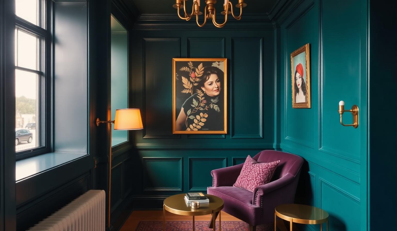
The Direct Answer: Bold Color Combinations for Small Spaces Actually Work
If you're searching for bold color combinations for small spaces, here is the truth designers have known for a century: small rooms don't need to be white to feel bigger — they need committed color to feel intentional. A powder room in Black Forest Green with brass sconces reads as a jewel box. The same room in builder-beige reads as an afterthought. Deep, saturated, and jewel-toned palettes dissolve corners, add perceived depth, and turn a tight footprint into the most memorable space in the house.
This guide breaks down the exact bold color combinations for small spaces that professional interior designers reach for — every hue with its HEX code, four ready-to-paint palettes, the color psychology behind each choice, and the practical execution rules that separate a striking small room from a cramped one.
Why the "Paint Small Rooms White" Rule Is Wrong
The white-walls-make-rooms-bigger idea is a shortcut, not a law. Pale walls only enlarge a space when the light quality, ceiling height, and sightlines cooperate. In a windowless powder room, a north-facing entry, or a tight urban bedroom, white reads flat, cold, and clinical — and paradoxically emphasizes every awkward angle. Dark, saturated color does the opposite: it blurs the boundary between wall and shadow, so the eye stops measuring the room and starts inhabiting it.
We cover the counter-strategy in depth in our guide to what color palette makes a room look bigger. For rooms where enlargement isn't the goal — where intimacy, drama, and character matter more — bold color is the smarter tool.
The Bold Color Palette for Small Spaces: Exact HEX Codes
Before you commit to a wall, know your colors. These are the shades designers specify again and again for small rooms:
Deep Greens
- Black Forest Green — HEX #393D35. A blackened forest green (Benjamin Moore territory). Reads nearly black in low light, unmistakably green in daylight.
- Caldwell Green — HEX #5F604D. A muted, earthy olive. Softer than Black Forest, works beautifully in daylight-poor rooms.
Rich Blues
- Deep Navy — HEX #000080. The classic. Sophisticated, timeless, endlessly pairable.
- Sapphire Blue — HEX #0F52BA. A vibrant jewel-tone blue with real saturation — the color of a cocktail bar, not a nursery.
Dark Grays and Charcoals
- Kendall Charcoal — HEX #686968. Rich neutral dark gray. The most versatile bold neutral you can specify.
- Ashland Slate — HEX #58595B. Deep, almost-black slate gray. Reads architectural.
Jewel Tones
- Plum Noir / Deep Purple — HEX #4E0E2E. Royal, luxurious, mysterious. See our dedicated study on purple in luxury branding psychology for why this hue signals premium.
- Emerald Green — HEX #009B77. Vibrant, energizing, unapologetically saturated.
Supporting Colors and Metals
- Brass / Gold — HEX #B89B72. The single most important accent metal for bold palettes.
- Crisp White Trim — HEX #F4F4F4. Not pure white — softened, so it warms rather than fights the walls.
- Creamy White — HEX #F5F5DC. Ceiling and trim companion for green palettes.
- Terracotta — HEX #B87333. The earth-tone bridge for olives and charcoals.
- Coral — HEX #FF7F50. Textile pop against navy.
- Dusty Rose — HEX #D0A9A9. Softens plum and burgundy walls.
- Sage — HEX #9DC183. Living, unexpected companion to plum and gold.
- Silver / Chrome — HEX #C0C0C0. Cool metal for navy palettes.
Four Designer Palettes: Bold Color Combinations for Small Spaces
Each palette below is calibrated to a specific room type and mood. Pick the one that matches your light conditions and personality.
Palette 1 — The Jewel Box Powder Room
The safest, highest-impact bold combination for a windowless or tight bathroom.
- Walls: Black Forest Green #393D35 in high-gloss or eggshell.
- Trim and ceiling: Crisp White #F4F4F4.
- Hardware and lighting: Brass #B89B72.
- Textiles: Dusty Rose #D0A9A9 hand towels.
- Floor: warm terracotta or walnut wood.
Why it works: green + brass is the most flattering color combination on human skin at close range — critical in a bathroom mirror. The rose softens what could otherwise feel masculine.
Palette 2 — The Navy and Coral Study or Home Office
For a small workspace that has to feel serious but not sterile.
- Walls: Deep Navy #000080 on three walls; a single Crisp White #F4F4F4 wall behind the desk.
- Trim: Crisp White #F4F4F4.
- Accent textiles and art matting: Coral #FF7F50.
- Punctuation: Silver / Chrome #C0C0C0 desk lamp and hardware.
- Optional pop: Bright Yellow #FFFF00 on a single object — a chair back, a book spine display, a ceramic vessel.
Navy makes screens easier on the eyes and drops perceived noise levels. Coral keeps the room from feeling corporate.
Palette 3 — The Plum Noir Bedroom Cocoon
A small bedroom transformed into a private retreat.
- Walls: Plum Noir #4E0E2E on all four walls or as a headboard-wall feature.
- Ceiling: Creamy White #F5F5DC (never dark).
- Bedding: Dusty Rose #D0A9A9 with a Sage #9DC183 throw.
- Metals: Brass / Gold #B89B72 for lamps and picture frames.
- Floor: rich walnut or a deep-pile cream rug.
Purple lowers heart rate at the perceptual level — one reason it dominates spa branding. In a small bedroom, plum noir turns a footprint issue into an emotional feature.
Palette 4 — The Maximalist Emerald Entry or Reading Nook
For the fearless.
- Walls: Emerald Green #009B77 in eggshell.
- One accent element: Sapphire Blue #0F52BA velvet chair or upholstered bench.
- Metals: Brass #B89B72 and warm gold.
- Art and textiles: touches of Plum Noir #4E0E2E and coral.
- Trim: Crisp White #F4F4F4.
This is the most photographed kind of small space on design blogs for a reason — the saturation is the entire point.
The Color Psychology Behind Bold Small-Space Design
Every bold hue does specific perceptual work. Understanding the psychology is what separates decoration from design.
- Deep greens activate the biophilic response — associations with forests, safety, and restoration. Ideal for spaces where you want people to slow down (bathrooms, bedrooms, reading nooks).
- Navy and sapphire communicate trust, focus, and authority. Excellent for home offices, entries, and any room that greets guests.
- Dark charcoals read as architectural rather than decorative — they treat the wall as a background object, letting art and furniture perform.
- Plum and deep purple signal luxury and introspection. Historically the most expensive pigment, and the subconscious knows it.
- Emerald codes as prosperity, growth, and confidence. High energy without the aggression of red.
Layered against these dark walls, warm metals (brass, gold, aged bronze) add candlelight-quality reflectance that pure whites and cool metals cannot produce.
Bold Color Combinations for Small Spaces: The Complete Data Table
| Item | Color | Hex | Color Name | Psychological Meaning |
|---|---|---|---|---|
| Powder room walls | Black Forest Green | #393D35 | Black Forest Green | Grounding, restoration, quiet luxury |
| Study walls | Deep Navy | #000080 | Deep Navy | Focus, trust, sophistication |
| Bedroom feature wall | Plum Noir | #4E0E2E | Plum Noir | Royalty, introspection, sensuality |
| Reading nook walls | Emerald Green | #009B77 | Emerald Green | Prosperity, vitality, confidence |
| Alternative bold blue | Sapphire Blue | #0F52BA | Sapphire Blue | Depth, clarity, jewel-tone drama |
| Neutral bold wall | Kendall Charcoal | #686968 | Kendall Charcoal | Architectural calm, versatility |
| Near-black accent | Ashland Slate | #58595B | Ashland Slate | Anchor, contrast, modernity |
| Olive alternative | Caldwell Green | #5F604D | Caldwell Green | Earthiness, warmth, timelessness |
| Warm metal accents | Brass / Gold | #B89B72 | Antique Brass | Warmth, heritage, understated luxury |
| Cool metal accents | Silver / Chrome | #C0C0C0 | Polished Silver | Modernity, precision, coolness |
| Trim and ceilings | Crisp White | #F4F4F4 | Soft Crisp White | Lift, breathing room, contrast |
| Ceiling for warm palettes | Creamy White | #F5F5DC | Creamy Ivory | Warmth, softness, envelopment |
| Textile softener | Dusty Rose | #D0A9A9 | Dusty Rose | Comfort, romance, balance |
| Earth-tone bridge | Terracotta | #B87333 | Terracotta | Grounding, hospitality, warmth |
| Living accent | Sage | #9DC183 | Sage Green | Growth, calm, renewal |
| High-energy textile pop | Coral | #FF7F50 | Coral | Optimism, warmth, playfulness |
Practical Designer Takeaways for Bold Color Combinations in Small Spaces
Bold color in tight rooms is not a paint choice — it is an execution problem. The following rules make or break every project.
1. Ceilings stay light. Always.
A dark ceiling in a small room feels claustrophobic in 95% of situations. Keep the ceiling in Crisp White #F4F4F4 or Creamy White #F5F5DC. The ceiling is where the eye finds vertical relief; do not steal it.
2. Trim is not a neutral choice — it is a design decision.
Bright white trim against a bold wall creates crisp graphic contrast (modern, editorial). Trim painted the same color as the wall (color-drenched) dissolves architecture and enlarges perceived space. Both approaches work; mixing them badly does not.
3. Respect the 60-30-10 rule, inverted.
In a bold small-space scheme, the dominant color is the bold one — but it should still represent roughly 60% of visible surface, with 30% neutral (whites, wood, natural fabric) and 10% accent. Our full breakdown of the 60-30-10 color proportions rule shows exactly how to distribute these ratios across walls, furniture, and accessories.
4. Lighting is 60% of the outcome.
Bold color demands warm-white light (2700K–3000K). Cool white or fluorescent will turn any jewel tone corpse-cold. Add dimmers to every circuit — plum at 100% is a boardroom, plum at 30% is a spa.
5. Layer at least three warm textures.
Velvet, walnut wood, brushed brass, leather, wool. Bold walls without tactile warmth feel like a stage set. Textural depth is the difference between a small room that reads rich and one that reads flat.
6. Sample on the specific wall for 48 hours.
Paint at least two square feet in your chosen bold color on the wall you're considering. Live with it through morning, midday, evening, and artificial light. Deep hues shift dramatically with light temperature — a color that looks "moody sophisticated" at 3pm can look "haunted house" at 9pm without the right bulb.
7. Kill the fear with a powder room first.
If you have never lived with bold color, do not start with a bedroom. Paint your smallest, most enclosed bathroom in Black Forest Green #393D35 or Plum Noir #4E0E2E. You will finish the project convinced.
Common Mistakes That Kill Bold Small-Space Palettes
- Cool-white LED bulbs — the single fastest way to turn a rich palette flat and morgue-like.
- Chrome hardware against warm-toned walls — chrome fights greens, plums, and browns. Specify brass, gold, or aged bronze instead.
- All-matte finishes in low light — dark, matte, and dim compound into a cave. Introduce at least one reflective surface: a large mirror, lacquered furniture, or a metallic light fixture.
- Too many competing bold colors — one bold hero color per small room, supported by two neutrals and one accent. That is it.
- Skipping trim contrast — bold walls with the same-color trim (color-drench) is a deliberate move; bold walls with beige builder trim is an accident.
Bringing It All Together
Bold color combinations for small spaces work because small rooms are the ideal canvas for saturation. The footprint that feels like a limitation on a floor plan becomes an asset the moment you commit to a jewel tone, a warm metal, and a light ceiling. Powder rooms become jewel boxes. Studies become libraries. Bedrooms become cocoons. And every room becomes the one guests photograph.
The formula is repeatable: one saturated hero color, a light ceiling, one warm metal, two natural textures, and warm light on a dimmer. Execute those five moves and a five-by-eight bathroom or a nine-by-ten bedroom can hold its own against any large-format space.
Build Your Bold Small-Space Palette in Coloracci
The palettes in this guide are starting points, tuned by hand. To generate a bold small-space palette calibrated to your existing floor, natural light, and furniture — including complementary accents and exact HEX codes ready for the paint counter — drop your hero color (try Black Forest Green #393D35 or Plum Noir #4E0E2E) into the Coloracci palette generator. In seconds you'll get a full room-ready scheme with trim, ceiling, textile, and accent recommendations.
Small doesn't have to mean safe. Bold is the strategy — Coloracci is the tool.