The Best Paint Colors for Living Rooms with High Ceilings & Abundant Natural Light
· Coloracci Team
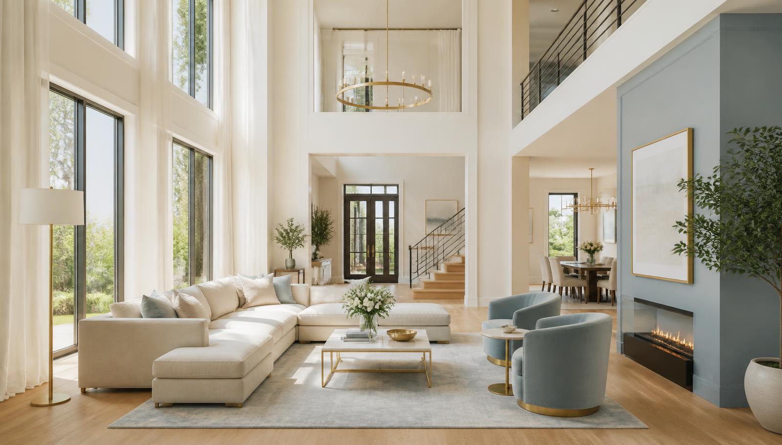
The best paint colors for a living room with high ceilings and natural light are soft, light-reflective hues with a warm or gently recessive undertone — think Benjamin Moore Simply White (#F5F5F3), Swiss Coffee (#EFEBE0), and Smoke (#BAC8C9) — because tall, sun-filled rooms already have brightness and volume in abundance. What they usually lack is warmth, intimacy, and a sense of visual containment. Your paint should supply what the architecture does not.
That single idea reverses most of what homeowners assume. In a dim, low-ceilinged room, you fight for light. In a soaring, glass-filled great room, light is free — and often overwhelming. Bounce too much of it off a stark white and the space starts to feel like an airport atrium: impressive, but not somewhere you want to read a book on a Sunday afternoon.
Why the Best Paint Colors for a Living Room with High Ceilings and Natural Light Behave Differently
Three physical factors change how paint reads in these rooms.
1. Light volume multiplies saturation. Direct daylight through tall windows can push a color one to two shades lighter and noticeably more intense than the chip suggests. A pale butter yellow becomes a full-strength yellow at 2 p.m. Always assume your color will read lighter and louder than the sample.
2. Vertical surface area magnifies undertone. A 16-foot wall shows roughly twice the pigment of an 8-foot wall. A whisper of green in a gray becomes a statement. Undertones you can barely detect on a chip will dominate the room — which is exactly why testing at full scale matters more here than anywhere else in the house.
3. Ceiling height increases apparent coldness. Air volume plus hard reflective surfaces equals acoustic and visual chill. Warmth has to be reintroduced deliberately through color temperature, texture, and value contrast.
Understanding LRV for Rooms with Natural Light
LRV (Light Reflectance Value) runs from 0 (absolute black) to 100 (pure white). In dark rooms you chase high LRV. In a bright, tall living room, the sweet spot is different:
- LRV 82–92: Crisp, gallery-bright. Beautiful with abundant art and architecture; risks glare and sterility.
- LRV 70–82: The comfort zone. Bright enough to feel airy, soft enough to prevent bounce-back glare. Most of the colors below live here.
- LRV 55–70: Grounding mid-tones. Excellent for feature walls, fireplace surrounds, and the upper reaches of a double-height wall.
- Under 40: Reserve for accent walls, built-ins, or ceilings you want to visually lower.
A practical rule: in a room with two or more large windows and a ceiling above 10 feet, subtract roughly five points of LRV from what you would choose in a standard room. The extra daylight makes up the difference.
The Complete Color Breakdown: Exact HEX Codes and Names
Benjamin Moore Simply White (2143-70) — #F5F5F3
An uplifting white with a barely-there warm cast. Simply White is the answer when you want the space to read genuinely white without the clinical edge of a pure white. In a tall room it keeps the upper walls quiet so architecture — beams, clerestory windows, a stone chimney breast — does the talking. Psychology: cleanliness, simplicity, spaciousness. Best for: whole-room treatment in a room with strong architectural features.
Benjamin Moore Swiss Coffee (OC-45) — #EFEBE0
A warm, creamy off-white and the single most reliable answer to how to make a large room feel cozy. The soft yellow-beige base absorbs the blue edge of midday light, so the walls stay luminous but never cold. Psychology: warmth, comfort, sophistication. Best for: open-plan great rooms shared with dining and kitchen zones.
Benjamin Moore Smoke (2122-40) — #BAC8C9
A recessive light blue-gray. Physically, cool colors appear to sit further from the eye than warm ones — which means Smoke pushes walls back and makes an already generous room feel effortlessly expansive. Use it when you want serenity rather than energy. Psychology: calm, serenity, spaciousness. Best for: coastal, transitional, and quiet-modern living rooms.
Sherwin-Williams Wondrous Blue (SW 6807) — #CBD9E3
Light, airy, and unmistakably blue without turning nursery-sweet. Wondrous Blue needs real daylight to sing; in a dim room it collapses into gray, but in a sun-filled one it stays fresh from morning to dusk. Psychology: clarity, openness, tranquility. Best for: south- and west-facing rooms with tall glazing.
Super White (Benjamin Moore PM-1) — #F7F8F8
The purest, crispest white in common use, and the maximum-reflectance option. It is spectacular behind modern art and with black window frames — and unforgiving without warm counterweights. If you choose Super White, commit to oak floors, natural linen, jute, leather, and brass. Psychology: purity, modernity, expansive. Best for: contemporary and gallery-style interiors.
Benjamin Moore Hawthorne Yellow (HC-4) — #EFDDAF
Soft, buttery, and sunlit. Yellows mimic daylight, which is why a large room painted in a gentle yellow feels perpetually cheerful. In a high-ceilinged space use it below a picture rail or on the lower two-thirds of a double-height wall to visually bring the ceiling down. Psychology: optimism, energy, welcome. Best for: family living rooms and rooms used mainly in the evening.
Sherwin-Williams Agreeable Gray (SW 7029) — #D1CBC1
The archetypal warm light gray — a greige that reads neutral in most light but never turns icy. This is the safety net for anyone nervous about undertones: it holds its character whether the sun is out or the sky is flat. Psychology: balance, calm, understated sophistication. Best for: resale-friendly neutrality with warmth.
Farrow & Ball Elephant's Breath (No. 229) — #B9AFA5
A deeper warm greige with a subtle mauve cast. On a two-story wall it delivers something whites cannot: gravity. It reads soft in full sun and richly enveloping at dusk. Psychology: grounded, refined, intimate. Best for: feature walls, fireplace surrounds, and the lower band of a tall wall.
Benjamin Moore Kendall Charcoal (HC-166) — #6E6D64
A deep, warm charcoal for the anchoring role. Painted on a chimney breast or across built-in shelving, it stops the eye from drifting endlessly upward and gives a vast room a defined center of gravity. Psychology: stability, drama, sophistication. Best for: accents, joinery, and ceilings you want to visually lower.
Four Designer Palettes for High Ceilings and Abundant Daylight
Palette 1 — Warm Gallery
Simply White (#F5F5F3) walls · Swiss Coffee (#EFEBE0) trim · Kendall Charcoal (#6E6D64) fireplace · natural oak and brass. Bright and architectural, but the charcoal anchor prevents the volume from feeling unmoored. The trim in a warmer white than the walls creates a subtle, expensive-looking layering effect.
Palette 2 — Serene Expanse
Smoke (#BAC8C9) walls · Simply White (#F5F5F3) ceiling and trim · Elephant's Breath (#B9AFA5) on built-ins · linen and pale wool. The recessive blue makes walls retreat while the warm greige joinery adds enough weight to feel residential rather than institutional. This is the palette for anyone who wants calm above all else.
Palette 3 — Sunlit Comfort
Swiss Coffee (#EFEBE0) walls · Hawthorne Yellow (#EFDDAF) in a stairwell or adjoining hall · Kendall Charcoal (#6E6D64) window frames · terracotta and rattan accents. The most forgiving option for large open-plan spaces: warm, layered, and immune to the cold-cavern effect.
Palette 4 — Modern Contrast
Super White (#F7F8F8) walls · Wondrous Blue (#CBD9E3) accent wall · Kendall Charcoal (#6E6D64) steel-frame doors and window mullions. Crisp and contemporary. The blue accent absorbs enough light to stop glare, while the charcoal frames draw the eye horizontally across the room rather than vertically up the wall.
If you want to see how a set of hues behaves at different scales before you buy a single sample pot, our guide to what color palette makes a room look bigger breaks down the perceptual mechanics in detail. And if your home also contains a dim north-facing space, the opposite strategy applies — see the best paint colors for a room with low natural light.
The Color Psychology of Tall, Bright Rooms
Height and brightness both signal freedom to the human nervous system. Research on ceiling height and cognition suggests high ceilings encourage abstract, expansive thinking, while lower ceilings support focus and detail work. Daylight, meanwhile, regulates circadian rhythm and reliably lifts mood.
The catch is that freedom without shelter reads as exposure. Evolutionary psychologists call the preferred balance prospect and refuge: humans like to see far while feeling protected. A soaring, all-white living room delivers enormous prospect and almost no refuge — which is precisely why people describe such rooms as beautiful but uncomfortable.
Color is the cheapest way to restore refuge:
- Warm hues advance. Swiss Coffee, Hawthorne Yellow, and Elephant's Breath visually pull surfaces closer, shrinking perceived volume.
- Cool hues recede. Smoke and Wondrous Blue widen the room but do nothing for coziness — pair them with warm textiles and wood.
- Dark values ground. Kendall Charcoal on the lower third of a wall, on joinery, or on the ceiling itself creates a psychological "lid" that makes the room habitable.
Data Table: Colors at a Glance
| Item | Color | Hex | Color Name | Psychological Meaning |
|---|---|---|---|---|
| Main Wall (bright) | #F5F5F3 | Benjamin Moore Simply White (2143-70) | Cleanliness, simplicity, spaciousness | |
| Main Wall (warm) | #EFEBE0 | Benjamin Moore Swiss Coffee (OC-45) | Warmth, comfort, sophistication | |
| Recessive Wall | #BAC8C9 | Benjamin Moore Smoke (2122-40) | Calm, serenity, spaciousness | |
| Airy Accent | #CBD9E3 | Sherwin-Williams Wondrous Blue (SW 6807) | Clarity, openness, tranquility | |
| Maximum Reflectance | #F7F8F8 | Benjamin Moore Super White (PM-1) | Purity, modernity, expansive | |
| Sunlight Mimic | #EFDDAF | Benjamin Moore Hawthorne Yellow (HC-4) | Optimism, energy, welcome | |
| Warm Neutral | #D1CBC1 | Sherwin-Williams Agreeable Gray (SW 7029) | Balance, calm, understated | |
| Grounding Greige | #B9AFA5 | Farrow & Ball Elephant's Breath (No. 229) | Grounded, refined, intimate | |
| Anchor / Joinery | #6E6D64 | Benjamin Moore Kendall Charcoal (HC-166) | Stability, drama, sophistication |
Practical Takeaways for Designers and Homeowners
Test at full height, not at eye level. Paint two-foot poster boards and tape them at floor level, mid-wall, and as high as you can reach. Color at 14 feet catches different light than color at four feet — and in a tall room, that difference decides the outcome.
Treat the ceiling as a fifth wall. A ceiling painted two to three shades darker than the walls (Agreeable Gray over Swiss Coffee, for example) lowers the room perceptually and adds instant intimacy. A ceiling in the same color as the walls, wrapped continuously, reads calm and modern.
Use horizontal breaks. A picture rail, chair rail, or two-tone wall at roughly 60–70% of the wall height interrupts the vertical run and makes furniture feel correctly scaled.
Scale the accents up. Small art and low-slung furniture look lost under a 16-foot ceiling. Oversized artwork, floor-to-ceiling drapery hung at the ceiling line, and a tall bookcase in your accent color do more for proportion than any wall hue.
Respect proportion in the palette itself. Apply the 60-30-10 rule: 60% dominant wall color, 30% secondary (trim, large upholstery, drapery), 10% accent (charcoal joinery, brass, art). In a big room, that 10% has to be genuinely bold or it disappears.
Match sheen to light volume. Matte and eggshell absorb glare; satin and semi-gloss amplify it. In a room with abundant daylight, keep walls matte or eggshell and save the sheen for trim.
Check the color at three times of day. Morning, midday, and lamplight. A color that is perfect at noon can turn green under warm LEDs at 8 p.m. Choose 2700K–3000K bulbs to keep warm whites reading warm after dark.
Warm up the hard surfaces. No paint color can fix a room of glass, stone, and painted drywall on its own. Wool rugs, linen curtains, wood, and woven texture are part of the color scheme, not decoration added afterward.
Conclusion: Design for What the Room Lacks
A living room with high ceilings and natural light is a gift with one condition: you must add warmth and weight back in. Choose Simply White or Super White when the architecture deserves a gallery backdrop. Choose Swiss Coffee or Hawthorne Yellow when you want the room to feel lived-in and welcoming. Choose Smoke or Wondrous Blue when serenity matters more than energy. And in every case, anchor the scheme with something dark — Kendall Charcoal on a fireplace, built-ins, or the ceiling — so that all that beautiful volume has somewhere to settle.
Ready to build the full scheme? Drop any HEX code from this article into the Coloracci AI palette generator and instantly generate a coordinated wall, trim, accent, and textile palette tuned to your room's light. It is the fastest way to move from a favorite color to a complete, harmonious plan you can hand straight to your painter.