Bakery & Patisserie Color Psychology: Sweet Palettes That Drive Sales
· Coloracci Team
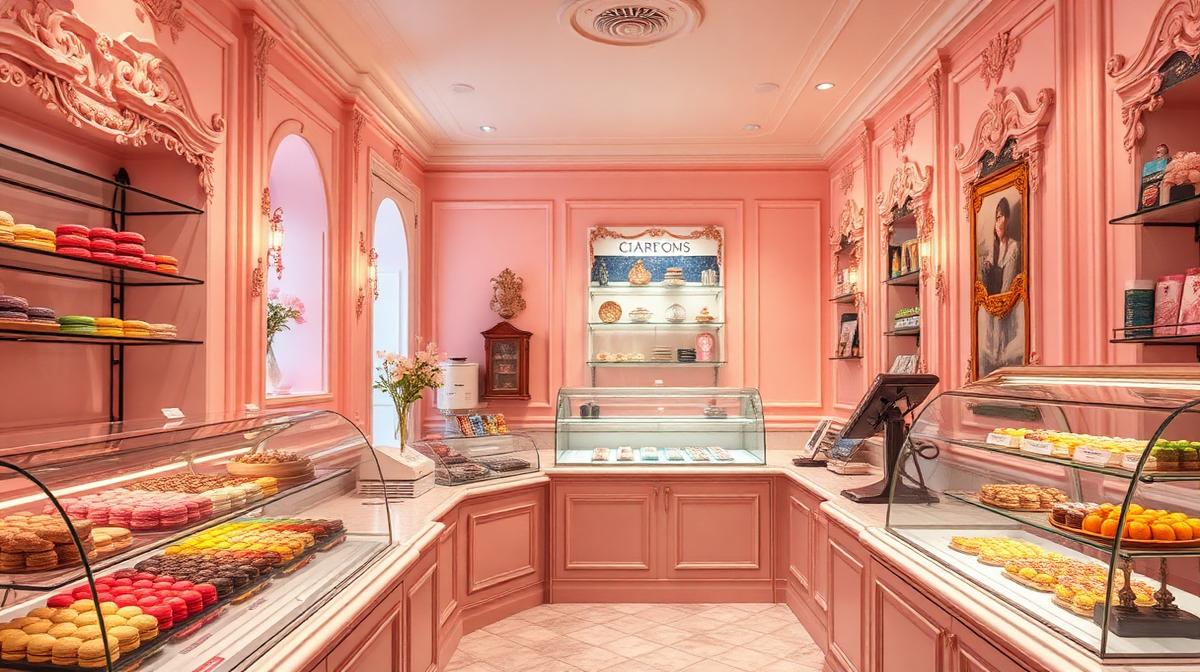
Bakery & Patisserie Color Psychology: Sweet Palettes That Drive Sales
A bakery's color palette works before the aroma does. While the smell of fresh bread reaches customers at the door, the visual impression begins from the street. The right colors don't just attract customers—they prime taste expectations, justify premium pricing, and create the emotional context that transforms a simple purchase into an experience.
The Science of Sweet Colors
Color-Taste Associations
Research in crossmodal perception reveals strong connections between colors and taste:
| Color | Hex Code | Taste Association | Application |
|---|---|---|---|
| Pink | #FFB6C1 | Sweetness | Macaron displays, branding |
| Warm brown | #5C3317 | Rich, chocolatey | Chocolate shops, artisan bread |
| Cream | #FFF8E7 | Butter, vanilla | General bakery base |
| Caramel gold | #C4913C | Sweet, indulgent | Premium patisseries |
| Soft yellow | #FFF5BA | Lemon, butter | Morning bakeries |
| Dusty rose | #C9918A | Sophisticated sweetness | High-end patisseries |
| Mint green | #98E8C1 | Fresh, light | Health-oriented bakeries |
The "Appetite Warmth" Principle
Bakeries universally favor warm color temperatures because:
- Warm colors stimulate appetite: Red, orange, and yellow wavelengths increase hunger response
- Warm lighting suggests freshness: Golden light mimics just-baked appearance
- Warm environments increase dwell time: Customers linger 12-18% longer in warm-toned spaces
- Cool colors suppress appetite: Blue and gray should be minimized in bakery environments
The Five Bakery Archetypes
1. The Parisian Patisserie
Palette: Blush pink (#F5C6CB) + Gold (#C9A64C) + Cream (#FFFDD0) + Black (#1A1A1A)
The gold standard of bakery design:
- Soft pink walls: Create a luxurious, feminine, "confection-like" environment
- Gold accents: Communicate premium quality and French elegance
- Glass display cases: Let the pastries provide the color
- Black typography: Contrast and sophistication
This archetype works because it makes the bakery itself feel like a beautiful box of confections—the space becomes the packaging.
2. The Rustic Artisan Bakery
Palette: Warm white (#FAF0E6) + Natural wood (#8B6914) + Charcoal (#36454F) + Linen (#C8B99A)
Emphasizing craft and authenticity:
- Exposed brick or stone: Natural, unrefined warmth
- Wooden shelving: Connection to traditional baking
- Flour-dusted aesthetic: Visible baking process builds trust
- Earth tones: Signal natural ingredients and honest craftsmanship
3. The Modern Minimalist
Palette: White (#FAFAFA) + Concrete gray (#A0A0A0) + Light wood (#D4B896) + One accent
Clean, contemporary bakery design:
- White dominance: Makes colorful pastries the visual focus
- Concrete or terrazzo: Urban sophistication
- Minimal branding: Quality communicates itself
- Strategic color accent: One brand color used sparingly (e.g., terracotta #C65D3E or sage #8BC48A)
4. The Neighborhood Comfort Bakery
Palette: Butter yellow (#FFF3C4) + Warm brown (#6B4226) + Cream (#FFFDD0) + Red check (#CC3333)
Home-like warmth and familiarity:
- Yellow tones: Sunshine, happiness, morning energy
- Warm wood: Kitchen table association
- Gingham/check patterns: Domestic comfort
- Visible baking: Open kitchen in warm tones
5. The Chocolate Boutique
Palette: Dark chocolate (#2C1810) + Rose gold (#B76E79) + Cream (#F5E6CC) + Deep burgundy (#4A0E2B)
Pure indulgence positioning:
- Dark walls: Create jewel-box intimate atmosphere
- Metallic accents: Rose gold or copper for luxury
- Spot lighting: Dramatic highlights on product displays
- Velvet textures: Tactile luxury in seating and packaging
Display Color Psychology
The Display Case as Sales Engine
The bakery display case is the primary sales tool. Color strategies that increase purchases:
Color blocking: Group pastries by color for visual impact—a row of green pistachio next to pink raspberry next to golden croissants creates an irresistible color gradient
The "golden ratio" of display: The most successful displays maintain approximately 60% warm tones (golden, brown, caramel) and 40% bright accents (fruits, glazes, colored elements)
White space: Leave breathing room between items—overcrowded displays reduce perceived quality by 25%
Height variation: Tiered displays with different levels show more surface area of colorful items
Packaging That Sells
Bakery packaging directly impacts perceived value:
- Pink boxes (#FFB6C1): Increase perceived sweetness, classic bakery association
- White boxes (#FFFFFF): Clean, premium, versatile
- Kraft boxes (#C19A6B): Artisan, eco-conscious, natural
- Black boxes (#1A1A1A): Luxury, gift-worthy, special occasion
- Branded tissue (#F5E6CC): Inside packaging matters—reveals feel premium
Research finding: Customers rate identical pastries 22% higher in quality when presented in branded packaging versus plain boxes.
Lighting as Color Tool
The Baker's Lighting Guide
Lighting color temperature dramatically affects how baked goods appear:
- 2700-3000K (warm white): Best for bread—creates golden, just-baked appearance
- 3000-3500K: Ideal for pastries—warmth without color distortion
- 4000K+ (cool white): Avoid—makes baked goods appear stale and unappetizing
The spotlight technique: Use warm directional spots on feature products to create a "glow" that draws the eye and increases desire.
Digital and Branding Strategy
Website and Online Ordering
Bakery websites should:
- Feature warm photography: Golden lighting, steam, texture close-ups
- Use warm base colors: Cream (#FFF8E7) or soft pink (#FFF0F3) backgrounds
- Clear product photography: Show colors accurately—customers ordering online rely on visual accuracy
- Warm CTAs: Gold (#C9A64C) or warm coral (#E8735A) order buttons
Social Media Color Consistency
The top-performing bakery Instagram accounts share common color traits:
- Consistent warm filter: Every image maintains the same golden warmth
- Close-up texture: Color of crumb, glaze, and detail photographed beautifully
- Brand color integration: Packaging, signage, and props maintain palette consistency
- Natural light: Window-lit photography outperforms artificial for engagement
Use Coloracci's AI tools to build a warm bakery palette, and our image color extractor to create consistent color themes from product photography.
Explore more food & retail design: Coffee Shop Color Psychology, Ice Cream Shop Colors, Restaurant Color Psychology, or Brewery & Winery Colors.