The Colors of the Northern Lights: Aurora Borealis Palette & Meaning
· Coloracci Team
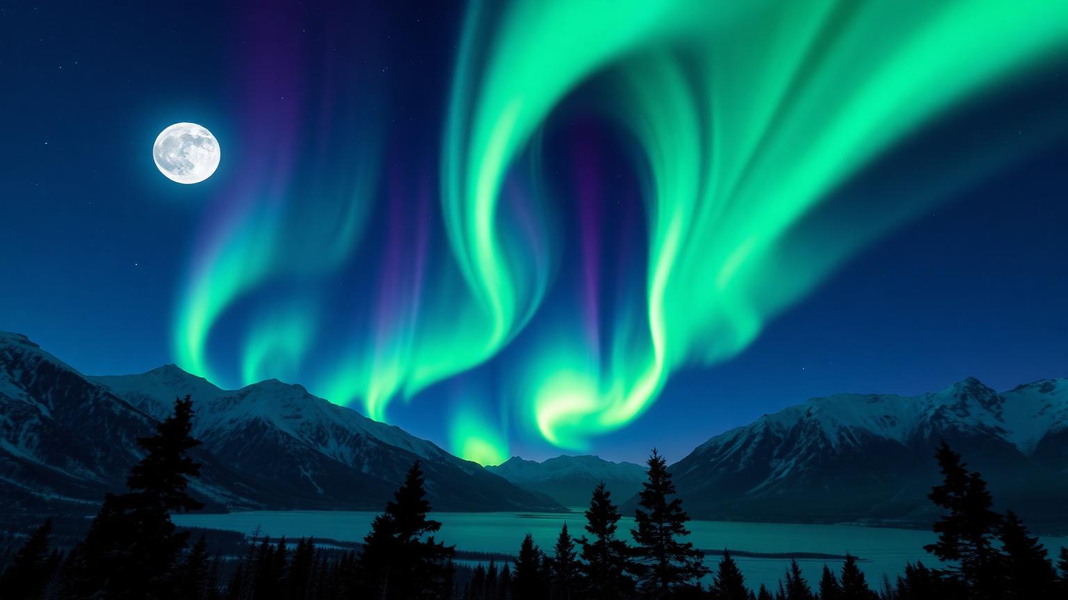
There is a reason photographers travel thousands of miles, in sub-zero darkness, just to stand on a frozen lake and wait. The aurora borealis is not simply a "light in the sky" — it is a living, breathing palette, painted in particles, where physics becomes poetry. Greens ripple like silk, violets bleed into navy, and for a few seconds, the whole horizon becomes a color study no designer could ever invent from scratch.
For colorists, brand strategists, and interior designers, the northern lights are more than a bucket-list view. They are a masterclass in luminous color harmony — how a small set of hues, layered against deep darkness, can feel both otherworldly and deeply emotional. In this guide, we'll break down the exact hex codes that make up the aurora, what each color means (scientifically and psychologically), and how to translate this palette into modern design work.
Why the Aurora Is the Ultimate Color Reference
Most "trend" palettes you see online are arbitrary. The aurora is not. Every color you see in the sky corresponds to a specific atom, at a specific altitude, hit by a specific kind of solar particle.
- Oxygen at ~100 km altitude → the famous emerald green
- Oxygen at 200+ km altitude → rare deep crimson reds
- Nitrogen at lower altitudes → the dramatic violets, blues, and pinks
- The night sky itself → the indigo and obsidian backdrop that makes everything glow
That's why the aurora palette feels so right to the human eye: it is nature's own complementary scheme, with cool greens and violets sitting against the deepest blue-blacks. It's the same logic dark mode design relies on — luminous accents over a controlled dark base.
The Aurora Borealis Color Palette (Exact Hex Codes)
Below are the seven colors that define the northern lights. Each swatch is paired with the physical phenomenon behind it and the meaning it carries in design and color psychology.
1. Aurora Green — #39FF8B
The signature color of the northern lights. Aurora Green is #39FF8B — a high-saturation, slightly yellow-shifted green that almost glows on screen. In nature, this is excited oxygen at 100 km altitude. In design, this hue communicates vitality, mystery, and the supernatural.
It sits at the cooler edge of the green family, avoiding the corporate "trust green" or the organic "sage green," and instead leaning into a futuristic, almost neon character. Pair it with deep navy and it instantly feels like sci-fi cinema.
2. Electric Mint — #7FFFD4
Electric Mint (#7FFFD4) appears at the soft edges of an aurora ribbon, where the green meets the night. It is gentler, more aquatic, and pairs beautifully with both colder violets and warmer creams. Psychologically, it reads as calm, clarity, and renewal — the visual equivalent of a deep exhale.
In UI design, this is an excellent accent color for success states, charts, or onboarding flows where you want energy without the aggression of pure neon green.
3. Cosmic Violet — #8A2BE2
When the aurora climbs higher and nitrogen joins the show, you get Cosmic Violet (#8A2BE2) — a saturated blue-purple that feels both regal and electric. It is the bridge color of the aurora palette, sitting halfway between the cool greens and the deep night blues.
Violet carries strong associations with imagination, intuition, and luxury. Used sparingly, it elevates a palette from "nature-inspired" to "mythological." For deeper guidance, see our piece on violet color psychology in design.
4. Solar Magenta — #FF3FA4
The rarest aurora color is the pink-magenta flash at the bottom of a strong nitrogen ribbon. Solar Magenta (#FF3FA4) is unexpected, bold, and visually loud — which is precisely why it works as the one warm accent in an otherwise cool palette. It introduces emotion and surprise without breaking harmony.
In branding, a single warm accent against a cool dominant palette is one of the most reliable ways to draw the eye without overwhelming it.
5. Twilight Indigo — #2D3A7B
Twilight Indigo (#2D3A7B) is the upper-sky color of an aurora night — that moment when the sky is no longer black, but not yet purple either. It is the connective tissue of the palette, the color you'd use as a background, a card surface, or a hero section base.
Indigo is one of the most underrated colors in modern UI. It's softer than pure black, but disciplined enough to keep neon accents legible and accessible.
6. Deep Night Blue — #0A1A40
This is the foundation of the entire palette. Deep Night Blue (#0A1A40) is the canvas — the cold, almost-black blue of the polar sky between aurora bursts. It absorbs light, makes every other color glow, and gives the palette its emotional gravity.
If you only borrow one color from the aurora for your design system, make it this one. It is a perfect dark-mode background that avoids the harshness of pure black (#000000) while still letting accent colors shine.
7. Glacier White — #E8F4FF
Finally, Glacier White (#E8F4FF) — the cool, slightly blue-tinted white reflected from snow and ice under aurora light. It's the perfect text color over Deep Night Blue, and an excellent neutral that doesn't feel sterile.
This is the "snow underfoot" color — quiet, structural, and absolutely essential to keep the rest of the palette from feeling heavy.
The Aurora Palette at a Glance
Here is the full aurora borealis palette in one table, with hex codes and meaning. Each hex below renders as a live color swatch.
| Color | Hex | Meaning |
|---|---|---|
| Aurora Green | #39FF8B | Vitality, mystery, supernatural energy |
| Electric Mint | #7FFFD4 | Calm, clarity, renewal |
| Cosmic Violet | #8A2BE2 | Imagination, intuition, luxury |
| Solar Magenta | #FF3FA4 | Surprise, emotion, bold accent |
| Twilight Indigo | #2D3A7B | Depth, transition, connective base |
| Deep Night Blue | #0A1A40 | Foundation, focus, infinite space |
| Glacier White | #E8F4FF | Clarity, neutrality, fresh contrast |
The Color Psychology of the Northern Lights
Few palettes evoke such a consistent emotional response across cultures. Whether you grew up in Tromsø or Tokyo, the aurora reads as awe. There's a reason for that, and it's mostly about contrast and motion.
Cool dominance + one warm flash
The aurora palette is overwhelmingly cool — greens, violets, blues. Cool colors recede; they feel quiet, distant, and meditative. But the rare magenta flash provides a single warm note that prevents the palette from feeling cold or clinical. This balance is exactly what gives the aurora its emotional warmth despite literally appearing in the coldest places on Earth.
Luminance over saturation
Aurora colors look saturated, but their real magic is luminance — they appear self-lit against darkness. This is the same trick that makes neon UI design and bioluminescent branding feel alive. If you want to recreate the aurora feeling on screen, focus less on the hue itself and more on how it sits against a very dark background.
Slow movement, low frequency
Auroras don't strobe; they breathe. Their visual rhythm is slow, organic, and unpredictable. In digital design, this translates to soft gradient transitions, slow animations, and generous negative space. Aurora-inspired interfaces should never feel busy.
Designer Takeaways: Using the Aurora Palette
Here's how to actually use this palette in real-world design work without it feeling like a stock screensaver.
1. Anchor everything in Deep Night Blue
Use #0A1A40 as your dominant background — 60% or more of the surface area. This single decision does most of the heavy lifting. Avoid pure black: the aurora effect depends on a cool dark, not a neutral one.
2. Limit accents to two of the four "light" colors
Pick two from Aurora Green, Electric Mint, Cosmic Violet, and Solar Magenta. Using all four at once turns sophisticated into chaotic. A common winning pair: Aurora Green for primary CTAs, Cosmic Violet for secondary highlights.
3. Use Twilight Indigo for surfaces and cards
Don't make every card pure dark blue — that flattens depth. #2D3A7B as a card or elevated-surface color creates the layered "sky depth" effect that aurora photos capture so well.
4. Keep text in Glacier White, not pure white
Pure white (#FFFFFF) against deep blue creates harsh contrast that strains eyes. #E8F4FF is just blue enough to feel intentional and soft enough to read comfortably for long sessions — a principle backed by color contrast best practices.
5. Add motion, but make it slow
If you use gradients or animations, keep the duration long (2–6 seconds) and the easing organic. Aurora colors lose all their magic when forced into snappy, mechanical motion.
Where the Aurora Palette Works Best
Some categories where this palette absolutely sings:
- Astronomy, space tech, and science brands — the obvious fit, but rarely done well
- Meditation, sleep, and mindfulness apps — luminance + calm is a perfect match
- Premium dark-mode dashboards — analytics, crypto, dev tools
- Music streaming and creative tools — luminous accents over dark UI feel inherently artistic
- Winter and Nordic tourism brands — for cultural and geographic authenticity
It works less well for industries that demand instant warmth or trust at scale — banking, insurance, healthcare — where established blue trust palettes usually serve better.
Aurora-Inspired Palette Variations
You can also remix the aurora palette into related directions without losing its identity:
- Soft Aurora — Replace neon greens with sage and dusty lavender for a calmer, editorial mood.
- High-Voltage Aurora — Push saturation on the green and magenta for a gaming or esports brand.
- Glacial Aurora — Drop the magenta, lean on icy whites and pale teals for a luxury wellness feel.
- Cosmic Aurora — Add deep plum and starlight gold for a more cosmic, mystical direction.
Each remix keeps the core idea — luminous cool accents on a deep blue canvas — while shifting the emotional register.
Conclusion: Let the Sky Do the Work
The aurora borealis is proof that the most memorable color palettes don't come from trend reports — they come from paying close attention to the world. A handful of hues, used with restraint and respect for darkness, can produce something genuinely unforgettable.
If you take one thing from this guide, let it be this: constraint is what makes the aurora beautiful. Seven colors. One dominant dark. A few luminous accents. Slow motion. That's the entire formula.
Build your own aurora palette
Ready to put this into practice? You can extract, remix, and export every color in this article — plus generate your own aurora-inspired variations — using the Coloracci AI palette generator. Drop in any aurora photograph, and Coloracci will pull the exact hex codes for you in seconds, then suggest harmonized variations you can ship straight into Figma, Tailwind, or your design system.
The sky has already done the hard work. Your job is just to listen.