Neon Colors in Digital Marketing: When and How
· Coloracci Team
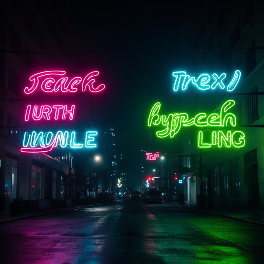
Neon colors are the loudest tool in a designer's palette. They demand attention, polarize audiences, and break every rule of conservative brand design. Used well, they create unforgettable campaigns that cut through the visual noise of crowded feeds and inboxes. Used poorly, they overwhelm, alienate, and send conversion rates plummeting.
The difference between neon that electrifies and neon that exhausts comes down to understanding the psychology behind these extreme colors, knowing how to deploy them in digital contexts, and — perhaps most importantly — recognizing when not to use them at all.
The Psychology of Neon Colors
Neon colors trigger physiological and psychological responses that no other color family can match. Understanding these reactions is essential before committing to a neon-forward marketing strategy.
Attention and Urgency
The human visual system is wired to prioritize high-saturation, high-luminance stimuli. Neon colors exploit this wiring directly. A neon green #39FF14 or electric pink #FF10F0 activates the same neurological pathways that evolved to notice bright flowers, ripe fruit, and warning signals in nature.
In marketing terms, this translates to:
- Higher scroll-stop rates — neon elements in social feeds halt thumb movement
- Increased click-through on CTAs — neon buttons outperform muted alternatives in A/B tests (when the surrounding design supports them)
- Stronger recall — users remember neon-accented campaigns days later at significantly higher rates than subdued alternatives
Youth and Counter-Culture Association
Neon carries strong cultural coding. It evokes nightlife, gaming culture, electronic music, streetwear, and digital-native aesthetics. Brands targeting Gen Z and younger Millennials can leverage this association to signal that they belong in those spaces.
The core neon palette and its cultural associations:
- Electric Pink — #FF10F0 — Nightlife, beauty, rebellion, and pop culture
- Neon Green — #39FF14 — Gaming, tech, hacking, and environmental activism
- Cyber Cyan — #00FFFF — Futurism, digital culture, and science fiction
- Hot Magenta — #FF0090 — Fashion, boldness, and creative industries
- Electric Yellow — #FFFF00 — Caution, energy, and street culture
- Neon Orange — #FF6600 — Action sports, urgency, and entertainment
Emotional Intensity
Neon colors amplify whatever emotion a campaign carries. A joyful message becomes ecstatic. An urgent message becomes alarming. A rebellious message becomes confrontational. This amplification effect is powerful but dangerous — it works for you or against you, never neutrally.
Neon Colors in Web Design
Translating neon from concept to screen requires specific technical knowledge. Neon colors behave differently from conventional saturated colors, and standard design approaches often fail.
The Glow Effect
Neon's defining characteristic isn't just color — it's the perception of emitted light. Physical neon signs glow because gas-filled tubes actually produce light. In digital design, you simulate this effect with CSS:
.neon-text {
  color: #FF10F0;
  text-shadow:
    0 0 7px #FF10F0,
    0 0 10px #FF10F0,
    0 0 21px #FF10F0,
    0 0 42px #FF10F0;
}
The layered text-shadow creates a convincing glow that makes the color feel luminous rather than flat. Without the glow, neon colors on screen look like saturated paints — intense but not electric.
Button and CTA Design
Neon CTAs work best with these principles:
Contained glow: The neon color fills the button with a subtle outer glow, but text inside is white or very dark for readability:
.neon-cta {
  background: #39FF14;
  color: #0A0A0A;
  box-shadow: 0 0 15px rgba(57, 255, 20, 0.4),
              0 0 30px rgba(57, 255, 20, 0.2);
  border: none;
  font-weight: 700;
}
Dark text on neon backgrounds is essential. White text on #39FF14 has a contrast ratio of only 1.2:1. Dark text (#0A0A0A) on the same green achieves 16.8:1 — a massive difference in readability.
Typography Considerations
Neon colors work best with specific typeface characteristics:
- Thin to medium weight — mimics the slender tubes of real neon signs
- Sans-serif or geometric fonts — clean lines render the glow effect more convincingly
- Generous letter-spacing — prevents glow effects from merging between characters
- Large sizes only — neon at body text size creates an unreadable mess
Reserve neon typography for headlines, hero sections, and promotional banners. Never use neon for body copy, navigation labels, or form fields.
Dark Backgrounds and Neon: The Essential Pairing
Neon colors on white or light backgrounds look garish and lose their signature luminosity. The single most important rule of neon design is this: neon requires darkness to work.
Why Dark Backgrounds Are Non-Negotiable
On a white background (#FFFFFF), neon green #39FF14 looks like a highlighter stain. On a near-black background (#0A0A0A), the same color appears to glow from within. This isn't subjective — it's physics. The perceived luminosity of a color is relative to its surroundings. Dark surroundings make bright colors appear brighter.
Choosing the Right Dark
Not all darks are equal for neon work:
- Pure Black #000000 — Maximum contrast, but can feel flat and lifeless. Use for dramatic, minimal compositions.
- Rich Black #0A0A0A — Slightly warmer than pure black, prevents the "void" feeling while maintaining strong contrast.
- Dark Navy #0D1117 — GitHub's dark mode color. Adds a subtle cool undertone that complements cyan and green neons beautifully.
- Dark Purple #120B1C — Creates a nightclub atmosphere. Pairs exceptionally with pink and magenta neons.
- Dark Charcoal #1A1A2E — A versatile dark with blue undertones that supports virtually any neon accent.
Multi-Neon Palettes
Using multiple neon colors together creates cyberpunk and synthwave aesthetics, but requires careful hierarchy:
Two-neon rule: Limit to two neon colors maximum. One serves as the primary accent, the other as a secondary highlight:
- Primary: Cyber Cyan #00FFFF — headlines, primary CTAs, key data
- Secondary: Hot Magenta #FF0090 — secondary actions, decorative elements, hover states
- Background: Dark Charcoal #1A1A2E
- Text: Cool Gray #B0B0C0 — body text (not white, which competes with neons)
Using three or more neon colors simultaneously creates visual chaos. Each neon competes for attention, and the hierarchy collapses.
Gradient Neon
Neon-to-neon gradients are striking when used sparingly:
.neon-gradient {
  background: linear-gradient(135deg, #FF10F0, #00FFFF);
}
This pink-to-cyan gradient is one of the most recognizable effects in modern digital design. Use it for hero banners, promotional cards, or loading states — never for large text areas or backgrounds that contain content.
When to Avoid Neon Colors
Neon's power makes it tempting to deploy everywhere, but there are clear contexts where neon colors actively harm your marketing goals.
Conservative and Trust-Dependent Industries
Finance, healthcare, legal services, and insurance rely on perceived stability and trustworthiness. Neon colors signal excitement and disruption — the exact opposite of what a bank or hospital should communicate.
Even fintech brands that target younger audiences should use neon cautiously. A neon accent on a dark dashboard might work; a fully neon-branded banking app will trigger anxiety about whether the institution is serious enough to trust with money.
Content-Heavy Interfaces
Neon colors create cognitive interference with reading. If your marketing relies on long-form content — blog posts, whitepapers, case studies, documentation — neon accents distract from comprehension. The reader's eye keeps bouncing to the brightest element on the page instead of following the text.
Safe alternative: Use neon only in the hero section or promotional banner, then transition to a conventional palette for the content body.
Accessibility-Critical Products
Neon colors present severe accessibility challenges:
- Neon on dark often passes contrast checks for large text but fails for small text
- Color blindness — neon green #39FF14 and neon yellow #FFFF00 are nearly indistinguishable for users with deuteranopia
- Photosensitive users — neon animations and flashing effects can trigger seizures in users with photosensitive epilepsy
- Screen reader users don't benefit from neon at all, so any information conveyed solely through neon color is lost
If your audience includes users with visual impairments or your product must meet WCAG compliance, limit neon to decorative elements and ensure all information has non-color alternatives.
Print and Physical Media
Neon colors are inherently screen-native. CMYK printing cannot reproduce the luminosity of #FF10F0 or #00FFFF — the closest print approximation will look dull and muddy compared to the screen version. If your marketing campaign spans digital and print, neon elements that look electric on screen will disappoint in brochures, business cards, and billboards.
Exception: Fluorescent (Pantone Neon) inks exist for specialized printing, but they're expensive, inconsistent across print runs, and fade faster than conventional inks.
When Your Competitors Already Own Neon
If every brand in your space uses neon aesthetics — common in gaming, nightlife, and streetwear — adopting neon won't differentiate you. In saturated-neon markets, the contrarian move is restraint. A matte, muted palette stands out precisely because everyone else is glowing.
The Fatigue Factor
Neon creates immediate impact but poor sustained engagement. Users exposed to neon-heavy interfaces for extended periods report higher eye strain and faster attention decline compared to muted interfaces. For products with long session times — productivity tools, reading apps, social platforms — neon should be limited to momentary highlights rather than persistent UI elements.
The best neon marketing follows a simple formula: dark canvas, one or two neon accents, generous negative space, and clear hierarchy. When these conditions are met, neon cuts through noise like nothing else in the designer's toolkit. When they're not, it's just noise.