Airport Lounge Color Design: Premium Travel Space Psychology
· Coloracci Team
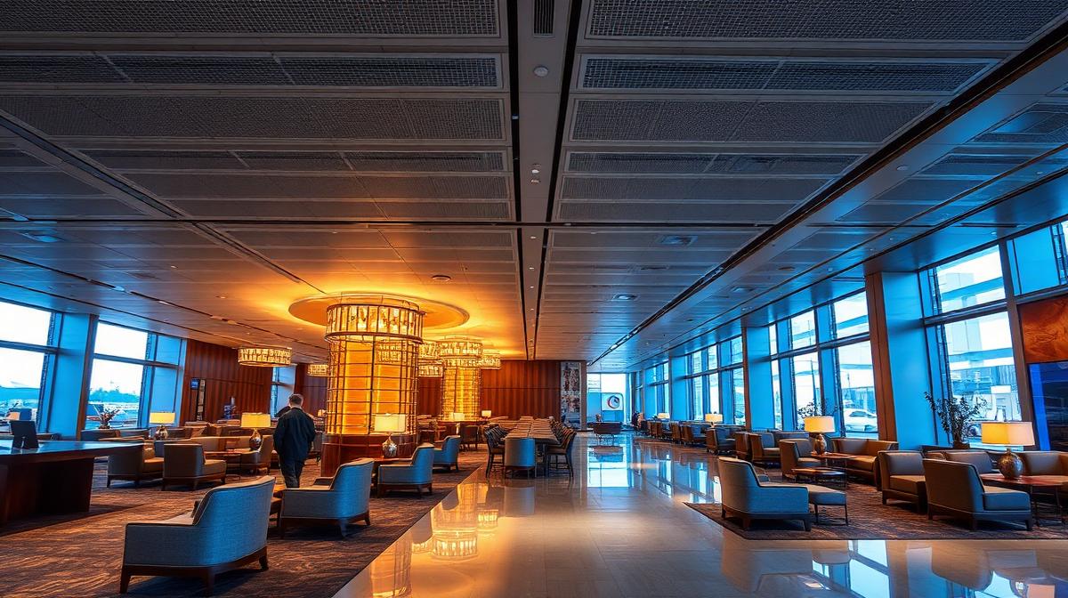
Airport Lounge Color Design: Premium Travel Space Psychology
Airport lounges represent one of the most psychologically complex design challenges in commercial interiors. They must simultaneously calm anxious travelers, energize business professionals, project luxury that justifies premium access fees, integrate airline brand identity, and function 24/7 across multiple time zones and lighting conditions. The color palette of a world-class airport lounge is a masterclass in adaptive environmental psychology.
The Unique Psychology of Transit Spaces
The Traveler's Emotional State
Airport lounge color design must address multiple simultaneous emotional states:
| Emotional State | Percentage of Travelers | Color Need | Design Response |
|---|---|---|---|
| Stressed/anxious | 40% | Calming, grounding | Cool blues, warm neutrals |
| Tired/jet-lagged | 30% | Restorative, gentle | Soft warm tones, low contrast |
| Business-focused | 20% | Professional, focused | Neutral, clean, organized |
| Excited/leisure | 10% | Welcoming, celebratory | Warm accents, luxury cues |
The Calm-Luxury Equation
The fundamental formula: Calm + Quality = Perceived Luxury
- Calm comes from: Low-contrast color schemes, warm neutrals, nature-inspired hues
- Quality comes from: Rich material colors, precise detailing, brand consistency
- Together they create: An environment that feels exclusive without being pretentious
Airline Lounge Brand Color Integration
Major Carrier Lounge Palettes
| Airline | Brand Color | Hex | Lounge Palette | Design Philosophy |
|---|---|---|---|---|
| Emirates | Gold + dark red | #C6A962 + #8B0000 | Gold + cream + walnut | Opulent Arabian luxury |
| Singapore Airlines | Navy + gold | #003366 + #C6A962 | Navy + champagne + teak | Refined Asian elegance |
| Qantas | Red + white | #CC0000 + #FFFFFF | Warm gray + red accents + timber | Contemporary Australian |
| Cathay Pacific | Jade green + gray | #006A4E + #808080 | Jade + charcoal + bamboo | East-meets-West calm |
| British Airways | Blue + red | #003DA5 + #CC0000 | Navy + champagne + leather | Classic British sophistication |
| Lufthansa | Blue + yellow | #003366 + #FFD700 | Blue-gray + warm white + oak | German precision comfort |
| United Polaris | Blue + gold | #004080 + #B8860B | Navy + gray + ambient blue light | Modern American premium |
Brand Color Balance: The 10% Rule
Successful lounges follow a crucial ratio:
- 10% brand color: Used in signage, accent pieces, staff uniforms, and subtle touches
- 60% warm neutrals: The dominant atmosphere—cream, warm gray, natural wood
- 30% complementary tones: Supporting colors that bridge brand and neutral
Too much brand color feels like a branded advertisement; too little loses identity.
Zone-Based Color Design
Reception/Welcome
First impression sets the expectation:
- Wall color: Warm neutral (#E8DED1) or brand-tinted neutral
- Reception desk: Dark natural material—walnut (#5C4033), dark stone (#333333)
- Lighting: 3000-3500K warm white, higher intensity than lounging areas
- Brand moment: Logo wall or feature in brand color—the strongest brand expression
- Floor: Polished dark stone or premium carpet in muted tones
Business/Working Area
Concentration and productivity:
- Color temperature: Slightly cooler—4000K lighting for alertness
- Desk surfaces: Medium neutral (#A0937D) or dark wood (#5C4033)
- Partitions: Frosted glass (#E8E8E8) or medium gray fabric (#808080)
- Ambient color: Cool neutral—light gray (#D5D0CA) or soft blue-gray (#B0BEC5)
- Charging stations: Dark, recessive colors so tech doesn't dominate the space
Dining/Bar Area
Social warmth and appetite:
- Color shift: Warmer than business area—3000K lighting, amber accents
- Bar backdrop: Dark (#1A1A1A) with bottle display and warm backlight
- Dining tables: Warm wood (#8B6914) or white marble (#F0EDE8) with warm undertones
- Upholstery: Rich leather in cognac (#A0522D), dark green (#2E4A3E), or brand accent
- Ceiling: Lower perceived height with warmer colors creates intimacy
Rest/Quiet Zone
Maximum calm and recovery:
- Lowest light levels: 2700-3000K, dimmable
- Color palette: Earth tones—taupe (#8B7D6B), warm gray (#9E9589), soft sand (#D2B48C)
- Pod/chair color: Medium neutral—not too light (shows marks) or too dark (absorbing)
- Sound-absorbing panels: In muted, warm colors—fabric in earth tones
- No brand color: This zone should feel domestic, not commercial
Shower/Refresh Suites
Rejuvenation and hygiene:
- Tile: White or soft gray (#E8E3DD)—communicates cleanliness
- Accent: Warm metallic—brushed gold (#B8860B) or bronze (#CD7F32)
- Amenity colors: Premium product packaging in neutral tones
- Lighting: High CRI (95+) at 4000K—accurate mirror lighting for grooming
- Towels: Always white (#FFFFFF)—universal signal of luxury hotel-level cleanliness
Circadian-Responsive Color Design
Time-of-Day Color Adaptation
Leading lounges now adapt color temperature throughout the day:
| Time Period | Color Temperature | Ambient Light Level | Purpose |
|---|---|---|---|
| Morning (6-9am) | 4000-4500K (cool) | Bright | Energize, simulate morning light |
| Midday (9am-3pm) | 4000K (neutral) | Full | Productive, balanced |
| Afternoon (3-6pm) | 3500K (warm-neutral) | Medium-high | Transition, maintain alertness |
| Evening (6-10pm) | 3000K (warm) | Medium | Wind down, social dining |
| Night (10pm-6am) | 2700K (very warm) | Low | Rest, minimal disruption |
Jet Lag Mitigation Through Color
Some advanced lounges offer:
- Destination-synced lighting: Pods with lighting that matches the time zone of the traveler's destination
- Blue-enriched zones: For travelers needing to stay alert (blue light suppresses melatonin)
- Amber zones: For travelers needing to sleep (amber light doesn't disrupt melatonin production)
Material Colors That Define Premium
The Material-Color Relationship
| Material | Color | Hex | Premium Signal |
|---|---|---|---|
| Natural walnut | Warm brown | #5C4033 | Craftsmanship, heritage |
| White marble | Warm white with veining | #F0EDE8 | Natural luxury, timelessness |
| Brushed brass | Warm gold | #B8860B | Sophisticated metallic warmth |
| Leather (cognac) | Warm brown | #A0522D | Classic luxury, aging beautifully |
| Terrazzo | Light multicolor | #E8DED1 base | Contemporary craft |
| Linen/wool fabric | Natural beige | #D2B48C | Textural warmth, sustainability |
| Smoked glass | Tinted gray | #696969 | Modern privacy, sophistication |
Use Coloracci's palette tools to design circadian-responsive, brand-aligned color palettes for premium hospitality and travel spaces.
Explore more hospitality colors: Airline Cabin Color Psychology, Hotel & Spa Colors, Luxury Retail Colors, or Coworking Space Colors.