Why 75% of National Airline Liveries Colors Are Blue: A Designer's Decoder for Tailfins, Flags & Hex Codes
· Coloracci Editorial
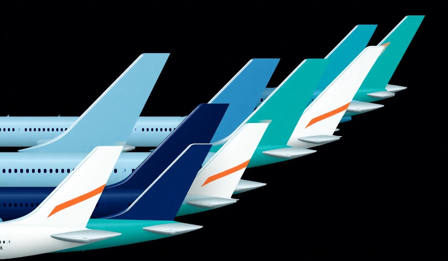
When you look up at the underbelly of an Airbus A350 banking over an airport, you are reading one of the most disciplined color systems on Earth. National airline liveries colors are not styling decisions — they are sovereign signatures, certified by aviation authorities, painted at $200,000 per aircraft, and engineered to remain legible from half a mile away. And over 75% of the world's flag carriers reach for the same hue: blue.
This guide decodes the why. Why blue dominates the skies, how national airlines encode flags, mythologies, and geography into a 60-foot tailfin, and what designers can steal from the most expensive color palette industry on the planet. If you want the lighter cabin-interior story, see our airline cabin color psychology breakdown; if you want the full atlas of flag carriers, read our national airline liveries atlas. This post focuses on the system — the rules behind the rules.
The Blue Sky Paradox: Why 75% of National Airline Liveries Colors Converge on One Hue
The aviation industry is a near-monoculture of blue. Lufthansa wears Deep Bay Blue #05164D. KLM owns Sky Blue #00A1E0. British Airways anchors on Speedmarque Navy #075AAA. Aer Lingus claims Teal #006271. United, Delta, ANA, JAL, Korean Air, Aeroflot, LATAM, El Al, Saudia, Etihad, Egypt Air, Air France — all blue.
Why this convergence? Four reasons, all rooted in human factors:
- Trust biology. Blue is the only color that consistently lowers heart rate in lab studies. For an industry selling "we won't crash," that is a structural advantage.
- Sky camouflage flips into sky contrast. A blue tail against a blue sky reads as confident continuity; against gray cloud or night tarmac, blue + white reads as the highest-legibility duo aviation has ever found.
- It hides fluid stains. Hydraulic fluid, jet fuel, deicing chemicals — all leave residue. Blue absorbs the visual noise that white amplifies.
- Path dependency. Pan Am chose blue in 1958. Every challenger that wanted to look as serious as Pan Am also chose blue. Sixty-eight years later, the gravity well is unbreakable.
The result: the aviation color wheel is essentially a blue gradient with national accents bolted on the tail.
The Complete Hex Breakdown: Flag Carriers by Region
Below is the working palette every aviation designer should have bookmarked. Hex values are sampled from current livery refreshes (2022–2026) and brand guidelines where public.
Europe
- Lufthansa (Germany) — Deep Bay Blue
#05164D, Lufthansa Yellow#FFAD00, White#FFFFFF - KLM (Netherlands) — KLM Sky Blue
#00A1E0, White#FFFFFF - British Airways (UK) — Speedmarque Navy
#075AAA, Chatham Red#EB2226, White#FFFFFF - Air France (France) — Air France Blue
#002157, Air France Red#EF3340, White#FFFFFF - ITA Airways (Italy) — Savoy Blue
#003478, Italian Green#008C45, Italian Red#CD212A - Iberia (Spain) — Iberia Red
#D7192D, Iberia Yellow#FFC72C, Navy#1C1F4A - Aer Lingus (Ireland) — Teal
#006271, Shamrock Green#009B48, White#FFFFFF - SAS (Scandinavia) — SAS Blue
#003473, Signal Red#E11933, White#FFFFFF - Swiss International (Switzerland) — Swiss Red
#E2231A, White Cross#FFFFFF, Charcoal#1A1A1A - Austrian Airlines (Austria) — Austrian Red
#CC0000, White#FFFFFF - TAP Air Portugal (Portugal) — TAP Red
#C8102E, TAP Green#006A4E, White#FFFFFF - Finnair (Finland) — Finnair Blue
#0B1F8F, White#FFFFFF - Aeroflot (Russia) — Aeroflot Blue
#002F87, Aeroflot Red#CC092F, White#FFFFFF
North America
- American Airlines (USA) — Eagle Silver
#9DA6AB, Flag Red#E1251B, Flag Blue#0078D2 - Delta (USA) — Delta Blue
#003366, Delta Red#E01933, White#FFFFFF - United (USA) — Rhapsody Blue
#002244, United Blue#0033A0, White#FFFFFF - Air Canada (Canada) — Air Canada Red
#D2122E, Black#000000, White#FFFFFF
Middle East & Africa
- Emirates (UAE) — Emirates Red
#D71921, Emirates Dark#1A1A1A, Gold#C7A977 - Etihad (UAE) — Etihad Brown
#5C4033, Sand Gold#B68D4C, White#FFFFFF - Qatar Airways (Qatar) — Qatar Burgundy
#5C0F2C, Silver Grey#9B9B9B - Saudia (Saudi Arabia) — Saudia Green
#0E5C2F, Saudia Gold#C9A227, White#FFFFFF - EgyptAir (Egypt) — EgyptAir Blue
#002F6C, Horus Gold#D4AF37, White#FFFFFF - Royal Air Maroc (Morocco) — RAM Red
#C8102E, Sharifian Green Star#006233, White#FFFFFF - Ethiopian Airlines (Ethiopia) — Ethiopian Green
#078930, Ethiopian Yellow#FCDD09, Ethiopian Red#DA121A - El Al (Israel) — El Al Blue
#003E7E, White#FFFFFF - Middle East Airlines (Lebanon) — MEA Red
#ED1C24, Cedar Green#007A33, White#FFFFFF - South African Airways (South Africa) — SAA Blue
#003366, SAA Gold#FFB81C, Red#DE3831, Green#007749
Asia & Oceania
- Air India (India) — Vermillion Red
#C8102E, Konark Sun Gold#D29F13, Aubergine#412234 - Singapore Airlines (Singapore) — SIA Navy
#003C71, Sarong Yellow#FFB81C, SIA Gold#A88B3D - ANA (Japan) — ANA Triton Blue
#13294B, White#FFFFFF - JAL (Japan) — JAL Red
#E60012, Tsurumaru White#FFFFFF, Charcoal#1A1A1A - Korean Air (South Korea) — Sky Blue
#00256C, Taegeuk Red#CD2E3A, Taegeuk Blue#0047A0 - Cathay Pacific (Hong Kong) — Brushwing Green
#006564, White#FFFFFF - Garuda Indonesia (Indonesia) — Garuda Blue
#005EB8, Garuda Cyan#00A1E0, White#FFFFFF - Thai Airways (Thailand) — Royal Purple
#5E2D79, Magenta#E5007D, Gold#C9A227 - Malaysia Airlines (Malaysia) — Malaysia Blue
#0C2340, Malaysia Red#C8102E, Kite Yellow#FFB81C - Qantas (Australia) — Qantas Red
#E40000, Charcoal#231F20, White#FFFFFF - Air New Zealand (NZ) — Pacific Black
#000000, Pacific Teal#00837F, White#FFFFFF
Latin America
- LATAM (Pan-regional) — LATAM Indigo
#1B0088, Coral#ED4C00, White#FFFFFF - Avianca (Colombia) — Avianca Red
#D52B1E, White#FFFFFF - Aeroméxico (Mexico) — Aeroméxico Navy
#0033A0, Aeroméxico Red#E4002B
Pattern Analysis: Three Systems Underneath the Surface
Look at the data above for ten minutes and three structural systems emerge. Every flag carrier on the planet is solving the same brief with one of these three playbooks.
System 1: The Sovereign Tail (Body Neutral, Tail = Flag)
White or silver fuselage, with the tail acting as a national flag. This is the dominant pattern for European and former-Commonwealth carriers.
Examples: British Airways (Union Flag chevron), Air France (tricolor stripes), Austrian Airlines (red-white-red), Swiss (white cross), Singapore Airlines (yellow bird-of-paradise), Korean Air (Taegeuk wheel).
Designer takeaway: Treat your hero asset like a flag. Keep the rest of the system neutral and let one surface carry 100% of the cultural weight. This is the same logic Apple uses with the Apple logo and Patagonia uses with the label.
System 2: The Monogram Monolith (Single Hue, Everywhere)
The entire aircraft is one bold color from nose to tail. Used by carriers that want to be their color rather than display a symbol.
Examples: Emirates (Emirates Red panels), Qantas (Red Roo on charcoal), Etihad (sand brown), Cathay Pacific (Brushwing teal). Compare to how Spotify owns green or Discord owns Blurple.
Designer takeaway: If you can defend a color trademark — legally or perceptually — go monolithic. The cost of consistency is the reward of instant recognition.
System 3: The Cultural Iconograph (Symbol > Color)
The color palette is restrained, but a mythological or cultural icon does the heavy lifting. The plane is essentially a flying mascot.
Examples: Garuda Indonesia (mythical Garuda bird), SriLankan Airlines (peacock), Air India (red flying swan), Middle East Airlines (cedar tree), Aeroméxico (Aztec eagle warrior).
Designer takeaway: When color alone cannot carry the story, design a proprietary symbol and let color play a supporting role. Burn the icon into every touchpoint.
The Color Psychology of Flight
Every color on the tarmac is doing emotional labor. Here is what each pigment actually communicates to a passenger walking down a jet bridge.
Blue — Trust, Safety, Sky
The dominant 75%. Blue is the only color clinical studies have linked to reduced cortisol and lowered heart rate. For an industry where the primary unspoken question is "will I survive this flight?", blue is the cheapest sedative available. Deeper navies (United, Lufthansa, Finnair) signal executive, premium, long-haul. Sky blues (KLM, Garuda) signal accessible, friendly, short-haul leisure. For more on the cognitive science behind it, see our color psychology guide.
Red — Energy, Heritage, Speed
Almost never used as a full-body color (Emirates is the rare exception). Instead, red carries national identity and brand energy in stripes, tails, and accents. British Airways' Chatham Red, JAL's Tsurumaru Red, Aeroméxico Red — all positioned where the eye lands first.
White — Neutrality and Economics
White is not a design choice; it is a financial one. White paint reflects 90% of solar radiation, keeping fuselage skin temperatures 5–10°C cooler, which reduces fuel-burning AC load. It also masks the inevitable surface scratches that any aircraft accumulates. Every white fuselage you see is a $50,000-a-year fuel saving wearing a brand mask.
Gold & Bronze — Premium Heritage
Used by Etihad, Qatar, Emirates, and Saudia to signal Gulf luxury. Gold reads as wealth, longevity, and royal patronage — exactly the brand promise of carriers whose first-class suites cost more than a small car.
Green — National Identity (Rarely Commercial)
When you see green on a tail (Ethiopian, MEA, Saudia, TAP), it is almost always the national flag speaking, not a commercial choice. Green is structurally rare in aviation because it competes with runway signage and approach lighting.
Yellow — High-Contrast Accent
Used as a directional accent, never a body color. Lufthansa Yellow, SAA Gold, Sarong Yellow on Singapore Airlines — yellow guides the eye toward logos and brand marks, exploiting the human eye's peak sensitivity at 555 nm.
The 2026 Drift: Why Liveries Are Going Darker
A clear trend has emerged across livery refreshes since 2022: Midnight Navy is replacing Royal Blue. Lufthansa darkened from its mid-blue to Deep Bay Blue #05164D in 2018, ITA Airways relaunched in 2021 with Savoy Blue #003478 (notably deeper than legacy Alitalia), Finnair pulled toward #0B1F8F, and Etihad's facelift introduced more brown-black bias.
Three forces are driving this:
- Sustainability signaling. Darker hues read as serious, responsible, aligned with ESG narratives. Bright primaries feel like 1990s mass-market.
- Tech-sector mimicry. Premium fintech and AI brands have anchored on near-black blues. Airlines are borrowing the gravitas.
- Screen-first design. Liveries now have to survive Instagram and TikTok thumbnails. Darker, higher-saturation hues retain identity at low resolution where sky blue dissolves into white sky.
If you are choosing a brand color in 2026, the airline industry is telling you: go darker than you think. The same logic shapes our tech startup color trends 2026 analysis.
Designer Takeaways: How to Steal from Aviation
You will probably never paint an aircraft. But the constraints aviation designers solve for — high legibility at distance, durability across decades, cultural specificity, regulatory compliance — are the same constraints any serious brand system faces. Five lessons to lift:
- Make one surface the flag. Pick a single element of your design (a tail, a button, a wordmark) and load 100% of cultural meaning into it. Keep everything else quiet.
- Pair one trust color with one energy color. Almost every flag carrier balances a deep blue or navy (trust) with a single accent of red, yellow, or gold (energy). Two colors, two jobs. Stop using six.
- Optimize for distance, not detail. If your logo does not read at 30% of its size on a phone, it will not survive a billboard, a tarmac, or a notification icon. Aviation designs first for the half-mile-away test.
- White is functional, not decorative. Use white as a deliberate reflector and resetter, not a default. It hides flaws and creates breathing room — same as in interface design.
- Encode something a competitor cannot copy. Garuda has a mythological bird. Air India has the Konark Sun Wheel. Cathay has Brushwing. Find a cultural asset only you have license to deploy, then never let go of it.
Quick Reference: Aviation Color Decoder
| Airline | Primary Color | Hex Code | Color Name | Psychological Meaning |
|---|---|---|---|---|
| Lufthansa | Deep Bay Blue | #05164D |
Midnight Navy | Authority, German precision |
| KLM | Sky Blue | #00A1E0 |
Cyan Blue | Accessibility, Dutch openness |
| British Airways | Speedmarque Navy | #075AAA |
Royal Blue | Empire heritage, trust |
| Air France | Air France Blue | #002157 |
Deep Navy | Republican formality |
| Aer Lingus | Teal | #006271 |
Irish Teal | Calm, regional pride |
| United | Rhapsody Blue | #002244 |
Midnight | Executive American gravitas |
| Delta | Delta Blue | #003366 |
Patriot Navy | Reliability, scale |
| Emirates | Emirates Red | #D71921 |
Crimson | Energy, Gulf confidence |
| Etihad | Etihad Brown | #5C4033 |
Sand Bronze | Premium, desert heritage |
| Qatar Airways | Qatar Burgundy | #5C0F2C |
Oxblood | Luxury, restraint |
| Singapore Airlines | SIA Navy | #003C71 |
Asian Navy | Service excellence |
| ANA | Triton Blue | #13294B |
Deep Pacific | Japanese precision |
| JAL | JAL Red | #E60012 |
Tsurumaru Crimson | Speed, national pride |
| Korean Air | Sky Blue | #00256C |
Han River Blue | Heritage, modernity |
| Cathay Pacific | Brushwing Green | #006564 |
Teal Green | Asian sophistication |
| Garuda Indonesia | Garuda Blue | #005EB8 |
Strong Sky Blue | Mythic guardianship |
| Qantas | Qantas Red | #E40000 |
Roo Red | Outback warmth |
| Aeroflot | Aeroflot Blue | #002F87 |
Soviet Navy | Continuity, scale |
| TAP Air Portugal | TAP Red | #C8102E |
Iberian Red | Adventure, heritage |
| Swiss | Swiss Red | #E2231A |
Helvetica Red | Reliability, neutrality |
| ITA Airways | Savoy Blue | #003478 |
Royal Italian | Italian elegance |
| Ethiopian | Ethiopian Green | #078930 |
Pan-African Green | Sovereignty, prosperity |
| El Al | El Al Blue | #003E7E |
Star Blue | Trust, return home |
| Air India | Vermillion | #C8102E |
Konark Red | Spiritual heritage |
| Air Canada | Air Canada Red | #D2122E |
Maple Red | National warmth |
| Aeroméxico | Aeroméxico Navy | #0033A0 |
Aztec Navy | Authority, depth |
Generate Your Own Flag-Carrier Palette
If aviation teaches anything, it is that two colors, perfectly chosen, will outlast every trend cycle. Trust + energy. Blue + red. Navy + gold. Pick a pair, commit, and let your competitors burn out chasing chromatic novelty.
Want to find your own pair? Use the Coloracci palette generator to feed in a seed hex from the table above and generate Fibonacci-balanced extensions ready for brand systems. Layer it through the Fibonacci color generator to lock in mathematically harmonious accents, or run it through the color contrast checker to confirm it ships WCAG-AA compliant on every surface — from a tailfin to a CTA button.
The 75% of the world that picked blue did not pick wrong. They picked the same color, then made it unmistakably theirs. That is the real lesson of national airline liveries colors: discipline beats originality, every time, at 35,000 feet and at every resolution below it.
Sources: Wikipedia — List of airline liveries and logos; Airline.LogoStream brand-color database; airline brand guidelines (2022–2026 livery refreshes).