Airline Cabin Color Psychology: How Seat Colors, Lighting Phases & Livery Drive Comfort and Loyalty
· Coloracci Team
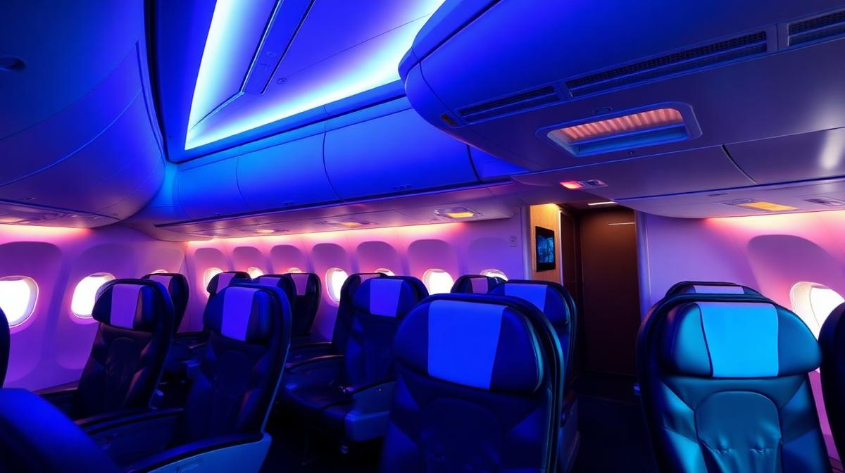
Every detail inside an aircraft cabin is engineered — from the curvature of the overhead bins to the thread count of the headrest covers. But perhaps no design element shapes passenger experience more profoundly than color. Airlines invest millions in color research because the right palette can reduce anxiety, extend perceived cabin space, boost premium ticket sales, and build the kind of brand recognition that turns first-time flyers into lifelong loyalists.
This guide explores the science behind airline cabin color psychology, breaking down how seat fabrics, LED mood lighting systems, and exterior livery schemes work together to create a seamless brand experience at 35,000 feet.

Why Color Matters More at Altitude
Flying is an inherently stressful activity. Passengers surrender control, enter a pressurized metal tube, and sit in close proximity to strangers for hours. Research shows that cabin pressure equivalent to 6,000–8,000 feet altitude affects color perception — reduced oxygen saturation makes warm tones appear slightly muted while cool blues become more vivid.
This physiological shift means airline designers can't simply transplant ground-level interior palettes into the sky. They must compensate for:
- Reduced contrast sensitivity — Colors that look distinct on the ground can blur together at altitude
- Lower ambient light levels — Window shades, dimmed cabins, and night flights change color appearance
- Heightened emotional states — Anxious passengers are more sensitive to aggressive or jarring color contrasts
Airlines that understand these altitude-specific color dynamics gain a measurable advantage in passenger satisfaction scores.
The Airline Seat Color Playbook
Seat upholstery is the single largest color surface passengers interact with. The choice of seat color communicates class positioning, cleanliness perception, and brand identity simultaneously.
Economy Class: The Blue Dominance
| Color | Hex Code | Psychological Effect | Airlines Using It |
|---|---|---|---|
| Navy Blue | #1B365D | Trust, reliability, calm | Delta, United, British Airways |
| Slate Blue | #6A7B8B | Modern, neutral, spacious | JetBlue, Alaska Airlines |
| Charcoal Grey | #36454F | Sophisticated, hides wear | Lufthansa, Singapore Airlines |
| Dark Teal | #004E5F | Fresh, contemporary | Cathay Pacific, Korean Air |
Blue dominates economy for three evidence-based reasons: it lowers heart rate (reducing flight anxiety), it recedes visually (making tight seat pitches feel more spacious), and it hides stains and wear far better than lighter alternatives. Research in color psychology consistently shows blue as the world's most universally preferred color — making it a safe default for diverse passenger demographics.
Business & First Class: Warm Neutrals Signal Luxury
Premium cabins shift toward warm neutrals — champagne (#F7E7CE), warm taupe (#8B8589), and cognac brown (#834A21). This palette mirrors luxury hospitality interiors like five-star hotel lobbies and premium lounges.
The psychology is deliberate:
- Warm tones feel intimate — They shrink perceived space, creating a cocooning "private suite" sensation
- Leather cognac signals heritage — Borrowing from luxury automotive (Bentley, Rolls-Royce) and gentlemen's club aesthetics
- Champagne and cream suggest exclusivity — Light colors that would be impractical in economy signal that this space is maintained to a higher standard
The "Red Seat" Exception
A handful of carriers — notably Virgin Atlantic (#CC0000) and AirAsia (#FF0000) — use red seats as a brand differentiator. Red is energizing and attention-grabbing, but it also increases perceived time passage. These airlines compensate with shorter average flight durations and a youthful brand positioning where excitement outweighs relaxation.
Cabin Mood Lighting: The 7-Phase Journey

Modern wide-body aircraft like the Boeing 787 Dreamliner and Airbus A350 feature 16.7 million color LED mood lighting systems. Airlines program these systems into distinct phases that guide passengers through an emotional journey:
The 7 Standard Lighting Phases
| Phase | Color Temperature | Hex Reference | Purpose |
|---|---|---|---|
| 1. Welcome/Boarding | Warm Amber | #FFB347 | Hospitality, reduce boarding stress |
| 2. Safety Demo | Bright White | #F5F5F0 | Alertness, attention to instructions |
| 3. Takeoff | Soft Blue | #4A90D9 | Calm anxiety during acceleration |
| 4. Cruise (Day) | Cool Sky Blue | #87CEEB | Simulate natural daylight, reduce fatigue |
| 5. Cruise (Night) | Deep Indigo | #2E0854 | Encourage sleep, suppress melatonin disruption |
| 6. Pre-Landing Wake | Sunrise Amber | #FF8C42 | Gentle wake stimulus, circadian reset |
| 7. Landing/Arrival | Brand Color | Varies | Reinforce brand identity on arrival |
The Science Behind Each Phase
Phase 1 — Warm Amber Boarding: When passengers board, they're often stressed from security checks, gate changes, and overhead bin anxiety. Warm amber light (2700K–3000K) mimics the golden-hour sunlight that signals "welcome" and "safety" across cultures. This is the same principle restaurants use to make diners feel immediately comfortable.
Phase 3 — Takeoff Blue: During the most anxiety-inducing moment of flight, blue light activates the parasympathetic nervous system, measurably lowering heart rate and blood pressure. Airlines report that passenger call-button usage drops by up to 18% during blue-lit takeoff sequences compared to white lighting.
Phase 5 — Deep Indigo Sleep: On long-haul flights, deep indigo lighting (mimicking twilight) helps suppress the blue-light spectrum that disrupts melatonin production. Combined with dimmed personal reading lights, this creates a "cabin night" that significantly improves passenger sleep quality.
Phase 6 — Sunrise Wake: The most psychologically sophisticated phase. Airlines gradually shift from indigo through warm gradients of rose, peach, and amber over 20–30 minutes — simulating a natural sunrise. This gentle wake cycle prevents the jarring disorientation of sudden bright lights and helps passengers arrive feeling more rested.
Airline Livery: Brand Identity at 200 Feet

An airline's exterior livery is the largest mobile billboard in the world — a typical widebody fuselage presents over 1,200 square meters of painted surface. The color choices here serve dual purposes: instant brand recognition from terminal windows and psychological priming before passengers even board.
The Color Strategy Breakdown
| Airline Archetype | Primary Colors | Psychology | Examples |
|---|---|---|---|
| Trust & Safety | Blue + White | Reliability, institutional authority | Delta, United, KLM, ANA |
| National Pride | Flag Colors | Patriotism, cultural identity | Emirates (green/red), Air India (saffron/green), Turkish Airlines (red/white) |
| Luxury & Premium | Gold + Dark Navy | Exclusivity, sophistication | Singapore Airlines, Qatar Airways, Etihad |
| Disruptor & Budget | Red + White or Yellow | Energy, value, urgency | Southwest, EasyJet, AirAsia |
| Eco-Conscious | Green + Earth Tones | Sustainability, nature | JetBlue (updated), Frontier |
Why Blue Dominates Aviation Branding
Over 60% of major airlines use blue as their primary livery color. This isn't coincidence — it's strategic:
- Sky association — Blue livery visually merges with the sky, creating a subliminal "this aircraft belongs here" message
- Trust signaling — Blue is the color of trust across virtually all cultures
- Regulatory history — Early aviation regulations favored high-visibility colors; blue provided excellent contrast against clouds while remaining professional
- Material durability — Blue pigments resist UV fading better than reds and yellows, reducing repaint frequency (saving $200,000+ per aircraft per cycle)
The Gold Standard: Singapore Airlines
Singapore Airlines' distinctive gold and dark blue (#003366) livery, combined with the iconic "Singapore Girl" in her sarong kebaya, represents perhaps the most effective color branding in aviation history. The gold communicates luxury without ostentation, while the deep navy grounds the brand in trustworthiness. This consistent color identity has contributed to Singapore Airlines maintaining a top-3 position in global airline brand value for over two decades.
Cabin Class Color Hierarchy
Airlines use a deliberate color hierarchy that intensifies as passengers move from economy to first class:
The Color Gradient of Prestige
| Class | Color Palette | Materials | Lighting Warmth |
|---|---|---|---|
| Economy | Cool blues, greys | Fabric, plastic | 4000K–5000K (neutral) |
| Premium Economy | Blue-grey + wood accents | Leather blend, laminate | 3500K–4000K (warm-neutral) |
| Business | Warm taupe, champagne | Full leather, real wood | 3000K–3500K (warm) |
| First/Suite | Gold, cream, burgundy | Bespoke leather, marble | 2700K–3000K (very warm) |
This gradient mirrors hospitality design principles: warmth equals luxury, coolness equals efficiency. The progression ensures that premium passengers feel an immediate, visceral difference the moment they step past the curtain divider.
Emergency & Safety Color Coding
Beyond aesthetics, cabin colors serve critical safety functions:
- Exit signs: Green (#00FF00) — Universal safety color, visible through smoke
- Floor path lighting: Green/White — Guides evacuation in darkness
- Life vest: Yellow-Orange (#FFCC00) — Maximum visibility in water and from rescue aircraft
- Oxygen mask: Yellow (#FFD700) — Immediate visual identification in emergency
- Flight attendant vests: High-Vis (#FF6600) — Crew identification during evacuation
These colors aren't design choices — they're mandated by aviation authorities (FAA, EASA) based on decades of human factors research into visibility under stress, smoke conditions, and reduced lighting. Understanding the difference between aesthetic and safety color use is essential for anyone studying color accessibility.
How Mood Lighting Affects Spending
Airlines have discovered that lighting color directly impacts ancillary revenue:
- Warm amber lighting during meal service increases premium food and beverage purchases by up to 22% (mirroring restaurant lighting psychology)
- Cool blue lighting during duty-free cart service reduces perceived time pressure, encouraging browsing — duty-free sales increase by 15% under relaxed blue lighting
- Brand-colored lighting during boarding increases brand recall by 34%, boosting loyalty program sign-ups
These findings parallel research in retail color psychology: warm colors stimulate appetites and impulse purchases, while cool colors encourage thoughtful decision-making.
Cultural Considerations in Global Airlines
Airlines serving diverse international routes must navigate cultural color sensitivities:
- White symbolizes purity in Western cultures but mourning in parts of East Asia — airlines like Cathay Pacific balance white fuselages with auspicious green and red cabin accents
- Red is lucky in Chinese culture but signals danger in Western contexts — Chinese carriers use red generously while European airlines restrict it to accent details
- Green represents Islam and is revered across Middle Eastern airlines (Saudia, Emirates' accent color) but has different associations in South America
- Gold/Yellow universally signals premium quality, making it the safest prestige color for global carriers
Learn more about how colors vary across cultures and how this impacts design decisions.
Designer Takeaways: Applying Airline Color Psychology
Whether you're designing for aviation or adapting these principles to other environments, here are the key lessons:
- Match color to emotional phase — Use color palettes that shift with the user's emotional journey, not static designs
- Use blue for baseline trust — Especially in contexts where users feel vulnerable or out of control
- Warm = premium, cool = efficient — Apply this gradient consistently across product tiers
- Plan for environmental distortion — Test colors under the actual lighting conditions they'll be viewed in
- Safety colors are non-negotiable — Never compromise accessibility standards for aesthetics
- Cultural sensitivity scales with audience diversity — Global products need globally-tested palettes
Use Coloracci's AI color tools to generate aviation-inspired palettes, and check contrast ratios to ensure your designs maintain readability under variable lighting conditions.
Conclusion: Color as Co-Pilot
The next time you board an aircraft, notice the colors. The warm amber glow greeting you at the door, the deep blue seats that quietly lower your heart rate, the gradual sunrise that wakes you before landing — none of it is accidental. Airlines have turned color psychology into a precision instrument, one that shapes how safe you feel, how long you sleep, how much you spend, and whether you'll fly with them again.
In an industry where switching costs are low and competition is fierce, color isn't decoration — it's differentiation. The airlines that invest in sophisticated color strategy don't just fill seats; they build the kind of subconscious brand loyalty that survives fare wars and flight delays.
For designers working in any high-anxiety, enclosed environment — from hospitals to offices to transit systems — aviation cabin design offers a masterclass in how color can transform a stressful experience into a memorable one.