Tech Startup Color Trends 2026
· Coloracci Team
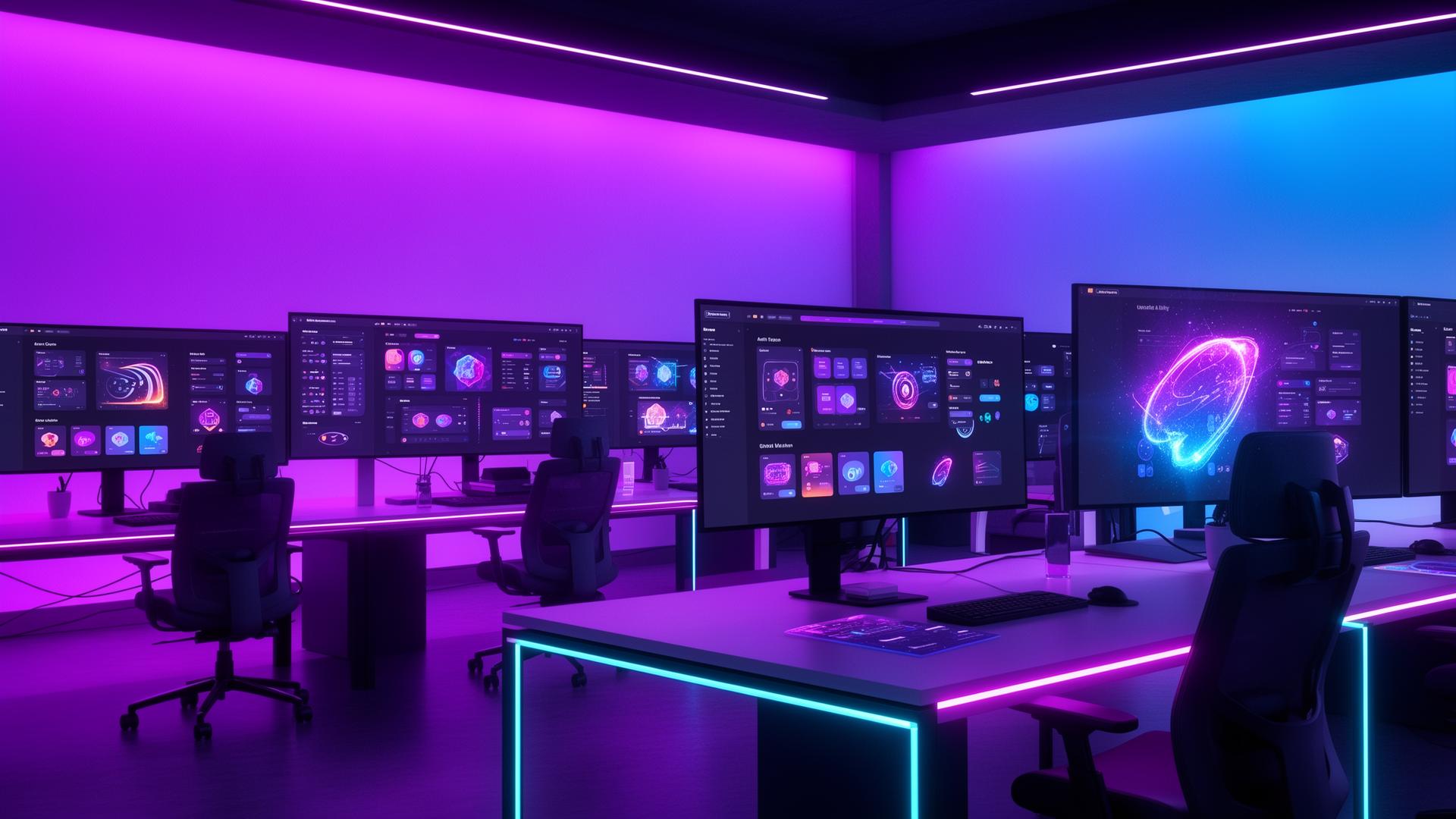
The color landscape of tech startups shifts faster than any other industry. What looked cutting-edge eighteen months ago now reads as dated, and the brands that fail to evolve their palettes risk being perceived as yesterday's technology solving yesterday's problems. In 2026, four major color movements are reshaping how startups present themselves to investors, users, and the market. Each trend reflects deeper shifts in technology, culture, and user expectation.
This guide analyzes the four dominant color trends defining tech startup branding in 2026, provides exact hex codes for implementation, explains the cultural and technological forces driving each trend, and offers practical guidance for founders and designers building brands in this environment.
The Purple Renaissance
Purple has emerged as the defining color of the 2026 tech landscape. After a decade where blue dominated startup branding — think every fintech, SaaS, and cloud platform defaulting to some shade of corporate blue — founders and design teams are gravitating toward purple as a deliberate signal of differentiation, creativity, and ambition.
Why purple, why now? Three forces converge. First, the saturation of blue in tech branding has made it functionally invisible. When every competitor uses blue, no one stands out. Purple offers the trust associations of blue while adding the energy and creativity of red — a combination that communicates innovation more effectively than blue alone. Second, the cultural normalization of purple through gaming, streaming, and creator economies (Twitch #9146FF, Discord #5865F2) has made it feel native to digital contexts rather than eccentric. Third, the AI revolution has created a new category of products that need to feel simultaneously intelligent and approachable — purple threads that needle perfectly.
The 2026 purple palette spans a wide range of temperatures and saturations:
- Electric Violet
#7C3AED— The flagship purple of 2026. High-energy, confident, and unmistakably modern. This is the purple that says "we are building the future" without saying it in words. - Deep Intelligence
#4C1D95— A darker, more contemplative purple used by AI companies that want to suggest depth of capability. Works exceptionally well on dark backgrounds where it glows with quiet authority. - Soft Lavender Tech
#A78BFA— The accessible, friendly side of the purple spectrum. Used by startups targeting consumer audiences who want approachability without sacrificing modernity. - Cosmic Indigo
#5B21B6— Sits between blue and purple, capturing the trust of one and the innovation of the other. Popular among enterprise startups making the transition from blue to purple incrementally. - Neon Ultraviolet
#8B5CF6— High saturation, high impact. Works best as an accent color or in gradient combinations. Frequently appears in onboarding flows and feature announcements where attention is the priority.
Implementation strategy: The most effective purple-led brands in 2026 pair their primary purple with a warm neutral. #7C3AED (Electric Violet) with #FDF4FF (Lavender Mist) for light mode, or with #1A1625 (Deep Plum Black) for dark mode. Avoid pairing purple with cool gray — it drains the color of its energy and creates a generic, corporate feeling that defeats the purpose of choosing purple in the first place.
Gradient Trends: Beyond the Linear Fade
Gradients have evolved far beyond the simple two-color linear fades that defined the 2018-2022 era. In 2026, gradients function as brand signatures — complex, intentional color transitions that communicate motion, energy, and technological sophistication. The flat-color backlash is over; dimensionality is back, and gradients are the primary vehicle for achieving it.
The mesh gradient revolution. Mesh gradients — multi-point color blends that create organic, fluid color fields — have become the dominant gradient style in 2026 tech branding. Unlike linear or radial gradients, mesh gradients feel alive, suggesting the complexity and dynamism of the products they represent. Apple's continued use of mesh gradients across its product marketing has normalized the technique, and startups are following with their own interpretations.
Key gradient combinations defining 2026:
- Aurora Gradient —
#7C3AED→#06B6D4→#10B981— Purple to cyan to emerald. The most replicated gradient in 2026 startup branding. Suggests a full spectrum of capability, from creative intelligence (purple) through technological precision (cyan) to growth and results (emerald). - Sunset AI —
#F59E0B→#EF4444→#8B5CF6— Warm amber through red to purple. Used by AI companies that want to feel human and warm rather than cold and robotic. The transition from warm to cool suggests the bridge between human intuition and machine intelligence. - Deep Space —
#1E1B4B→#312E81→#4338CA— A monochromatic purple gradient that creates depth without complexity. Works exceptionally well as a hero background where text readability is paramount. - Electric Horizon —
#06B6D4→#3B82F6→#8B5CF6— Cyan to blue to purple. The evolution of the classic blue gradient, adding purple to signal that the brand is forward-looking rather than establishment. - Mint Dawn —
#D9F99D→#6EE7B7→#34D399— A green-to-green gradient that feels fresh and organic. Popular among climate tech and sustainability startups that want to feel technological rather than earthy.
CSS implementation note: Mesh gradients require either SVG-based approaches or the emerging CSS mesh-gradient() specification. For production in 2026, most teams use a combination of layered radial gradients with carefully positioned color stops to approximate the mesh effect:
background:
  radial-gradient(ellipse at 20% 50%, #7C3AED40 0%, transparent 50%),
  radial-gradient(ellipse at 80% 20%, #06B6D440 0%, transparent 50%),
  radial-gradient(ellipse at 60% 80%, #10B98140 0%, transparent 50%),
  #0F0F1A;
Dark Mode First Colors
The paradigm has inverted. In 2026, the majority of new tech startups design their brand colors for dark mode first and adapt to light mode second. This is not a stylistic preference — it reflects user behavior. Analytics consistently show that 65-75% of tech product users now default to dark mode, and that percentage climbs above 85% for developer tools, AI products, and productivity software.
Dark mode first design changes everything about color selection. Colors that work on white backgrounds often fail on dark surfaces. Saturated blues that look authoritative on white become garish on dark gray. Subtle pastels that feel sophisticated on light backgrounds disappear entirely on dark ones. The 2026 approach starts with dark backgrounds and selects colors that glow, float, and breathe on those surfaces.
The defining dark mode background palette of 2026:
- True Dark
#0A0A0B— Not pure black (#000000), which creates excessive contrast and eye strain, but a near-black that feels rich and deep. Most premium tech brands have settled on values between#0A0A0Band#111113. - Elevated Surface
#1A1A1D— The card and container surface color. Just enough lighter than the background to create hierarchy without obvious borders. - Subtle Border
#2A2A2E— Border and divider color that creates structure without visual noise. - Muted Text
#71717A— Secondary text and metadata. Passes accessibility requirements on dark backgrounds while remaining clearly secondary to primary content.
Accent colors optimized for dark mode:
The colors that sing on dark backgrounds share specific characteristics — they tend toward medium saturation with slightly elevated lightness, avoiding both the washed-out look of pastels and the eye-burning intensity of fully saturated neons.
- Dark Mode Purple
#A78BFA— Lighter than the#7C3AEDused on white backgrounds. On#0A0A0B, this purple glows with exactly the right intensity. - Dark Mode Cyan
#22D3EE— The signature accent of developer tools and infrastructure startups. On dark backgrounds, cyan creates a technological, precise aesthetic. - Dark Mode Emerald
#34D399— Success states, growth indicators, and positive actions. This green reads clearly on dark surfaces without the garish quality of brighter greens. - Dark Mode Amber
#FBBF24— Warning states and attention markers. Amber provides warmth in dark interfaces that would otherwise feel cold and uninviting.
AI Brand Colors: A New Category Emerges
The explosion of AI products in 2025-2026 has created an entirely new branding challenge: how do you visually communicate artificial intelligence without defaulting to the clichés of glowing brains, neural networks, and cold blue interfaces? The most successful AI brands in 2026 have answered this question with distinctive color strategies that balance technological sophistication with human approachability.
The three AI color archetypes:
The Warm Intelligence palette uses warm purples, soft oranges, and muted golds to suggest that AI is a tool that enhances human capability rather than replacing it. This approach dominates consumer-facing AI products.
- Primary:
#7C3AED(Electric Violet) - Secondary:
#F59E0B(Warm Amber) - Neutral:
#FDF4FF(Lavender Mist)
- Primary:
The Precision Engine palette uses cool cyans, deep navies, and silver grays to signal accuracy, reliability, and enterprise-grade capability. This approach dominates B2B AI tools and infrastructure.
- Primary:
#06B6D4(Technical Cyan) - Secondary:
#1E3A5F(Deep Navy) - Neutral:
#F1F5F9(Cool Slate)
- Primary:
The Creative Partner palette uses vibrant gradients and unexpected color combinations to position AI as a creative collaborator. This approach dominates generative AI products — image generators, writing assistants, and design tools.
- Primary gradient:
#EC4899→#8B5CF6(Pink to Purple) - Secondary:
#10B981(Emerald) - Neutral:
#FAFAFA(Near White)
- Primary gradient:
Notable AI brand colors of 2026:
- OpenAI continues to evolve its palette around
#10A37F(OpenAI Green), but has introduced purple accents for its creative tools, acknowledging the color's association with innovation. - Anthropic maintains its warm, approachable palette centered on
#D4A574(Warm Sand), deliberately avoiding the cool blues that dominate AI branding to emphasize safety and human alignment. - Midjourney has fully embraced the creative gradient approach with rich blues and purples that evoke imagination and artistic possibility.
Practical Tips for 2026 Tech Branding
Audit your blue dependency. If your brand uses blue as its primary color, evaluate whether it still differentiates you. In a market where 60% of tech companies use blue, switching to
#7C3AEDpurple or#06B6D4cyan can immediately increase brand recognition.Design your gradient as a brand asset. Your gradient should be as intentional and consistent as your logo. Define exact color stops, angles, and opacity values. Document them in your brand guidelines as precisely as you document your typography.
Test every color on
#0A0A0B. Before committing to any brand color, place it on a near-black background. If it looks wrong, find the dark-mode-optimized variant. Your#7C3AEDmight need to become#A78BFAon dark surfaces.Build a semantic color system. Define colors by function (primary, secondary, success, warning, error, info) rather than by hue. This creates a system that adapts to dark mode, accessibility requirements, and future brand evolution without requiring a complete redesign.
Avoid the AI cliché palette. If you are building an AI product, resist the temptation to use glowing blue and chrome. The most memorable AI brands of 2026 use color to feel human, warm, and trustworthy — qualities that differentiate in a category prone to cold, robotic aesthetics.
Embrace color as competitive intelligence. Map the colors of every competitor in your category. If the landscape is dominated by blues and greens, purple or warm amber becomes a strategic advantage. Color differentiation is one of the cheapest and most effective ways to stand out in a crowded market.
Plan for animation. Static colors are the baseline; animated color transitions are the differentiator. Your brand palette should include guidance for how colors transition — which gradient direction to use, how long transitions should last, and which colors should pulse or glow in interactive states.
The tech startups that will define 2026 are the ones that treat color not as an afterthought but as a strategic asset. In a market saturated with blue SaaS dashboards and gray enterprise interfaces, a bold, intentional color strategy is the fastest path to being remembered. The hex codes in your brand system are not just design decisions — they are business decisions.