What Colors Go With Plum Noir? A Deep Dive into Palettes and Psychology
· Coloracci Team
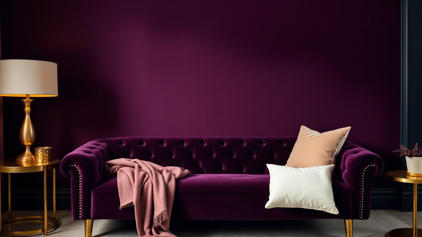
The Direct Answer: What Colors Go With Plum Noir
If you are asking what colors go with plum noir, the short answer is four families: warm metallics, soft neutrals, muted greens, and deeper wine reds. Specifically, plum noir (#4B2067 at its deepest, #4b163f at its most wine-leaning) is at its best beside warm gold #C9A84C, cream #F5F0E8, dusty mauve #9E7A94, sage green #A7B69D, aged burgundy #6B1E2D, blush pink #F1D4D4, and a cool light gray #D3D3D3.
Plum noir is not simply "dark purple." It is a purple carrying measurable amounts of red and brown, which is exactly why it behaves so differently from a clean violet. That red-brown load makes it read as a near-neutral in low light and as a saturated jewel tone under warm lamps — a dual personality that most other dark colors do not have. Understanding that duality is the key to pairing it well.
This guide gives you the exact HEX values, four field-tested palettes, the psychology behind the color, and the proportional rules that keep plum noir from swallowing a room or a brand.
Defining Plum Noir: The Exact HEX Values
Plum is a family, not a single swatch. These are the four values worth building from:
| Swatch name | HEX | Character |
|---|---|---|
| Deep Plum | #4B2067 |
The truest "noir" reading — violet-dominant, almost black at 20% light |
| Standard Plum | #8E4585 |
Brighter, more magenta; the classic dictionary plum |
| Plum Noir (wine) | #4b163f |
Red-shifted, the moodiest of the set, superb on cabinetry |
| Plum Noir (soft) | #6a1b5a |
Lifted and slightly warmer; the most forgiving in daylight |
Two practical notes. First, #4B2067 and #4b163f are close in value but far apart in temperature: the first leans cool-violet, the second leans warm-wine. Put them side by side and the difference is obvious; specify the wrong one and your gold accents will either sing or look muddy. Second, all four have low light reflectance values, which means they absorb light rather than bounce it. In a compact space that is a deliberate choice, not an accident — see our guide on monochromatic color schemes for how to build depth without adding brightness.
The Supporting Cast: Exact Partner Colors
Warm Gold — #C9A84C
The single most reliable partner. Gold's yellow-orange sits opposite plum's violet-red on the wheel, producing a near-complementary contrast that reads as luxury rather than clash. Use it in hardware, picture frames, thin metal legs, or a brand's typographic accent. Keep it matte or brushed; high-polish gold against plum tips quickly into costume territory.
Cream — #F5F0E8
The breathing room. Cream is warm enough to belong to plum's family and light enough to reset the eye. Ceilings, trim, upholstery piping, and negative space in layouts all belong here. Pure white #FFFFFF is the common mistake — it is too cold and turns plum noir grey.
Dusty Mauve — #9E7A94
The analogous bridge. Mauve is plum with the saturation drained and the value lifted, which makes it the perfect mid-tone between a dark plum wall and a cream ceiling. It prevents the jarring jump from very dark to very light. This is textbook analogous harmony, covered in depth in our analogous colors examples guide.
Aged Burgundy — #6B1E2D
The deepening partner. Burgundy shares plum's red content but abandons the violet, so the two sit together as a layered, wine-cellar richness rather than a contrast. Use sparingly — a leather chair, a rug border, a secondary brand color.
Sage Green — #A7B69D
The unexpected one, and the most sophisticated. Green is plum's true complement territory, but sage is desaturated enough to whisper instead of shout. A sage velvet cushion on a plum sofa is the detail that makes a room look designed rather than decorated.
Blush Pink — #F1D4D4
The romantic lift. Blush is plum's tint cousin: same red base, radically higher value. It softens plum noir in bedrooms and in beauty branding, where the pairing reads as feminine without being juvenile.
Light Gray — #D3D3D3
The modernizer. Cool gray strips plum of its historical, velvet-curtain associations and pushes it contemporary. Use it when plum noir needs to look like 2026 rather than 1896.
Four Complete Plum Noir Color Combinations
1. Royal Velvet (Luxury Interior)
- Walls: Deep Plum
#4B2067 - Trim and ceiling: Cream
#F5F0E8 - Metals: Warm Gold
#C9A84C - Accent textile: Aged Burgundy
#6B1E2D
Proportion: 60% plum, 30% cream, 10% split between gold and burgundy. This is the palette for a formal living room or a dining room used mostly after dark. It requires warm 2700K lighting; under cool daylight bulbs the plum turns cold and the gold turns brassy.
2. Modern Muted (Contemporary Living)
- Walls: Light Gray
#D3D3D3 - Feature wall or cabinetry: Plum Noir
#6a1b5a - Soft furnishings: Dusty Mauve
#9E7A94 - Accent: Sage Green
#A7B69D
Here plum is the accent, not the field. This inverts the usual approach and is far safer in a small or north-facing room: you get the drama of plum on one plane while the gray keeps overall brightness up.
3. Wine Cellar (Moody Hospitality)
- Base: Plum Noir wine
#4b163f - Secondary: Aged Burgundy
#6B1E2D - Neutral: Cream
#F5F0E8 - Metal: Warm Gold
#C9A84C
A near-monochromatic scheme built entirely from the red-violet range. Restaurants, bars, and boutique hotels use this because it flatters skin tones under low light — the reflected warmth does what a filter does.
4. Soft Romance (Bedroom / Beauty Branding)
- Walls: Blush Pink
#F1D4D4 - Headboard or packaging: Standard Plum
#8E4585 - Mid-tone: Dusty Mauve
#9E7A94 - Grounding: Deep Plum
#4B2067
This palette answers what colors go with plum noir for anyone who wants the color's sophistication without its heaviness. The blush field keeps the room light while the plum anchors it.
The Psychology of Plum: Luxury, Wisdom, Mystery
Plum inherits the entire cultural weight of purple — a color that for most of history was the most expensive pigment available, restricted by law to emperors and cardinals. That scarcity is gone, but the association is permanent. Plum still signals this is not ordinary, which is why it dominates in luxury goods, high-end cosmetics, artisanal food packaging, and creative agencies. Our deep dive on purple in luxury branding traces that lineage in detail.
But plum noir adds two things standard purple lacks. The red content brings warmth, appetite, and physicality — it is why plum works in dining rooms where a pure violet would feel clinical. The brown content brings groundedness and age, the sense that the color has been there a while. Together they produce a specific emotional signature: sophisticated but not cold, dramatic but not aggressive, romantic but not sweet.
Three associations dominate in practice:
Wisdom and depth. Dark purples are consistently rated as the most "thoughtful" colors in perception studies. Publishers, consultancies, and educational brands use plum to say considered rather than fast.
Mystery and romance. Plum's low reflectance means it never fully resolves under low light — the eye cannot pin it down. That ambiguity is read emotionally as intrigue.
Creativity. Purple sits between the passion of red and the calm of blue, which is why it is the default color of the creative sector. Plum noir is that signal with a serious, adult register.
Practical Takeaways for Designers and Homeowners
Test in situ, and test at night. Plum noir changes more than almost any other color between daylight and lamplight. Paint a two-foot square, live with it for 48 hours, and judge it at 9 p.m. — that is when you will actually be in the room.
Use warm bulbs. 2700K–3000K. Cool white light pulls the red out of plum and leaves a flat, bruised grey-purple.
Give it a matte or velvet finish. Plum's richness lives in texture. Flat and eggshell paints hold the depth; satin and gloss create hot reflective spots that fracture the color.
Respect the 60-30-10 split. Plum noir as the 60% works only in rooms with good natural light or a deliberately theatrical intent. In every other case, make it the 30% or the 10%.
Watch contrast for accessibility. #4B2067 against cream #F5F0E8 clears WCAG AAA comfortably for body text. #8E4585 against white is borderline for small text — verify before shipping a brand system.
For branding, pick one plum and lock it. The four values above are close enough that inconsistency looks like a printing error rather than a range. Choose your primary, then derive tints and shades from it rather than switching families.
In fashion, plum is a neutral. A plum noir coat, suit, or evening gown behaves like navy: it goes with camel, cream, gold, black, and grey without any further thought.
Data Table: Plum Noir Palette at a Glance
| Item | Color | Hex | Color Name | Psychological Meaning |
|---|---|---|---|---|
| Feature wall | ■ | #4B2067 |
Deep Plum | Luxury, wisdom, authority |
| Velvet sofa | ■ | #4b163f |
Plum Noir (wine) | Mystery, intimacy, depth |
| Kitchen cabinetry | ■ | #6a1b5a |
Plum Noir (soft) | Modern confidence, individuality |
| Brand primary | ■ | #8E4585 |
Standard Plum | Creativity, imagination |
| Hardware and frames | ■ | #C9A84C |
Warm Gold | Prestige, warmth, value |
| Trim and ceiling | ■ | #F5F0E8 |
Cream | Calm, space, refinement |
| Cushions and throws | ■ | #9E7A94 |
Dusty Mauve | Nostalgia, softness, balance |
| Leather accent chair | ■ | #6B1E2D |
Aged Burgundy | Tradition, richness, appetite |
| Botanical accents | ■ | #A7B69D |
Sage Green | Renewal, balance, calm |
| Bedroom walls | ■ | #F1D4D4 |
Blush Pink | Romance, tenderness, ease |
| Modern neutral base | ■ | #D3D3D3 |
Light Gray | Clarity, restraint, contemporaneity |
Conclusion
What colors go with plum noir comes down to a simple structure: one warm metallic to create contrast, one light neutral to create breathing room, one analogous mid-tone to bridge the values, and one muted green or deep wine to add sophistication. Gold, cream, dusty mauve, and sage will carry almost any plum noir scheme, whether it is a bedroom wall, a velvet sofa, or a cosmetics label.
The color rewards restraint. Used at 60% in a bright room it is spectacular; used at 60% in a dim one it is oppressive. Start with plum as the accent, and promote it only once you have seen it live at night.
Ready to build your own version? Drop your chosen plum HEX into the Coloracci palette generator and let it generate mathematically harmonious tints, shades, and complements around it — then export the whole system as CSS variables or Tailwind tokens in one click.