Purple in Luxury Branding: From Royalty to Modern Logos
· Coloracci Team
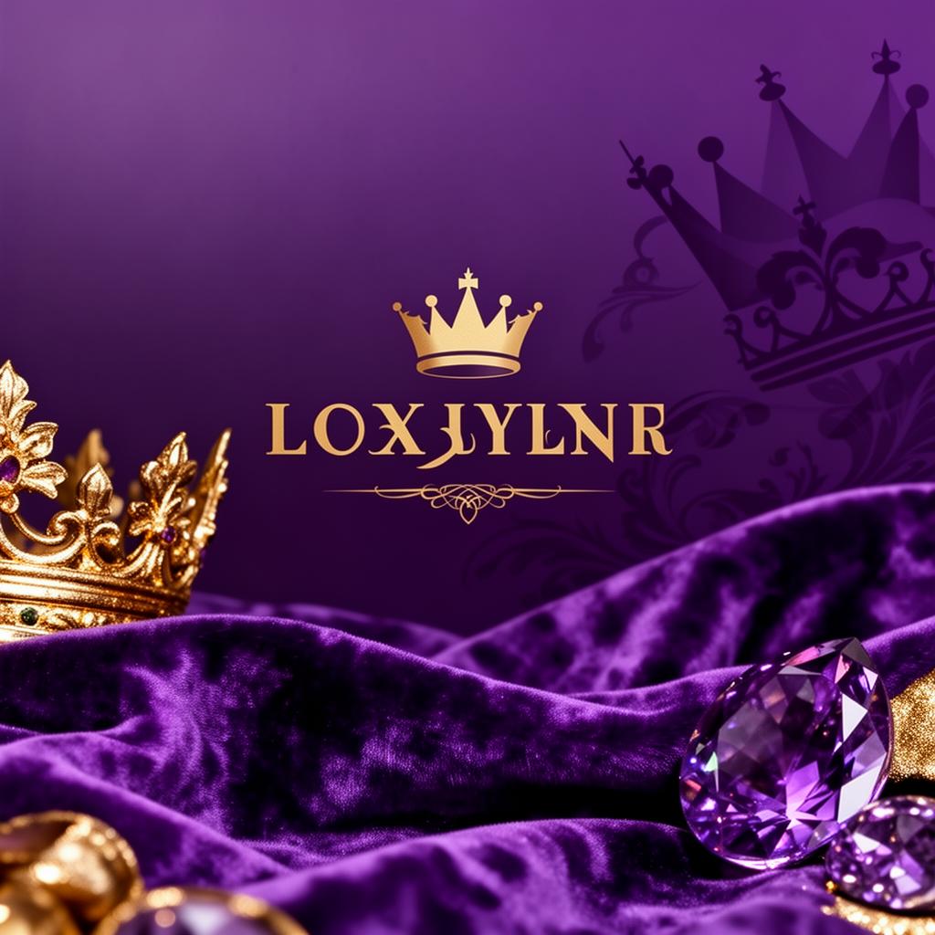
Purple has always been extraordinary. For most of human history, it was literally the most expensive color on Earth — more valuable than gold by weight. That legacy of exclusivity has never faded. Today, purple remains the color brands reach for when they want to communicate luxury, creativity, and a sense of the exceptional. No other color carries this particular combination of associations, and understanding how to deploy purple effectively gives designers and marketers access to one of the most powerful tools in the branding palette.
From the robes of Roman emperors to the wrappers of Cadbury chocolate bars, purple tells a consistent story: this is something special. In this article, we trace purple's journey from ancient rarity to modern branding essential, examine how today's most successful companies use it, and provide practical guidance for incorporating purple into your own brand design.
The Historical Power of Purple
The story of purple begins with a snail. Tyrian purple, the most prized dye of the ancient world, was extracted from the mucus glands of the Bolinus brandaris sea snail found along the coast of modern-day Lebanon. Producing a single gram of dye required roughly 10,000 snails, making the color astronomically expensive. A pound of Tyrian purple dye cost more than a pound of gold.
This extreme scarcity created an unbreakable association between purple and power. Roman sumptuary laws restricted the wearing of purple to senators and emperors. Byzantine emperors were said to be "born in the purple" — literally born in a chamber lined with purple porphyry stone. Queen Elizabeth I forbade anyone outside the royal family from wearing purple. The message was unmistakable: purple was for the elite, and wearing it was a declaration of supreme status.
Even after synthetic purple dyes became available in the 1850s — starting with William Henry Perkin's accidental discovery of mauveine — the psychological association persisted. Centuries of exclusivity had embedded purple so deeply in the human psyche that no amount of chemical democratization could erase it. When we see purple today, we still feel, on some instinctive level, that we are in the presence of something rare and valuable.
This is the foundation that every modern brand using purple builds upon, whether consciously or not.
Purple in Modern Luxury Branding
The most successful luxury brands understand that purple communicates exclusivity without the coldness of black or the aggression of red. It occupies a unique emotional space — regal but warm, prestigious but approachable.
Cadbury is perhaps the most iconic purple brand in the world. Their signature Cadbury Purple (#4A148C) is so central to their identity that they attempted to trademark it. The deep, rich violet wrapping communicates indulgence and premium quality, transforming an everyday chocolate bar into a small luxury. Cadbury's purple is dark enough to feel sophisticated but saturated enough to feel pleasurable — a perfect match for a brand selling affordable indulgence.
Hallmark uses a refined purple (#6A1B9A) alongside gold to position its greeting cards and gifts as premium products. The combination of purple and gold is one of the oldest luxury pairings in existence, directly echoing royal heraldry. Hallmark's purple says, "This card is not just paper — it is a meaningful gesture worthy of the occasion."
Crown Royal leans into the royalty association with characteristic directness. The Canadian whisky brand wraps every bottle in a purple velvet bag, uses a gold crown in its logo, and employs a deep imperial purple (#4A148C) throughout its branding. There is no subtlety here — Crown Royal wants you to feel like royalty when you pour a glass, and the purple delivers that message with absolute clarity.
Asprey, the British luxury goods house that has held royal warrants since Queen Victoria, uses purple as its signature color to reinforce its centuries-long association with the British crown. Their purple is restrained and dark, communicating old-money sophistication rather than flashy opulence.
The pattern across these brands is consistent: purple signals that a product exists above the ordinary. It transforms everyday items — chocolate, cards, whisky — into experiences that feel elevated and special.
Purple for Creativity and Innovation
While luxury brands exploit purple's historical associations with royalty, a different category of companies uses purple to communicate creativity, imagination, and forward-thinking innovation. This second axis of purple's psychology is equally powerful.
Yahoo was one of the first major tech companies to adopt purple (#7B1FA2) as a primary brand color, differentiating itself from the blues and reds that dominated early internet branding. Yahoo's purple suggested that the internet was not just a utility — it was a place of wonder and discovery.
Twitch, the live-streaming platform, uses a vibrant purple (#9C27B0) that has become synonymous with gaming culture and creative content. Twitch's purple is brighter and more energetic than luxury purples, communicating excitement, community, and creative expression. The choice was strategic: purple stands out against the blues of Facebook and Twitter and the reds of YouTube, giving Twitch a distinctive visual identity in a crowded social media landscape.
Roku employs a deep purple (#6A1B9A) to position itself as an innovative, premium streaming platform. The purple differentiates Roku from competitors and suggests a more curated, thoughtful entertainment experience.
FedEx uses purple in combination with orange — a complementary color scheme that creates maximum visual contrast. The FedEx purple (#4A148C) communicates reliability and professionalism, while the orange adds energy and speed. This combination is a masterclass in using purple outside the luxury space while still benefiting from its associations with quality and trustworthiness.
The creative use of purple works because the color sits at the boundary between warm red and cool blue — literally blending passion with reason. This makes purple feel both imaginative and credible, a combination that technology and creative companies find irresistible.
Light Purple vs Deep Purple: Shade Psychology
As with every color, the specific shade of purple you choose dramatically alters the message your brand sends.
Deep Purple / Dark Violet (#4A148C) is the most traditionally luxurious shade. It carries the strongest associations with royalty, wealth, and exclusivity. Brands targeting high-net-worth consumers or positioning products as ultra-premium should gravitate toward these deeper shades. Dark purple pairs exceptionally well with gold, silver, and cream.
Royal Purple (#7B1FA2) sits in the mid-range and is the most versatile shade. It is luxurious enough for premium brands but vibrant enough for creative companies. This is the sweet spot for brands that want to feel both prestigious and contemporary.
Bright Purple / Medium Purple (#AB47BC) skews younger and more energetic. It communicates creativity, playfulness, and digital-native thinking. Social media platforms, gaming companies, and brands targeting millennials and Gen Z often choose this range. It is approachable without sacrificing purple's inherent sense of specialness.
Vivid Purple (#9C27B0) is bold and attention-grabbing. It works well for brands that want to make a strong visual statement — entertainment companies, event brands, and products that compete on shelf impact. This shade demands attention and communicates confidence.
Lavender / Light Purple (#E1BEE7) is gentle, calming, and feminine. It evokes spring flowers, soft fabrics, and delicate fragrances. Wellness brands, beauty products, and lifestyle companies use lavender to suggest tenderness and care. However, lavender lacks the authority of deeper purples — it whispers where royal purple declares.
Understanding this spectrum is essential. A fintech startup using lavender will feel insubstantial; a children's toy brand using dark violet will feel intimidating. The shade must match the brand's personality and audience.
When Purple Works for Your Brand
Purple is powerful, but it demands careful deployment. Here is when it excels and when it can backfire.
Use purple when positioning a product as premium. If you are selling a higher-priced version of a common product — artisanal chocolate, premium streaming, luxury spirits — purple immediately signals that your offering is a cut above.
Use purple when creativity is your differentiator. If your brand promise centers on imagination, innovation, or creative expression, purple communicates those values more effectively than any other color.
Use purple when you need to stand out in a blue-dominated industry. In technology, finance, and healthcare — where blue is ubiquitous — purple provides differentiation while retaining much of blue's trustworthiness.
Avoid purple for budget or value brands. Purple's luxury associations work against brands competing on price. Discount retailers and budget products should reach for yellows, oranges, or reds instead.
Avoid purple for masculine-skewed brands unless paired with dark neutrals. In Western markets, purple can skew feminine in perception. Brands targeting predominantly male audiences should use deep, dark purples (#4A148C) paired with black or charcoal rather than lighter, brighter shades.
Be cautious with purple in food branding outside of confectionery. Purple is rarely found in nature as a food color, which can create subconscious unease. Cadbury works because chocolate is an indulgence; a purple-branded vegetable company would feel wrong.
Practical Design Tips
Purple and gold is the ultimate luxury pairing. This combination has been signaling wealth and royalty for millennia. Use it when premium positioning is paramount.
Purple and white creates a clean, modern aesthetic. This pairing works well for tech companies and SaaS products that want to feel innovative without being overwhelming.
Never use purple text on a dark background without testing contrast. Many purple shades fail WCAG accessibility requirements against dark backgrounds. Always verify contrast ratios.
Build a purple system with at least four shades. Use deep purple (
#4A148C) for primary elements, medium purple (#7B1FA2) for secondary elements, bright purple (#AB47BC) for accents and CTAs, and light purple (#E1BEE7) for backgrounds and subtle highlights.Consider purple as an accent rather than a dominant color. A website that is entirely purple can feel overwhelming. Many successful brands use purple as a signature accent — in logos, buttons, and key UI elements — against neutral backgrounds.
Test across cultural contexts. In Thailand, purple is the color of mourning. In Brazil, it is associated with death and grief. Always research your target markets before committing to purple as a primary brand color.
Purple's journey from ancient sea snails to modern brand identities is a testament to the enduring power of color psychology. No other color carries such a rich cargo of historical meaning into the contemporary marketplace. For designers and marketers willing to wield it thoughtfully, purple remains what it has always been — the color of the extraordinary.