What Colors Go With Mushroom Paint? A Designer's Guide to Earthy Palettes
· Coloracci Team
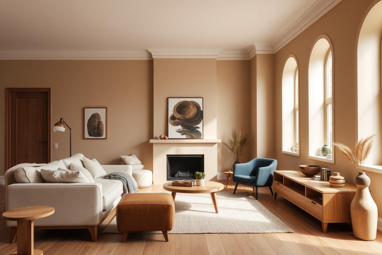
The Direct Answer: What Colors Go With Mushroom Paint?
If you're asking what colors go with mushroom paint, the designer's short answer is this: mushroom is a chameleon greige — a warm, earthy neutral that sits between beige and gray — and it partners beautifully with crisp whites for structure, deep greens for grounded contrast, soft blues for calm, terracotta and rust for warmth, and charcoal for sophisticated drama. Because mushroom already contains warm and cool undertones in a single hue, almost every serious interior color plays nicely with it. The trick is choosing partners that reinforce the mood you want — spa-like calm, layered organic modernism, or crisp editorial elegance.
This guide breaks down the exact HEX codes for the most-used mushroom paints (Benjamin Moore Pale Oak, Sherwin Williams Accessible Beige, Farrow & Ball Elephant's Breath, Dunn-Edwards Loggia), three complete room-ready palettes, the color psychology behind each pairing, and practical takeaways for painters, homeowners, and interior designers who need the answer to work in a real room — not just in theory.
Understanding Mushroom Paint: Not One Color, but a Family
Mushroom is a category, not a single swatch. Every major paint brand has its own take, and the differences matter when you're pairing accent colors. Here are the four canonical mushroom paints designers reach for most, with exact HEX values:
- Benjamin Moore Pale Oak (OC-20) — #D5D1C4. The lightest, airiest greige of the group. Reads almost white in bright north light, warms up dramatically in evening lamplight. Ideal for open-plan living areas that need to feel expansive.
- Sherwin Williams Accessible Beige (SW 7036) — #D1C8B9. The most popular warm beige-gray in North American interiors. It's the "safe hero" of mushroom paints — universally flattering, works in almost any orientation.
- Farrow & Ball Elephant's Breath (No. 229) — #CAC1B7. A warm mid-gray with a whisper of magenta. This magenta undertone is what makes it feel sophisticated and slightly moody rather than flat.
- Dunn-Edwards Loggia (DE6218) — #C4B9A9. A deeper, earthier greige with more brown in it. Excellent for bedrooms, libraries, and enveloping spaces where you want a soft cocoon.
- Generic "Mushroom" — #7C695A. The saturated, cap-of-a-portobello version. Use as an accent — furniture, a single feature wall, cabinetry — rather than a whole-room color.
The reason mushroom is having a decade-long moment is simple: it is the most flexible neutral in the modern painter's kit. It never fights with wood tones, works with both brass and matte black hardware, and — unlike pure gray — never feels cold under LED lighting.
Color Psychology: What Mushroom Paint Communicates
Color psychology is behavioral pattern recognition, not mysticism. Mushroom tones trigger specific associations because they mirror the palette of forests, mycelium, tree bark, natural linen, and unbleached wool. Those associations are consistent across cultures.
- Grounding and stable. Mushroom sits low on the visible-light spectrum in terms of saturation. Low-saturation earth tones lower visual cortisol — measurable in eye-tracking studies of retail environments — which is why spas, boutique hotels, and wellness brands lean on this family.
- Sophisticated without being cold. Where a pure gray can read corporate or clinical, mushroom's beige undertone keeps it human. It signals "considered" rather than "sterile."
- Timeless. Because mushroom is essentially a color found in nature, it doesn't date the way trend colors do. A room painted Pale Oak in 2010 still looks intentional in 2026.
- Quietly luxurious. High-end residential brands (Vervoordt, Kelly Wearstler's calmer projects, Studio McGee) rely on the mushroom family because it lets textures, art, and craftsmanship do the talking.
The psychological risk with mushroom is monotony. Too much mushroom, in too many finishes, in a room with too little contrast, and the space starts to feel flat and sleepy. Every palette below solves that risk with a deliberate contrast partner.
Palette 1 — Crisp & Editorial: What Colors Go With Mushroom Paint for a Bright, Modern Home
This is the default answer for most new-build homes, urban apartments, and open-plan renovations. The mushroom carries warmth; the whites carry light.
- Walls: Benjamin Moore Pale Oak #D5D1C4
- Trim, ceilings, doors: Chantilly Lace #F0F3F0 (Benjamin Moore's cleanest warm white)
- Anchor / contrast: Charcoal #36454F
- Metallic accent: aged brass or matte black hardware
- Textile support: natural linen, ivory bouclé, oak
Why it works. Chantilly Lace against Pale Oak creates a subtle two-tone effect on the walls-and-trim junction that adds architectural clarity without high contrast. Charcoal — used sparingly in a fireplace surround, kitchen island, or window frames — gives the eye a place to land. This palette is what most editorial "quiet luxury" homes look like on Instagram in 2026.
Where to use it: open-plan living/kitchen, entryways, primary bedrooms, boutique retail interiors, minimalist branding for wellness or homeware companies.
Palette 2 — Deep & Organic: Mushroom + Forest Green + Terracotta
If you want the layered, biophilic, "collected over decades" look, this is your palette. It's the answer for people asking what colors go with mushroom paint who want a room with soul, not a magazine shoot.
- Walls: Sherwin Williams Accessible Beige #D1C8B9
- Accent wall or cabinetry: Forest Green #228B22
- Warm accent (upholstery, ceramics, rug detail): Burnt Sienna / Terracotta #E97451
- Grounding neutral: Generic Mushroom #7C695A (leather sofa, wood beams, or side table)
- Support: aged brass, walnut, unlacquered oak
Why it works. Forest green and mushroom share a common ancestor — both are pulled from the forest-floor palette — so they read as belonging together rather than competing. Terracotta is the split-complement that keeps the scheme from feeling too "damp"; it warms the room the way autumn light does. Used together in roughly 60% mushroom / 25% white or oak / 10% green / 5% terracotta proportions, this palette feels grown-up, warm, and enduring.
Where to use it: libraries, home offices, dens, restaurant interiors, craft-focused product packaging, hospitality branding that wants to feel rooted rather than trendy. If you want to go deeper on this family of shades, our earth tone color palette guide covers the full spectrum of ochres, umbers, and clay tones that layer beautifully with mushroom.
Palette 3 — Calm & Airy: Mushroom + Soft Blue for a Spa-Like Retreat
This is the answer when the room in question is a bedroom, bathroom, nursery, or reading nook — anywhere the priority is nervous-system regulation.
- Walls: Farrow & Ball Elephant's Breath #CAC1B7
- Ceiling: warm white (#F8F5EE)
- Accent (textiles, tile, art): Light Blue #ADD8E6
- Deeper cool accent: Slate Blue #6A7B8C (small doses in cabinetry hardware, ceramics)
- Natural materials: rattan, linen, unglazed ceramics, oak
Why it works. Elephant's Breath's magenta undertone makes it play unusually well with cool blues — the pink and blue soften each other into something that reads as expensive coastal rather than beachy cliché. Light blue at 15–20% of the palette introduces air and expansiveness without breaking the earth-tone quietness.
Where to use it: bedrooms, primary bathrooms, spa spaces, meditation rooms, coastal homes that want to feel elevated rather than nautical. This is also a strong palette for rooms with limited natural light, because the warm greige base absorbs less light than a pure gray would.
Palette 4 — Monochromatic Mushroom: A Full Tonal Study
For designers and homeowners who love restraint, a monochromatic mushroom palette is the most sophisticated answer to what colors go with mushroom paint: itself, in graduated tones.
- Lightest layer (ceiling, trim): #EDE7DC
- Wall base: Dunn-Edwards Loggia #C4B9A9
- Mid-tone (upholstery, drapery): #A8998A
- Deep anchor (cabinetry, feature wall, leather): Generic Mushroom #7C695A
- Textural contrast: matte black hardware, unglazed ceramics, raw linen
Why it works. A monochromatic scheme forces the eye to notice texture, form, and light instead of color contrast — which is exactly why so much high-end minimalism looks so calm. If you're new to the technique, our monochromatic color schemes guide walks through the tone-value math that makes it feel elegant instead of flat.
Where to use it: primary bedrooms, meditation rooms, gallery-style hallways, editorial photography backdrops, high-end residential branding.
Practical Takeaways for Painters, Homeowners, and Designers
The palettes are only useful if you translate them into real rooms. Here is what actually goes wrong — and how to avoid it — when working with mushroom paint.
- Test undertones in the actual room, not the store. Mushroom paints shift dramatically under different light temperatures. Pale Oak in a north-facing room can read almost lavender; the same paint in a south-facing kitchen reads warm cream. Always sample a large swatch (at least 12×12 inches) on multiple walls, and check it at 8am, 2pm, and 8pm.
- Match your whites to your mushroom's undertone. A cool bright white like Decorator's White next to Elephant's Breath will make the mushroom look dirty. Use a warm white (Chantilly Lace, Simply White, or a custom off-white) instead.
- Use 60-30-10 as a discipline, not a rule. Roughly 60% mushroom, 30% supporting neutral (white, wood, linen), 10% accent color. Rooms that break this ratio tend to feel either flat or chaotic.
- Choose one metal and commit. Mushroom flatters aged brass, matte black, and unlacquered nickel — but mixing all three in the same room fights with the paint's quietness.
- Layer textures, not just colors. Because mushroom is low-contrast, a mushroom-heavy room needs bouclé against linen against velvet against oak to stay interesting. Flat drywall + flat cotton + flat wood = a dead room.
- For accent walls, go 2–3 shades deeper — not to a different color. A darker mushroom accent (like the generic #7C695A) on a single wall is more sophisticated than a random contrasting color.
Mushroom Paint Data Table
| Item | Color | Hex | Color Name | Psychological Meaning |
|---|---|---|---|---|
| Mushroom paint (lightest) | ▉ | #D5D1C4 | Benjamin Moore Pale Oak | Openness, airiness, calm neutrality |
| Mushroom paint (warm) | ▉ | #D1C8B9 | Sherwin Williams Accessible Beige | Approachability, timeless comfort |
| Mushroom paint (moody) | ▉ | #CAC1B7 | Farrow & Ball Elephant's Breath | Sophistication, quiet luxury |
| Mushroom paint (deep) | ▉ | #C4B9A9 | Dunn-Edwards Loggia | Groundedness, enveloping warmth |
| Mushroom accent | ▉ | #7C695A | Generic Mushroom | Stability, earthiness, natural authority |
| Trim / ceiling | ▉ | #F0F3F0 | Chantilly Lace | Clarity, freshness, architectural definition |
| Accent — nature | ▉ | #228B22 | Forest Green | Vitality, biophilia, restoration |
| Accent — calm | ▉ | #ADD8E6 | Light Blue | Serenity, mental spaciousness, trust |
| Accent — warmth | ▉ | #E97451 | Burnt Sienna | Energy, hospitality, human warmth |
| Accent — drama | ▉ | #36454F | Charcoal | Weight, sophistication, focus |
Where Mushroom Paint Wins in 2026 Interior Design
The reason mushroom paint color palette searches keep climbing is that the mushroom family solves a specific 2020s problem: homeowners are tired of cold gray, but not ready to return to yellow-beige. Mushroom is the bridge. It carries the warmth people missed during the all-gray decade without the golden-hour orange undertone of early-2000s beige.
Design-forward brands — Studio McGee, Athena Calderone, Colin King styling, and boutique hotel groups like The Hoxton and Casa Cook — have all leaned into mushroom-and-earth palettes because they photograph beautifully in natural light and age gracefully in real life. That combination is rare, and it is why best mushroom paint colors is now a genuine consumer search category rather than a designer niche.
For homeowners planning an interior design with mushroom walls, the winning move is to commit fully: paint the ceiling and trim in a coordinated warm white, choose one accent color from the palettes above, and layer textures aggressively. Half-measures — mushroom walls with a stark bright-white ceiling and a random blue sofa — are what make the color feel dated. Full commitment is what makes it feel like a magazine cover.
Conclusion: Build Your Perfect Mushroom Palette
The complete answer to what colors go with mushroom paint is that this earthy, versatile greige is one of the most forgiving neutrals in the designer's toolkit. It pairs with crisp whites for clarity, deep greens for organic depth, soft blues for calm, terracotta for warmth, and charcoal for drama. Choose your partner based on the mood the room needs to serve — not on what's trending on Pinterest this month.
The single biggest mistake with mushroom paint is treating it as background. It's not. It's a low-key hero color that rewards careful pairing and punishes lazy accessorizing. Test large swatches in the actual room, match your whites to the mushroom's undertone, commit to one metal, layer your textures, and use the 60-30-10 ratio as a discipline. Do those five things and mushroom will look expensive in any room, in any orientation, in any light.
Ready to design your own mushroom-based palette? Try the Coloracci AI palette generator — describe the mood you want ("warm mushroom bedroom with forest green accents," "editorial mushroom kitchen with charcoal"), and get a complete HEX-coded palette in seconds. It's the fastest way to move from "I like this idea" to "I have the exact colors to give my painter."