What Color Hardware for Light Wood Cabinets? A Designer's Guide
· Coloracci Team
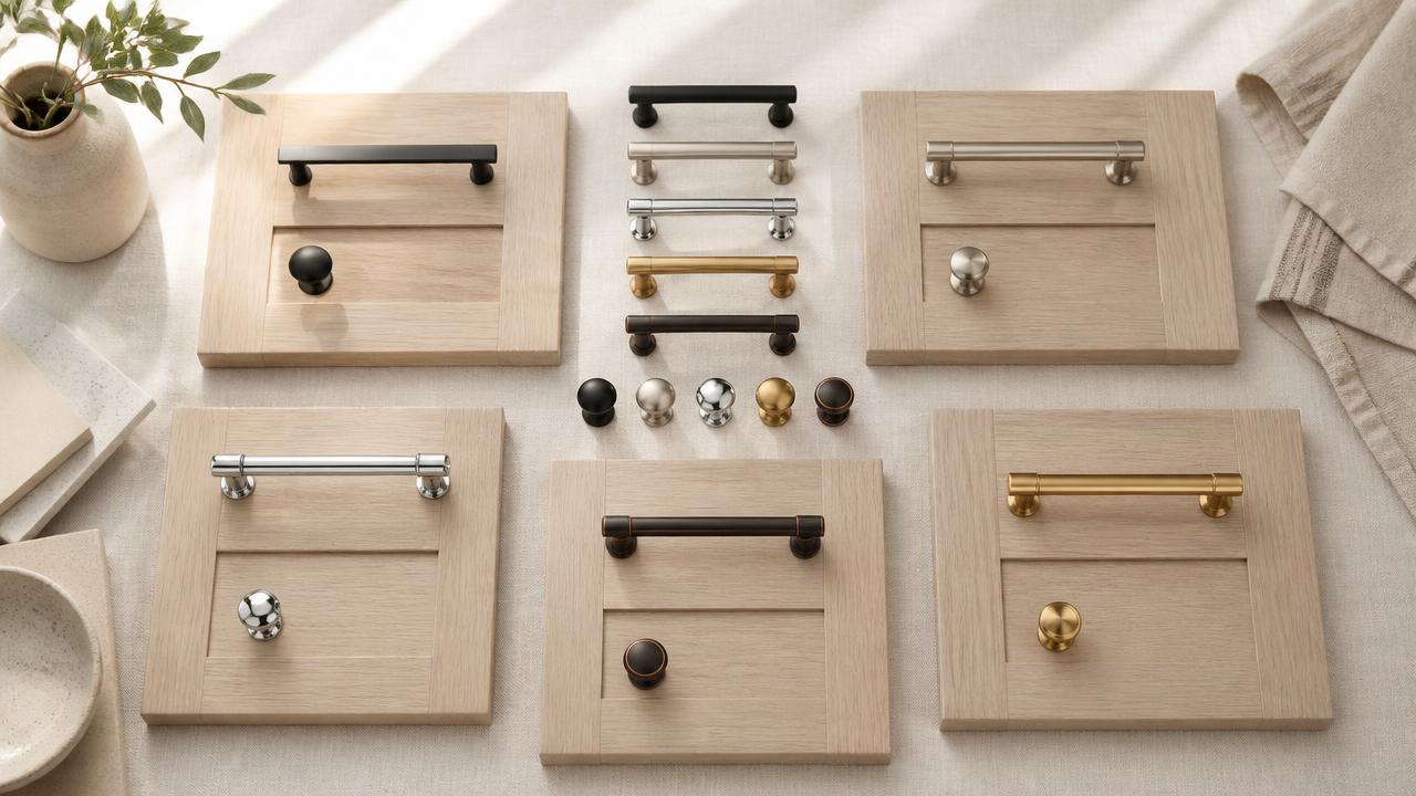
The Short Answer
If you are asking what color hardware for light wood cabinets is the right choice, the short answer is: it depends on three things — contrast, undertone, and proportion. The five finishes that dominate professional kitchens and bathrooms are matte black (#000000) for graphic contrast, satin nickel (#A9A9A9) for cool neutrality, polished chrome (#D3D3D3) for clean reflection, warm brass (#B5A642) for tonal harmony, and oil-rubbed bronze (#5C4033) for depth and tradition.
Everything below explains how each finish behaves against different light wood tones, the exact HEX codes that describe them, and the ratios that keep a kitchen from feeling like a showroom floor.
Understanding Light Wood Cabinets Before You Choose Hardware
Light wood cabinets are not a single color. They range from pale Scandinavian birch and white oak with a barely-there stain, to honey-toned maple, golden alder, and warm natural pine. Each of those substrates has an undertone — cool gray, warm yellow, pinkish beige, or golden orange — and the hardware finish either amplifies that undertone or corrects it.
This matters because hardware is small but repeated. A single knob is a detail; thirty knobs and ten pulls become a visual rhythm. If the finish fights the wood, the whole kitchen feels off. If it harmonizes, the cabinets look more expensive than they are.
For the underlying principles of how colors interact with surfaces, our guide to how to match colors like a professional designer covers the same contrast and undertone logic.
What Color Hardware for Light Wood Cabinets: The Core Finishes
Matte Black — #000000
Matte black is the highest-contrast option. Against light wood it creates a crisp, graphic outline that reads as contemporary and architectural. It works especially well on slab or Shaker doors where the hardware is meant to read as a deliberate line rather than a decorative object.
Use matte black when the wood has a cool or neutral undertone — white oak, gray-washed maple, or pale ash. On very warm honey cabinets, black can feel slightly harsh unless you repeat the black elsewhere: window frames, pendant lights, faucet, or bar stools.
Satin Nickel — #A9A9A9
Satin nickel is the safe default for a reason. It is cool, muted, and slightly warm at the same time, which lets it sit quietly against almost any light wood. It does not demand attention, so it is ideal when the cabinet profile, tile, or countertop is the star.
Best for transitional kitchens, rental properties, and anyone who wants the hardware to disappear. Pair it with gray-leaning woods or cool quartz countertops. If your cabinets read very golden, satin nickel can look a little flat; in that case, warm brass is usually the better neutral.
Polished Chrome — #D3D3D3
Polished chrome is the brightest and most reflective of the common finishes. It bounces light around a room, which makes it a strong choice for small kitchens or spaces with limited natural light. Against light wood it reads clean, commercial, and slightly retro-modern.
The risk is fingerprints and water spots. Chrome also amplifies any cool undertone in the wood, so it can make warm honey cabinets look slightly orange by comparison. Use it when you want sparkle and are willing to maintain it.
Warm Brass — #B5A642
Warm brass is the tonal partner. It echoes the yellow and orange undertones in honey, maple, and pine cabinets rather than competing with them. The result is a cohesive, sun-washed palette that feels expensive and collected.
Brass has made a strong comeback because it adds warmth without the heaviness of oil-rubbed bronze. It works on both traditional raised-panel doors and modern flat slabs. The key is choosing a warm brass with a muted, brushed surface rather than a lacquered, high-shine yellow gold, which can look cheap.
Oil-Rubbed Bronze — #5C4033
Oil-rubbed bronze is the darkest warm finish. It gives light wood cabinets a grounded, traditional feel and is the go-to for Craftsman, farmhouse, and Mediterranean kitchens. The dark brown base with subtle copper highlights creates depth without the starkness of pure black.
Use it when the cabinetry has visible grain, knots, or a hand-finished texture. It also pairs well with stone countertops and aged metals. The only caveat: in very small kitchens, too much dark bronze can feel heavy, so keep pulls slender rather than chunky.
Five Hardware + Light Wood Cabinet Combinations That Work
1. The Scandinavian Quiet — White Oak + Satin Nickel
- Cabinet: White oak with a clear or white-oil finish
- Hardware: Satin Nickel #A9A9A9
- Palette: Soft white walls (#FAFAF7), pale concrete countertop, black accent faucet (#000000)
This is the lowest-contrast, highest-calm combination. Satin nickel disappears into the pale wood and lets the grain do the talking. Ideal for compact apartments and anyone chasing hygge.
2. The Modern Farmhouse — Honey Maple + Matte Black
- Cabinet: Honey-toned maple or birch
- Hardware: Matte Black #000000
- Palette: Creamy subway tile (#F5F5DC), butcher block counter, aged brass pendant (#B5A642)
The black pulls give the warm wood a crisp edge, while the butcher block and brass pendant keep the palette from feeling too stark. This is the most photographed combination on design blogs for a reason.
3. The Warm Minimalist — Natural Pine + Warm Brass
- Cabinet: Natural pine with a clear lacquer
- Hardware: Warm Brass #B5A642
- Palette: Linen white walls (#F5F5DC), terracotta accents (#C1613C), sage textiles (#9CAF88)
Brass and pine share a yellow warmth that makes the whole kitchen feel like late-afternoon light. Add one cool counterweight — a slate floor or black island legs — so the warmth does not tip into sweetness.
4. The Polished Contemporary — Bleached Oak + Polished Chrome
- Cabinet: Bleached or limed oak
- Hardware: Polished Chrome #D3D3D3
- Palette: Cool gray walls (#A9A9A9), white quartz counter (#FFFFFF), glass backsplash
Chrome against bleached oak reads as coastal, clinical, or luxurious depending on the surrounding materials. Keep the palette restrained and let the reflections do the decorative work.
5. The Craftsman Heritage — Quarter-Sawn Oak + Oil-Rubbed Bronze
- Cabinet: Quarter-sawn oak with an amber stain
- Hardware: Oil-Rubbed Bronze #5C4033
- Palette: Deep green walls (#2F4F4F), cream trim (#F5F5DC), copper cookware accents (#B87333)
This is the most traditional pairing on the list. The dark bronze echoes the wood's amber tones while the green walls provide a historic, nature-rooted contrast. It is the choice for homeowners who want the kitchen to feel like it has always been there.
The Color Psychology of Cabinet Hardware
Hardware finishes carry psychological weight that goes beyond their literal color. Understanding this helps when the choice feels subjective.
Matte black (#000000) signals precision, edge, and modernity. It frames light wood the way a black frame frames a photograph: it adds definition and makes the material inside feel more intentional.
Satin nickel (#A9A9A9) signals restraint and professionalism. It is the finish of hotels, rental kitchens, and anyone who wants the room to feel maintained and neutral.
Polished chrome (#D3D3D3) signals cleanliness and technology. Its reflectivity reads as hygienic, which is why it dominates commercial kitchens and contemporary bathrooms.
Warm brass (#B5A642) signals heritage, optimism, and approachable luxury. It is the only finish on this list that literally glows under warm light, which makes a kitchen feel welcoming.
Oil-rubbed bronze (#5C4033) signals tradition, weight, and craftsmanship. It anchors light wood and makes a space feel settled rather than trendy.
The same finish can feel completely different depending on the shape of the pull. A matte black T-bar pull reads industrial; a matte black cup pull reads cottage. A warm brass square bar reads modern; a warm brass bin pull reads vintage. Shape and finish work together.
Matching Hardware to Cabinet Undertone
The undertone of the wood is the real decision-maker. Here is how to read it:
Cool gray undertone (white oak, gray-washed birch): Choose satin nickel, polished chrome, or matte black. Warm brass can work if the rest of the room has warm accents, but it needs to be intentional.
Warm yellow undertone (honey maple, natural birch): Choose warm brass, oil-rubbed bronze, or matte black. Satin nickel and chrome will look slightly sterile unless balanced with warm walls or lighting.
Pinkish beige undertone (cherry, alder, some pines): Choose oil-rubbed bronze or warm brass. Black can feel too harsh; chrome can make the wood look orange.
Golden orange undertone (natural pine, golden oak): Choose warm brass for harmony, matte black for contrast, or oil-rubbed bronze for depth. Avoid cool silvers unless you are deliberately creating tension.
If you are building a whole brand system around these choices, our guide to how to create a color style guide for your brand shows how to document finishes, HEX codes, and usage rules so the palette stays consistent.
Proportion, Placement, and Practical Rules
Cap the finish count. A kitchen should have one primary hardware finish, maybe two if the island is treated as a separate piece. Three finishes in one small kitchen starts to look accidental.
Repeat the finish at eye level. If you choose matte black pulls, repeat matte black in the faucet, pendant cords, or window latches. Repetition turns hardware from an isolated detail into a design language.
Match the scale to the door. Large slab drawers need long pulls or oversized knobs; small Shaker doors need modest pulls or simple knobs. A tiny knob on a 36-inch drawer looks lost; a massive pull on a 12-inch door looks aggressive.
Think about maintenance. Polished chrome and warm brass show fingerprints. Matte black and oil-rubbed bronze hide them. Satin nickel is the middle ground. If you have young children, this matters more than aesthetics.
Test in the actual room. Hardware looks different under 2700K incandescent bulbs, 4000K LEDs, and north daylight. Order samples and live with them for a weekend before committing.
Hardware Color Reference Table
| Item | Color | Hex | Color Name | Psychological Meaning |
|---|---|---|---|---|
| Modern contrast pulls | Matte Black | #000000 | Black | Precision, edge, definition |
| Neutral everyday pulls | Satin Nickel | #A9A9A9 | Dark Gray | Restraint, professionalism, calm |
| Bright reflective knobs | Polished Chrome | #D3D3D3 | Light Gray | Cleanliness, technology, sparkle |
| Warm tonal accents | Warm Brass | #B5A642 | Antique Brass | Heritage, optimism, approachable luxury |
| Traditional deep pulls | Oil-Rubbed Bronze | #5C4033 | Dark Brown | Tradition, weight, craftsmanship |
| Scandinavian wood backdrop | White Oak | #D4C4A8 | Light Tan | Warmth, natural texture, airiness |
| Honey maple cabinets | Honey Maple | #E3C688 | Pale Gold | Comfort, familiarity, brightness |
| Soft wall neutral | Creamy White | #F5F5DC | Beige / Cream | Openness, softness, balance |
| Cool counterweight | Cool Gray | #A9A9A9 | Dark Gray | Neutrality, modernity, restraint |
Practical Takeaways for Designers and Homeowners
Start with the wood undertone, not the trend. The best finish is the one that flatters the cabinet, not the one currently dominating Pinterest. A warm brass trend will pass; a honey maple cabinet with clashing chrome will annoy you every morning.
Use contrast intentionally. High contrast (matte black on pale wood) draws the eye to the hardware. Low contrast (satin nickel on gray oak) draws the eye to the cabinet form. Decide which you want.
Balance warm and cool. Every successful kitchen has at least one cool element and one warm element. If your wood and hardware are both warm, add a cool countertop or backsplash. If both are cool, add wood open shelving or brass lighting.
Consider the room's light. North-facing rooms and rooms with cool LED bulbs make warm brass look more yellow and chrome look bluer. Test samples under the actual lighting.
Document your choices. Once you land on a finish, write down the manufacturer, product code, and the nearest HEX approximation. This prevents the contractor from substituting a similar-but-wrong finish during installation.
For accessibility and contrast considerations — especially if you are pairing hardware with painted cabinets or signage — our guide to color contrast ratios and accessibility rules explains how to measure legibility with real tools.
Conclusion
The question of what color hardware for light wood cabinets has a clear, if nuanced, answer. Matte black (#000000) gives you graphic contrast. Satin nickel (#A9A9A9) gives you quiet neutrality. Polished chrome (#D3D3D3) gives you reflective brightness. Warm brass (#B5A642) gives you tonal harmony. Oil-rubbed bronze (#5C4033) gives you traditional depth.
Start by reading the undertone of your wood, choose a finish that either harmonizes with it or deliberately contrasts it, and then repeat that finish at least once more in the room so the choice feels intentional.
Ready to test the full palette? Use the Coloracci AI palette generator to build a complete kitchen color scheme around your cabinet and hardware choices — including wall color, countertop, and accent metals — with exact HEX codes and contrast checks.