Wes Anderson's Grand Budapest Hotel Color Palette
· Coloracci Team
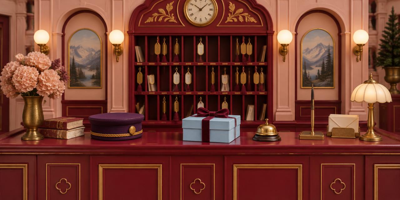
A pale-blue pastry box crosses a prison checkpoint in 1932, tied with a narrow pink ribbon and carrying tools for an escape. It is packaging, plot device, social passport, and perfectly controlled color accent at once. That object explains The Grand Budapest Hotel color palette better than a wall of pastel screenshots: Wes Anderson assigns hues to institutions, loyalties, eras, and memories, then lets those assignments drive the story.
Released in 2014, The Grand Budapest Hotel was directed by Anderson, photographed by Robert Yeoman, and shaped visually by production designer Adam Stockhausen, set decorator Anna Pinnock, costume designer Milena Canonero, and colorist Jill Bogdanowicz. Its famous pink hotel is only one layer. The film moves through nested recollections, and each period receives its own relationship between hue, saturation, material, and framing. The 1930s are built from light pink, deep red, purple, powder blue, and warm gold. The later hotel shifts toward mustard, orange, avocado, and brown. The framing present is comparatively neutral and withdrawn.
The HEX values below are Coloracci's design-ready approximations, not official studio specifications. No definitive production HEX set exists, and any sampled value changes with film scan, theatrical or streaming transfer, display calibration, and the lighting within a shot. Use these swatches to study the palette's hierarchy—not as claims about an immutable pixel.
The Grand Budapest Hotel Color Palette at a Glance
| Item | Color | Hex | Name | Meaning |
|---|---|---|---|---|
| Grand Budapest facade | Confectionery rose | #E7A2B0 |
Alpine Pink | Idealized hospitality, romance, constructed memory |
| Lobby walls and carpets | Deep lacquered red | #8F1D2C |
Lobby Red | Ceremony, control, danger beneath elegance |
| Lobby Boy uniform | Saturated dark violet | #5A285F |
Lobby Purple | Belonging, rank, theatrical service |
| Mendl's pastry box | Pale powder blue | #BFD7E5 |
Mendl's Blue | Innocence, precision, trust, visual relief |
| Brass fittings and trim | Muted warm gold | #B99555 |
Faded Gilt | Prestige, ritual, an aging social order |
| 1960s hotel interior | Yellowed mustard | #B08A3E |
Republic Mustard | Modernization, decline, institutional fatigue |
| Exterior landscape accents | Cool pine green | #3F6654 |
Zubrowka Green | Place, distance, a world beyond the hotel |
| Documents and snowy light | Soft warm ivory | #F2E5D5 |
Archive Ivory | Recollection, paper, selective historical truth |
Alpine Pink — #E7A2B0
Alpine Pink (#E7A2B0) is the film's most recognizable hue, but its power comes from scale and contradiction. Pink coats an enormous hotel facade, converting architecture associated with wealth and social authority into something confectionery and almost impossible. The building appears less like an objective place than a memory polished through repeated telling.
This is not passive nursery pink. Against snow, stone, and mountain air, it becomes a declaration of cultivated hospitality. The hotel promises warmth and etiquette in a Europe moving toward violence. Because the color is visibly artificial, the promise always feels fragile. Anderson does not ask pink to represent innocence alone; he asks it to represent the labor required to preserve innocence as a performance.
The hue also establishes a productive tension between mass and delicacy. A pastry can be pink without surprise. A many-story institution in the same family of color becomes surreal. Designers can use that principle without copying the film: move a hue into an unexpected scale or category, and its familiar emotional associations become newly visible.
Lobby Red — #8F1D2C
Lobby Red (#8F1D2C) gives the 1930s interiors their ceremonial depth. It appears conceptually in carpets, lacquered wood, doors, upholstery, and graphic details. Pink welcomes; red regulates. It turns the lobby from a fantasy shell into a stage where status, timing, and protocol matter.
Red also anticipates danger without breaking the palette. A bright emergency red would feel imported from another visual language. This darker, brown-influenced red can belong to velvet and timber while retaining associations with blood, alarm, and authority. It lets elegance and threat occupy the same surface.
That dual function creates an illuminating contrast with The Godfather color palette. Gordon Willis's world buries power in black and umber; Anderson displays it through saturated service ritual.
Lobby Purple — #5A285F
Lobby Purple (#5A285F) turns costume into institutional identity. The Lobby Boy uniform is instantly legible against pink walls, red carpets, pale snow, and blue packaging. Purple bridges red's heat and blue's restraint, making it both theatrical and disciplined. It communicates service as a role performed with pride.
The uniform demonstrates why palette analysis must include mobile color. Architecture establishes the field, but costume carries a repeatable swatch through corridors, trains, prisons, and outdoor scenes. Zero remains visually connected to the hotel even when physically separated from it. The color functions like a portable emblem.
Purple historically carries associations with ceremony, rarity, and hierarchy. Here, those associations are democratized into labor. The uniform grants membership, yet also marks rank. For brand and production designers, that ambiguity is valuable: a signature color can create belonging while still exposing the system that assigns roles.
Mendl's Blue — #BFD7E5
Mendl's Blue (#BFD7E5) is cool enough to separate from the warm hotel and gentle enough to remain inside its storybook world. The pastry box is associated with Agatha, craft, and an apparently civilized social code. Its neat geometry and ribbon make care visible before the box is opened.
When that package enters hostile spaces, the color's meaning expands. Pale blue becomes camouflage through politeness: guards and officials recognize the object as harmless, desirable, and socially familiar. Packaging does not merely contain the action; it changes what the action can pass through.
This is a practical lesson in color-led props. A repeated object should remain identifiable at multiple scales and in multiple environments. The combination of pale blue, pink, and dark red holds together in warm interiors, grey institutional rooms, and snowy exteriors because it uses temperature contrast without abandoning the larger palette.
Faded Gilt — #B99555
Faded Gilt (#B99555) appears through brass bells, keys, frames, fixtures, and trim. It is less a brilliant metallic yellow than a muted record of prestige. Gold says the hotel was designed to impress; its softened surface says that prestige requires continuous maintenance.
Metallic color cannot be reduced to one HEX value because reflection changes with source angle and material finish. Still, #B99555 is a useful middle-value reference: warm enough to feel ceremonial, restrained enough not to compete with pink and purple. Its role is connective. Gold links the public spectacle of the building to Gustave's precise rituals of service.
How The Grand Budapest Hotel Color Palette Organizes Time
The film does not treat period as a collection of costumes placed in front of one consistent grade. Its eras are complete visual systems. Color, aspect ratio, production design, and texture shift together, allowing viewers to locate themselves in time before exposition catches up.
The central 1930s story uses the near-square Academy ratio. Within that compact frame, pink, red, purple, blue, ivory, and gold stack vertically and symmetrically. The constrained geometry intensifies the palette: uniforms read clearly, doorways become nested color blocks, and centrally placed props acquire emblematic force. The image feels curated because everything is visibly assigned a position.
The 1960s material moves to a much wider frame and a warmer, more yellowed world. The once-confectionery institution now leans toward Republic Mustard (#B08A3E), burnt orange, olive green, and brown. These colors are not simply uglier replacements for pink. They communicate a different administrative ideal—mass tourism, practical surfaces, modernized comfort—and the exhaustion of a social performance that once gave the hotel its identity.
The contrast creates a sophisticated form of nostalgia. The 1930s are not presented as historically neutral truth; they are a remembered world inside another remembered world. Their palette is selective, compressed, and emotionally organized. The later hotel's drabness makes the earlier colors feel more precious, while the artificial perfection of those colors reminds us that memory edits.
Colorist Jill Bogdanowicz has described differentiated period treatments: less-saturated light pinks with deep reds and purples for the 1930s, warmer golds and greens for the 1960s, and a more neutral, desaturated treatment for the framing present. That workflow matters because production color and post-production color are distinct crafts. Stockhausen and Pinnock supplied physical surfaces; Canonero supplied moving textile color; Yeoman's lighting and exposure translated them photographically; grading then protected and separated the intended period identities.
This layered authorship prevents the common mistake of describing a film palette as a filter. A filter affects everything indiscriminately. A designed palette begins before the camera rolls: surface, fabric, pigment, prop, weather, and light are selected so grading can refine relationships rather than invent them wholesale.
Symmetry, Saturation, and Controlled Sweetness
Wes Anderson's symmetry is often imitated as centered furniture plus pastel paint. The Grand Budapest Hotel demonstrates why that recipe is incomplete. Symmetry creates expectation; color tells the eye where to look inside that expectation. A purple uniform on a pink axis, a blue box crossing a red room, or a gold bell at the center of a counter becomes instantly readable because geometry has reduced visual noise.
Saturation is equally controlled. The palette feels colorful, but not every element is equally intense. Ivory paper, snow, skin, stone, and desaturated scenery give the signature colors room. If pink, red, purple, blue, and gold all reached maximum chroma at maximum area, the result would be retail spectacle. Their measured distribution produces hierarchy.
The strongest combinations are also relational. Alpine Pink feels delicate beside Lobby Red. Mendl's Blue feels innocent beside prison grey. Lobby Purple feels authoritative against snow but playful beside pink. Meaning is not embedded in a swatch independently; it emerges from adjacency, proportion, material, and story.
This is where digital color references need discipline. HEX describes emitted RGB light, while the film's key colors originated in paint, textile, paper, metal, photochemical capture, and digital finishing. Coloracci's guide to Pantone vs. HEX explains why a screen value cannot guarantee a physical match. When moving a cinematic palette into packaging or fabric, use HEX as the visual brief, then approve physical standards under the intended light.
Practical Lessons for Designers and Filmmakers
1. Build eras from systems, not sepia overlays
To distinguish time periods, change several coordinated variables: dominant hue, saturation, neutral temperature, material, and image format. The 1930s and 1960s hotel remain recognizably related, but their color hierarchies express different institutional lives. A generic vintage filter would erase that specificity.
2. Give one object chromatic permission to travel
The Mendl's box remains identifiable wherever it appears. Choose one prop, package, interface element, or costume accent that can cross environments without losing its role. Test it against every major background before production.
3. Use complementary temperature, not automatic complements
Powder blue separates from red and pink through temperature, yet its low saturation prevents a loud complementary clash. A useful derived system could pair #E7A2B0 with #BFD7E5, anchor both with #5A285F, and use #8F1D2C only where emphasis is required.
4. Let neutrals prove the color is intentional
Archive Ivory (#F2E5D5) and natural greys stop the palette from becoming a continuous confection. Neutrals provide evidence that the art direction can exercise restraint. In editorial layouts, interfaces, or title sequences, reserve large reading areas for quiet values and let signature hues mark hierarchy.
5. Coordinate color with composition
A centered composition increases the authority of whatever occupies its axis. If the focal object is pale, deepen the surrounding field; if the focal costume is saturated, simplify adjacent props. Color and framing should answer the same question: what must the viewer recognize first?
6. Design decline as transformation, not removal
The later hotel does not become colorless. Pink's romantic warmth mutates into mustard, orange, and olive. This makes loss specific. When showing a brand, place, or character changing over time, evolve the original palette's temperature and material logic rather than switching abruptly to grey.
7. Standardize only after choosing the medium
Start with on-screen references, but do not send HEX alone to a printer, textile mill, scenic painter, or packaging supplier. Search Coloracci's Pantone Finder for nearby standardized candidates, then compare physical samples under production lighting. Matte paper, glossy lacquer, velvet, and brass can share a nominal hue while behaving very differently.
8. Borrow grammar, never copyrighted scenery
The transferable grammar is clear: one dominant romantic field, a dark institutional anchor, a mobile uniform color, a cool crafted object, warm metallic punctuation, and a later palette that reveals decline. Apply those roles to a new subject. Do not reproduce the hotel's facade, Mendl's marks, costumes, or recognizable compositions.
A Palette Recipe for Controlled Nostalgia
For an original editorial identity, begin with 40 percent Archive Ivory (#F2E5D5) and 25 percent Alpine Pink (#E7A2B0). Give Lobby Purple (#5A285F) 15 percent for headings or structural blocks, Mendl's Blue (#BFD7E5) 10 percent for secondary information, Lobby Red (#8F1D2C) 7 percent for decisive actions, and Faded Gilt (#B99555) 3 percent for rules, icons, or tactile detail.
The percentages are a starting hierarchy, not a law. Increase ivory for long-form reading or expand blue for greater calm. What should remain constant is role clarity: pink establishes the emotional world, purple belongs to the institution, blue marks crafted care, red signals consequential action, and gold rewards attention.
Check contrast independently of cinematic appeal. Pale pink and powder blue are poor small-text partners without a dark foreground. Use Lobby Purple or a near-black for body copy, and never rely on red versus purple alone to communicate status. A film frame can prioritize atmosphere for seconds; a product must remain readable through repeated use.
Conclusion: Memory Built in Color
The Grand Budapest Hotel color palette is memorable because it does more than make a fictional hotel attractive. Alpine Pink turns hospitality into an idealized performance. Lobby Red gives that performance rules and danger. Lobby Purple makes service portable. Mendl's Blue allows care and ingenuity to move through hostile systems. Faded Gilt records prestige, while Republic Mustard shows what remains when ritual loses its keeper.
Different eras receive distinct chromatic logic, material character, and framing. Color tells us when we are, whose memory we occupy, and how much has disappeared. The sweetness works because decline is built into it.
For designers and filmmakers, the lesson is not to “make it Wes Anderson.” It is to assign color with narrative precision. Decide which hue belongs to a place, which can travel with a character, which object can cross a boundary, and how the system should age. Then control saturation, proportion, and material until every color performs its part.
Ready to build a scheme from the film's visual grammar? Visit the Movie Color Palettes hub, select Alpine Pink (#E7A2B0) or Mendl's Blue (#BFD7E5), and generate a matching harmony—then adapt the roles to a story of your own.