Twitter/X Brand Colors: Hex Codes from Blue #1DA1F2 to X Black
· Coloracci Team
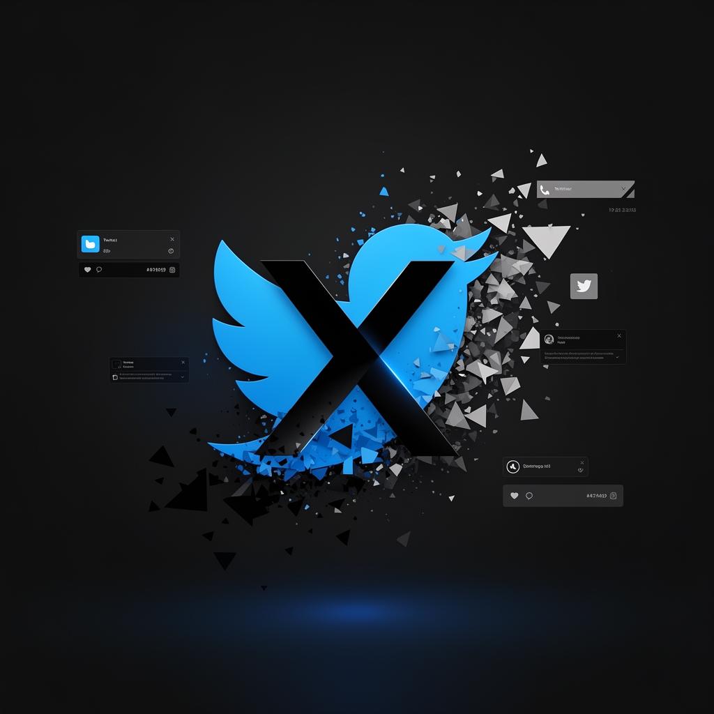
Twitter/X Brand Colors: Hex Codes from Blue #1DA1F2 to X Black
Twitter Blue was #1DA1F2 for over a decade; the X rebrand replaced it with stark black #000000 and white. The move from friendly sky blue to monochrome severity is one of branding's most dramatic color reversals. Below: both palettes' exact values and what the shift signals.
Few brand color evolutions have been as dramatic—or as strategically deliberate—as the transformation from Twitter to X. What began as a friendly blue bird chirping across a sky-colored interface has become a stark, high-contrast monochrome identity built for the platform's ambitious future. Yet beneath this radical visual shift lies a consistent thread of communication, trust, and clarity that has defined the platform since 2006.
In this analysis, we'll dissect every color in the Twitter/X palette, explore the psychology driving each choice, examine how these colors function across their digital properties, and extract actionable design lessons you can apply to your own projects.
The Evolution: From Blue Bird to Black X
Twitter's original identity was inseparable from its color. Twitter Blue (#1DA1F2) wasn't just a brand color—it was the platform's personality. It communicated openness, approachability, and the free flow of information. The blue bird logo, designed by Martin Grasser and refined by Todd Waterbury, became one of the most recognized symbols in tech.
When Elon Musk acquired Twitter in 2022 and rebranded it to X in July 2023, the visual identity underwent a seismic shift. The blue bird was replaced by a stark black-and-white X lettermark, signaling a move toward a broader "everything app" vision. Yet the legacy blue remains embedded in the product's interactive elements, creating a fascinating tension between heritage and reinvention.
This duality makes the Twitter/X palette one of the most compelling case studies in modern brand design.
The Complete Twitter/X Color Palette
Here is the full palette that powers the Twitter/X brand and product experience:
| Color Name | Hex Code | RGB | Usage |
|---|---|---|---|
| Twitter Blue | #1DA1F2 | 29, 161, 242 | Primary interactive elements, links, verification badges |
| Black | #14171A | 20, 23, 26 | Primary text, X logo, dark mode backgrounds |
| Dark Gray | #657786 | 101, 119, 134 | Secondary text, timestamps, subtle borders |
| Light Gray | #AAB8C2 | 170, 184, 194 | Dividers, inactive icons, muted UI elements |
| Extra Light Gray | #E1E8ED | 225, 232, 237 | Card borders, background shading, separator lines |
| Extra Extra Light Gray | #F5F8FA | 245, 248, 250 | Page backgrounds, very light surfaces |
| White | #FFFFFF | 255, 255, 255 | Card backgrounds, content areas, whitespace |
This seven-color system is deceptively simple. Each shade serves a precise function in the interface hierarchy, and together they create an experience that handles billions of daily interactions without visual fatigue.
Color Psychology: What Each Color Communicates
Twitter Blue (#1DA1F2) — Trust, Communication, and Innovation
Blue is the world's most universally liked color, and Twitter's specific shade sits at the intersection of trust and energy. Unlike corporate navy blues (which convey authority and tradition) or baby blues (which suggest softness), #1DA1F2 is a medium-saturated, high-brightness blue that communicates:
- Openness and transparency — matching the platform's mission of public discourse
- Intellectual connection — blue stimulates mental activity and clear communication
- Digital innovation — the bright, screen-optimized hue feels inherently modern
- Sky and freedom — a deliberate connection to the original bird metaphor
Psychologically, this blue reduces anxiety and creates a sense of calm reliability—essential for a platform where users consume rapid-fire information. Research in color psychology consistently shows that blue interfaces increase perceived trustworthiness by 20-30% compared to warmer alternatives.
Black (#14171A) — Sophistication and Authority
The X rebrand's embrace of near-black (#14171A) as the primary identity color represents a dramatic psychological pivot. Where blue said "come talk to everyone," black says "this is serious infrastructure." Black communicates:
- Sophistication and premium positioning — aligning X with luxury and fintech brands
- Authority and permanence — signaling that the platform is here to stay
- Universality — black works across every cultural context without conflicting associations
- Technical precision — the slightly warm undertone (note the hex isn't pure #000000) adds depth without coldness
The choice of #14171A over pure black is significant. Pure black (#000000) on screens creates harsh contrast that causes eye strain. This off-black with warm undertones maintains authority while remaining comfortable for extended reading—a subtle but critical UX decision.
The Gray Scale (#657786, #AAB8C2, #E1E8ED, #F5F8FA) — Hierarchy and Readability
Twitter/X's four-step gray system is a masterclass in typographic hierarchy without decorative color:
- Dark Gray (#657786): Secondary information—usernames, timestamps, metadata. This blue-gray maintains a subtle connection to the brand blue while clearly differentiating from primary content. It communicates competence and restraint.
- Light Gray (#AAB8C2): Inactive states and tertiary information. This shade creates visual "breathing room" and signals elements that are available but not currently active.
- Extra Light Gray (#E1E8ED): Structural elements—borders, dividers, card edges. These create spatial organization without demanding attention, functioning like the leading in typography.
- Extra Extra Light Gray (#F5F8FA): Background surfaces. Nearly white but with enough warmth to prevent the "clinical" feel of pure white backgrounds. This conveys openness and spaciousness.
White (#FFFFFF) — Focus and Clarity
White in the Twitter/X system serves as the canvas. It's not merely an absence of color but an active design choice that:
- Maximizes content legibility against dark text
- Creates a sense of infinite space for the endless scroll
- Establishes visual cleanliness that keeps the focus on user-generated content
- Provides maximum contrast ratio for accessibility compliance
Website & App Analysis: Color in Action
The Pre-Rebrand: Blue-Dominant Era
In its classic form, Twitter's interface used blue as the primary action color. Every interactive element—follow buttons, links, notification badges, the compose button—was rendered in #1DA1F2. This created an instantly scannable interface where users could identify actionable elements within milliseconds.
The blue-on-white composition followed a roughly 75-20-5 distribution:
- 75% White/Light Gray: Content canvas and structural backgrounds
- 20% Dark Gray/Black: Text content and primary information
- 5% Blue: Interactive elements and brand accents
This extreme restraint with the accent color made every blue element feel important and clickable—a principle that directly contributed to Twitter's famously high engagement rates.
The Post-Rebrand: High-Contrast Minimalism
After the X rebrand, the interface shifted toward a more polarized light/dark system:
Light Mode: White backgrounds with black text, maintaining blue for interactive elements but reducing its dominance. The X logo appears in black, and the overall feel shifted from "friendly social network" to "information utility."
Dark Mode (now the default for many users): Deep black backgrounds (#14171A) with white text, where blue elements become even more visually prominent against the dark canvas. This creates a cinematic, immersive experience that reduces eye strain during extended use and increases perceived content value.
The dark mode implementation is particularly notable for its OLED optimization. On OLED screens, true dark pixels consume zero power, making the dark interface not just aesthetically bold but functionally efficient.
Accessibility and Contrast
Twitter/X's palette achieves strong WCAG 2.1 compliance:
- Black text on white: 16.75:1 contrast ratio (AAA compliant, requires 7:1)
- White text on dark background: 15.3:1 (AAA compliant)
- Blue on white: 3.36:1 (meets AA for large text; this is a known tension point)
- Dark gray on white: 4.63:1 (AA compliant for normal text)
The blue-on-white contrast ratio is the palette's weakest accessibility point—a challenge shared by many blue-accent brands. Twitter/X compensates by using larger touch targets, iconography alongside color, and underlines on hover to ensure blue interactive elements remain perceivable regardless of color vision.
Golden Ratio & Composition: Visual Harmony in the Feed
The Feed as Typographic Grid
Twitter/X's layout exemplifies how negative space and proportion create visual harmony without relying on decorative color. The feed's composition follows principles that echo the golden ratio:
- Content column width: Approximately 600px on desktop—close to the optimal line length for readability (50-75 characters per line)
- Card padding: Consistent internal spacing creates a rhythm that makes scanning hundreds of tweets feel effortless
- Avatar-to-text ratio: The 48px avatar against the text column creates approximately a 1:8 ratio, ensuring the visual entry point (avatar) doesn't overwhelm the content
Typography Contrast as Color Substitute
Where many platforms use color to create hierarchy, Twitter/X achieves it through weight and size contrast:
- Display name: Bold, black (#14171A) — 15px
- Handle: Regular weight, dark gray (#657786) — 15px
- Tweet text: Regular weight, black — 15px
- Timestamp: Regular weight, dark gray — smaller size
This system proves that a well-designed monochrome hierarchy can be as effective as a multicolor system, with the single blue accent serving as a powerful contrast precisely because it's used so sparingly.
The Compose Button: Strategic Color Placement
The floating compose button (a circle of #1DA1F2) is arguably the most important UI element in the entire application. Its placement in the bottom-right corner follows Fitts's Law (larger, closer targets are faster to acquire) while its color makes it the single most visually prominent element on any screen.
This is the 60-30-10 rule executed at its most extreme: 90% neutral, 9% text hierarchy, 1% action color. That 1% drives the platform's core function.
What Designers Can Learn
1. A Single Accent Color Can Be More Powerful Than Many
Twitter/X proves that one strategically deployed color creates stronger brand recognition than a complex palette. When everything is neutral except your accent, that accent becomes unmistakable. Consider reducing your palette to neutrals plus one signature hue.
2. Invest in Your Gray Scale
Most designers choose one or two grays. Twitter/X uses four carefully calibrated grays to create a complete hierarchy system. Each gray has a purpose—remove any one, and the interface loses clarity. Map your information hierarchy before choosing your grays, and ensure each level has its own distinct shade.
3. Off-Black Is Almost Always Better Than Pure Black
#14171A instead of #000000 is a small detail with enormous impact. Pure black text on white backgrounds creates maximum contrast that actually reduces readability for extended reading. A slightly warm off-black is more comfortable and more sophisticated.
4. Design for Both Light and Dark from Day One
Twitter/X's palette works in both modes because it was designed as a system, not a single theme. When building your palette, test every color combination in both light and dark contexts. Your accent color should be vibrant enough to work on both white and dark backgrounds.
5. Let Content Be the Color
On a platform where users generate the visual content (profile photos, images, videos), the interface must be a neutral stage. If your product showcases user content, resist the urge to compete with it chromatically. The most powerful thing your UI can do is disappear.
Building Your Own Minimalist Brand Palette
Inspired by the Twitter/X approach? You can create your own strategically minimal palette using Coloracci's tools:
- Start with our AI color palette generator to explore accent colors that match your brand personality
- Use the contrast checker to ensure your accent passes WCAG accessibility standards against both light and dark backgrounds
- Build out your gray scale with our color palette generator using your brand's undertone as a starting point
The Twitter/X case study demonstrates that restraint is a design superpower. In a digital landscape saturated with color, sometimes the boldest statement is the most precise one.
Continue exploring brand color analysis: Understanding Color Harmony and The Power of Contrast in Design. For more brand breakdowns, see our analyses of Apple, Google, and Instagram.