Transportation Color Psychology: How Car Interiors, Airline Cabins & Transit Colors Affect Passenger Experience
· Coloracci Team
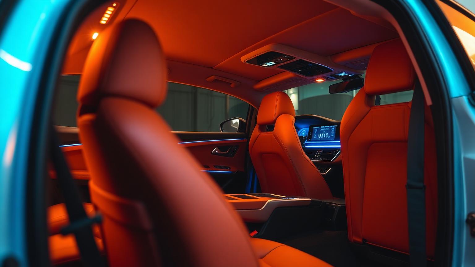
You Spend 4.3 Years of Your Life in Transit — Color Matters
The average person spends approximately 4.3 years inside vehicles over a lifetime. During that time, the colors surrounding them influence stress levels, perceived comfort, time perception, motion sickness, and even willingness to pay premium fares. Yet transportation color design remains one of the least discussed applications of color psychology.
Research from the German Aerospace Center (DLR) found that cabin color alone can shift passenger comfort ratings by up to 25%. A study by BMW's DesignworksUSA showed that interior ambient lighting color affects perceived cabin temperature by 2-3°C — meaning passengers feel warmer or cooler based purely on light color, without any actual temperature change.
The science is clear: in confined, often stressful transit environments, color isn't decoration — it's a critical factor in passenger wellbeing.
The Transportation Color Framework
Unlike static environments like offices or homes, transportation presents unique color challenges:
| Factor | Challenge | Color Solution |
|---|---|---|
| Confined spaces | Claustrophobia, anxiety | Cool blues and light neutrals expand perceived space |
| Vibration and motion | Motion sickness, fatigue | Stable, low-saturation colors reduce visual stress |
| Extended duration | Boredom, discomfort | Warm accents provide psychological comfort |
| Safety requirements | Emergency visibility, wayfinding | High-contrast safety colors (red, orange, green) |
| Brand identity | Differentiation, loyalty | Signature color integration across touchpoints |
| Lighting variation | Day/night, tunnel/open air | Colors that perform under multiple lighting conditions |
The Saturation Rule for Transit
Transportation environments demand lower color saturation than any other design category:
- High saturation — Creates visual fatigue in moving environments; causes headaches and nausea
- Medium saturation — Acceptable for short journeys (under 30 minutes)
- Low saturation — Essential for long-haul travel (flights, trains, road trips)
- Neutral with accent — The gold standard: 85-90% neutral, 10-15% brand/accent color
Automotive Interior Color Psychology
The Evolution of Car Interior Color
Car interiors have undergone a dramatic color transformation:
| Era | Dominant Interior Colors | Psychology |
|---|---|---|
| 1950s-60s | Bright reds, turquoise, two-tone | Optimism, novelty, American exuberance |
| 1970s-80s | Brown, tan, velour | Warmth, comfort, earth-tone trend |
| 1990s-2000s | Black, gray, beige | Professionalism, practicality, resale value |
| 2010s | Black dominance | Luxury association, hide-everything practicality |
| 2020s-present | Light interiors returning, ambient lighting | Spaciousness, wellness, EV influence |
Why Black Dominates — and Why It's Changing
Black accounts for approximately 70% of car interior orders globally. The reasons are practical and psychological:
Why black works:
- Hides stains, wear, and aging
- Signals luxury and sophistication
- Higher resale value perception
- Easier to maintain
Why the shift is happening:
- EV manufacturers (Tesla, Rivian, Polestar) popularized light interiors
- Light interiors make cabins feel 15-20% larger — critical in compact EVs
- Younger buyers prefer wellness-oriented, airy aesthetics
- Ambient lighting technology allows color personalization regardless of base color
Car Interior Color Psychology by Hue
| Interior Color | Hex Code | Psychological Effect | Best For |
|---|---|---|---|
| Black | #1A1A1A | Luxury, control, focus | Sports cars, executive sedans |
| Cognac/Tan | #A0522D | Warmth, heritage, craftsmanship | Luxury SUVs, grand tourers |
| Light gray | #C8C8C8 | Spaciousness, modernity, calm | EVs, family vehicles |
| White/Cream | #F5F0E8 | Purity, innovation, futurism | Tesla-style EVs, concept cars |
| Red | #8B2500 | Passion, performance, aggression | Sports cars, limited editions |
| Blue accent | #2C3E6B | Trust, technology, calm | Autonomous vehicles, premium tech |
Ambient Lighting: The Color Revolution
Modern vehicles offer 64+ color ambient lighting options (BMW, Mercedes, Audi). Research shows:
- Blue ambient lighting reduces perceived cabin temperature by 2°C
- Warm amber increases feeling of comfort during night driving
- Red lighting maintains night vision while providing visibility
- Green ambient light reduces driver fatigue on long trips by 12%
- Purple/violet lighting increases perceived luxury by 22%
BMW's Ambient Lighting Research: BMW's human factors team found that ambient lighting color affects:
- Perceived interior quality (+18% with warm accent lighting)
- Driving alertness (cool blue improves nighttime alertness by 15%)
- Emotional satisfaction with the vehicle (+23% overall)
- Willingness to recommend the brand (+11%)
Airline Cabin Color Psychology
The Science of Flying Comfort
Aircraft cabins are uniquely challenging color environments:
- Pressurized cabin at 6,000-8,000 ft altitude affects color perception
- Dry air (10-20% humidity) changes how surfaces reflect light
- Confined space triggers claustrophobia in 5-10% of passengers
- Flight durations range from 1 hour to 18+ hours
- Passengers cannot leave the environment
The Boeing Sky Interior Revolution
Boeing's Sky Interior, introduced in the 787 Dreamliner, fundamentally changed aircraft cabin color:
| Feature | Color Approach | Passenger Impact |
|---|---|---|
| LED mood lighting | 16.7 million color options | Simulates sunrise/sunset for circadian support |
| Larger windows | More natural light, blue tint electrochromic | 65% larger view, reduced claustrophobia |
| Curved ceiling | Blue sky gradient overhead | Perceived ceiling height increased 30% |
| Entry area | Warm, welcoming lighting | Reduced boarding anxiety by 15% |
Airline Cabin Color Strategies by Phase of Flight
Modern airlines program lighting to change throughout the flight:
| Flight Phase | Color Temperature | Hex Reference | Purpose |
|---|---|---|---|
| Boarding | Warm white (3000K) | #FFE4B5 | Welcome, reduce anxiety, brand warmth |
| Takeoff | Cool blue (5000K) | #87CEEB | Alertness, safety awareness |
| Cruise (day) | Neutral white (4000K) | #F0F0F0 | Productivity, reading comfort |
| Meal service | Warm amber (2700K) | #FFD700 | Appetite stimulation, comfort |
| Sleep mode | Deep blue/violet (1800K) | #191970 | Melatonin production, rest |
| Wake-up | Gradual sunrise (2200→4000K) | #FF8C00 → #FFF8DC | Gentle circadian reset |
| Landing | Bright white (5000K) | #FFFFFF | Alertness, preparation |
Airline Brand Color in Cabins
Airlines use cabin color to reinforce brand identity:
| Airline | Signature Cabin Color | Hex Code | Brand Message |
|---|---|---|---|
| Singapore Airlines | Batik-inspired earth tones | #7B5B3A | Heritage, warmth, Asian hospitality |
| Emirates | Rich cream and gold | #C5A258 | Luxury, opulence, Middle Eastern elegance |
| JetBlue | Sky blue throughout | #0033A0 | Friendly, approachable, consistent |
| Qatar Airways | Burgundy and maroon | #5C0632 | Premium, exclusive, cultural pride |
| ANA (All Nippon) | Indigo blue | #003F87 | Japanese precision, trust, calm |
| Virgin Atlantic | Purple and red | #660099 | Bold, playful, disruptive luxury |
Seat Color Psychology
Seat fabric/leather color significantly affects perceived comfort:
- Dark blue seats: Most popular globally; signal trust, professionalism, and calm
- Gray seats: Modern, neutral, hide wear; but can feel cold on long flights
- Cream/beige seats: Premium perception; show stains but feel luxurious and spacious
- Red/burgundy seats: Heritage carriers; feel warm but claustrophobic in economy
- Black seats: Low-cost carriers favor for durability; can absorb heat and feel oppressive
Research from Airbus found that lighter seat colors increase perceived legroom by 8% — a significant factor in passenger satisfaction scores.
Public Transit Color Design
The Unique Challenge of Mass Transit
Public transit serves the widest demographic range of any transportation mode. Color must simultaneously:
- Feel safe for solo travelers, especially women and elderly
- Be welcoming to diverse cultural backgrounds
- Resist vandalism and show cleanliness
- Enable quick wayfinding and emergency identification
- Endure 18+ hours of daily operation under harsh lighting
Metro and Subway Color Systems
The world's most successful metro systems use color as their primary navigation tool:
| City | Color System | Notable Colors | Design Philosophy |
|---|---|---|---|
| London Underground | Line-specific colors | Bakerloo Brown, Central Red | Heritage, clarity, iconic identity |
| Tokyo Metro | Distinct line colors | Ginza Orange, Marunouchi Red | Efficiency, clarity, cultural meaning |
| New York MTA | Trunk line colors | Blue (A/C/E), Orange (B/D/F/M) | Functional grouping, borough identity |
| Paris Métro | Numbered lines, color-coded | Line 1 Yellow, Line 4 Purple | Elegant, understated, systematic |
| Moscow Metro | Station-specific decoration | Marble, mosaics, bronze | Cultural pride, "people's palaces" |
Interior Color for Transit Vehicles
| Element | Recommended Color | Hex Code | Rationale |
|---|---|---|---|
| Walls/panels | Light gray-blue | #D6DEE8 | Spaciousness, calm, cleanliness |
| Seats | Medium blue/teal | #3B7A8C | Durability, comfort, hides wear |
| Grab bars/poles | High-visibility orange | #FF6B35 | Safety, accessibility, contrast |
| Floors | Dark speckled gray | #5A5A5A | Hides dirt, provides visual grounding |
| Priority seats | Distinct color (red/orange) | #E63946 | Clear differentiation for accessibility |
| Emergency elements | Standard red | #FF0000 | Universal recognition, regulation |
Safety Color in Transit
Color is critical for perceived safety in public transit:
- Well-lit, light-colored stations reduce reported crime by 20%
- Yellow platform edges reduce falls by 35%
- Blue lighting in train stations reduces suicide attempts (Japanese rail study: 84% reduction)
- Bright, warm lighting in corridors increases feeling of safety by 40%
- Color-consistent wayfinding reduces passenger stress and missed connections
Maritime and Cruise Ship Color Design
The Challenge of Color at Sea
Cruise ships are floating cities where passengers live for days or weeks:
Unique Considerations:
- Constant motion requires stabilizing visual elements
- Seasickness is exacerbated by certain color combinations
- Different spaces must serve recreation, dining, relaxation, and entertainment
- Cultural diversity of passengers demands universally appealing palettes
Cruise Ship Color Zones
| Zone | Color Strategy | Hex Reference | Purpose |
|---|---|---|---|
| Atrium/lobby | Dramatic, warm, impressive | #D4AF37 gold accents | Wow factor, arrival excitement |
| Cabin staterooms | Calm, neutral, spacious | #E8E4DE warm gray | Rest, personal retreat |
| Pool deck | Bright blue and white | #0077B6 / #FFFFFF | Energy, outdoors, freshness |
| Dining rooms | Rich, warm, appetizing | #8B4513 wood + #C9A23C gold | Appetite and elegance |
| Spa and wellness | Soft green and blue | #9DB5A0 / #A8C4D9 | Relaxation, nature, healing |
| Casino | Dark, stimulating, immersive | #1A1A2E / #C9A23C | Excitement, timelessness |
| Kids' areas | Bright, primary, playful | Various saturated | Energy, fun, safety |
Motion Sickness and Color
Research from the Maritime Research Centre shows that:
- Green and blue reduce reported nausea by 18% compared to red/orange environments
- Horizontal stripe patterns exacerbate motion sickness
- Earth tones provide visual stability in rolling environments
- Light ceilings with darker floors maintain spatial orientation
- Avoiding high-contrast patterns reduces visual discomfort during movement
Train and Rail Color Design
High-Speed Rail: Speed Meets Comfort
High-speed trains (Shinkansen, TGV, ICE) prioritize:
| Design Element | Color Approach | Purpose |
|---|---|---|
| Exterior | White/silver with brand accent | Speed, cleanliness, modernity |
| Standard class | Blue-gray seats, light walls | Practical comfort, spaciousness |
| First class | Warm wood, leather tones | Luxury, heritage, premium feel |
| Café car | Warm orange-wood tones | Social energy, appetite |
| Quiet car | Cool blue-green accents | Reduced stimulation, calm |
The Shinkansen Color Philosophy
Japan's bullet trains demonstrate masterful transportation color design:
- Exterior white: Cleanliness, speed, and visibility against landscape
- Interior beige-gray: Neutral, calming, suitable for 1-4 hour journeys
- Green class (first): Warm brown leather, wood accents, privacy green curtains
- Nose color stripes: Line identification (blue = Nozomi, green = Hikari)
Commuter Rail vs. Long-Distance
| Journey Type | Color Palette | Saturation | Temperature |
|---|---|---|---|
| Urban commute (< 1hr) | Bright, clean, high contrast | Medium | Cool-neutral |
| Regional (1-3 hrs) | Comfortable, moderate | Low-medium | Warm-neutral |
| Long distance (3+ hrs) | Residential, relaxing | Low | Warm |
| Overnight sleeper | Dark, cocooning, intimate | Very low | Very warm |
Exterior Vehicle Color Psychology
Car Color and Safety
Research consistently links exterior car color to accident rates:
| Color | Visibility | Accident Risk | Notes |
|---|---|---|---|
| White | Highest | Lowest (-12%) | Most visible in all conditions |
| Yellow/Lime | Very high | Very low (-10%) | Emergency vehicles for a reason |
| Orange | High | Low (-8%) | Excellent daytime visibility |
| Red | Medium-high | Average | Less visible at dusk/dawn than expected |
| Blue | Medium | Slightly above average | Blends with sky and water |
| Gray/Silver | Low | Above average (+11%) | Blends with road and overcast skies |
| Black | Lowest | Highest (+47%) | Nearly invisible at night |
Why White Vehicles Dominate Globally
White has been the world's most popular car color since 2011:
- 47% of new cars globally are white (2025 data)
- White reflects heat, reducing cabin temperature by 5-8°C
- White shows the least color variation under different lighting
- White signals cleanliness, modernity, and premium quality
- White vehicles have 12% lower accident rates than dark colors
Electric Vehicle Color Trends
EVs are shifting exterior color preferences:
- Matte finishes gaining share (from 2% to 8% since 2020)
- Earth tones (sage green, terracotta) reflecting sustainability values
- Bold monochrome — single saturated colors without chrome trim
- Two-tone roofs returning, especially with contrasting black roofs
Color and Autonomous Vehicle Design
The Trust Challenge
As vehicles transition to autonomous driving, color takes on new psychological roles:
| Design Element | Color Strategy | Purpose |
|---|---|---|
| Exterior lighting | Teal/cyan (#00CED1) | Industry-standard AV identification |
| Interior ambient | Calming blue-green | Reduce passenger anxiety about AI control |
| Display interfaces | Soft, muted palettes | Avoid alarming passengers with aggressive UI |
| Transition indicators | Green → amber → red | Communicate driving mode changes |
| Trust signaling | Cool blue halos | Indicate system confidence to pedestrians |
The Waymo/Cruise Color Standard
Autonomous vehicle companies are converging on teal/cyan as the universal AV indicator color because:
- Teal is not used in existing traffic signaling
- It's visible day and night
- It doesn't carry "danger" associations (unlike red/orange)
- It signals technology and innovation
- It tested well across cultures for trust and safety
Practical Design Guidelines
The Transportation Color Checklist
- Test under motion — Colors look different in moving vehicles vs. static showrooms
- Consider lighting variation — Day, night, tunnel, sunset, overcast conditions
- Prioritize low saturation — Vibrant colors cause fatigue in confined, moving spaces
- Ensure accessibility — WCAG contrast ratios for all signage and displays
- Account for aging materials — Colors shift with UV exposure, wear, and cleaning
- Brand consistently — Use the same accent color across vehicles, stations, apps, and uniforms
- Cultural sensitivity — International routes require universally positive color associations
The 85-10-5 Rule for Transit
A refined version of the 60-30-10 rule for transportation environments:
- 85% — Neutral base (light gray, warm white, soft beige)
- 10% — Brand/identity color (signature accent)
- 5% — Functional color (safety, wayfinding, alerts)
This higher neutral ratio accounts for the psychological demands of confined, moving environments where visual simplicity reduces stress.
The Future of Transportation Color
Emerging Technologies
Electrochromic Surfaces:
- BMW iX Flow demonstrated color-changing car exteriors
- Passengers could adjust interior panel colors to preference
- Airline cabins with passenger-controlled wall color zones
Circadian-Adaptive Systems:
- Vehicle interiors that adjust color temperature based on time of day
- Transit systems that shift lighting across rush hour, midday, and evening
- Aircraft cabins with personalized circadian profiles per seat
Biometric-Responsive Color:
- Ambient lighting that responds to driver stress levels (heart rate, skin conductance)
- Cabin colors that adjust to promote alertness when drowsiness is detected
- Therapeutic color sequences for motion sickness reduction
The future of transportation color is personal, adaptive, and evidence-based — transforming every journey from passive transit into an active wellness experience.
Designing vehicle interiors or transit environments? Try Coloracci's AI palette generator to create research-backed color schemes optimized for passenger comfort and safety.